Hi, servus and thanks so much for stopping by!
Today's project is all about making most of the paints you are using with your stencils. The artwork that resulted from this task is a tiny folder holding a series of stencilled, stencil-printed and stencil-paint-residue-smudged and -rubbed (yes, I've obviously just invented these words) ATCs and I will explain all of these techniques in this post (though there isn't too much "magic" or "technique" involved honestly). As always I went for a project where I would embrace any imperfections that I would meet on my creative journey (and as I have already mentioned that a good deal of smudging has been involved, imperfection was certainly expected and hoped for) - and that led to some beautifully textured layers.
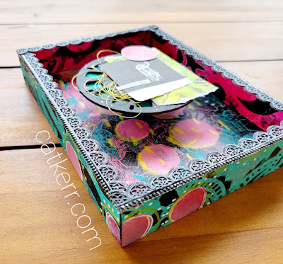
I especially love how the folder turned out!
I have of course done all sides of the folder (and had to pay attention to not accidentally do the front cover upside down!), but I will share images of the other sides later. First I want to talk about the set of ATCs which were inspired especially by one of the stencils I had quite randomly picked to use for my happy messy session with various spray paints:
The stencils I've used were:
Sea of Skiffs Mini Stencil (
M109)
and
by
Rae Missigman
ATC Mixup - Carriker (
L651)
by
Pam Carriker
...and it was Pam Carrikers head design on this stencil which inspired me to do an ATC series all about heads and what's in them (or comes out of them...). The fact that this particular stencil design also comes with the mask makes this stencil even more rewarding and versatile to play with.
Building up layers by not only applying paint through the stencil but also using the paint that's then left on the stencil to make a print is great fun - and not a single drop of your spray paint gets wasted. I even used the paint residue on my craft mat that came from the cap of my blue spray paint (I had shaken the bottle too wildly so some of the paint oozed out and the cap left a blue paint circle on my mat) and took a "print" from it.
But let's start with the first initial layers:
I worked simultaneously on the tiny Kraft folder and eight white ATC blanks. On these I used whatever spray paints I had at hand (Ranger Dylusions - white linen, Distress OxideSpray Paint - marmalade spice, Tattered Angels Glimmer Mist - Teal High Heel, I Zink dye spray - Cerise) and the only acrylic paint on this project that came in a jar: yellow Pantheon Paint (a gift from my wonderful boss, MaryBeth Shaw). The picture above shows the very first layers on the folder. I heat dried these so I could continue with applying the yellow paint through the sequin design stencil using a silicone brush.
The silicone brush kind of forces the paint under the stencil, so you get a beautifully smudged result (if you prefer crisp and tidy designs and edges, you better apply the paint with a stipple or stencil brush or a sponge). The picture shows the smudged on (yellow) layer to the left, on the folder. The result looks a bit like fish scales (which I absolutely love).
Then I used the left over paint on the stencil to print with it (by flipping it over) and add a base layer to the ATC. To fill in the circles with the brighter yellow I used a baby wipe and rubbed across the stencil (that was still in place) in circular motions. This gives a smooth pastel-like effect (and you are cleaning and using your stencil in one go).
I did the same with the teal Glimmer Mist on the Fort Hill stencil: first I sprayed some hills through the stencil to my folder's front cover...
...then I printed the (blue) negative space around the hills to a different background and finally I did the baby wipe smudging on another ATC blank.
Actually the only paint that was "wasted" throughout the whole project, was the one that got soaked up by the baby wipe. But everything else went on one or the other ATC - either printed or (baby) wiped.
Another thing I found gave a cool result, was to apply spray paint to the head mask and print a head image with trying to keep the paint drops visible. Usually you print with a sprayed stencil by flipping it over, putting it in place on your substrate, then covering the stencil with a sheet of paper (or kitchen towel) and rubbing thoroughly to divide the paint evenly.
This time I just picked up the sprayed mask with a pair of tweezers and put it face down on my ATC blank without adding any pressure at all. I just let it sit for a few seconds and then lifted it as gently as I could.
Afterwards I "cleaned" the mask on top of another ATC with the baby wipe. This way the smallest amount of left over paint gets transferred to the paper around the mask. This is perfect to create soft transparent layers on top of printed or stencilled ones.
Some of the results so far:
I wanted to find out how the Distress Oxide Spray paint would behave when being layered onto different paints and substrates. I used it together with the Twisted Forest stencil on one of the folder's cover insides (and really like how it looks on the Kraft card stock). I layered two stencils this time and put the head mask on top of the forest design. This way I ended up with a clean head shaped area on the folder and two misted stencils to use for printing.
I picked two of the ATCs that already had stencilled or printed base layers on them and put them closely side by side as I wanted to get two halves of a printed head in one go.
I didn't think too much about which print or baby wipe layer was to go where - I just played and went by what I felt was the most fun, interest or contrast needed. And (of course) my favourite ATC from the series turned out to be the one that I additionally cut from the sheet of protective paper (and which therefore had come together totally by accident and without any thinking at all).
Some final touches were added by going in with the stencils or mask again and trace some of the designs with a black Faber Castell fine tip PITT artist pen. With some of the ATCs I also shifted the stencil/mask on purpose, so the heads or hills didn't all just get a neat outline but some visual interest instead.


Last but not least I also added some splatters and scribbling directly with the nozzle from a black acrylic spray paint and some cut out words (matching the "heads" theme) from old dictionary pages and collage papers.
I think I will continue doing ATC series that go into separate folders each as I really like the concept of having themed ATCs stored in a visually matching folder.
By the way: I've used a die cut folder (the one from the Tim Holtz "Specimen" Thinlits dies set), but you can just as easily cut out and fold a fast one from recycled sturdy envelopes or thin cardboard. This way not only paint residue on stencils gets a new purpose ;)
Of course I want to also share all sides of the folder - starting with some close up shots and then the back, the inside and finally the front cover again. I hope that you like this as much as I do and that I could encourage you to go wild with spray paints, silicone brushes, baby wipes and your favourite stencils! It's a great deal of fun (have I already mentioned that?) - you'll see!
Once more thanks so much for stopping by! I hope you have enjoyed your visit!
Hugs and happy creative times!
Claudia
xxx


.jpg)


