Showing posts with label black and white stencil art. Show all posts

Tuesday, February 15, 2022

Crazy Little Thing Called Love

I am happy to be back on the blog today with another installment of music themed artwork.  I know it's the day after Valentine's Day, but I couldn't help myself so we'll extend the celebration.  It all started when I was wandering the aisles of Target earlier this month and happened upon a pack of six heart shaped canvasses.  On a whim, I bought them, thinking they were destined to be in my pile of "almost" used substrates. I had some other commitments to work on through much of the month, but this week I'd cleared my schedule to create something special for this blog.  I have to admit I was low on ideas until I walked into my studio with my newly opened StencilGirl® January Club stencils to put them away and the lightbulb went off. One of January's stencils is a grid of four different patterns.  You'll see that stencil in the first process photo, but I linked it here so you could see both of the current ones available.  Mary Beth is the queen of the grid, but I don't often work that way so these pieces are a bit of a departure for me, yet I use some familiar design techniques.  I always love the strong,  graphic nature that working with one dark color can emote and I do love to play with asymmetry so I decided to play with those ideas on all five hearts.  Let's breakdown the materials and then get to my process.  

MATERIALS:  hearts of any kind, gesso, a dark color of acrylic paint (I used Payne's Gray that reads as black on the computer monitor and in low light), stencils (duh), painter's tape (I used blue Scotch in a wider format and narrow ), Golden gel matte, scrap paper to mask, embellishments, Hero Arts playful flowers set (using your own writing would make these uniquely yours). I linked you to the particular media I chose, but any descent quality will do.


                     1                                 2                                3                             4                                 5

STENCILS USED:  


OFF CAMERA: I prepped the canvases with another layer of gesso as soon as I got them home from the store.  Mine happened to be white, but clear would also work well.  


STENCILING PROCESS:  I varied the widths and placement of the stencils on all five.  The stenciling process is the same for all of them.  I will show you snippet pictures of each choice I made. 


Heart #4

I am using a cosmetic sponge, paper towel and Payne's Gray acrylic on a paper plate.  For good coverage without seepage, be sure to tap the sponge off on the paper towel before pouncing through the stencil.  If you are concerned about stencil movement during the pouncing use Pixie spray.


Heart #2

I use a wide painter's tape to grid the space on the heart. I used only one stencil on this one, but used different areas to create interest. Be sure to get the tape down solidly.  You can always use a clean brayer to ensure good adhesion. 


Heart #3 below

(a)  I used scrap paper to mask areas that already had stencil motifs and then added two parallel tape strips (1/8") to create the vertical stripe.

(b)   I wanted smaller solid areas to offset the treble area and the embellishment that's in my head to use.

(c)   I broke up the vast white space in the treble grid portion with different sized dots.                                                       

     a                                                    b                                                  c
 
      
 Heart #5 below
 
(a) I used wide painter's tape to create a clean edge to separate the larger stenciled area from the smaller area that I would eventually make solid Payne's Gray.  
 
(b) I moved the tape for another clean line to fill in the solid area.

                        a                                                   b


Heart #1: Once again, I used a combination of wide and narrow tape.  Initially I used the wide to create the clear edge to separate the top and bottom of the heart.  Not pictured (artist omission-oops) was a second step where I used two 1/8"  tapes to create a narrow stripe before I added the smaller solid area. 

EMBELLISHMENT  CHOICE & AFFIXING:  I had quite a few buttons and brads leftover from my cardmaking days so I chose from those. As I was auditioning embellishments, I realized I was really loving the florals, pearls, and filigree type pieces with the graphic grids. I committed to what was laid out and used metal snips to cut the shanks off and brads.  Once all were laid out, I grabbed my matte gel and applied it to each element with a wipeable wood skewer.  I pressed all of them firmly to get good adhesion and set them away to dry.  


VERBIAGE:
(a)  I always knew I wanted to have lettering on these pieces.  As the pieces progressed, song titles flitted in and out of my mind.  I made a list of the possibles and narrowed them down based on what spaces I had in the target areas.  Then I quickly lettered scraps so I could check for size.  
 
(b)  Sometimes I hand letter or use my line of rubber stamps, but this time I had my eyes set on a Hero Arts lower case alphabet that I love. I tried all caps, too, but something didn't sit right with that idea. 

(c)  I used black permanent ink to start the lettering process.  It really helps placement if you can leave the scrap title in place. 
 
  
                     a                                b                                    c
I used the same process with all five hearts.  TA DA ........ Here are your finished beauty shots and their credited songs.  Click on them for more detail. 
 

        The One I Love (REM)                        Crazy Little Thing Called Love              Love is Blue (Paul Mauriat)                                                                                          (Queen)


                                                       Addicted to Love                             All You Need is Love
                                                        (Robert Palmer)                                     (The Beatles)

 
I enjoyed playing with a fresh viewpoint in this pieces and hope you enjoyed this modern take on traditional Valentine's.  I plan to revisit this concept in non-holiday art soon.  Let me know if you have any questions in the comments.  As always, it's a pleasure being on this blog with you all.  For more of my art, follow along on Instagram and Facebook at Nancy Curry Art. To shop for prints or originals, you'll find my collections here. See you soon!
 

                                                                                     XOXO
                                                                                Nancy Curry


Tuesday, June 22, 2021

Paint it Black


Paint it Black

Hi everyone.  I'm Nancy Curry and I am here to give you a glimpse into a little art vacation that I take from time to time.  Perhaps after reading this blog, you might join me.                   

I adore color. I really do, but a few times a year, I take a holiday away from all it for a few days or even a week. For me, the time in retreat from color that I crave acts as an intermezzo or amuse-bouche. It cleanses my mental palette and allows me to focus on other parts of good composition. My intermezzo coincided perfectly with my first project for the team so bear with me if I go against nature and head into monochrome. Last year I focused on Payne's Gray and did a series of florals and a landscape. This year after working with Lamp Black for a class, I decided to extend my time with it and explore different tones, how it reacts to different papers, and where it fits in my art practice. 

As part of my exploration, I took StencilGirl® stencils for a spin. I used them with deli, tissue, rice, drawing, mixed media, and watercolor (cold and hot pressed) paper and loved learning how each took the watercolor. Stencils used from left to right are: Wonky Eyes, Art Deco Fairview, StencilClub 6/2020 and StencilClub 5/2021 (Past club sets are available to current club members.)

All tones of Lamp Black


Collage Fodder
                                                                  

I took some of these paper for a ride in a trio of paint and paper collages on heavyweight index cards. I am participating for the first time in the ICAD (Index Card a Day) challenge by Daisy Yellow in Instagram so why not use them to practice.  They will be the star of the video below and are the beauty shot at the top of the page.  It was fun to add some silver leafing to the small format collages.  My go-to adhesive is Duo by USArtQuest but any low tack adhesive will do.  My go-to paper adhesive is PPA also by USArtquest, but any clear matte drying glue or matte medium will work for the collage. Stencils used in the trio above include: Eddy Rose 6 and Art Deco Fairview.

This more intensive collage piece was done on watercolor paper.  I enjoyed layering the tissue papers with the heavier weight ones.  Stencils used here include: Art Deco Fairview and my Stay in Your Magic set for StencilClub 10/2018.


Shadow Dancing

I really enjoyed monoprinting with the backs of stencils on various papers. I liked using all of the papers other than the tissue paper for this. The resulting prints are largely gestural which makes their imperfections all the more forgiving.  The pictures below show these monoprint results. You'll see the how-to moment in the video, but it's not rocket science. You simply paint on the back of the stencil. The two stencils used: Rural Buildings and StencilClub 6/2020.


It Takes a Village


I also did a bit of painting on plain drawing paper....florals, of course.  That paper doesn't allow for much repetition with the paint, however, I was able to spot darken the tones by letting the paper fully dry and dry brushing in areas (very little water used.)

Posies


Finally, I enjoyed using full stencils with repeat images.  I used a larger brush and quickly brushed through the stencil.  The quicker you are the less time there will be for you to overthink and pool the watercolor.  Moving quickly without too much thought will help limit the running underneath the stencil.  I did not use it for my play, but Pixie Spray is awesome for holding the stencil still and affixed to the paper.  If you haven't tried it, you should.  You can see a timelapse of the process at the end of the video. These will be collage fodder for me mostly but once in a while I might frame them as is.


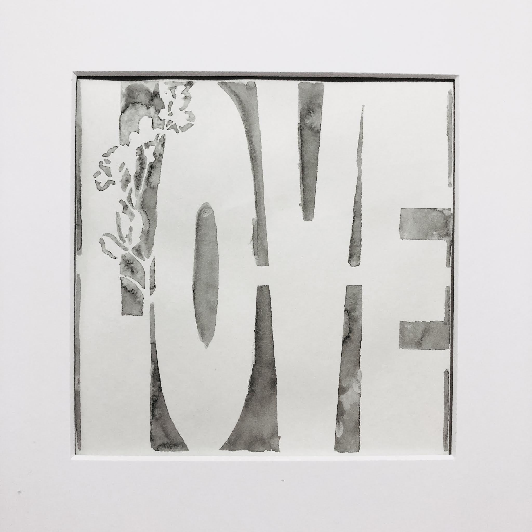
All We Need is Love

Large open areas can be difficult but they can be successful.  This one is not perfect but I love the softness in the black so much.  If I were to redo it, I would do it on hot-pressed watercolor paper. Cecilia Swatton designed this LOVE word stencil. The Rooted in Nature Lg Monarch stencil worked a little better because there is more to the composition to distract any imperfections. 

Fly Away Home

Here's a timelapse video I put together to help you visualize the process:

You may have noticed that the stencil designs stand out in a different way than they do in color. They look very cohesive and soothing to me. But for me, it's also a practice that helps me experiment in brush strokes, composition, tonality, and to just challenge myself more. I can see my own errors better when painting or even in stencil placement, as well as working on transitions between light and dark that will help when I return to color. I also am able to use mark-making more effectively as a tool. Often I resort to color, but here the single color simplifies everything and highlights the marks and their impact on the piece. If you have never taken an intermezzo, try it and let me know how it goes for you. I'd love to hear.  

As always, it's a delight to be on the blog--now as a team member. I'm in great company this year and we all bring a different point of view to the table. I'll be back in August with another adventure. To see more of my pursuits, follow me on Instagram and Facebook at Nancy Curry Art. For my class schedule, blog, and full galleries, hop over to Nancy Curry Art. I often do reels/IG TV to showcase what I'm up to.  I'd love to have your feedback there, too!