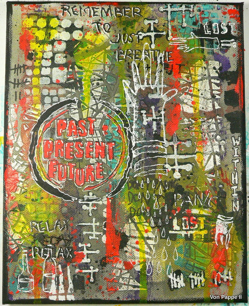
Today's project is - as vibrant, funky and street art style fun it may look - based on a rather earnest theme - my Hashimoto illness and the rough times it is giving me at the moment. I usually do not make a fuss about it and try to keep stuff like this away from design team work and blog readers and I am not going to burden you with many details about my struggles here, but this project just took on a life on its own during the creative process and turned out in a way that I feel I need to explain...and I cannot do that without mentioning my actual health issues.
But let me show you the finished canvas first. Or let's say the finished finished canvas...as it took on a life on its own after I thought I had almost finished it. ;)
So this is my abstract piece of art, done with loads of StencilGirl® stencils at its "second finished state" (which is the state I like much better because I think is the much more authentic one and the result I can identify with).
And this is how the canvas looked when I thought I was almost done and only needed to add some details here and there and bring in some more stencils from my StencilGirl® stencils stash...
A nice, little piece of abstract art, right? And what a difference!!!!
I could have called the canvas done at that point, but something inside me didn't like it at all. Not because of the colors that I had picked, not because of the composition (I honestly liked that!)...I just couldn't relate at all to what I had created.
Oh, well...I could have said to myself "job done" and just look at the canvas as another piece of design team work to tick off my list and just add a bit of texture here and there for more interest...some splatters....or a quote...but obviously my mind does not work that way (and my subconscious did not allow me to deal with it that way either).
If I cannot relate to what I create, I cannot share it with an audience. For me - what makes a piece of art, art, is the fact that the artist has shared a piece of her or his soul in it and allows the audience to catch a glimpse of what goes on in her or his mind by looking at the artwork. And this canvas was just so....so not personal at all. It was as if my hands had created something my soul could not relate to. And therefore I could not add any "finishing touches" - I just had no idea on how to finish this off, because what I saw in this canvas was so not me and so "not true".
I felt I was holding the wolf by the ears...my health issues have been giving me such a hard time at the moment that "gorgeous", "jolly" and "bright" are obviously not doable for me - simply because I do not feel jolly or bright. I think I was trying to pretend (mainly to myself) that everything was fine by creating a bright piece of art. I guess I hoped that would make me feel bright too....which it didn't. On the contrary - I was frustrated by the outcome, angry and desperate.
And then I realized that that was exactly what I was missing in my project - a sign of all the anxiety, struggle, angriness and despair I have been going through these weeks. At that moment I decided to let my feelings take the lead. If I messed up...well...then this canvas would go into the bin. So what!
What happened from that moment on was a complete copy of my actual state: I struggled!
I struggled with pastes or paints not working properly when I applied these through the stencils, I struggled with effects that didn't turn out as planned, I struggled with organizing my work desk, I struggled with techniques I usually do with ease...and it was as if it was meant to be that way.
At some point I kind of "gave up" and accepted failure - and from there suddenly everything I did and added and tried just felt right - and worked (I guess because I had stopped fighting and started feeling).
I got lost in a process of adding layers on top of other layers, redoing areas I didn't like, toning down, adding highlights, doodling and painting over, adding scribbled text (written with my non-dominant hand), filling in shapes, drawing outlines...and I found myself in the process as well as in the result. The painting is a sign of a struggle - and that is what I wanted it to be. (and it is also a sign of my love for street art and especially the art of Jean Michel Basquiat I found ;)
StencilGirl® Stencils used:
- Mash Up! - January 2019 Stencil Club Kit - by Mary Beth Shaw and Seth Apter
- Playtime - August 2018 Stencil Club Kit - by Carolyn Dube
- Wolf - by Roxanne Coble
I have taken steps images though ('cos I almost always do), so I can take you through the layers step by step.
I started with scraping some Warm Grey DecoArt premium acrylic paint onto a canvas using a plastic card.
Next, I applied some white DecoArt media Modelling Paste through the beautiful "Maps" stencil from Mary C. Nasser. I made sure I did not move the stencil but used only some areas on it to apply the modeling paste through.
Once that had dried I sprayed on some yellow acrylic spray paint that I had mixed myself from DecoArt Cadmium Yellow Hue premium paint and water.
I also scraped on some Dioxazine Purple here and there using a palette knife.
After that had dried I put the Maps stencil back in the same position I had used it the first time.
Using a cosmetic sponge and Cobalt Teal Hue premium acrylic paint, I only added paint to some of the raised modeling paste areas (but not all of them).
That was followed by adding diluted Quinacridone Gold Hue premium paint through the largest stencil of the Stencil Club "Mash Up" set by Mary Beth Shaw and Seth Apter.
The medium sized stencil from that set was used too and I also added DecoArt Americana Lamp Black through the cool "Picket Fences" stencil by Daniella Woolf.
Once again the "finished canvas" at its first stage...
I decided to use the Maps stencil from Mary again - this time with DecoArt premium Titanium White acrylic paint. (I didn't really like the result ;)
Then I went for additional patterns and marks using Lamp Black Americana paint and the large stencil from the "Play" Stencil Club set by Carolyn Dube. As the paint was a bit too liquid I didn't get crisp shapes. Hmmmm....
After that I heat dried the canvas and then painted all over it with diluted Lamp Black acrylic paint to tone everything down - which means I wiped back the still wet paint with a baby wipe to only get a light grey background. The previously applied acrylic paints worked as a resist - so these areas stayed bright.
That was followed by more mark making....this time with the smallest stencil from the "Mash Up" Stencil Club set. I had already used it before with the Lamp Black and didn't like the outcome, so I went over the same spot with the same stencil using DecoArt media white Gesso this time. The "outlined" effect looked really cool. Yay! I added more words and patterns in white Gesso here and there and also redid the larger black marks I had done earlier.
At that point, I decided I needed a focal element that would look a bit like graffiti on a wall with loads of graffiti layers underneath. I needed that element to be a really bright color so I first did a layer with DecoArt media white Gesso and a cosmetic sponge. I used Seth Apters "Past Present Future" stencil (one of my favs).
Once the white Gesso had dried, I went over the same area with DecoArt media "Pyrole Orange" fluid acrylic.
The Pyrole Orange leftovers on the palette were diluted and sprinkled onto the canvas using a brush and tapping it gently.
I did the same with the leftovers of Lamp Black on my palette, but this time covered up the focal element with a torn to size paper scrap. I also used the Lamp Black and my fingertip to add a black border around the canvas edge.
At that stage, my "graffiti" started to feel "right" for me. But it still lacked some interest and "struggle".
Using a white gel pen and a black permanent PITT artist pen I outlined the focal quote.
To repeat the color of my focal element I scraped on more Pyrole Orange with a palette knife.
Then I added more spritzes of my self made yellow acrylic paint spray and let it create some drip lines.
Using the black brush tip PITT marker and my non-dominant hand I added some scribbling here and there. (That was the moment I realized what my canvas was all about).
On top of that layer, I added some white doodling using my white gel pen and the "Rabid" and "Wolf" stencils by Roxanne Coble. I added the raindrops (or tears? or drops of blood?), some of her cool cut off hands, teeth, and bottles by tracing the shapes through the stencil.
I especially loved the large cut off hand so I placed it close to the center as my second focal element.
Almost there!
I also felt I still needed to fill every space on the canvas with some white or black doodling or scribbling, so I went in with Seth Apter's and Mary Beth Shaw's medium size stencil from their Mash-Up set again and added some screw heads.
Using the black brush tip PITT marker again, I filled in some of the shapes I had drawn with the white gel pen. Earlier on I had also shaded some of the words I had written in black with the white gel pen. I found that made a huge difference...
So here it is - my personal "struggle" piece of art.
Letting go felt right. Showing my fear and anger and letting these become part of my artwork felt right. I love the energy that evolved from the process of struggling, letting go and diving into my own feelings. I love that this energy also has become visible on my canvas. Energy is good - because it is the opposite of giving up.
I hope you can feel some of this energy in my painting, too.
May you never loose yours!
Take care!
Claudia
xxx