Showing posts with label collage elements. Show all posts

Friday, December 26, 2025

Using a Stencil for Art Fundamentals

Hi Everyone!  I hope you had a wonderful holiday! Mary Beth here with a special blog post for you. 


Are you seeking a set of rules for your work? I know I was, especially when I first started out. Being self-taught, I sooooo wanted to organize the mixed media process into a reasonable list of dos and don’ts. I tend to be a researcher by nature and I bought and studied book after book on art fundamentals. I figured this knowledge would guarantee I produce successful work. You are probably laughing out loud by now as you, like me, realize art is such a subjective topic that it isn’t easy to define what even makes a piece successful, let alone trying to produce one on demand. 


Perhaps it is the color and texture. Or lack of color. Or off the charts texture. The disappearing lines, broken lines, bold lines or tiny scribbles, what kind of line is best!? The unity among shapes or total discord between shapes. Aaack, I was overwhelmed. 


See what I mean? Students of Art Fundamentals are often guided by the Elements and Principles of Art but sadly, they are not consistent within the arts or crafts industries. Typically, the Elements refer to the things each of us use to make our art; call these building blocks if you want. The Principles describe what we do with these things. But why can’t everyone just agree as to what they are – my research turned up so many options!!! Can you hear me smacking my head against my desk?


Here is my version, you will see other references online and in books 


Elements

1. Line

2. Shape

3. Color

4. Texture

5. Space 

6. Value


Principles

1. Balance

2. Contrast

3. Rhythm/Repetition/Movement

4. Emphasis/Focus/Contrast

5. Unity/Harmony/Variety


A stencil, by its nature, is a tool that can give us the Elements of line and shape; I contend a stencil may also help us utilize techniques within the Principles as well. Specifically, Rhythm/Repetition/Movement. 


In order to flush out my supposition, I decided to select just one single stencil to create a variety of parts using multiple techniques involving stencils. Next, I would make a piece of art. Actually I made two small paintings; I used the parts I had made and then also used the stencils with paint. 


Supplies 

White paper, text weight

Black paper, text weight

Vintage paper, old book pages

White crayon, pencil or China Marker

91% alcohol

Inexpensive brush to use with alcohol ink

Duralar or Yupo

Sponge for stenciling, brushes for painting

Limited paint palette, I used Golden Permanent Maroon, Daniel Smith Gold Gesso, Golden Black Gesso, Paper Artsy Heavy Cream

Alcohol ink within the color scheme – Tim Holtz Crimson, Pitch Black and Alloy Gilded

Scissors

Brayer

Bristol, Cardstock or Matboard for the actual art Substrate

Matte Medium or Glue Stick

1 stencil with interesting shapes and lines (S869, StencilGirl®Products)


Before I started the project, I tested out my colors to make sure they would provide an interesting punch and work well together. Taking a minute to do that will make an enormous difference in your result.


1. Be aware that Alcohol Ink stains your hands, so you might want to wear rubber gloves. 


2. Use the selected acrylic colors and a sponge to pounce over the stencil on top of your papers. You may tape off part of the stencil to hone in on part of the design. This will also allow you to repeat the same limited area over and over. Try all your colors on different backgrounds. Make sure you have more collage materials than you will need. You can always save them for later.


3. Place the stencil underneath the black paper and make a rubbing with either a white crayon or pencil. 


4. Cut a piece of Duralar or Yupo to the size of your stencil. Flood the surface with alcohol making sure more than half is covered. Place the stencil on top of the alcohol covered surface. Dribble alcohol ink on top. You may add Gold if you like. Blow with a straw, tilt the Duralar, do whatever you like to move the ink around. You may also like to dribble more alcohol or use a brush to add drops of alcohol which will create ‘blooms’. Allow the ink to mix on its own and wait until it is dry before removing the stencil.


5. Clean the alcohol ink-stained stencil by placing it on top of white paper. Swipe over it with a cleaning tool or a cloth covered with alcohol. Continue until you are satisfied with the result. I ended up with two sheets of paper this way. 


6. Prepare the substrate as desired. This might involve painting sections of background color, gluing neutral collage or whatever you might normally do to start a painting. I did a little bit of painting and collage. 


7. Cut up your parts and start moving them around the substrate like puzzle pieces. Try layering them in different ways. When you are satisfied glue them down.


8. Stencil directly onto the background continuing to use the one stencil. I went back and forth from gluing to painting. It was fun to glue down a collage element and then try to stencil a continued line to achieve continuity in the painting. 


Confession Time. 

I had never tried this prior to writing the article. I wasn’t quite sure what would happen, but I suppose that pretty much defines the art process, right? Truly, I was exhilarated with the result and want to try it again with other stencils. This particular stencil, designed by Jennifer Evans for StencilGirl® Products offered up a beautiful blend of organic effects. I chose it because it had different areas – the squarish shapes, the flower, the linear parts – and I thought it had great opportunity. If you decide to try this on your own, I would suggest you also consider a stencil with diverse sections. I know this won’t be the last time I do this project!!


Tuesday, August 29, 2023

Cyanotype with Stencils + Vintage Papers


Hello StencilGirl® fans! Nicole here, and I’m back with a fun way to create unique papers for your mixed media collages and art journaling. 


I have long admired cyanotypes. There’s just something about those mysterious blue and white images that draw me in. In fact, when a local art gallery had a class last fall to learn how to cyanotype, I was there! In class we used hot press watercolor paper and fresh flowers to play with layers and the sun to create a few different pieces of art. Here is what I made in class:


After taking the class, I knew I just had to try the process with stencils.  And, I failed. Miserably. I don’t know what I did wrong, but nothing worked. All my images washed away in the developing process. 


However, I am determined! So, I am here several months later trying this again.


The basic process of creating a cyanotype is simple:


1. Mix up the solutions as directed (allow to rest 24 hours) 
2. Mix one part of each solution (I use the lid to measure) and put into a cup (only mix what you need as the solution is only stable for a short time)
3. Lightly paint the solution on your papers in a darkish room with limited UV light


4. When dry, protect the papers from light until you are ready to develop them
5. Place the stencil on top the paper and expose it to the sun (3-30 minutes) 


6. Once developed, process the print in water


7. It will take about 24 hours for the print to completely oxidize, or turn the deeper blue

 Note: More detailed instructions are on the cyanotype solution package, and there are a lot of websites and videos to also help in the process and include even more ways to alter prints.

Creating cyanotypes my way.


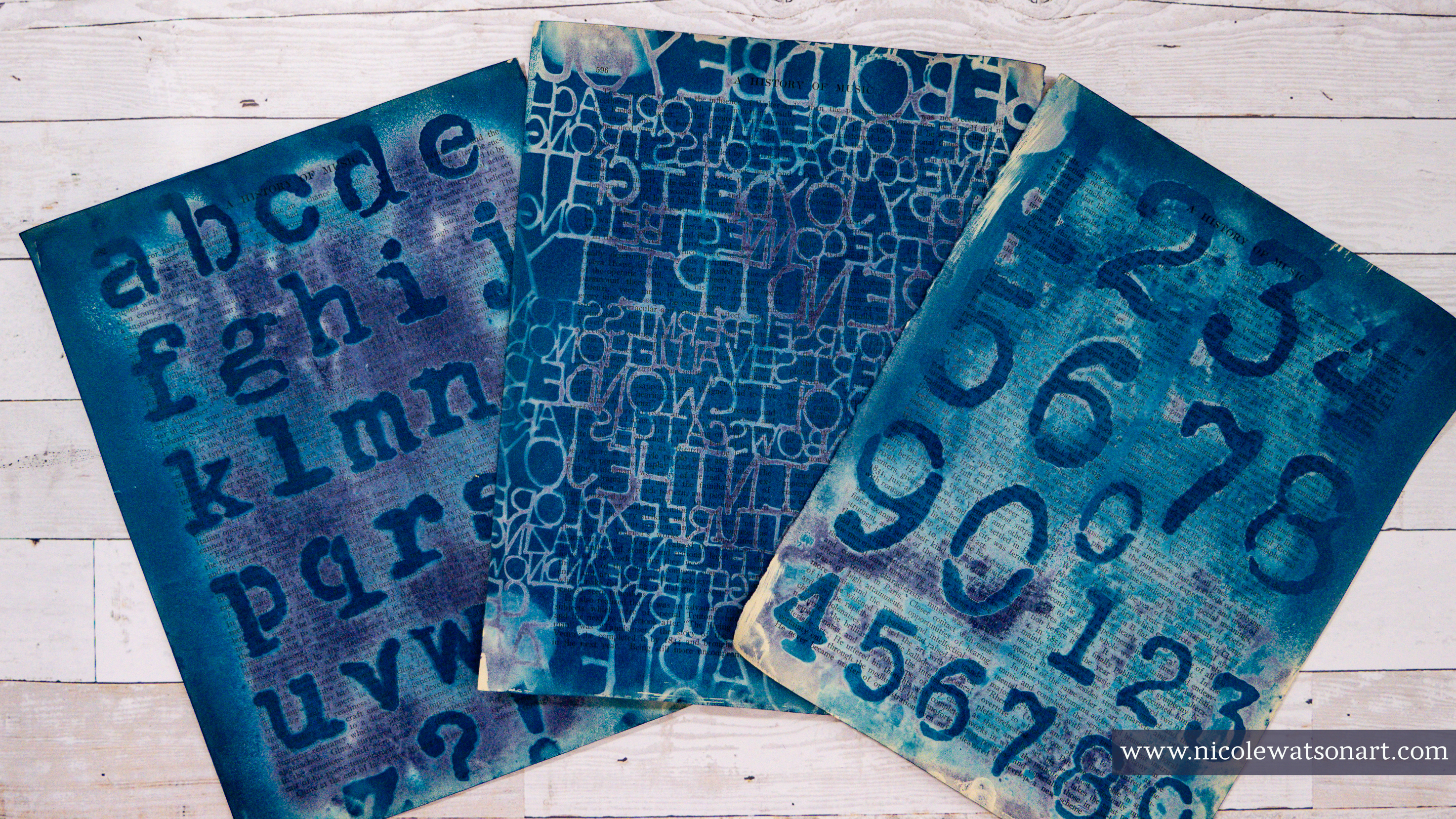
Instead of plain watercolor paper for my substrate, I wanted to use vintage book pages and ledger pages, two of my favorite papers to use in my artwork. In keeping with the cyanotype tradition, I did also use some hot press watercolor paper and a white tag (pictured below) as well to have some of the true blue and white images.


One of the fun parts of cyanotypes is the unpredictability and layering. On the other hand, it’s also one of the most frustrating parts. They take a few minutes to develop, and you don’t always know what you’ll create until the end. During the development process, you can move the flowers (or stencils in my case) about every 30 seconds or so to add interest and different intensities of blue.

Since I failed miserably the first time, I practiced before my official blog. And, yay! It worked, plus I learned a few things to tweak.


I learned that not all paper works the same.


When using vintage papers, you have to be ok with the unpredictability! Not all papers are created the same, and some just don’t work as well. But, I’m making collage material, so in the end there is always something to use no matter how well it works.


Sometimes the vintage paper itself reacts with the solution so that the cyanotype doesn’t darken as much. Also, since vintage papers are not white, the final outcome colors are varied. It can be frustrating, but occasionally you develop amazing results that you have no idea how it occurred. 


For some reason, several of my papers partially developed soon after I spread the cyanotype mixture on them. I’m not sure if it was a reaction to the vintage papers or that I let too much light get to them. Since I didn’t want to waste the papers, I still printed on them with interesting results. 

On a side note, when using papers with handwriting, choose ones that won’t react with water, such as ledger pages written in pencil only.


I learned, or realized, that my previously used stencils that were full of paint worked the best.


Since new stencils are clear(ish), they don’t block the UV rays 100%. However, with that, the clear stencils were also fun because they let light in causing a lighter shade of blue with the darker images of the stencil. Both are fun! It just depends on what type of images you are wanting to create.


Since I had some new stencils I picked out specifically for cyanotypes, I solved that problem by spray painting them with black paint first. 


As an added bonus, this created some more collage papers!


Most importantly, I learned to just enjoy the process.


I am certainly not an expert at cyanotypes. Over the course of a couple days and sessions printing my papers, no results were alike. Some turned out absolutely amazing and others, well, let’s just say they will make great background layers.


As frustrated as I was in the sunshine and 100+ degree temps here in Austin, I am truly excited to play again! I have so many more amazing StencilGirl® stencils I want to explore.


If you are like me and always admired cyanotypes but thought they would be difficult to create, I hope this tutorial inspires you to have fun and play. I cannot wait to add these papers to my mixed media art and collage.


I posted my favorite result throughout the blog above, and here are some more of my favorites playing with stencils and cyanotypes:


And, you can watch some of the process in the video below, with additional commentary and a flip through of all the papers I made. 


 Happy Cyanotyping!


-Nicole


Connect with me on


Stencils Used (some are only shown in YouTube flip through)


Supplies

  • Cyanotype Solution by Jacquard
  • Foam brushes
  • Disposable cup
  • Access to water/sink or a large container of water
  • Hot press watercolor paper (90 lb or thinner for easier collage making)
  • Vintage book and ledger pages
  • Liquitex black spray paint (optional)
  • Sunshine! Or a UV light


Tuesday, January 17, 2023

Waking up Creativity with Stenciled Papers


Hello! Nicole here, back having fun with lots of wonderful StencilGirl® stencils! It’s always hard for me to jump into creating after a busy season, especially after the holidays. My house is a mess, my studio is worse, and my head is full of things I should be doing other than making art in my studio. 


The conundrum is that I want to create, but that energy is just zapped. One way I like to combat this is by spending time making collage sheets or background material for future creations. My hands get messy, my creative energies start waking up, and this leads to so much inspiration.


Since I’m trying to find my creativity, I stick with colors I know work for me, ones I use often in my work that aren’t going to squish my joy. There’s nothing worse than struggling with being creative, just to feel defeated in the end.


To get started, I grabbed a bunch of book and ledger pages. I like to choose ones that are a bit thicker and won’t rip as easily as I layer paint on them. 


Next, I gessoed them very lightly with super watered-down gesso. I don’t want to cover up the text on the pages, but need the gesso to protect them. Besides looking cool and adding interest, the gesso adds some integrity to these older pages and seals them a bit so they aren’t as porous. This way all the paint, water, and ink I add will move freely on the pages.


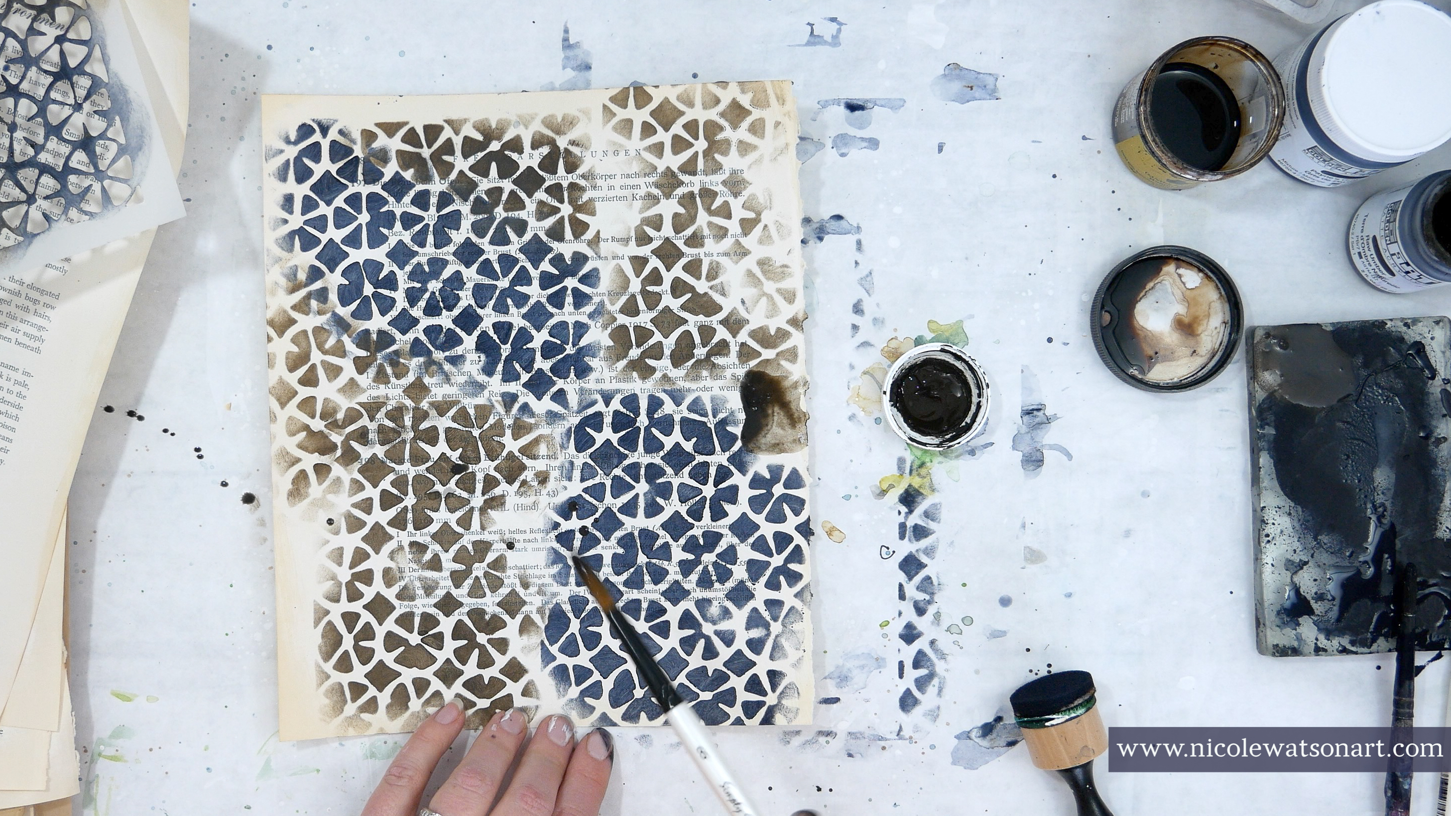
Once the gesso was completely dry, I grabbed my stencils, paint and applicator to start playing. I like using a small gel plate as my palette. It keeps the paint wet longer and is a great surface for the applicator.


You can catch how I played on each page in the video below (or click here!):


And, here are a few short and simple instructions. For each one the general rule is to use an applicator with paint through the stencil, add water + watered down paint, scruff up the stenciled image to distress it, sometimes add walnut ink, and use a hair dryer on the cool setting to move the paint around + help dry. Most important, however, is to have fun and be creative.


Page One: Payne’s gray through stencil, sprayed with water, added watered-down Payne’s gray, topped off with walnut ink spatters and watered-down walnut ink. Scruff up stenciled images a bit with a brush to remove paint/distress them. Use a hair dryer to move all the watery paint around, tip the page as well as it’s drying. 


Page Two: Payne’s gray & raw umber through stencil (separately!), watery Payne’s and raw umber spread around then use a hair dryer to move all the watery paint around, tip the page while drying,


Batik Stencil


Page One: Same process as Blades Page One above. Also, when I sprayed the stenciled image with water, it left watermarks as I scruff up the image right away. For this one, I grabbed the pipette for some large walnut ink spatters.


Page Two: Similar to Blades Page Two above, however the larger stencil allows for blending of the Payne’s Gray and raw umber, which is a cool effect. Use the Payne’s Gray on about half the stencil and then use raw umber. Repeat with more Payne’s if needed.


Circle Tile 6 Stencil


Page One: Burnt umber through the stencil with watered-down Payne’s gray and burnt umber.


Page Two: The opposite of page one. On this one you can really see the effect of the water sprays.


Grunge Marks Collection – Symbol Grid Stencil


Page One: Payne’s gray through the stencil onto the ledger sheet. I chose this stencil so you could see more of the ledger writing and not cover it up. Lots of watery Payne’s gray and walnut ink. The Payne’s gray and walnut ink (or raw umber/burnt umber coming up) combine to form a really nice charcoal/black color.


Page Two: Instead of lining up the stencil perfect, I randomly placed it all over the page and stenciled lighter and darker with Payne’s gray.


Broken Line Columns Stencil


Page One: Black through the stencil, but not stenciled perfectly, leaving some darker or lighter and some missing. Watery black paint and scruffing up. If you get too much paint, use another sheet to lift it up (and then use that sheet for page two!)


 Page Two: Same process as above but Payne’s Gray through the stencil and walnut ink.


Bittersweet Mini Stencil


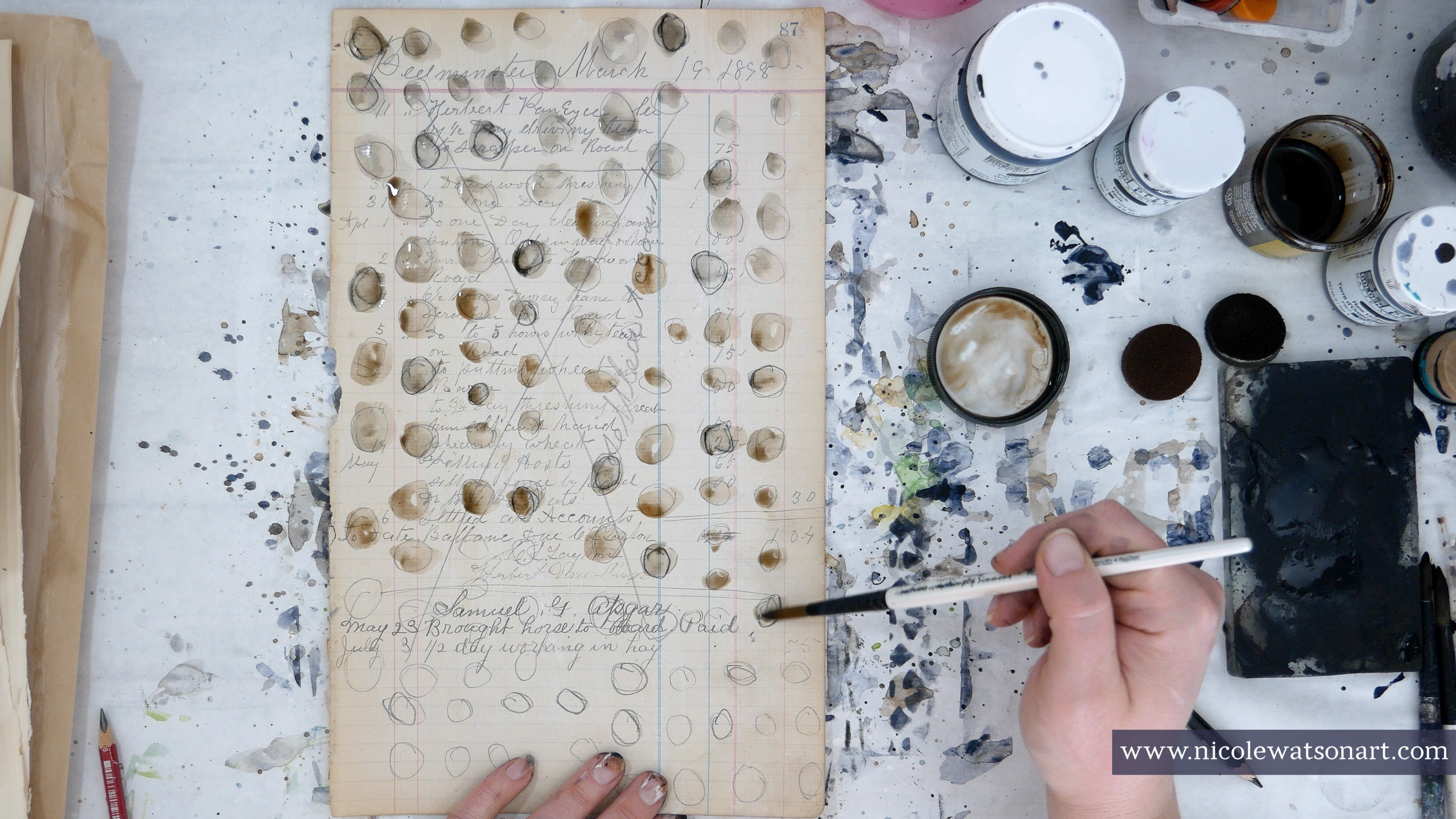
Page One: Very loosely trace the circles all over the page with a stabilo all (graphite), and then trace some with the black stabilo all. Activate the circles with walnut ink and dirty paint water.


Page Two: Payne’s gray through the stencil and then loosely circle around the dots with the stabilo all graphite and a few with black. Activate with dirty paint water.


Ginko 6 Stencil


Page one and page two are the exact processes as our first pages using the blades stencil, but I used burnt umber instead.


I tried to have a variety of papers including shapes, sizes, types of images, lighter and darker, etc, so that if needed, I could use these all for the same project. I think they will make some fun pages for a junk journal or to use in upcoming challenges (such as ICAD). 


See? I'm already thinking of what to create next and how to use these papers! Choosing some of my favorite colors and mediums and watching them mingle together while exploring new stencils reminded me of the magic of art.


Are you struggling to find your creativity, too? Grab a few colors, a bunch of stencils, and have fun playing!


-Nicole


Connect with me on


Stencils:


Supplies:

  • Gesso (white)
  • Golden So Flat Acrylic Paint (Payne’s gray, burnt sienna, raw umber, black )
  • Stabilo All (black and graphite)
  • Walnut Ink & Pipette
  • Foam applicators
  • Old book & ledger pages
  • Small gel plate