Showing posts with label lettering. Show all posts

Wednesday, November 12, 2025

Using Stencils to Highlight Your Lettering Style & SALE!

Hello Beautiful!

Trena Brannon here, and I'm so happy to spend a little time with you today, sharing a fun and simple project to create a greeting card that will make someone smile.


This technique puts your hand lettering in the spotlight, with the stencils playing a supporting role. We'll also explore how to use different elements to connect the layers of your artwork, making the whole piece feel cohesive and engaging. 

STEPS:

  • Building the base. I started by selecting a stencil (Curve Ball Tile S989) that was airy and open, allowing most of the white card base to show through. This creates a clean, minimal background that provides a nice contrast for the detailed design to come. I gently dabbed on some gouache paint with a sponge, keeping it slightly dry to get those nice, crisp lines.
  

  • TIP: Use a baby wipe to clean your stencil and transfer the paint onto a journal or scrap paper. It's a great way to start your next creative project! I learned this from my stencil sister, Carolyn Dube!
    • Connecting the layers. I used the same stencil on a piece of colored cardstock, using a similar color of paint to create a subtle tone-on-tone effect. This immediately begins to connect your different layers.


    To see it better, here's a shot of the piece of cardstock on a black background:

    • Adding a second connection. Next, I used a different stencil (Diamonds and Kisses Tile) and applied the color I used on my white card base. Repeating a color throughout the piece is another great way to create a feeling of connection.


    • Making the details sing. Now for a bit of contrast! I used a tiny detailed stencil (Couture ATC Patterns) to add little pops of white. Using the same color as the white card base helps tie everything together and adds some interest through a contrast in scale.  For more flexibility in using the ATC sections, I cut them out of the larger stencils.


    • Lettering with joy. Now for the most stylized part that personalizes the card —your lettering! I did a few quick very rough sketches on scrap paper to find the style I wanted. Then, I used a black brush pen to draw the letters on my orange cardstock, leaving enough space inside each letter to see a piece of the design. It's so important to have fun with this part! As you can see, my letters aren’t perfect—and that's okay! They are drawings of letters - that's what makes them unique. Initially, I forgot my "y." 😁


    • Bringing it all together. Once my letters were cut out, I played with their arrangement until I found a placement I loved. Before I glued them down, I added a few small black dots to the base layer—a final chance to connect color in the letters to the base card. I chose a bouncy, playful look that conveyed a sense of joy.


    • TIPS: 

    After cutting your letters out, use a black marker to darken the edges. This gives them a nice, finished look and tidies up any stray cuts. I do this from the back side of the cardstock to avoid accidentally drawing onto the design side. 

    Take a photo of your final layout before you glue anything down. It's the perfect guide to keep you on track.


    • One more detail: To make the card even more special, I added a design element to the envelope to give the receiver a hint of what's inside. 


    Here are the Supplies I used: 

    Stencils: 

    • substrate/surface: white and color cardstock
    • stencils: Curve Ball Tile S989Diamonds and Kisses TileCouture ATC Patterns
    • color: gouache paint dried in a palette, reactivated with distilled water - the white paint was freshly squeezed
    • tools: sponges, black marker pen, color pencil, scissors, craft knife, cutting mat
    • adhesives: low tack tape, permanent tape runner

    All my stencils are on sale for the next two weeks! Use code: TB20.

    When you create a card or another type of art piece with this technique, I would love to see it! Feel free to tag me on Instagram @trenabrannon and/or Facebook at TrenaBrannon Art & Design.

    Take care and stay positive! 

    Trena

    =========================

    Monday, May 11, 2020

    Typography: How To Gel Print Text With StencilGirl® Alphabet Stencils


    Hi there! It's Marsha Valk, and I have a new column and a new video to share with you today!


    If you've ever read one of my columns here before, you know that I love to visit museums. So when I heard about this month's theme 'Typography' back in March, I promptly decided to pay a visit to a local museum to see a collection of Hendrik Nicolaas Werkman prints on display.

    Little did I know that it would be my last museum visit for the foreseeable future as that same afternoon the Dutch government announced the closing down of all public places as part of its COVID-19 measures.

    Lucky for us living in this digital age, we don't have to miss out on art entirely even if we can't go to a museum.


    Some museums are sharing virtual tours of current exhibitions through their social media accounts and lots of museums offer digitalised archives online.

    A selection of Werkman's work is, for instance, viewable via the online collection of the Stedelijk Museum in Amsterdam.

    While I was looking for even more printmaking inspiration for another project, I came across the work of Corita Kent.


    I wasn't familiar with her work at all. However, one glimpse of her colourful prints was enough for me to want to find out more.

    The Corita Art Center website provides a lot of information as well as a digital archive of her work.

    Though the work of both printmakers was created decades apart and is very different, both Kent and Werkman used typography and bold colours. And, they both used their work to express activism concerning war, politics, religion and injustice.

    This prompted me to think of how I could use my StencilGirl® alphabet stencils on my gel printing plate in a more intentional way, beyond texture or motive.


    I wanted the letters to say something on my monoprints. Not as an act of activism in any way. However, I did want the letters to form words, and I also wanted control over the composition and alignment of the letters.

    See what I came up with in this video:


    Taking inspiration from Corita Kent's pop art prints, I turned to recipes for my words. However, you can use this technique to print any text you like!


    Gel printing words and sentences using StencilGirl® alphabet stencils is a lot of fun, even though it does take a bit more patience and elbow grease than pulling a regular gel print. Enjoy giving it a go yourself!

    Until next time!

    Marsha Valk

     
    Stencils used in prints:
    Vintage Typewriter Numbers Stencil by Carolyn Dube
    Vintage Typewriter Alphabet Stencil by Carolyn Dube
    Art Deco Empire Stencil by Nathalie Kalbach
    Art Nouveau Wallpaper Stencil by Nathalie Kalbach
    Signals Stencil by Nathalie Kalbach
    Manhattan Stencil by Nathalie Kalbach

    Links:
    Search results for Hendrik Nicolaas Werkman in the collection of the Stedelijk Museum
    The Corita Collection on the website of the Corita Art Center

    Friday, June 28, 2019

    Trena Brannon: StencilGirl Alphabet and Word Stencils!


    Hello Beautiful People!

    Trena Brannon here today to share with you some of my favorite ways to use alphabet and word stencils in my artwork! Alphabet stencils are so versatile. They can be used in the background, as a focal point, and/or as a voice in your artwork.

    The majority of my finished art comes out in greeting cards. I love to create interesting backgrounds and then add a focal point - something unique to make the recipient of the card feel special. To help get my creative mojo flowing, I will pull out a bunch of backgrounds - I create background designs in bulk with my gelli plate, paint off papers, fabrics pieces, etc... and then cut them into A2 size (4 1/4" x 5 1/2 ") pieces. I also pull out images I previously colored and design papers. I lay them all out and let the match making begin! I audition images and backgrounds together - looking for what goes with what.
    Below is the outcome of some of the match making. I added words with stencils.

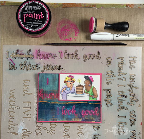
    The next three cards are actually the same card.  I started with painting a sentiment with These Jeans in a bright pink. The lovely ladies image is from Art Impressions. I colored them with Copic markers. The background is made with sponges and acrylic paint.
    I thought the sentiment needed to be lightened up, so I added white dots.
     Then finally decided I wanted the letters white with a hint of pink as a boarder. :)
    In the next several greeting cards, I used Brush Alphabet to add custom words to the greeting cards.

     I drew the yummy shake to match the scrapbook design paper background.
    The shake is watercolored and then cut out.
    This stylish woman is cut out from design paper. The background image is from Stampin' Up!
    The background is the second ghost pull from my gelli plate. The stencil is one my favorites - Tribal Leaves Stencil. The girlfriends in the selfie are from Art Impressions, colored with Copics.
    Now the girlfriends from Art Impressions are off on a bike ride, colored with Copics on scrapbook design paper background.
    One nice benefit of having an alphabet stencil is that you can create words in different languages - well, languages that use the 26 characters in the American English alphabet. :)  The background is from an afternoon gelli printing -"Under Lock and Key" by June Pfaff Daley, the exclusive January 2018 StencilClub collection.  The girlfriends, a.k.a hermanas (sisters), are now at the salon, colored with Copics - as you can see I have a bit of theme going. 
    I created this cute little grad greeting card with a sentiment from Positively Positive. The images are from Stampin' Up and Robert Jackson. The back ground features Ripples Stencil.
    The 'voice' that compliments the abstract scene in my journal came from I Get to Choose.
    This little sweet girl with the big dreams (image from Technique Junkies) was just perfect for My Mind and Opportunity and Progress.
    Click here to see a video showing you how to use alphabet and word stencils in your artwork highlighting various techniques and art supplies.

    TIPS/Suggestions on using Alphabet/word stencils: 
    1. be mindful of your paper and supplies, wet supplies will run under the stencil on watercolor paper.  When you want a painterly look, the results will please you. If you want a crisp look, the results will be different than you expect.
    2. when applying paint, use a dry brush or dry sponge and dab off most of the paint to get crisp lines. If you want a different, more painterly look, use a slightly damp brush or sponge - totally up to you, go for the look you want.
    3. press the stencil firmly to the surface and follow along the letters just as you would if you were writing the words with your handwriting - as with all stencils, be mindful of the tiny bridges that make the connections for the stencil. 
    4. use a thin paint brush or same color marker to connect the letters to each other to make them look seamless
    5. if needed, smooth the letters with a thin paint brush or the same color marker
    6. for words/phrases "in the center of an area," count the letters and start in the middle. I actually write them down so I don't get lost along the way. hehehe
    7. for words ending at a specific place, start at the end of the word
    8. I encourage you to take your time, just like with hand brush lettering
    9. Use a light color paint to apply your words/letters through the stencil and then trace over it with black or white or a contrasting color.
    10. recommendation: test your technique on scrap paper before you apply on your artwork.
    11. Have fun!


    Thanks you for allowing me to share with you today!
    Take care and STAY POSITIVE!
    Trena

    #trenabrannonart

    Saturday, January 26, 2019

    Open your art journal to Stone Pebble Tilings and Water Ripples stencils


    You could hardly go wrong art journaling with these versatile stencils direct from the hand of Valerie Sjodin. Let your imagination ripple outward!


    Stone & Pebble Tilings 9"x12" L706 
    Stone & Pebble Tilings create repeated patterns, layers, paths, stacks of stones in your artwork. If you have stacks of painted papers and wonder what to do with them, watch Valerie’s video and see how she makes a scrap painted paper into a beautiful collage paper. The largest of the tilings overlays perfectly with the 6"x6” Stones Tiling Stencil S677.


    Here is a delightful idea if making doodles and lettering pushes your happy buttons.
    Stencil your background with spray paints:


    Doodle away and include words that are meaningful to you.:


    Close-up:


    Water Ripples 9"x12" L705

    The Water Ripples Stencil helps you create dreamy water movement in your artwork and journaling. Use it alone:


     or layer over stones & pebbles and more…


    If you wish to add these stencils to your collection of art tools, click here.

    Catch Velie in action on her Visual Blessings blog.

    Friday, January 17, 2014

    Doodlicious Distractions with Lizzie Mayne's Half Moon Slant Stencil

     Hi, Linda here and I'm excited to be back today to share with you how I used Lizzie Mayne's awesome Half Moon Slant stencil to create a framework for some lettering and doodling fun.


    I've been craving some good doodling distraction lately, and when I saw this stencil I just knew it would be perfect to get me started on hours of play!

    I began by using the lines in the stencil to trace some rows of those 'half moons', creating the slanted spaces in which I planned to write my quote.  Since the spaces in the stencil are very skinny, I moved the stencil to create larger areas in which to write.  I liked the idea of the slant though, so I created large wedge shapes for my text (sorry there aren't better shots of this stage, but the pencil just didn't show up well).


    I traced all of my pencil lines with a permanent black pen and then began filling it some spaces along the border with doodles. I also filled out some of the lettering at this point to add more interest and definition to the words.


    Using Inktense pencils and a water brush, I coloured in the page with the bright watercolour pigment.

    Does anyone else suddenly crave gumdrops as they look at this? 

    I considered stopping at this stage, but as I said at the onset of this post I've been in the mood for some doodling lately, so I just couldn't seem to stop myself...


    This stencil was perfect for tackling the blank page and helping me create a wonderful framework for this great quote!


    Thanks for visiting today!