Showing posts with label map stencils. Show all posts

Friday, January 20, 2023

City Love Pin Board - by Claudia Neubacher


Hi and servus, everyone! My best wishes for a creative and healthy 2023! 

I am no longer a huge fan of new years resolutions I have to admit, but I find myself still passing one or the other...this year I decided to put up a pin board in my studio to help remind me of collected (and hoarded) bits 'n pieces that I have been keeping to put them on later projects. But keeping them in boxes and out of sight mostly means I sooner or later (rather sooner I'm afraid) totally forget about them. And then cool stuff keeps piling and not getting used...not exactly what it actually is meant for, isn't it? 

So here's this year's try on making better use of my hoarded treasures by keeping them in sight on my studio wall: 
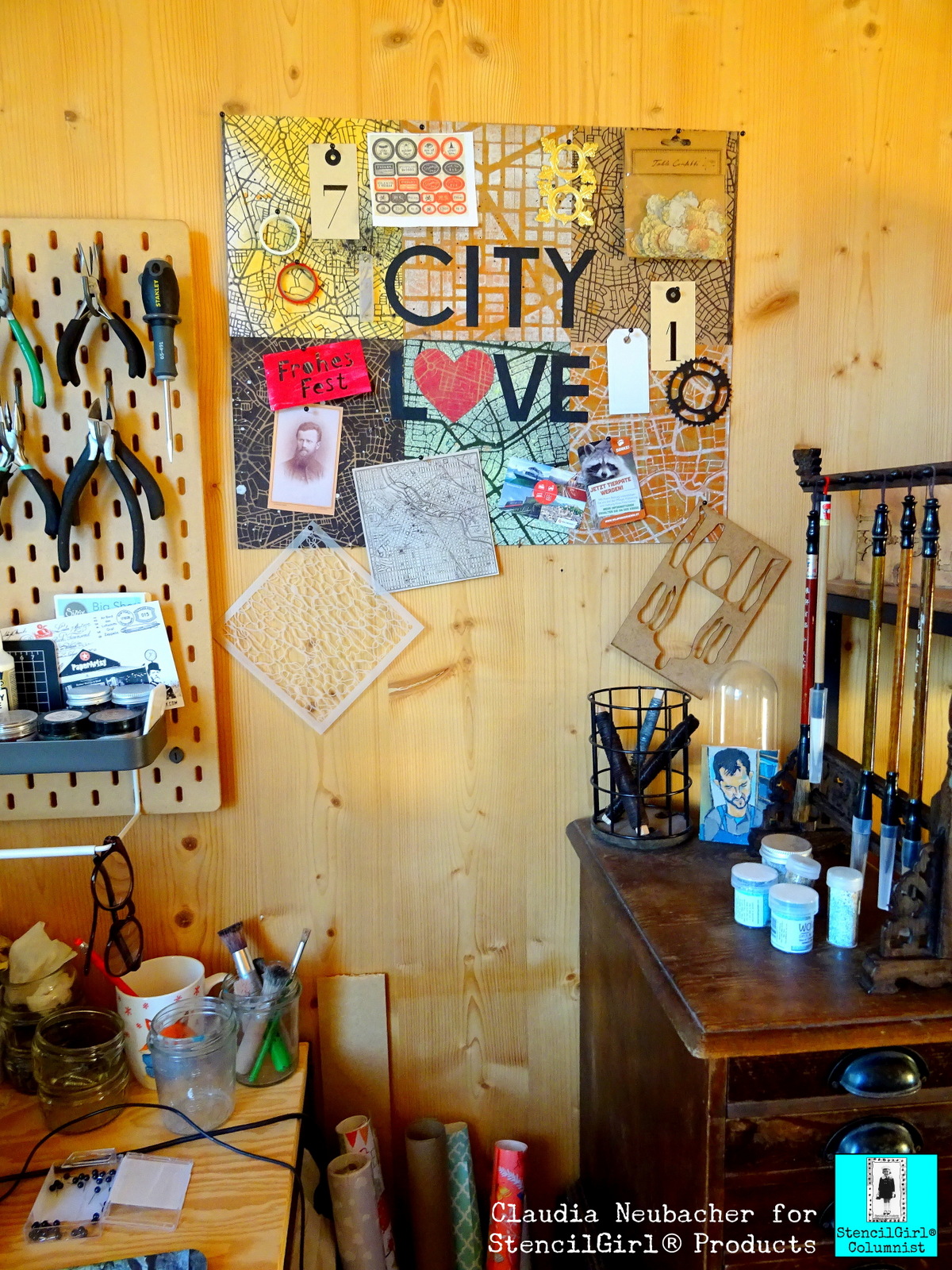


When you take a closer look at it, it reveals some scraps from older projects, one of Mary C. Nasser's awesome stencils I haven't yet used but wanted to play with asap (this one), two rolls of Washi tape that I re-discovered in a box where they definitely didn't belong at all, a printed out sheet with labels for Halloween potions, a left over gold Dresden Scrap, various tags, a copy of a vintage photograph, some tickets from a very inspiring trip to a beautiful wildlife park,...and all these treasures are being displayed on a pin board with a city travel theme - a reminder by itself to restart visiting awesome cities in Europe after all the Cov-19-lock-down-madness and my last year with mostly being ill. 


I love maps in general - so using some of the awesome StencilGirl stencils designed by fabulously creative Mary C. Nasser for this project was the only reasonable option for me, as she actually offers a wide range of gorgeous map stencils to choose from. 

I used these three gems for my self made pin board: 


I love how these three vary in scale and style, yet still they are all three typical map designs, which was important for me, as I knew the visual map characteristic would suffer as soon as I would randomly "throw" stuff on top on my pin board. 

I experimented happily (and a happy mess it was indeed that I created on my desk) with various spray inks and paints I had in my stash, trying them out on different substrates like heavy white aquarell paper, sturdy Kraft paper and black cardboard. 
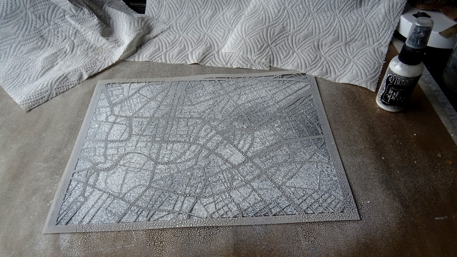

I started with some white Dylusions spray ink on the black cardboard. Then I used the left over wet ink on that same stencil to pull a print using Kraft paper. 


This way I got two results from one spray action and none of the spray ink was wasted. I continued with Distress Spray Stain, Canvas Corp Brands spray paints and Aladin I-Zink dye spray. 


I layered prints...


I misted the white map on the black cardboard with some transparent neon green spray ink in some spots...


I used the nozzles of the sprays to create splatter and drop marks for a slightly weathered look (as weathered maps tell stories of adventurous travels, don't they?)


I sprayed, printed, splattered, layered and misted away until I had a lovely collection of map papers to choose from (and more papers for future projects, which is always a nice and inspiring thing to have). 


Time to mount six of these beauties onto an A2 sized sheet of thick grey board! 


I roughly cut the papers to size (on my cutting mat using a steel ruler and a small carpet knife) and glued them in place. Then I turned over the grey board and cut off any excess paper along the edges. 


For the City Love quote I used thin black paper and a soft pencil. As I had no compasses at hand I used a roll of masking tape to draw the "C"-outline and then just eyeballed the inner circle. The other letters were drawn using a ruler to make sure they were all of the same width and height. 


I played around with the heart shape until it was narrow enough to fit with the style of the other letters but still "round" enough to stand for an "O". The white cut out heart you can see in the picture was my mask that I used on one of the other map papers I had made. 


When laying out the letters I made sure to not use same distances between them as that does create a poor design that has nothing to do with a good visual typographic rhythm. Letters with round shapes or open spaces to their sides like L, V or A, can be interlaced with their neighbours to form a visual union. Letters that are straight like I, N, E,...need more space between them when standing side by side. So I moved the C slightly closer to the I than the T for example. And the L and V very close to the heart shape. This way I also made sure both words had the same width in the end. 

As the maps' designs were a bit distracting, I used my ruler to make sure my words got glued in position exactly. 


Et voilĂ ! 


As my pin board is very light weight I simply fixed it to my wall using four small nails with wide heads. 


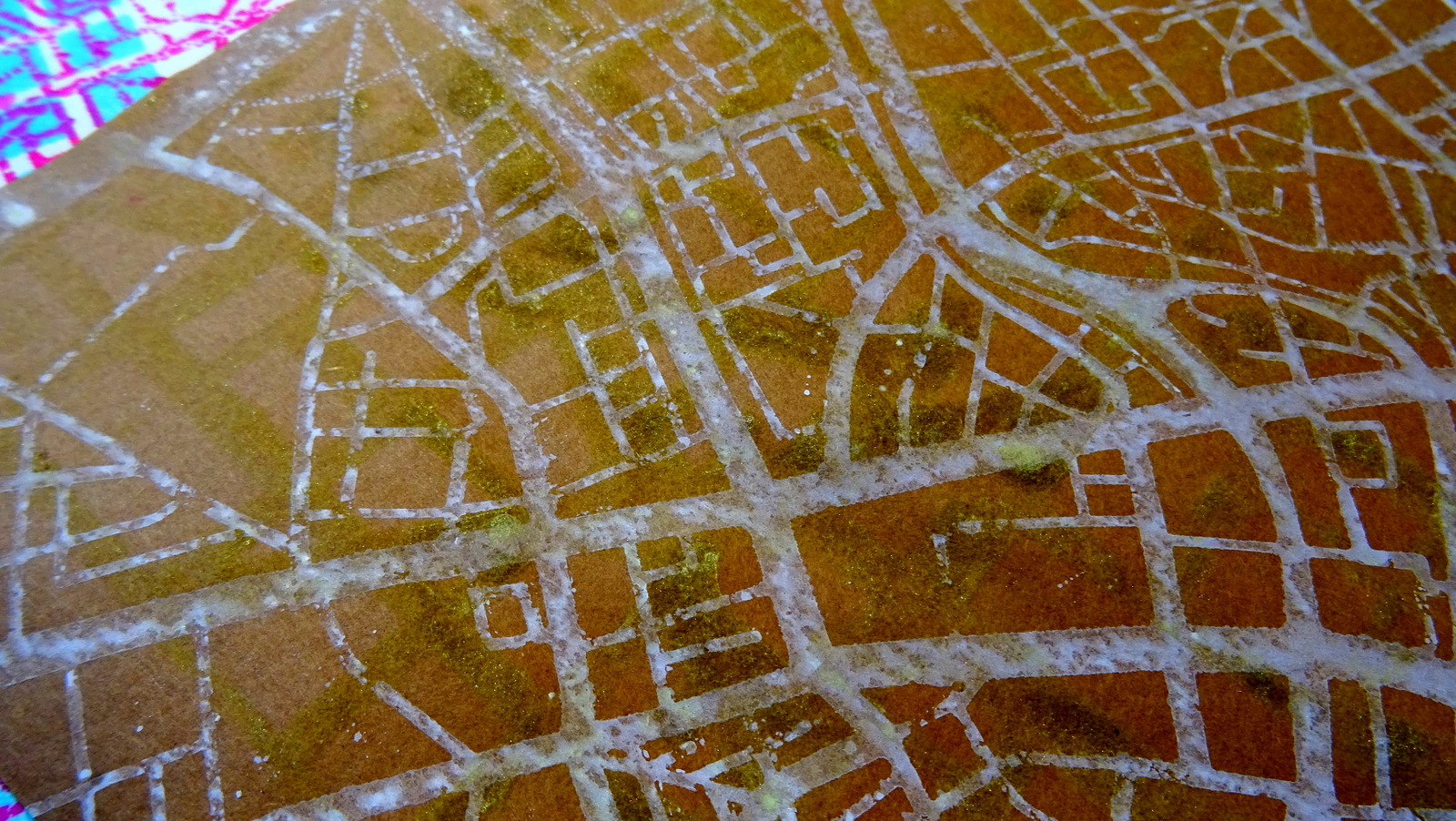
Here are some close ups of the lovely map designs I've created:


And once more the finished pin board in its new spot: 


I hope you like it! When was your last city travel? Where would you like to go next? Ahhh...so many cool places to visit.... 

How about making a pin board to display your latest travel tickets and snap shots on? It's so easy with all the fabulous map stencils you can find in the StencilGirl Shop! Or maybe use them on cotton bags to take with you on your next travels....oh, the many possibilities.... ;)  

Stay healthy and creative! 
Claudia 
xxx


Thursday, May 12, 2022

NEW RELEASE: Abstract Map Patterns & Masks Stencil Series

StencilGirl® Products is excited to release Mary C. Nasser's new 
Abstract Map Patterns & Masks stencil series!
Mary's new Abstract Map Patterns & Masks stencil series was inspired by
her love of maps and travel.​

The Abstract Map Patterns & Masks stencil series includes 4 new designs:
City Map Mask, Map Pattern, Map Mask and Abstract Metro Map Mask.


The abstract designs of these stencils makes them great for adding
lines, shapes, patterns, ​movement and visual rhythm to your art journal pages,
paintings, mixed media art, printmaking, and more.
You can find all of Mary’s stencils inspired by maps and travel here.

Friday, February 5, 2021

StencilGirl® Stencils on Collaged Postcards from Lauren Bergold

Hello, it's Lauren Bergold, a StencilGirl® superfan, and I'm thrilled to be a guest here on StencilGirl Talk. Today I've got a brand new project... with vintage flair. I've collected postcards since I was about ten; but I also love making my own. For this post, I've made a set of travel-inspired 5x7" postcards, using four of Mary Nasser's beautiful designs: Map Stencil, Metro Map, Map with Roundabouts (are you sensing a theme?!) and one of her travel word stencils, Let's Go 2, which has the best typewriter font ever! 


I started by making base collages of torn vintage paper, just slightly over 5x7". I used bits of old train schedules, foreign text paper, aeronautical diagrams and... well, a little bit of everything that felt travel-related, but fairly neutral. I covered the reverse side with an old NYC Subway map. Since my favorite postcards as a kid were those which came in a special little folder, I made one of those, too, out of a piece of wallpaper from a retired sample book.


The first thing I do with any new StencilGirl® Stencils is test them out; ok, actually I just play with them, lol! I try different inks and pastes on various types of paper; I experiment with colors and blending; I consider outlines and doodles using my favorite pens. For this project I chose Distress Oxide Inks, in strong but muted colors. I outlined the map images, but left the words alone. 


I don't always cut out all my vintage images before I start, but in this case I had a pretty strong vision and I knew I wanted a car, a ship, a plane and a train. I chose a few travel-related quotes and typed them on vintage labels. There's no earthly reason for flowers to make an appearance, but as in many of my pieces, somehow they worked their way in.


I used the travel words from Let's Go 2, in a medium grey ink on all four cards, scattering them across each panel and letting them run off the edges. I used the three map stencils selectively, sometimes taping off bits of the design, to get a more interesting shape. For example, I used the deepest curve of Map Stencil, to convey the idea of waves under my vintage ocean liner image.


My vintage car collage has words from Let's Go 2 and an angular section of Map with Roundabouts in a strong but muted yellow.


The airplane collage is built around the 6x6" Metro Map in a soft shade of blue; and once again the words from Let's Go 2 are nestled over and under bits of the background.


The ocean liner is floating on the "wave" from Map Stencil, with a sky adorned by that perfect typewriter font from Let's Go 2.


The railroad image is again paired with the finely geometric details of Map Stencil, in a soft green that echoes the foliage. You cannot exactly *read* the words from Let's Go 2, but they definitely add more of the travel spirit just by being there.


My folio has a small car, a huge floral and the anchor of Metro Map, in amber, on a piece of a vintage latitudinal chart, which I cut out with scissors, to capture the beautiful circle shapes.


The four cards tuck neatly inside their folder and tie with torn strips of sari silk. They will be winging off to a travel-loving friend.


I hope you'll be inspired to make your own map-inspired art using StencilGirl® Stencils; until such time as we can all dream of traveling again in real life!

loves vintage paper, colorful inks, 
and (especially!)