Showing posts with label Kim Collister. Show all posts

Tuesday, February 23, 2021

Circus 19 Dream: A Mixed Media Pastiche Honoring Kim Collister


Hi everyone! Linda Edkins Wyatt here, with a project that I really, really love, inspired by artist Kim Collister. 

 Were you thinking, like I was, "What the heck is a pastiche?" It sounded like a portion of pasta, or maybe a dish with both pasta and pistachios (wouldn't that be yummy?) But, it's a 25 cent word for tribute, or honor. 

In my mind, in my journal, and in my research, I tried about a dozen artists whose work I love and admire. I kept coming back to Kim, who I have been following for years. She's whimsical, colorful, introspective, creative, and fearless. Her recent series of faces using a vintage phrenology head really captivated me, so I decided to do something similar. I was a little worried about being too much of a clone or copy cat, but the end result, I think, combines both our styles without infringing on Kim's originality.

In addition to the detailed tutorial below, I made a video of my process.


I started with a 12" x 12" canvas, my gel plate, deli paper, and of course, acrylic paints. I made a bunch of prints using an assortment of stencils. Of the many prints, I liked the ones with the large design from Seth Apter's Borderlines December 2017 club set the best.

I cut and tore the section I liked best and set them aside. 

Next, using matte medium, I covered the canvas with pages from an old book and some washi tape with numbers and letters.


On top of the book pages, I arranged the printed pieces of the large Borderlines stencil to my liking then adhered them with matte medium. It had a nice typography look, but I knew it needed more.

I searched The Graphics Fairy for vintage images of a phrenology head, found one I liked, and printed it on good 8.5" x 11" paper with my laser printer. (I didn't want the ink to bleed, so I went with a black laser print rather than a color print from my inkjet printer.)


After positioning the head where I wanted it, and drawing in lines for the neck and shoulders, I added white acrylic and some pink paint as well. Then the real fun began. 


I rummaged through my papers looking for collage elements that I liked, and that was similar to what Kim would have used. After much puttering and switching elements in and out, I added a butterfly, a circus horse under a tent, and a botanical tulip. The "earring" is a small image from Gwen Lafluer's Afraid to Try stencil, done with turquoise paint on yellow cardstock.


The tulip needed leaves, so I stenciled some in using the StencilClub March 2013 set.  I thought circles would add to the circus feel, so I used the irregular circles from Carolyn Dube's August 2018 StencilClub Playtime set, randomly stenciling them around the canvas.

 I also added the small stencil from Tina Walker's October 2020 Vintage Wallpaper set, which felt like pinwheels and added some more whimsy to the canvas.

I added the words PEACE and JOY on the face with stamps, printed on thin tissue paper, and glued to the canvas. I also darkened some of the blacks and whitened the white areas. The last touches were adding depth with a black Aquarellable Stabilo pencil, a black sharpie, and some dots with Posca paint pens.


You can still see the original book pages and washi tape that covered the canvas, along with the deli paper numbers and marks from Seth's stencil. I chose the number 19 because that's my birthday, and the number 7 because that's the age kids are fearless artists. The other numbers around the canvas were random.

Here are some detail shots. I love the way the leaf stencils work with the botanical tulip, and the random numbers from the original phrenology image peeking through. The imperfect circles and pinwheels interact nicely.


Wednesday, September 2, 2020

Journal Covers with StencilGirl® Products

CREATIVE VISION

“A dream is your creative vision for your life. You must break out of your current comfort zone and become comfortable with the unfamiliar and the unknown.”
I love the quote above, it really resonates with me when it comes to having a vision for something.  I wouldn’t say that I am completely comfortable working with stencils but I am becoming pretty comfortable with the unfamiliar and the unknown. I didn’t use stencils for a long time because the word “perfection” kept coming to mind and that word is not even in my wheelhouse. 

I have come to love stencils for the tools they are, doorways to new exciting adventures, paths to the unknown and discoveries for the unfamiliar.  I can’t imagine not using them now and the thing I love most about them is not knowing exactly how my vision will turn out and what journey the stencils will take me on.

I created two journals using stencils for both the front and back covers on each of them. On both journals my vision took different turns and I love where the stencils took me on both of the covers.

For the first Journal, “Sweet Bird Sing with Me” I just started with some background color, using acrylic paint. Then I dabbed on some white paint with my brush and some red acrylic paint. I took another brush and made random marks in acrylic teal. Next, I took my pencil and made random marks. Putting something down on paper is a good starting point even if I don’t end up using it. For this journal cover, I used a stencil designed by Artist Judy Wise, called Sister Stencil L051.  This stencil is a 9” x 12” size. I placed the stencil in the center and starting at the top, I mixed some white and black paint to place a little gray where her eyes are on the stencil... Next I used black acrylic paint and dabbed it on with a brush in her facial area, eyes (over the gray) and hair. Leaving the stencil in place, I took a little darker blue acrylic paint and dabbed on the rest of the stencil, except her legs where I used a black Posca Pen. 

Once the stencil was lifted, you could see the first layers of color which gave her a dress and because I am messy, a few of the splotches on her chest began to take shape and one of them looked like a bird to  me, so that’s what I made it. 

This is where you can change the look to your own vision. I saw a bird, but you might see hands holding flowers or something else. I added wording to the blue area that outlines her arms because writing gave it more depth and interest for me. On either side of her, I made random brush marks and later used my pencil and pen to outline a few flowers. 
This is one of my favorite parts, wiping off my stencil, intentional but with no expectations. I used  a piece of regular copy, placed my stencil down with paint still damp on it and took a baby wipe and just wiped off my stencil from side to side, not even carefully removing the paint and this was the result on my paper. Right away I knew this was going to be the back cover.
I set it aside to dry and cut off the sides to fit my back cover.  Next I added a torn piece of collage paper for some color and to get me started. Then I added some teal blue acrylic paint. After adding my colors, I used a stencil designed by Mary Beth Shaw - S575 called “Layers of Scallop”. Before placing it over my colors at the bottom, I gave the bottom of my paper a coat of black paint (over the layers of colors) then I placed the stencil down over it. Using a baby wipe, I wiped off all the black in the exposed area with the stencil still in place and this allowed the bottom layer of colors to show through. Once I lifted the stencil the only black showing was the stencil design. 

I love how it turned out, messy, imperfect, a vision of another time. On the sides, I wrote the words: “Sing your Song today. . . before the sweetness fades away”.  This is a good example of breaking out of your comfort zone and becoming comfortable with the unfamiliar and the unknown. 
For my second journal cover, I chose the 6” X 6” Hearts and Flower Stencil by designer Margaret Applin - S069.
I started by placing random pieces of paper on my cover that I may or may not end up keeping. Next I chose the colors I wanted to use for the background using acrylic paints. Before the paint was dry, I took the end of my brush and made marks through the paint. I ended up covering up most of the paper I glued down except the face which I thought would look fun peeking through the heart.  Next, I placed the heart stencil over my background.

Using a brush I applied a couple layers of paint over the different areas on the stencil, starting with the red acrylic paint first. I did not put it on heavy because I still wanted the markings to show through the paint and the face to peek through. For the face, I used a baby wipe to gently remove some of the paint. After lifting off the stencil, I used a brush and added little details to the flowers. Once this was all dry, I used some alpha stamps and stamped the word “Love” on the blue flower petals.  On the bottom, I added some contrasting colors and then used a black Posca Pen for some random scribbling.

On the back side of this journal, I wanted my colors to be bold so I painted teal on the cover and then added a torn image from my stash. Once it was dry, I used purple acrylic paint and some magenta acrylic over it and then used the end of my brush to leave some scribble markings. 

Next, I added a stencil by Cecilia Swatton called Mikki’s Flowers - Mask S605 to the side of the cover and painted over it with purple and magenta acrylic paint. The mask allowed the teal flowers to remain on the cover. 

Next I painted some Magenta acrylic paint over red acrylic paint and added a flower to the top of her head using white paint and a white Posca Pen to make lines on the flower and writing scribbles at the bottom. The writing says: “She always showed up”.
I hope my post has inspired you to check out all the amazing stencils and tutorials over at StencilGirl®. You can view my post HERE and while you are there grab some stencils, break out of your comfort zone and see where it takes you!

You can see more of my art on my Blog @ www.KimCollister.com and connect with me on FB and Instagram.

Happy Creating!
Kim

Wednesday, June 24, 2020

Mixed Media Art by Kim Collister with StencilGirl® Products

Hello, creatives! Kim Collister here! 

Anytime I get to play with StencilGirl® products, it’s always a fun day in the studio! First off, I’ve been dying to use this frame I picked up at a flea market. What I love the most about it, is that it is all one piece. The center substrate is wood and originally someone had stamped the words “Hello Beautiful” on it.  I brought it home, sanded the paint off in the center of the frame and gave  it a layer of white Gesso with another light sanding and a coat of white acrylic paint.
The first stencil I chose to use was Tina Walker’s Stone Statue, which I just love.  This is the larger one which worked perfect for this frame.  I placed the stencil centered in the frame and used a makeup sponge to dab on some tan acrylic paint (Desert Sand) on the face area and the sides of the face.
Leaving the stencil in place, I took another sponge and dabbed on some background colors using four colors of acrylic paint: Laguna, Bahama Blue, Sweet Mint, Caribbean and Lavender.
I didn’t use a brush with the pounce effect because I wanted a more painterly look which you get more of by using a sponge and little more paint.
After lifting up the stencil, I used my heat gun to dry any areas still wet or damp. The next stencil I chose to use on this piece was one designed by Carolyn Dube called Words to Live By.   I placed the stencil in the center with the top as close to the top edge as possible. I used the Desert Sand acrylic paint to give the appearance of her extended hair dabbing it on a little thicker with a sponge. When I use the thicker paint, I let it sit for a few minutes before lifting the stencil. Once lifted, the words came through with my base colors of blue hues and lavender. 
I loved the words so much that I added some more blue and lavender colors at the bottom left and just randomly added lavender here and there.  Using the heat gun to dry again, I then placed the same stencil down and dabbed on the Desert Sand acrylic paint over the stencil in the lower left corner showing different words on the bottom of the stencil.
Now, I was left with a blank space on the right bottom. I loved working on this piece as I went along seeing what would surface with no expectations. So the next stencil I grabbed was a stencil designed by Andrea Matus deMeng: A Rose by Any Other Name. For this one, I used the Lavender acrylic paint over the base colors already there and after lifting the stencil, I filled in some areas of the rose with blues. 

At this point I wanted to add a little more of the Desert Sand to balance my picture so I used two of the leaf stems in a stencil by Roxanne Coble: Wolf.

Next, I added some doodle drawings and a tad bit of lace on the bottom of her collar using White and Black Posca paint pens and a pencil. 
There was still an uncertainty about her face so I dug through my collage and found an eye which totally brought the piece together for me. Through out creating this piece I was listening to Little Big Town’s album “Nightfall”, so I decided to name this painting “The Daughter’s” and I love that the words just fell into place with the name: Be Bold, Be You, Explore, Strong, Amazing, There and NOW.
“THE DAUGHTERS”
This is my finished piece, frame and all. Since the frame was attached, I painted it blending all the blues and highlighting different areas. Around the picture, I blended all the colors to make the picture stand out more so the frame would not be such a big focal point.
You can see more of my work by visiting my Blog or connecting with me on Instagram.

Until then, I hope you are finding lots of ways to create during this wild, crazy time.
Stay safe, stay well and BE BOLD, BE YOU!

Kim ~*

Thursday, June 4, 2020

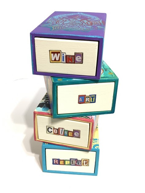
Wooden Matchbox Stackable Stash Boxes with StencilGirl® Stencils

WOW! That’s a lot to say in one breath!

Hello Creatives, Kim here. I am happy to be on the StencilGirl® Blog today to share with you how I decorated these really cool stash boxes. First of all, I was really fortunate enough to come across them, so when the vision reveals itself, you immediately snatch them up. I’m typically a fan of stash boxes, because I mean who doesn’t have a lot of stuff to stash away in cute stack boxes.
The four boxes I used are all wood and the drawers slide open just like a paper matchbox does. Because the drawers slide and come completely out, I created one end of the matchbox drawer with words and the other end with numbers, so they can easily be switched around. 

I didn’t have to think twice when it came to the top of the boxes, I went straight for my drawer of StencilGirl® Products. So if you have a box, cigar box or any other wooden box, you can easily create your own stackable stash boxes. Assorted sizes would work great as well. 

Matchbox Number 1.
Pretty as a Peacock Stencil by designer Andrea Matus deMeng was used on the top.  Before Using the this stencil, I painted the box, then I used a cosmetic sponge and two designs on the stencil Wolf  by designer Roxanne Coble to add some texture and color to the background before using the face stencil.
Next I placed the Pretty as a Peacock face stencil down and used a cosmetic sponge to dab on some black acrylic to all the open areas. After lifting the stencil off and a few swipes back and forth with my heat gun, I added some collage elements to the face. To the sides and back of the box, I added collage elements and papers from my stash. Once all sides were completed. I lined the edges of the box with acrylic paint using my finger to wipe the paint on, not necessarily being neat. On the edges, I prefer a little messy look. 
The drawer on this box reads: “COFFEE”, because that is what I need to start my day, the inside of the drawer says “Coffee by the Pound” and the reversible side of the drawer has the number #1 stamped on it using a vintage label that I painted.

Matchbox Number 2.
For Matchbox number two, I painted my box first a neutral crème color and the top of the box blue with some green paint around the edges. Next I added some stencil elements from Roxanne Coble’s stencil design Wolf.  After sponging on some background features to give a water effect, I used the Chinese Garden - Koi stencil by designer Gwen Lafleur.  Using a sponge in the same way as the first one, I dabbed on some orange acrylic. This time, I got a little too much paint and it was a bit messy underneath so I took a brush and spread the orange acrylic paint on the fish. I did lose some of the white stencil marks, but that was okay as I filled it in with my design and it was still an easy peasy way to add the Koi. Lastly, I added some pen doodling on the fish and the background.

Next, I collaged the sides and the back and lined the box edges again with acrylic paint using my finger. 

The drawer on one side of this box says “ART” because that is what I love to do every day. The inside of the drawer says “Always” and the reversible side of the drawer is stamped #2 on a vintage label that I painted first before gluing.

Matchbox Number 3.
For this Matchbox, I painted the top of the box blue and used Thanks A Lotus by designer Andrea Matus deMeng. I placed the stencil on top of the box holding it down with my hand and dabbed on red, gold, teal and purple, extending the purple out over the top of the box.  I used a thin brush to fill in any areas that I wanted more color. After adding collage papers to the sides and back of the box, I lined the edges with a coordinating paint color.

For the word on this drawer, I used the word, “WINE”, because some days just call for wine, especially during this crazy time we have all been experiencing.  The inside of the drawer has a stamped label that reads: “By the Bottle”.  The reversible end of the drawer has the #3 stamped on a vintage label that I painted with acrylic paint.
Matchbox Number 4.
For Matchbox number four, I used a stencil by designer Gwen Lafleur called Collage Textures and Patterns, Circles. I love all the designs on this stencil and I used the center one to have a focal point to add an elephant collage piece. Elephants always seem to find a place in my art and my heart.

To start with this box, I painted it yellow, and blended the background with a few darker hues. Next I placed the stencil on top and again used a cosmetic sponge to dab on some teal acrylic paint and some gold in the center. Once lifting it off and using my heat gun to dry, I added a little black with a brush and a couple more elements from the same stencil at the top. Lastly for the top I added my Ellie collage paper in the center. 

Once adding collage papers to the sides and the back, I lined the edges with paint using my finger. This also helps to seal the edges of your collage papers and give your box a more cohesive look. 


For Matchbox #4, on the drawer I collaged the words, “REPEAT”, because it is something I feel very blessed in my life that I get to do over and over again. The inside of the drawer has the word “Daily” stamped on a vintage painted label.   The reverse side of the drawer has the #4 stamped on a vintage painted label. 

So there you have 4 Stackable Stash Boxes, all easy to do using StencilGirl® Products and with so many possibilities. Thank you for viewing my post today. I hope this will inspire you to grab some stencils and get creative!


The colorful words on the box drawers are from MischiefCircus, a great place for Collage images and words.
Kim Collister is a Mixed Media Artist, a Design Team Member for Retro Cafe Art Gallery and a regular contributor to Stampington and Company. You can connect with her by visiting her website and blog at: KimCollister.com , KimCollisterArt.Etsy.com and social media found on her website.