Showing posts with label Lesley Riley. Show all posts

Friday, June 11, 2021

Frieda Oxenham: Art Journaling with StencilGirl® Stencils

There is more of Ben Okri’s poem left to illustrate and this month’s pages are a continuation of last month when I made a spread featuring the text: “The wise say life is a dream, and soon the dream is done”. The poem continues: “But what you did in the dream, is all that counts beneath the sun. In other words make your life worth living. This resonates specially during these still very difficult days in a world pandemic.  I aimed to make these dreamlike pages.

Here is the tutorial:

1.      Add gold gesso to two facing pages of 8 x 11.5”. I used my gelli plate to do this but you can also brayer or brush it on.

2.      Using a gelli plate large enough to cover your pages, put stencil Mountain Landscape underneath the plate, and on the top of the plate paint acrylic paint in suitable colours for the landscape. Then put the stencil on top of the painted gelli plate and take the print. Do this for both pages and for the second page use the other side of the stencil to get a mirror image.

3.      Stencil again, this time in the conventional way, with the stencil used in step 2, this time using a cosmetic wedge and the same colours but off setting it slightly. This gives an impressionistic image.

4.       Apply Glass Bead Gel (from Golden) to the right hand page through stencil Aztec Sun Large.

5.      Spray and paint the sun with yellow, orange and gold paint.

6.      Glue on the figure to the left hand page. My images are from a Stamperia rice paper collage sheet. Use gel medium to attach and also add the ship image to the facing page.

7.      Also glue on some flowers from the collage sheet.

8.      Stencil on leaves from the large stencil from April 2021 StencilClub using green paint and a cosmetic wedge.

9.      Add coloured circles (to represent flowers) by stencilling through stencil Starlight 6 x 6 using red, orange and yellow paint and a cosmetic wedge.

10.  Outline the leaves with a green colouring pencil and outline the rice paper images with a Stabilo All black pencil. Outline the mountain shapes with a brown colouring pencil.

11.  Add the text with a Dymo writer on transparent, self adhesive tape and outline with a permanent black marker.

12.  Glue on postage stamps as shown.

13.  Edge the pages with a permanent blue inkpad.

© Frieda Oxenham 2021. To see more of Frieda's work, please visit her BLOG.

Friday, December 18, 2020

Homage to Emily by Lesley Riley

I’ve been transferring photos to fabric since 1999. I’m particularly in love with early photos, like tintypes, ambrotypes and daguerreotypes. I call my fabric collages, Fragments, and consider them to be color studies and story sketches. I guess I’m a storyteller at heart and fabric is my medium.

This past year, I’ve done several projects using one of my favorite photos of the poet Emily Dickinson. Poets are writers and I have a StencilGirl® stencil with writing instruments on it, so off I went to create yet another homage to Emily.

I chose to do my stenciling on TAP Transfer Artist Paper, an iron-on transfer paper that I brought to the market about 10 years ago. “Why transfer a stencil?” you may be asking? Inks can bleed into fabric, giving the stencil a fuzzy edge. By stenciling onto TAP and ironing that onto fabric, I get a nice sharp edge.

Using the pen with nib from my Pen and Ink stencil, I taped paper over the two adjacent brushes so I wouldn’t have any accidents. But I did in spite of my carefulness! I was about 1/2 way through when I got a phone call. When I picked up the stencil to resume, I laid down the wrong, inky side. Yikes! Looking for the positive in the situation, I decided it made the stenciled image look like a block print. I knew I was going to be layering Emily’s photo on top as well, so I finished up my stenciled background and transferred the page to a vintage textile from my stash.

I transferred my photo of Emily to a pale blue polka dot fabric to give it added interest and spiced up the image background with my 6” Night Sky stencil. The stars looked like daisies to me, so I added dimensional gold paint to the centers to complete the look. Based on her poem, The daisy follows soft the sun, I know Emily would approve of the daisy wallpaper.

The daisy follows soft the sun,
And when his golden walk is done,
Sits shyly at his feet.
He, waking, finds the flower near.
"Wherefore, marauder, art thou here?"
"Because, sir, love is sweet!"
We are the flower, Thou the sun!
Forgive us, if as days decline,
We nearer steal to Thee, —
Enamoured of the parting west,
The peace, the flight, the amethyst,
Night's possibility!

A writer needs her ink, so using the ink bottle stencil from Pen and Ink and my Derwent Inktense blocks, I painted the ink bottle onto a piece of the vintage fabric, wetting the Inktense block with a wet brush to a creamy consistency. After it dried, I applied iron-on fusible, cut it out and fused it onto the fabric collage. Everything was machine-stitched in place. I couldn’t resisted hand-stitching a real pen nib onto the collage.

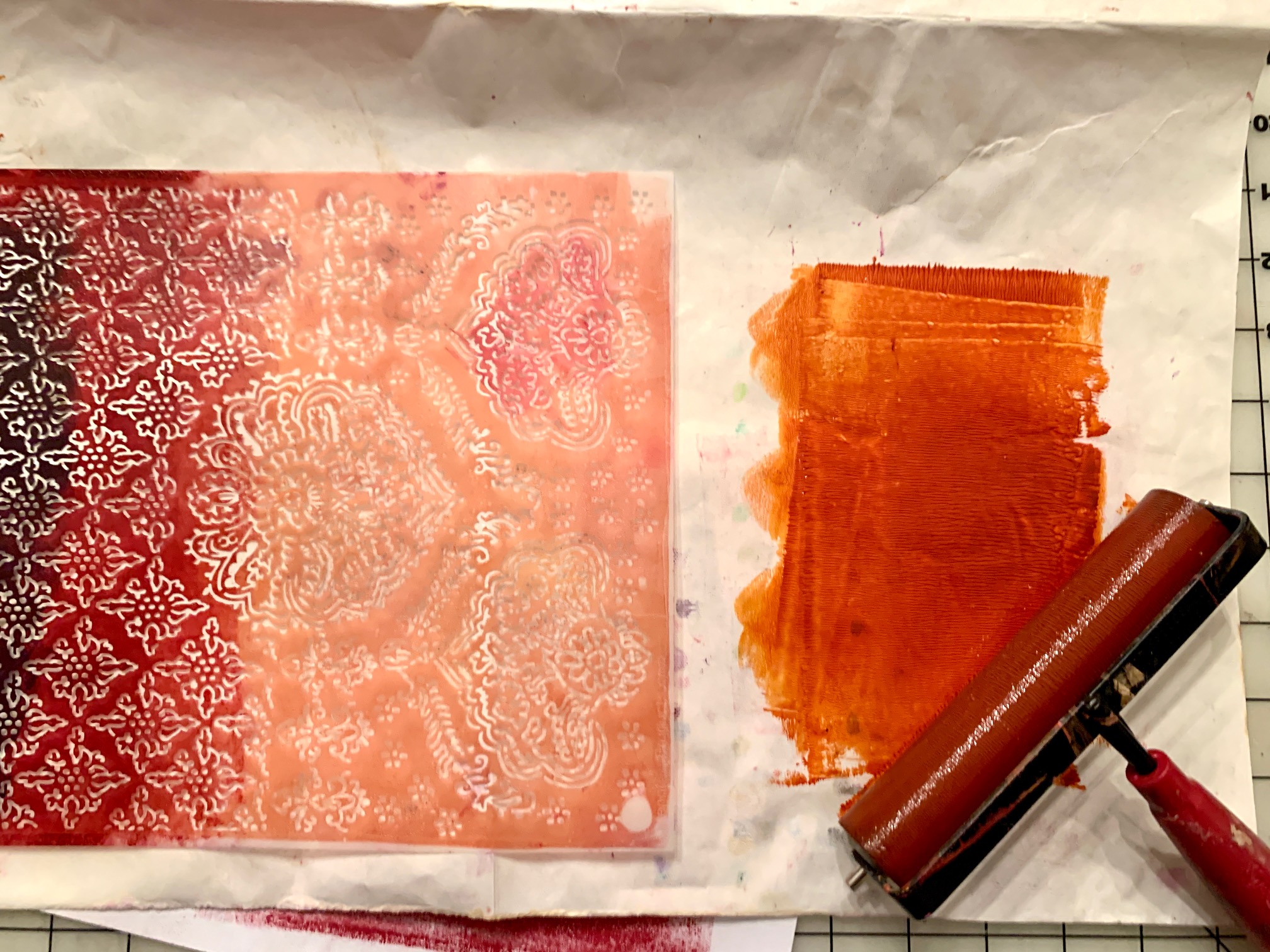
While I was in stencil mode, I decided to create a couple of small one-off of fabrics with Kate Thompson’s Floral Waterfall stencil. I kept it easy-peasy and applied two of my favorite Golden fluid acrylics (Quinacridone Nickel Azo Gold and Alizarin Crimson Hue) directly to the stencil with a brayer and burnished the “inked” stencil onto a sheet of TAP paper. Once it was thoroughly dry, I ironed it onto a pale green print fabric, ending up with a nice sharp pattern on pattern, just perfect for one of my Civil War fabric collage series.

I hope you’ll give my stencil techniques and stenciling on TAP and fabric a try. You can also find TAP and check out more of my favorite tools and more in my Amazon shop. Please let me know if you have any questions. I am always happy to help -  lesley@LesleyRiley.com.  And please be sure to visit Instagram, where I post inspiration daily, and my website for even more inspiration and ideas - LesleyRiley.com


Friday, October 2, 2020

Collage Cairns with Dar James

Hello! I’m Dar James, a painter and GOLDEN Artist Educator, living in eastern PA. Today I’m sharing what I hope you find to be a relaxing, “zen-like” project that celebrates cairns, or rock stacks. Cairns are human-made piles or stacks of rocks that have had navigational, spiritual, religious, cultural and decorative significance since ancient times. One of the things I like best about cairns is that, when I encounter one in the world, I think of another human making it for the enjoyment and delight of a stranger, and this fills me with a sweet kind of hope.

I’m also going to show you to something really cool that you can do with stencils that have a CIRCLE theme and go along so well with the idea of collage cairns…stenciling acrylic skins! Acrylic skins can be created with either Heavy Body or Fluid acrylic paints, as well as a wide array of acrylic mediums and gels. Once dry, they are fabulous to cut into shapes and use in a variety of collage and mixed media work.

Supply List at my Amazon Storefront: https://tinyurl.com/yxv7mhbg

To get started, you will need page protectors, acrylic paints and a palette knife. The page protectors will allow the skins to be peeled off once they are dry. Other kinds of plastic do not work as well.
I like to insert a piece of paper inside my page protector, with the “recipe” I am using written underneath the area it will be spread. You can be very inventive with colors, mediums and various specialty gels and pastes when creating skins. Experiment and see what happens!
For my Heavy Body skin, here, I am using GOLDEN’s Light Violet. For the Fluid skin, I am using GOLDEN’s Cobalt Blue with a bit of Titanium White. Squeeze or spread the paint onto the page protector and use enough of it to get a nice, thick application. If you make the layer too thin, it may tear when taking it off after drying. Depending on the thickness of your paint, temperature and humidity, skins can take 24+ hours to fully dry. Let them dry completely in a place where they will not be disturbed. Make several, using different colors and different thicknesses. Try things like not mixing your paints completely to have subtle swirls or adding paint to mediums to get more translucent effects. The sky is really the limit on these!
Once they are completely dry, carefully peel them off the page protectors and place onto a work surface. Then, use stencils to create pattern, texture and color on your skins!
Here I am using cut outs from Stone and Pebble Tilings with light blue fluid acrylic on a dark blue skin applied with a make-up sponge.
This is orange heavy body acrylic on a green skin with a slanted stencil brush, again with a section from Stone and Pebble Tilings.
This is metallic acrylic spray paint on a black skin with a lovely, delicate design called Puddles.
And, here, is magenta spray paint on an orange skin with a stencil called Organized Chaos.
You can also use mediums with color to create raised, acrylic patterns on your skins. For this mixture, I’ve used Soft Gel Gloss with Heavy Body Micaceous Iron Oxide. (If you have not experimented with MIO, it is some of the coolest paint ever!) Press your stencil onto a dry acrylic skin and then, with a palette knife, spread the mixture carefully and gently over the top. Scrape off any extra (which you can use to create another skin!) so that you do not have big blobs of paint. This design is Organic Zen Circles.
Carefully peel up the stencil to reveal the pattern in relief! Set aside to dry fully.
Once your skins are completely dry, you can use them for collage and mixed media work. Be sure to store your skins so that they don’t touch each other or fold onto themselves. They will stick and be very hard to separate. Parchment or “deli” paper works well between them, or leave them on their page protectors and stack separately.
Use Pinterest to explore different cairn designs and configurations. Get out the skins and papers that inspire you for this project and lay them out around your substrate. Here I am using a 4x8” Cradled Birch panel by DaVinci, but you could use any kind of substrate that strikes your fancy—paper, canvas, even a wood round would be interesting. I have taped off the edges with blue, painter’s tape because I like them clean, but you could leave them open and paint them as well if you prefer. The panel is primed with black gesso because I love the way that black peeks out beneath just about any color, but you can prime with white too.
I’m using a variety of whites and off-whites to create a dry-brush background that is “quiet.” Because the skins and paper I am using are patterned, I want a background that is less busy so that it doesn’t compete with my design. Also added is a tiny bit of GOLDEN’s Iridescent Pearl with Starlight Mini. Whenever you use iridescent or iridescent colors within your layers, they add luminescence and light to your work! Pearl is one of my favorites because it can be used as-is, diluted, or tinted with any color for amazing shine and glimmer.
Last, but not least, I’m adding an ethereal bit of detail with and GOLDEN’s Titan Green Pale. GOLDEN makes a line of “pales” that are absolutely wonderful for subtle color hints on whites and neutrals—or just about any color, really.
You can work from a photo to create a design that resonates with you, or make up your own. Jump in and begin cutting your rock shapes! Think about what color, size and shape arrangements reveal your own personal sense of balance. Avoid adhering anything just yet and know that if something doesn’t look quite right, you can remove it and save it for another project. You can even work on more than one at a time and create a series.
When you have a design you are happy with, use Soft Gel Gloss or Matte to adhere your pieces by brushing some down beneath the shape, placing the shape and then brushing more on top. Finish the piece with dots and detail if you’d like and, when that is dry, add another coat of soft gel—a palette knife can be helpful to make it even and smooth.
I used a gloss gel to adhere, but my final layer was a matte finish. Details were done with fluid acrylics and “nail art” dot tools.
Square substrates offer different ways of designing your cairns.
Cool and warm colors have different vibes!
One of my favorite ways to finish these is with a coat of shiny, resin. (ArtResin)

Wouldn’t these collage cairns be fabulous in a collection or as a soothing gift for someone special? I hope you have fun with this project and share your results on Instagram by tagging me! @indarsworld

This lesson comes from my upcoming Online Course, “Circle Celebration,” a three-module course that is a playful, open-ended exploration of technique and materials that informs our personal preferences and styles. Join my mailing list at www.darsworld.com  to be notified of specially priced, early registration which will be available on November 2, 2020.

Each module is three weeks long and contains nine exercises and three projects, a total of 12 videos, accompanying downloadable pdf files, and eight bonus mini-lessons on specific types of acrylic materials. The three modules will be available separately as well as a bundle. A private Facebook group will be where we will all interact and share our work, brainstorm and inspire each other.

The course will begin on December 7, and came very much from being an artist in quarantine, as well as from a deep searching in my own artist’s heart and soul. New things come from pushing ourselves out of routine, from trying new tools, from slowing down and focusing on very small but poignant moments. I have concerns about the hyped up type of art courses that promise unattainable creative outcomes without addressing the foundational experiences that allow us to understand our own preferences for such simple things like line, color and medium before we even attempt technique. My hope is that, through this course and the small moments within, participants will be able to slow down and notice what they love about art supplies, making marks and their own feelings and preferences about things like color, texture and shape. 
Dar James

Wednesday, October 23, 2019

Interactive painting: Imagination vs Knowledge by Cheetarah Cheda

Hi StencilGirl® enthusiasts, it's Cheetarah here and I'm very thrilled to have a guest post on StencilGirl® Talk today. For a while now I have been experimenting with watercolors and creating patterns with stencils. And I would like to share a project which was a result of an experimentation which is an interactive painting. 


The base is a large piece of watercolor paper by Viking 1914. I used the landscape pad which is 15x42 cm, 310gms in weight & 50% cotton mix paper. The paper was glued on to the pad on all sides so the paper doesn't warp with use of a lot of water. Great quality paper and having it taped down is very important for a successful watercolor painting. The paints I used are from Sennelier, a french professional watercolor brand which I have filled the wells of my Koi travel pocket box with. The brush I am using is a large quill brush and I made sure to have 2 water cups, one for cleaning and one for mixing. I traced the face silhouette from Seth Apter's Borderlines Large stencil (a StencilGirl® StencilClub stencil) on the right hand side and then went to work to create a galaxy color composition over the entire page.


When working with watercolors, timing is key, so I do not have many mid process pictures. I've worked on these layers for about 30-45 minutes, adding color and letting them blend out in a process you have to practice with patience and appropriate speed. I have watched many tutorials on YouTube on how to create galaxy watercolor paintings and this is a very simple & effective tutorial: https://youtu.be/ZFVLLjS912E and I have applied the same technique in my painting.  


After the piece was thoroughly dry I took a medium damp cloth and created texture by removing some color through the dotted pattern in the large stencil. I only did this on the aria's opposite the silhouette. 


I made sure the silhouette was standing out by using contrasting colors and keeping the edge of the line as sharp as possible. Darkened the face up more and used an opaque white ink for the starker contrast. Now to add more patterns in the piece. 


With a black paint pen I have traced the large bubbles which were in the same large stencil as the face, then colored them in with the opaque white acrylic paint. I also splattered some of the white paint over the painting. The added in the quote "Imagination is more important than Knowledge" with the black paint liner. The quote by Einstein is found on the Pen & Ink Large stencil by Lesley Riley


After I was done with the painting I took it off the watercolor block I folded the painting because I planned to make an interactive piece out of it. 

I took a semi transparent acrylic dark blue and a semi opaque lighter blue paint and sponged it through the large numbers of the Borderlines stencils. Then traced the numbers in with a black paint liner. I cut out the silhouette face so it folded over the quote. I traced the quote lines with a white paint liner for some contrast. 
This is what it looks like when you open up the side of the face. With an exacto knife I cut open a portion of the silhouette line, folded in half to glue it in place like this. Added the same numbers border with a mix of the paint and traced it with a white paint liner. With this last detail added I called the interactive painting done. Here are some close up pictures. 

I hope you enjoyed seeing how this interactive painting came together and that you might try making something like this yourself. Have a lovely day. 

_____