Showing posts with label portrait stencils. Show all posts

Wednesday, September 14, 2022

Expressive Portraits with StencilGirl® Stencils

Hi, everyone! Christa Forrest here! Want to explore creating expressive portraits but a bit fearful of drawing a face? Try using stencils!

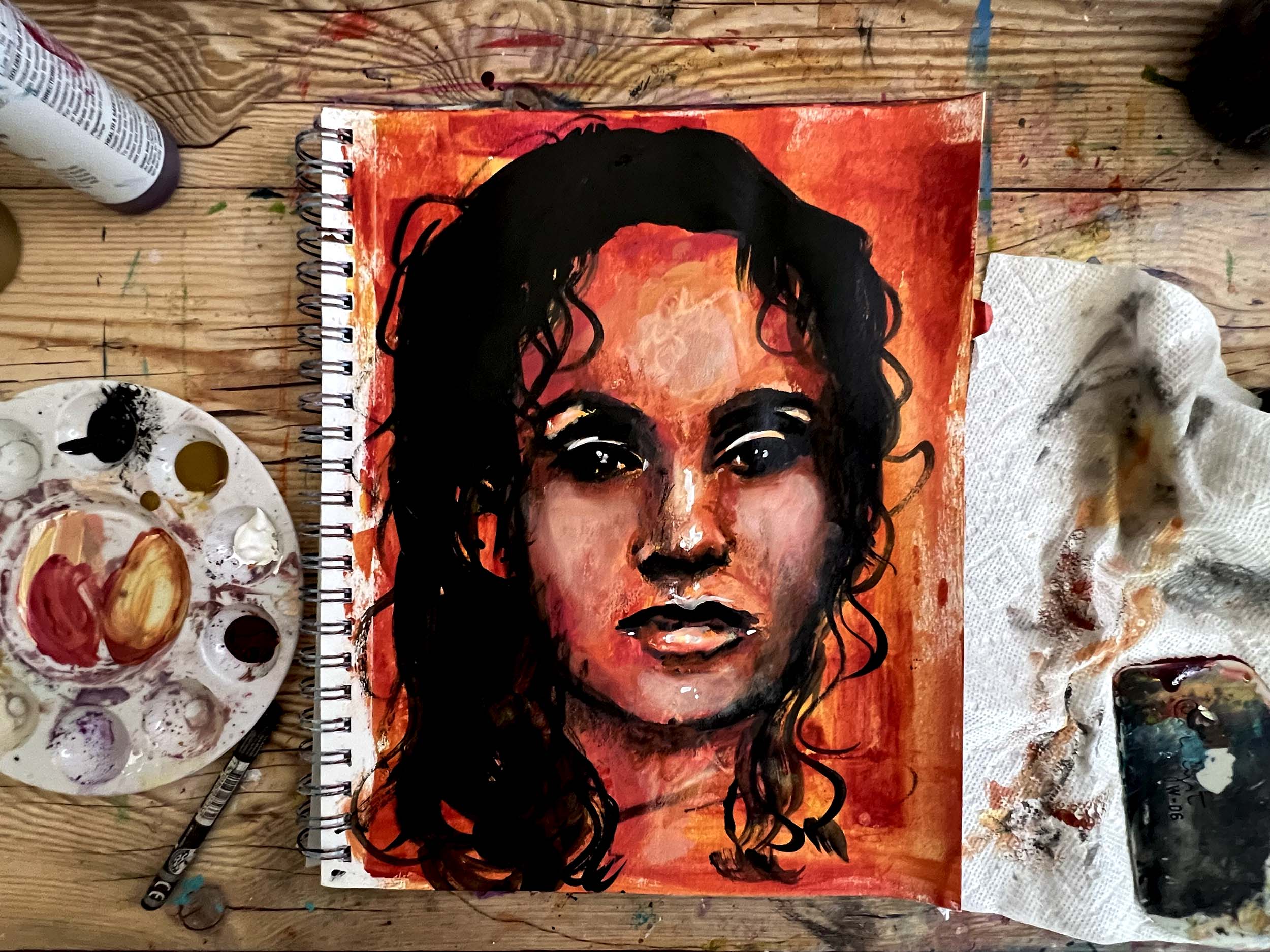
I love using stencils and about 6 years ago I wanted to paint faces but wasn’t too great at it.   Plain and simple I was scared.   I found these amazing face stencils from StencilGirl® and decided to explore.   I was immediately hooked! I could experiment with mediums, mixed media and not get caught up in struggling to draw a half-way decent face. I learned along the way.

The stencil made it easier for me to understand the basic structure of the face.   The eyes, nose and mouth were where they needed to be. I could then open myself up to playing and practicing.  This eventually built up my creative confidence to start actually drawing a face. 

Do I still use a face stencil?

I have come a long way since the beginning.  The face stencils allowed me to feel comfortable with exploring faces in my work.  The more confidence I gained, the more comfortable I became.  Now it feels like second nature.  I still bring out the stencils every once in a while, to play and practice AND show others that they too can incorporate expressive portraits in their work with ease.

Here is a quick video of how I can utilize a face stencil to create a fun expressive portrait. 


Materials:


StencilGirl® stencils:

Talaya Goddess of Rain Large

Eve a Modern Woman Large

Abigail, A Timeless Woman Large 


Acrylic Paint:

Golden’s Quinacridone crimson

Golden’s nickel azo yellow

Titanium white

Black


Assorted brushes 

Spray bottle

Paper towel

Princeton catalyst scraper tool

Caran d’Ache Neocolor II crayons

Mixed media sketchbook 9x12 


Christa Forrest

Creative Souls Art

https://www.facebook.com/ChristaForrestFineArt

https://www.instagram.com/christaforrestfineart/

https://www.youtube.com/Christaforrest

Monday, December 27, 2021

Crosshatched Ink Portrait with StencilGirl® Products


Self-portrait (at 13) by Albrecht Durer, using hatching to establish values

               There are a lot of elements that go into making a portrait come alive, and perhaps one of the most important is modeling - making the face appear dimensional.  The human face is a complex arrangement of shapes and forms - curving, casting shadows, jutting forward or dipping in - and it takes a lot of practice to get comfortable with how to use tone, line, and color, to recreate those three-dimensional contours on a two-dimensional surface.  If you also have to work on getting the proportions right, it can feel like a pretty daunting job.  Fortunately, the face stencils from StencilGirl® provide a wonderful framework for establishing the features of the face.  They are great templates for practicing shading and modeling.

                One of my favorite techniques for adding depth and dimension in a sketchy portrait is hatching (patches of lines in one direction) and crosshatching (patches of lines crossing one another).  It's almost magical to watch the build-up of parallel and crossed lines bringing a face to life by building up the values from light to dark.  It can be tedious to do, however, and can be very tiring to the hand.  Enter this clever makeup hack I learned from illustrator Henrik Drescher.  The Tattoo Studio Brow Tint Pen has a soft, flexible nib that draws four parallel lines.  It's not hard at all to remove the nib with a pair of pliers, and remove the makeup inside (there isn't much, anyway - according to the package, this pen contains only .037 ounces of product.)

    I managed (with a dropper) to add bit of a beautiful ink from Noodler's called American Aristocracy.  It's a deep purplish brown that I find really great for portraiture - I use it in a fountain pen and with dip pens, usually.  It's water soluble, and can be diluted and brushed to beautiful effect.  (At the end of this blog post I have added another portrait using one of Pam Carriker's face stencils.  It was done entirely in American Aristocracy, using both brush and dip pen, plus a bit of white pastel.  The pinkish and brown tones have a tendency to separate, which is lovely. )

    Whatever color ink you choose to put into the eyebrow pen, it's a good idea to practice drawing lines with it.  Press too hard and you'll get a solid line, but with a light touch, you will get the parallel lines.  It's also a good idea to practice simply to accustom your hand to drawing lines consistently and steadily. Fountain pen ink is very fluid, and will not dry out or gum up the nib.


            Using Pam Carriker's Create Face stencil (S646) I established the base layer of the features with the brow pen.  You'll see that I have cut away pieces of the stencil so I don't have a hard, square border.  I also penciled in a hair line as well as the cheek and jawline on the left side of the face use as guidelines during the hatching process.


            When that's all done, this is the result.  As you can see, my lines sometimes wobbled, sometimes went out of parallel.  However, the beauty of this technique is that there will be so many additional layers of hatching that the imperfections of the first layer will disappear.  But you can pretty quickly establish the start of the crosshatch this way.  To be honest I think there is probably still some brown eyebrow makeup in the pen mixing with the ink, but that's why I chose a purplish brown - and I don't think it matters if I'm drawing with makeup at this point!


                Now the magic begins.  This stencil (in this orientation) clearly indicates the light source from the upper right.  This means that all parts of the left side of the face will be darker than the right side.  Wherever the contours of the face curve away (into the eye socket, down the side of the nose, the corners of the eyeballs, the side of the jaw, etc. ), it should appear darker; wherever contours bring a feature forward (cheekbone, brow bone, tip of the nose, etc.) the values should be lighter.  With a variety of colors, line widths, and by varying the spacing of the lines, you can begin hatching to create these contours and changes in value.  Hatch perpendicular to your first set of lines, then switch colors and hatch straight up and down, then hatch straight across.  Use the typical palette of skin tones, or get more dramatic with some unexpected colors, keeping the lines in each layer as parallel as possible.  Experiment to see which direction is most comfortable for you and turn the paper or journal if it's easier to switch direction that way.  Take your time, keep checking where the shadows should be, and have fun!  Remember, it is the nature of stencils to have quite a few broken lines as a way of preventing whole chunks of Mylar falling out.  Where there are interrupted lines (for example, around the eyes) feel free to complete them with hatch lines.


        As you can see, I filled in the background with a wash of the American Aristocracy ink, and then hatched over that with a white gel pen.  To be honest, I may have gone too far and too dark, but I had gotten into the hatching rhythm, I was listening to a good podcast, and I just didn't want to stop!  It's a wonderfully meditative process.  I've used this face stencil with this technique a few times, and it really is a fun technique for practicing the modeling of the face.  

        And here, as promised, is the ink wash (not cross-hatched) portrait in American Aristocracy with Pam Carriker's Strength Face S653.  Using water soluble fountain pen inks with stencils always turns out great - especially with a gorgeous color like this.


stencils used: 

Create Face, by Pam Carriker


Strength Face, by Pam Carriker


Monday, June 28, 2021

Going in the Right Direction

   
     For about 30 years, I made my living as a children's book author.  I wrote quite a lot of books for children and teens, and many of the books I wrote were illustrated, although not be me.  In addition, all my books had covers (obviously) designed by either the in-house art director or a free-lance illustrator and/or designer.  As an author, I was never consulted on matters of book design and interior art.  I did, however, learn a great deal over the course of my children's book career about illustration and cover design, and about some of the key concepts related to narrative art.  Because many of us in the mixed media community are working in art journals where we have some narrative component, I thought it might be helpful to share one of these concepts as it relates to faces and figures: direction.
    At its most basic, direction in illustration or narrative art is determined by the direction of text.  In other words, if you read from left to right, anything moving to the right, facing right, pointing to the right, can be interpreted as heading forward. This is the direction we go when we read - we go to the right.  Typically, people who read from left to right also "read" artwork from left to right, read a crowd of people from left to right, inspect a room from left to right, and so on.  The left side is presumed to be the beginning, and the right side is presumed to be the end of a sequence, or a pause in the sequence.  (Incidentally, in cultures where text is read from right to left, the opposite is true; for example, the cover illustration of one of my books was reversed when published in Japanese.)  
    In the art journal spread below, featuring the Angel Circle Stencil by Kate Thompson and the Near Miss figure by Wendy Aikin, the figure is at the right side of the spread, facing right and leaning right.  With printed text above to reinforce the direction, and crows also facing right rather than retreating in alarm, this figure can easily be presumed to be focused intently on something interesting up ahead, rather than something behind. 


    Taking the idea of forward, ahead, and right a little further, we can manipulate this design choice to imply an emotional content for faces or figures pointing or facing right.   Figures in this orientation can indicate optimism, progress, hopefulness, success.  Conversely, faces and figures moving toward the left can imply return, regression, regret, the past, and so on.  Take for example, the two figures below, using the same mask from Figures Praising by Valerie Sjodin.   In both cases the background and colors are the same, but depending on other choices (color, line work, contrast, composition, massing, etc.) you could make the first figure seem to be bounding joyfully into the future, and the second figure running away from danger to safety. 


    Now, I do not mean to imply that every face or figure in your artwork is doomed to carry this kind of subconscious baggage depending on what direction it's going.  However, sometimes when narrative art featuring a face or a figure doesn't feel right, it's due to this - the brain is getting mixed signals.  Our brains are hard-wired to read images this way (for left-to-right language readers); we have this 'right is right' unconscious bias whether we like it or not.  As a test, try holding your work up to the mirror and see if it strikes you as emotionally or psychologically different.  A great advantage to using stencils is that they can be flipped in either direction.  So a composition that doesn't quite seem to hit the right note can be given another go by changing direction of the stencil.  
    Of course, when there are two figures or faces in a composition, they might be facing each other, in which case no particular psychological reading is especially pertinent - they are interacting.  The interaction may be negative, neutral, or positive, but the orientation is probably not going to factor into that reading.  However, if the faces or figures are not interacting, but oriented away from each other, there is a lot of room for inference.  With Jeanne Oliver's Thougtful Face, we also have the advantage of playing with scale, because this stencil comes in two sizes.  Now, with the smaller face on the left, facing left, and the larger face on the right, facing right, it is not hard to read this as the past and the present (or future) in  an autobiographical composition. 

    It would be an interesting exercise to use these two stencils in all possible configurations simply to see how different the compositions feel.  Obviously, many additional factors go into the emotional or psychological content of a piece of art - but going in the appropriate direction is one you don't want to miss if that's the one that can get you where you want to go.


Stencils used in these examples:

Angel Circle Stencil S271 by Kate Thompson, Three Crows Stencil S207 by Kimberly Baxter Packwood, Circle Up 6x6 from Club set March 2016 by Suzi Dennis, and Near Miss Stencil and mask set, S622 by Wendy Aikin

Figures Praising L727 by Valerie Sjodin, Dancing Lights S355 by Daniella Woolf

Thoughtful Face Large L839 by Jeanne Oliver, Thoughtful Face Small S862 by Jeanne Oliver, Periodic Table L837 by MaryBeth Shaw


Monday, March 22, 2021

On Faces and Figures


          Having occupied this space as a columnist for three years on the topic of collage, I have taken on a new topic: faces and figures - my favorite!  Many people, when working in a visual journal or art journal, want to use faces or figures in their compositions, and I am no exception.  Because my visual journal is usually a reflection of myself, I think of any face or figure as a stand-in for me - no matter the age, gender, or race.  If I cut out a picture of an old man from somewhere far away or long ago that I have found in a National Geographic magazine and use it in a collage in my visual journal, it is because somehow that man is a mirror of something in me - something I may not be able to articulate fully but want to express, nevertheless.  I am putting myself into the composition as the narrator, the subject, the point of view.     

         For several years now I have been working on my drawing and painting skills, taking numerous on-line and in-person classes on portrait and on the figure.  I often photograph my work and then print and collage it into one of my altered books or art journals and continue to build a new composition around that.  I'm not always confident of my skills, however, so I often find myself using one of the many wonderful StencilGirl® face stencils.  When I use them, I try to make them my own, and to incorporate other stencils as much as possible to alter them.   

        Because the human face and form are organic shapes, I like to look at the organic patterns and images in the  StencilGirl® catalog to find human forms, or shapes that remind me of faces or facial features.  Trish McKinney's botanical designs are full of rounded, looping lines, and Grand Wisteria (L679) has a great big oval in it - how can you not want to put a face right there! Whenever I get my hands on a stencil with lots of organic shapes in it, I turn it slowly by 360 degrees, then reverse it and spin it around from that perspective, too.  Just because the stencil appears in a particular orientation in the on-line catalog, doesn't mean that's the "correct" way to use it.   

       Like many of you, I have a  number of Pam Carriker's fantastic face stencils, and I held a bunch of them up against this wisteria stencil to see what would fit.  I used Truth Face (S650) to fit into that oval space, and worked a lot of black into different parts of the wisteria vine to add more shape and texture to the form.  I also added a lumpy ball form with white for highlights, and that's it - three stencils, and one color with black and white.


I think a really helpful way to use these face stencils is as a template for learning how to model the human face.  When used as is, the face stencil can seem rather two-dimensional, as in the photo below, which uses the large Pam Carriker face from the club set of November 2018, Her Story
 

As is, any stenciled image has only two values - dark and light (positive and negative).  But the human face includes many values, and this is what gives a painting or drawing a three-dimensional look.  I created some stenciled textures using the same quinacridone burnt orange I laid out on the art journal spread, and used the face stencil as a template to cut out shapes that would add a range of values and create a sense of form.  Again, I used just one color plus black charcoal and white gesso.


After much debate about what to do with the right side of this composition, I decided to add some figures using a mask from Valerie Sjodin's mask and stencil set, Figures Couples (L730) before adding more of the texture stencils used throughout the composition to tie it all together. 

In future posts for this column I will no doubt be using some of my portraits in conjunction with other organic or textural stencils, but I wanted to start out by showing how to add the always-evocative human face and figure into your work just using stencils.  


Other stencils used in these two projects:
 

Multiple small stencils used for texture include pieces from Mark Making Set April 2020, Mary Beth Shaw Private Collection April 2016, Shaw-Apter MashUp January 2019, ATC Mixup by Carolyn Dube (L657), ATC Mixup 1 (L543).  I cut up a lot of stencils that have multiple motifs on them but I tracked them all down!

Thursday, February 25, 2021

New Portrait, Floral, and Mark-making Stencils by Jeanne Oliver

StencilGirl® is elated to introduce you to our newest stencil designer, Jeanne Oliver!

Jeanne is inspired by personal stories and her new line of six portrait stencils, along with several focused on mark-making and layers, will help you showcase your own mixed media story.


"Simple lines can often be the beginning of beautiful larger works of art and sometimes simple lines are all you need," artist and stencil designer Jean Oliver says. "Each stencil has been created to use in your art journals, in your hand stitching, or even in larger works of art. Let the stencil be the starting point and then see where it takes you."

These large 9" x 12" portrait-style stencils give you the perfect layer for spray paint or for a larger portrait piece. With spray paint, charcoal, acrylics, stitching, inks, or more you can begin to add beginning lines into your work. Repeat the portrait for a larger impact or extend the lines into a body for more drama. Don't be afraid to even just use a portion of the stencil and include it in your art journal. 

Sweet Girl Face Large, L838


Hair bobbed and brushed, dress detailed with abstract bows and a striped collar, this young girl with a vintage look is dressed for her portrait in the Sweet Face Girl Large Stencil designed by Jeanne Oliver. Paint drips give this stencil a painterly look.


The woman in the Thoughtful Face Large Stencil is mindful and dreaming. It will be up to you as her portrait painter to decide how those dreams are revealed.


Jeanne Oliver’s Garden Face Stencil depicts a woman as ageless as her blooming garden with unruly hair, kind eyes, and a bit of a smile. 

Jeanne says, "Create the portrait and then consider stitching the floral design in the background! The possibilities are endless." 

The Small Portraits

These 6” x 6” portrait-style stencils are perfect for your art journal and daily practice. With simple marks, you can begin to add layers and texture. 

"This is a fun size to start with charcoal and then with a blending stick start to add those underlayers to your work," Jeanne says. "Come in with acrylics, spray paint, watercolors, Neocolor II, or more and bring your portrait to life." 

Kind Face Small Stencil, S863

Is she a girl or a woman with her unruly hair and the ghost of a smile? You as the painter will decide when you begin with the Kind Face Small Stencil.


Alone with her thoughts, is the woman looking outward or within?


Sweet Face Girl Small Stencil, S859

A young girl dressed up for her portrait in a bygone era when you had to stand still and not smile for the camera.


Taken directly from Jeanne Oliver’s mark-making and abstract work you can use her Abstract Marks Stencil to incorporate these marks into your own art. 

The Garden Spray and Bramble Stencil designed by Jeanne Oliver can become the background of your portraits, still-life works all on their own, or add texture and layers into your current work. Whether you use spray paint, charcoal, acrylic, inks, modeling paste, or your favorite medium each floral element will add simple and loose lines to your work. The floral elements on this stencil may be cut apart for ease of use.


Mark Making with Floral Embellishments Stencil, S860

"Creating repetitive marks within my work is one of my favorite ways to bring line and form," Jeanne says. 

This stencil is wonderful for art journaling or adding to the body or background of a portrait. You may wish to cut this stencil in half for ease of use.

Discover all of Jeanne Oliver's stencils right here.

Gathered is a mixed media class Jeanne is teaching that includes these stencils.


Thursday, August 13, 2020

A host of new faces and a bit of French lace from Andrea Matus deMeng!


Hello! 

StencilGirl® is pleased to announce three new women, one new face, and a bit of French Lace in store you courtesy of Andrea Matus deMeng.

But that's not all, if you ever wanted a 9" x 12" Pretty as a Peacock or Talaya Goddess of Rain Stencils, your wait is over.


All of Andrea'sface stencils can be used as a starting point for developing your own richly expressive portrait-based artworks, used on their own or in combination. Here is Andrea to tell you about these stencils in her own words:

Asteria

Andrea writes: "The gorgeous face on this stencil is inspired by the mythological Titan Goddess, Asteria. Asteria is the goddess of falling stars, astrology, and nighttime divinations through dreams. She mesmerizes you with her beauty and leaves you with the gift of her prophecies, and who couldn’t use a good prophecy right about now?"

Asteria is available as a large 9" x 12" and a small 6" x 6" stencil.


Art using Asteria and Talaya stencils.

Cassiopeia

"A rather confident goddess, Cassiopeia was best known for her vanity. Believing that she and her daughter Andromeda were the most beautiful of all of the goddesses did not make her very popular among her peers. Inspired by her story, this face stencil embodies her beauty and defiance perfectly."

Cassiopeia is available as a large 9" x 12" and a mini 4" x 4" stencil.


Not Calling You Back

"A woman in charge. Confident, capable, and charismatic. Not Calling You Back is inspired by the style and career of the legendary Lauren Bacall merged with one of my favorite song lyrics by Lizzo. What was so compelling to me about this pose was that Bacall’s famous chin down-eyes up look was actually her way of keeping herself from shaking when nerves got the best her. A good reminder that things aren’t always what they seem – the nuances and attitude of this stencil make it absolutely perfect for art journaling."

Not Calling You Back is available as a large 9" x 12" and a small 6" x 6" stencil.


Talaya

Tayala,Goddess of Rain was designed by Andrea Matus DeMeng. Tayala, the Phoenician named goddess of the dew, is rain personified.

Talaya is also available as a 6" x 6" small stencil (not pictured).


Pretty as a Peacock

Pretty as a Peacock was designed by Andrea Matus DeMeng. She has the beauty and looks but there is so much more to her. Her strong and confident gaze says she is ready for whatever life throws at her.

Pretty as a Peacock is also available as a mini 4" x 4" and a small 6" x 6" stencil (not pictured).


Delicate Face and French Lace


These are each 6" x 6" stencils.


Delicate Face by Andrea Matus deMeng is a beautiful stencil to use as a starting point for a portrait. Use a variety of pens as shown in the sample below to achieve a variety of windows into the soul.

"Inspired by a trip to the Parisian Flea markets, French Lace started out as my sketch of the lacy band that I found of a pair on vintage stockings. Delicate and beautifully detailed, this stencil will add an element of Old World splendor to any and all of your art projects from art journaling to home décor. French lace also works wonderfully to create amazing backgrounds for your mixed media artworks but is strong enough to be a featured element on its’ own."


Oh la la! Bathroom tiles!

Check out all of the portrait stencils Andrea Matus deMeng has designed so far.