Hi, you beautiful artist! Anouk here again to share another art journaling spread. I hope you had a wonderful Christmas and are all ready a new art journaling process video!
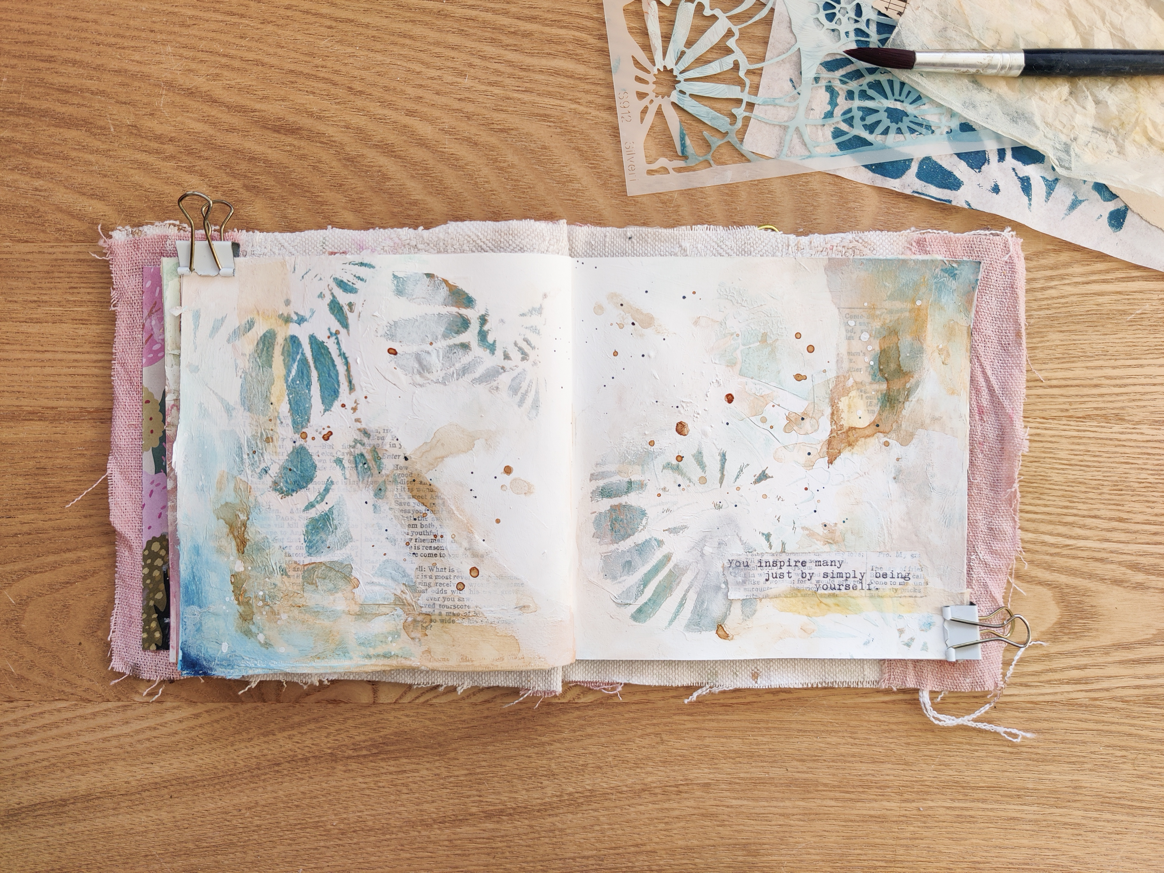
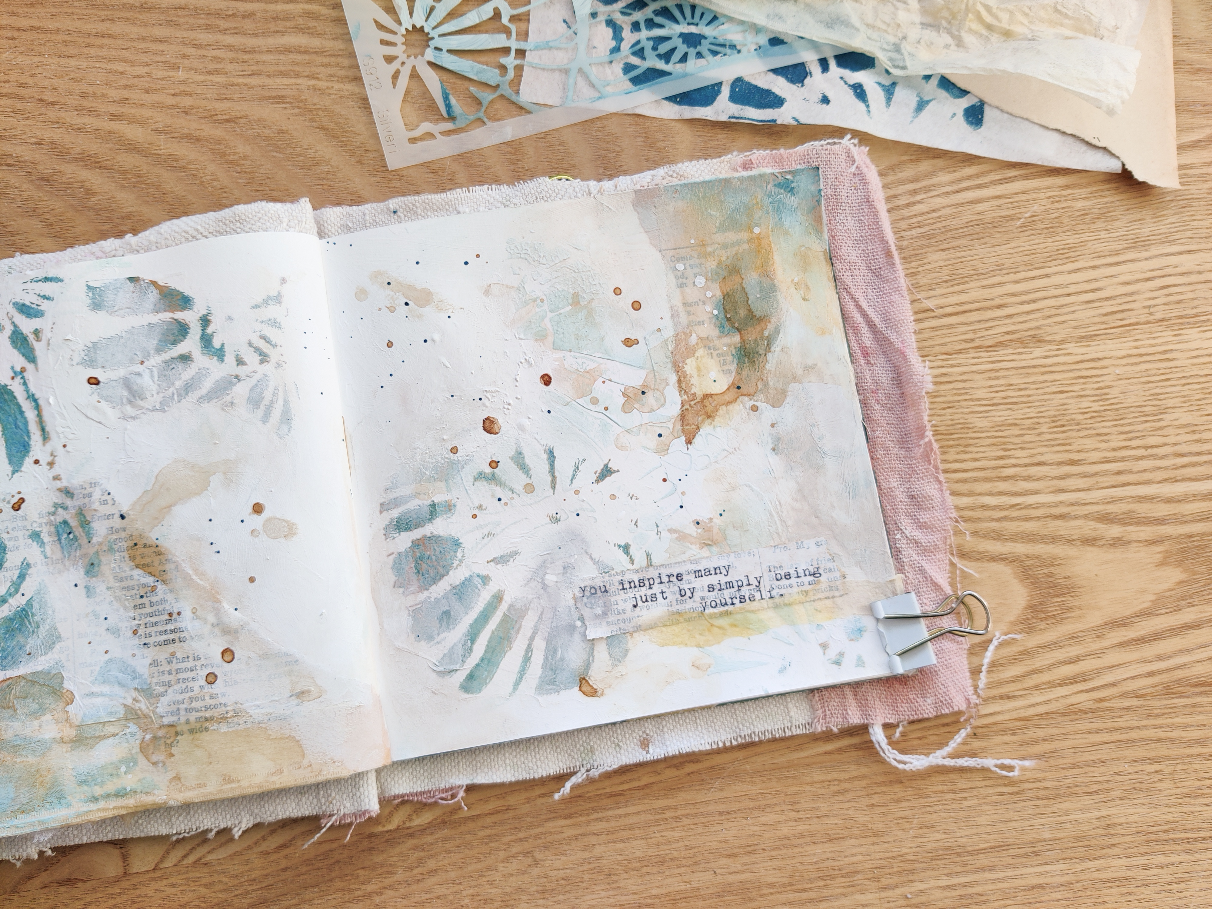
This time I worked with the gorgeous stencil Poppy Seed Heads by Cynthia Silveri that I pressed on tissue paper with my Gel Press printing plate. I alway enjoy a gel printing session, they are just so relaxing! And in the end you'll have a stack of beautiful papers to use in your art journal! You can use these papers when you don't have a lot of time to be creative or to just get yourself inspired.
I build this page up by creating layers with the same stencil. I started with a light colour as a background layer and then I add the darker tissue paper print of the stencilling to create the foreground. I like to work this way to create an art journal spread with a little bit of depth. Sometimes I even add a third layer with modeling paste or gesso to create even more dimension.
It can be scary to use one stencil multiple times, it can become quite busy if you overdue it. That's why I like to use my tissue paper prints when I'm building up a page with stencilling. The tissue paper is easier to control and to try out if you aren't sure of the outcome.
While I was filming this page I run out of Mod Podge. I almost cried. Ha! Life is tough with a newborn. I remembered that Matt Medium is also an adhesive so at the time it felt like a life saver. Little did I know that tissue paper and Matt Medium are not the best of friends. It dries very waxing in my opinion. So if you are watching this video and see me using Matt Medium for sticking down the tissue paper, I'll not recommend doing the same. I can't wait for my Mod Podge to arrive, because it's been a hard few days without.
As you can see, the Poppy Seed Heads is such a nice little stencil to create layers with. I hope you enjoy the video from my process that I made for you!
I wish you all a Happy New Year with lots of creativity!
Thank you so much for reading my blog post. I hope that I have inspired you to create today! My name is Anouk or Creanouk on social media, and I'm an all-round creative from the Netherlands. I love art journaling because I can put my heart and soul into it. You can find my work on Instagram and Youtube.
Hello Friends! Kristi Nazzaro here for StencilGirl Products. I’m back with another fun tutorial using my Gel Press Gel Plate and some really beautiful stencils and masks designed by Rae Missigman and Roxanne Evans Stout.
This time of year I like to make myself a Positive Affirmation Tag. I want something to hold in my hand that reminds me of the things I’d like to invite into my life for the upcoming year. This year I’m kicking fear to the curb and leaning heavily on faith to bring me peace, calm and growth.
Watch below as I create my tag using these amazing StencilGirl Products!
I hope this tutorial inspires you to grab your StencilGirl Stencils and Masks and create a Positive Affirmation Tag to remind you, encourage you and bring you creativity all throughout the new year.
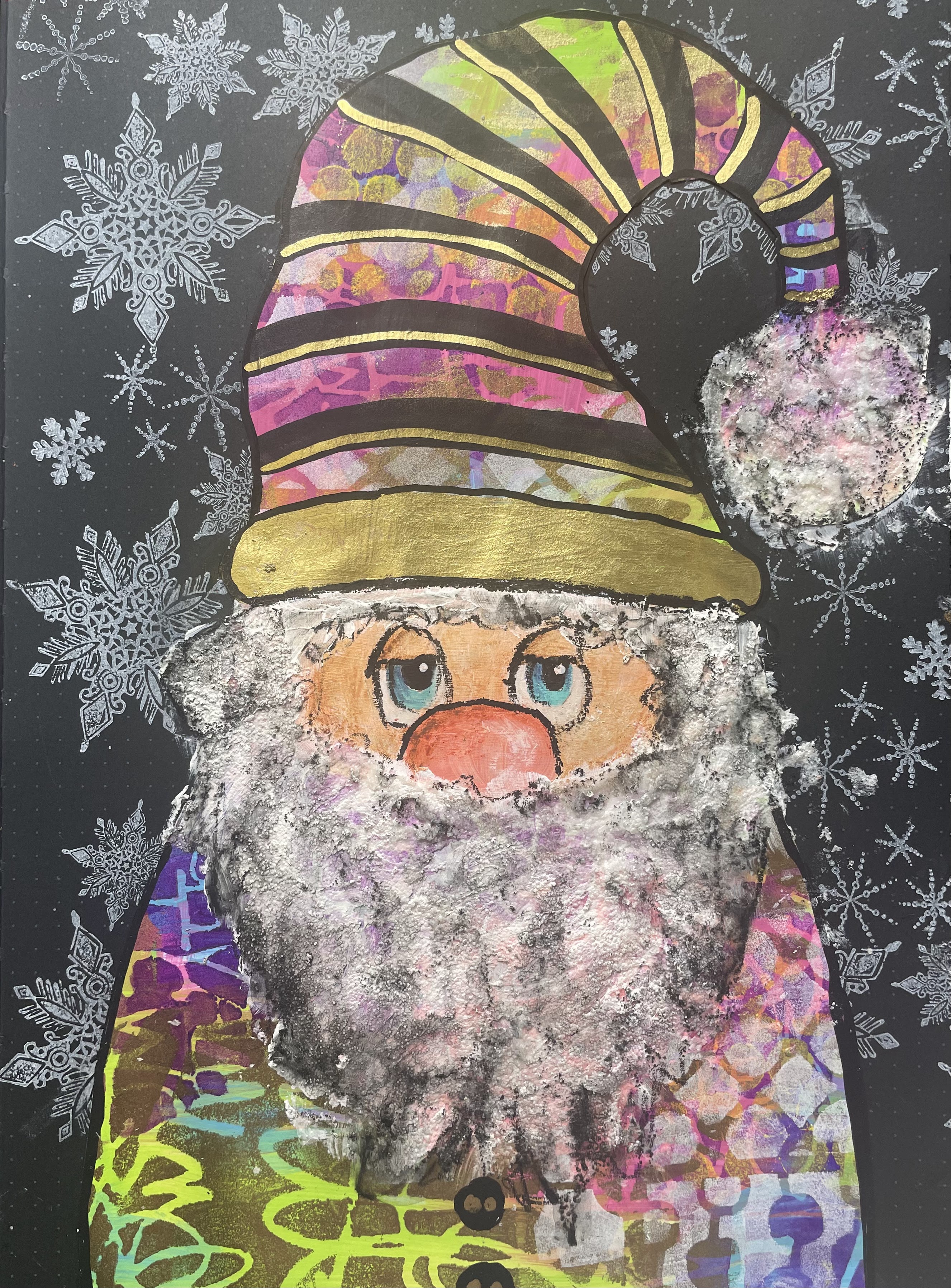
Merry Christmas and Happy Holidays from Down Under! While we are sweltering in the summer sunshine, my Irish bones misses the Northern Hemisphere Christmases - dark and cold, snuggled up by the fire. I think this is why every Christmas I create snowy scenes in my art journals to recreate the Christmases of the past.
This page is inspired by the talented Claire Stead (art journal love on Youtube and Instagram) and her amazing lace cut alphabet pages. It is such an easy technique, but a really effective framing tool for a page or a card. If you don't like cutting, try using a die cut machine to cut out the letters and adhere them on a piece of transparency or vellum to re-create to look easily.
To start I created a colourful background with acrylic paints and layered over lots of stencils with different patterns. None of these stencils are ' Christmassy' but choose whatever you have at hand. I also used a very bright colour palette with a gold metallic thrown in - you choose whatever colour palette suits your Holiday aesthetic.
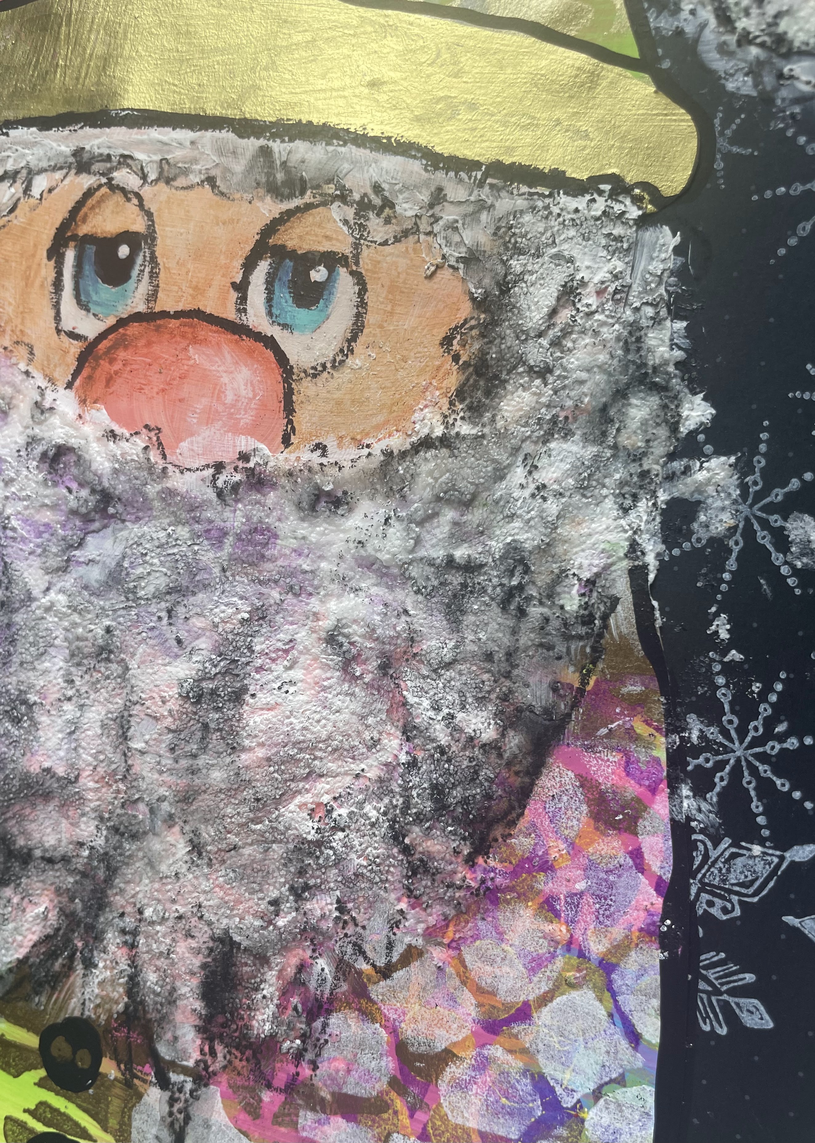
Once I was happy with my background I sketched out the rough shape of a Christmas Gnome (I used Pinterest to find a guide) and cut it out. I then used some skin tone paints to paint a rough oval face shape. I then used white to paint in a beard loosely with a lot of texture. I also added some glittery texture paste to add to the texture. It you would rather use a white surface to do this than the heavily coloured/patterned background you can - and just cut the clothes out of the patterned paper like a patchwork. I added in details to the face, hat and clothes using paint pens, water colour pencils and a stabilo all pencil.
To complete the cut page, I hand drew the lettering with a white stabilo pencil. I used a black dotted grid journal which helps with sizing and spacing. You can use an alphabet stencil or stamps to help you do this part as well. Just make sure that your letters touch and overlap slightly so that they will stay together when the negative space is cut out. With an exact knife and a cutting board underneath, carefully cut away any excess card from the page. Make sure that you have a sharp knife to do this - you may need to change blades if the paper starts to pull when you cut. When you have finished you can outline your letters and highlight them to make them stand out. I chose to stencil over the top of my letters with gold to really make them stand out from the background. Finally I chose to glue some vellum behind my letters so that you could see a glimpse of what was behind, but not the entire page. I have often used transparencies as well which is a great alternative. This gives the page a little more stability - especially if your letters are a little bit fragile.
The stencils I have used on this page are the following, but remember - use any you like as they are just to add pattern and interest into the backgrounds.
I hope you have a go at completing a page like this. And don't think it has to be holiday themed - check out my instagram page (@niamhbaly) to see lots of examples which are using the same technique, but completely different. I also have a live free class on my YouTube channel which takes you through a very similar project step by step in real time.
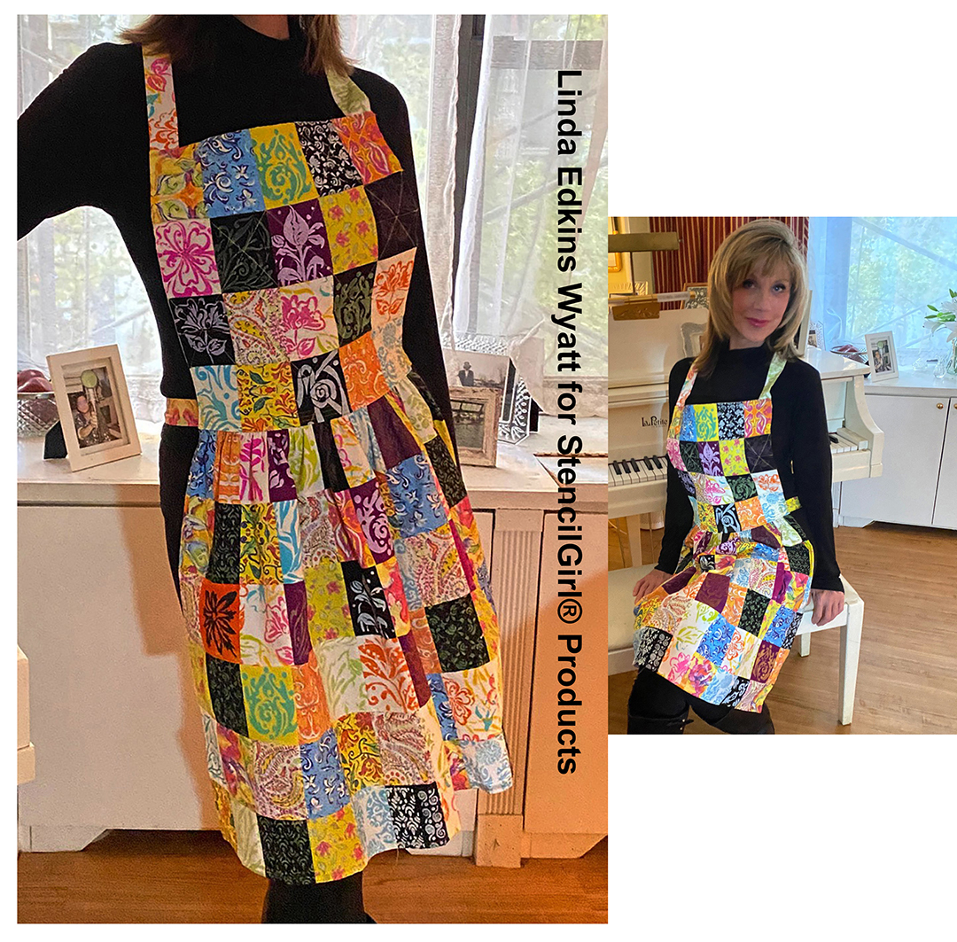
Aprons are a signal to my brain that creative joy is about to commence. When I put on an apron, my inner child starts percolating with ideas and excitement. Whether I'm cooking a meal or about to start making a beautiful artistic mess with paints, or collage, or stencils, or a gelliplate, donning an apron means I'm sliding into my happy place, and ready for some serious fun.
Tucked into my very small studio space (also known as a corner of my bedroom!) is a special box, full of fabric scraps and samples. Some large, some small, and all dear to my heart. There are tests on fabric of almost all my stencil designs. Also in the box are scraps from fabric that I designed myself and printed at Spoonflower.
Here's a few of my original fabric designs that I printed at Spoonflower on 100 percent cotton.
This is one of my favorite stenciled fabrics. It was hard to cut it up for the apron, but fabrics are for sewing, so I sliced it into ATC sized pieces! I also used a strip of it for the neck ties.
I decided to finally do something with the fabrics and debated just what to create...a throw pillow for my couch? A patchwork teddy bear? A tote bag? A blouse? I didn't want to make something that I would wear once, then tuck away in the closet, saved for special occasions only. It occurred to me as I was putting on my apron to prepare dinner that a patchwork apron would be just the right thing.
So, the next day, I took inventory of what I had. There were lots of little ATC sized pieces from testing my Wyatt ATC Mixup stencil in dark and light colors, brights, and pastels. Since I had so many ATC sized test prints, it seemed logical to make my patchwork rectangular (2.5" x 3.5") rather than the standard square shape. Using a piece of mylar, I cut my template 3" x 4", which allowed for a 1/4" seam on all sides. I also had stenciled fabric samples left over from the clothing I made for my Wisdom Doll last year.
I got out my green cutting mat, my metal-edged yardstick, and my rotary cutter and set about carefully cutting the blocks.
Here's the old, worn, favorite apron that my mother made years ago. I love the way it fits and feels, so I decided to use it as a pattern.
I measured the size I would need for the top and skirt of the apron. Next, I arranged the blocks, shuffling them to get a good distribution of dark and light, while being careful not to have the same stencil shape too close to itself. I took pictures so that I didn't forget what the arrangement was.
I tried to balance the light and dark fabrics, the large and small patterns, and have variety in the colors.
Once the arrangement of the squares in rows was decided, I clipped each batch together. On the right, you can see my notes, measurements, and sketches.
Here I have more of my Spoonflower fabric yardage, and in the background, some of the cut and uncut stenciled fabric pieces.
Next, I carefully sewed the rows together, pressing the seams open with my steam iron. When the rows were done, I sewed the top pieces together, then the bottom sections.
I pressed the seams open carefully on the ironing board after stitching each row.
I used chalk and a clear ruler to mark where I wanted my quilting lines to be. It easily brushed off when I was finished quilting.
I decided to quilt the top piece; it seemed a logical next step. I used a full piece of one of my fabrics, stitched a 1/4" seam on all three sides, turned, and pressed it. I cut a piece of felt to fit just inside, pinned it in place, and stitched.
The original apron has two patch pockets, which are very handy, but I decided it would be too busy and bulky with the patchwork fabric, so I omitted the pockets from my new design.
I hung the finished top and bottom pieces from a shelf and stepped back to see how the apron was shaping up.
The old apron had a gathered skirt, so I put in two rows of machine basting across the top of the skirt, pulled it until it was the same length as the top, adjusted the gathers so that they were even, and pinned it in place. Just to be extra careful, I hand-basted the gathered section to the top, removed the pins, checked to be sure the gathers were distributed evenly, then slowly stitched the pieces together.
The backside of the apron shows my mini paisley Spoonflower fabric that I backed the quilted top with, as well as the basting on the gathered bottom.
Here's the almost-finished apron. The finishing touch was adding long strips of fabric for ties at the neck and waist.
It was a bit of a happy accident that my stencil of the word ART fell right in the middle, above the waistline!
I'm really pleased with the way my quilted patchwork apron came out, and the best thing is that
100 percent ME...my own fabric designs, my own stencils, even my own
pattern design. While I kind of want to save it for special
occasions, I also can't wait to put it on and make some
creative mischief!
Many thanks to Jeanne Waller for modeling my special creation!
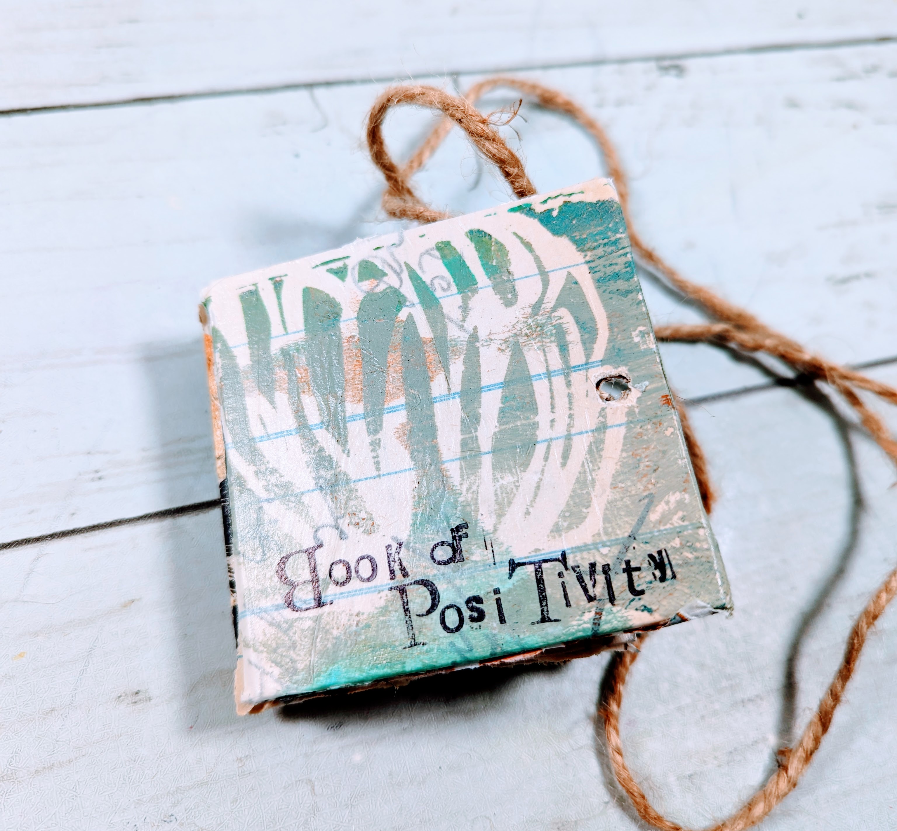
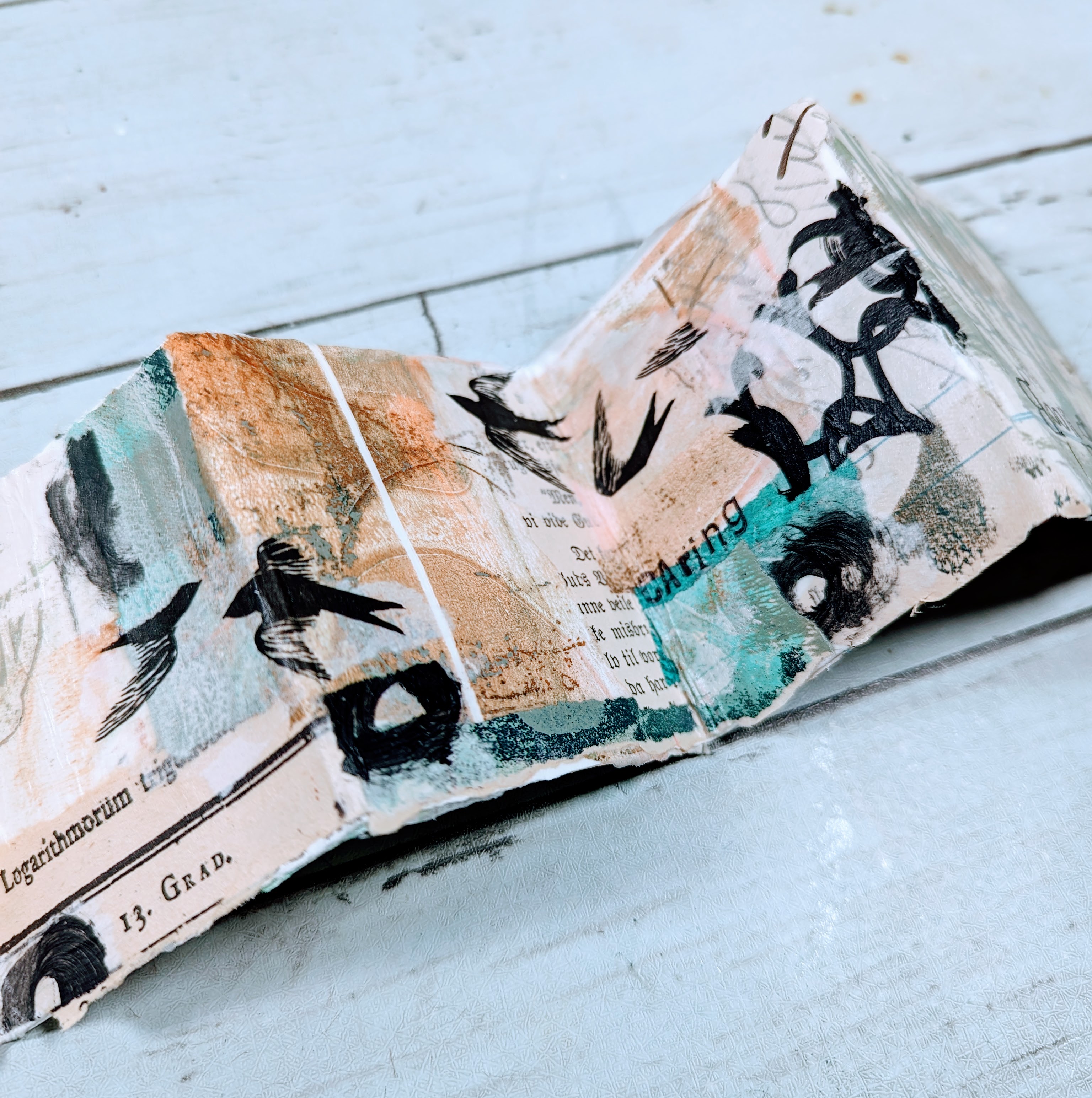
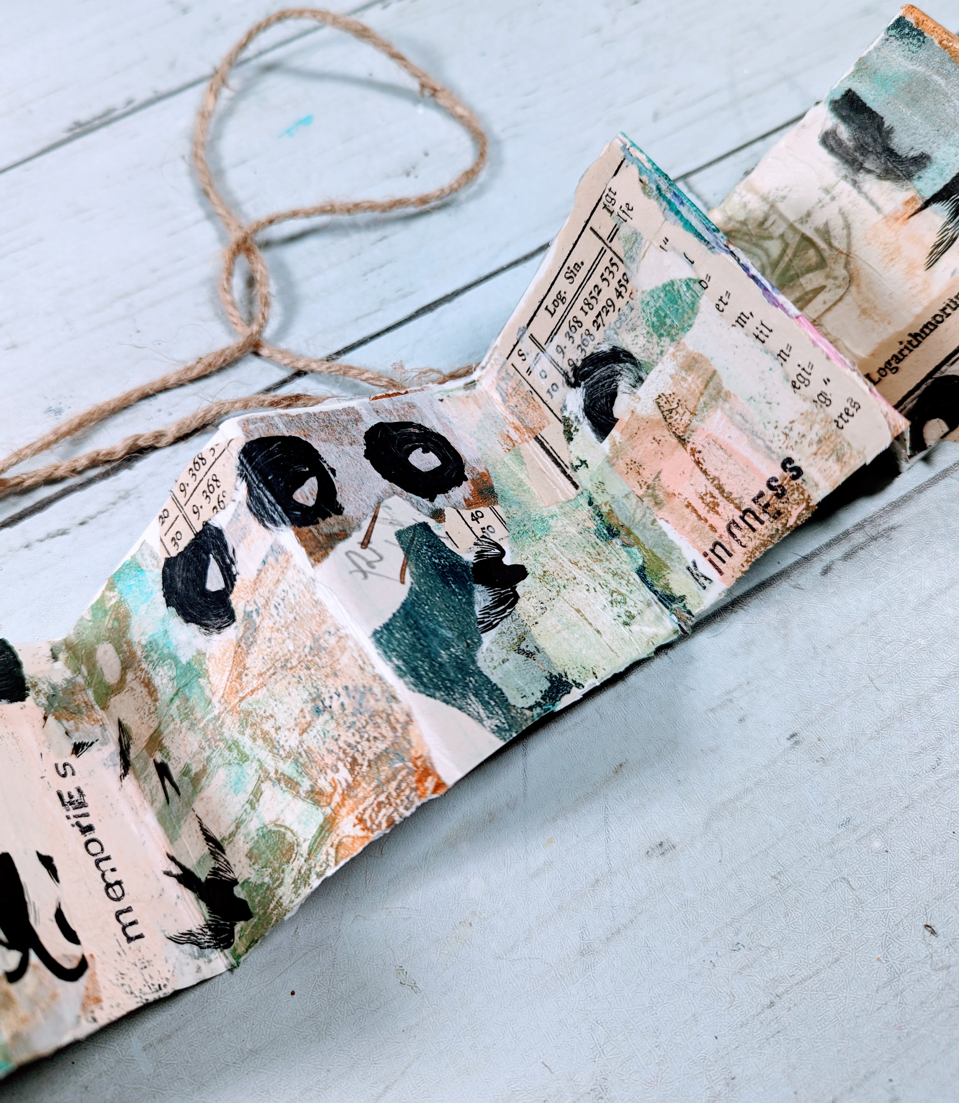
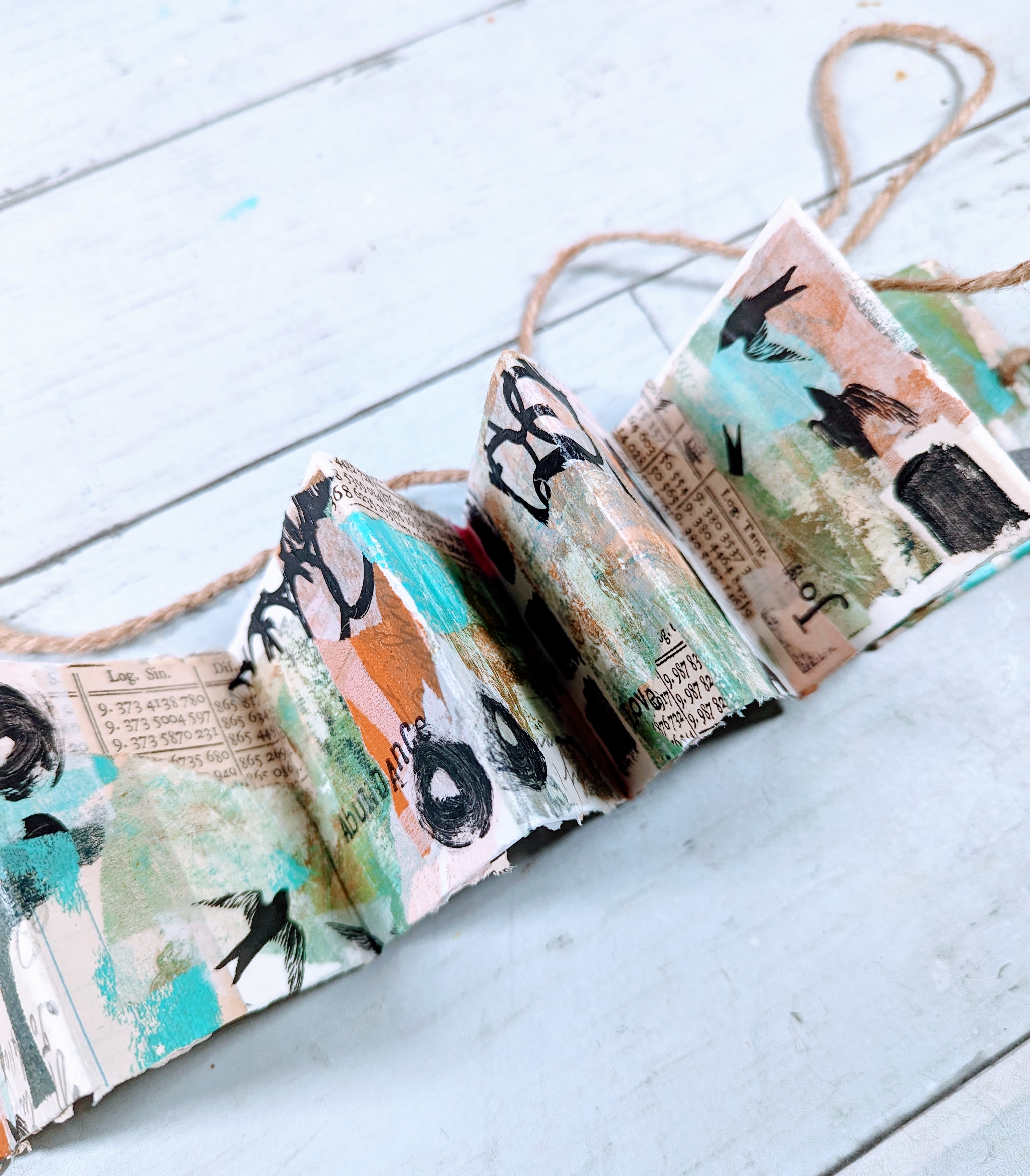
Hello! Laura Dame here, and today I am sharing this cute little accordion book inspired by gelli prints and Christmas ornaments!
I was walking around Michaels shopping for Christmas decorations, and I came across these blank wooden DIY Christmas ornaments.
I thought - hey, I could make ornaments for people for Christmas! So I picked them up and got them home, and realized I most likely wont end up making ornaments for Christmas, lol.
But I thought they must be good for something! So I decided to try to use them as covers for an accordion journal.
I've been slightly obsessed with gelli printing recently, so I decided to play with my (current) favorite color palette, the gelli plate, and some stencils.
I then used the papers I made to collage all over the accordion journal and wood covers.
After that, I added some words that I felt meant something to me - just letting the positivity flow through me.
I accidently stamped some letters upside down or backwards, but that's okay! I think it adds character, and this book ended up being all about positivity, so why be negative about a mistake?
I hope you enjoy the gelli printing, collaging, and the little book! Check out the video for the process below!
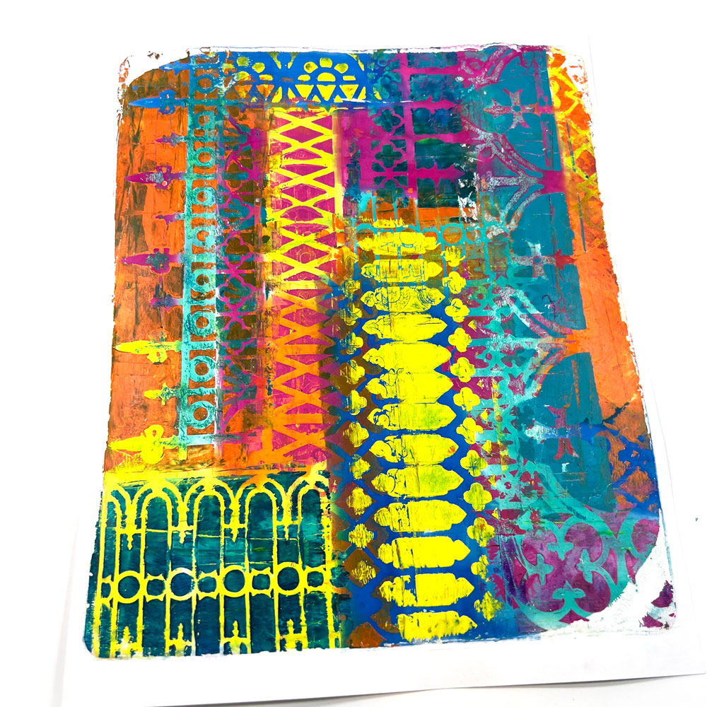
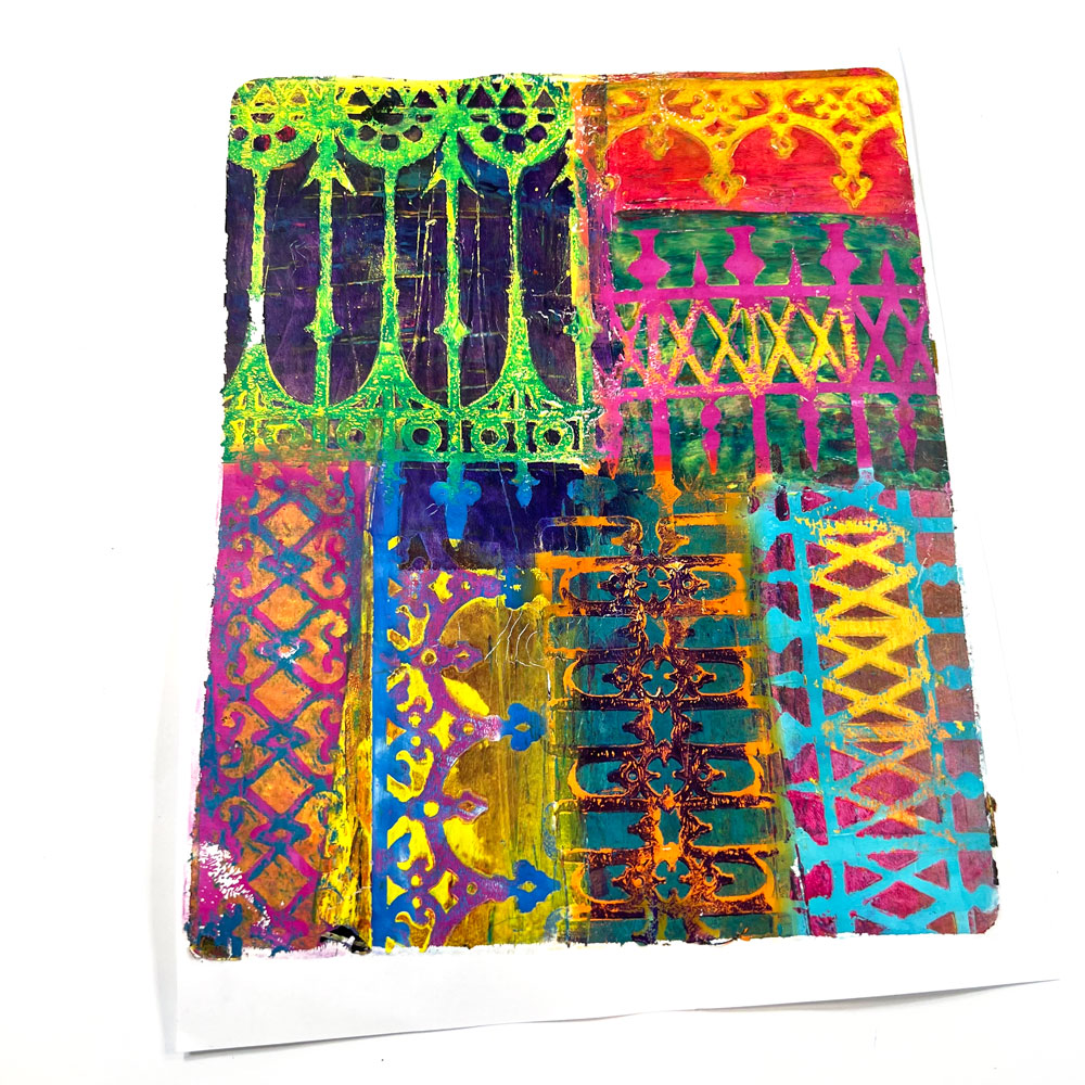
The Wrought Iron Collection by Carolyn Dube was inspired by the wrought iron of Savanah, Georgia. The moment she saw the artistry of the railings and fences, she wished she could grab some paint and use them to make gel prints. Since that wasn’t possible for so many reasons, she created these stencils so she could create with them!
There is a bit of mystery around the wrought iron of Savannah. According to the tour guide, wrought iron is a lost art because our modern-day skills and technology cannot duplicate the quality and craftsmanship of the 1700 and 1800s!
Use these stencils in your collages, mixed media art, on your gel plate, in an art journal and much, much more!
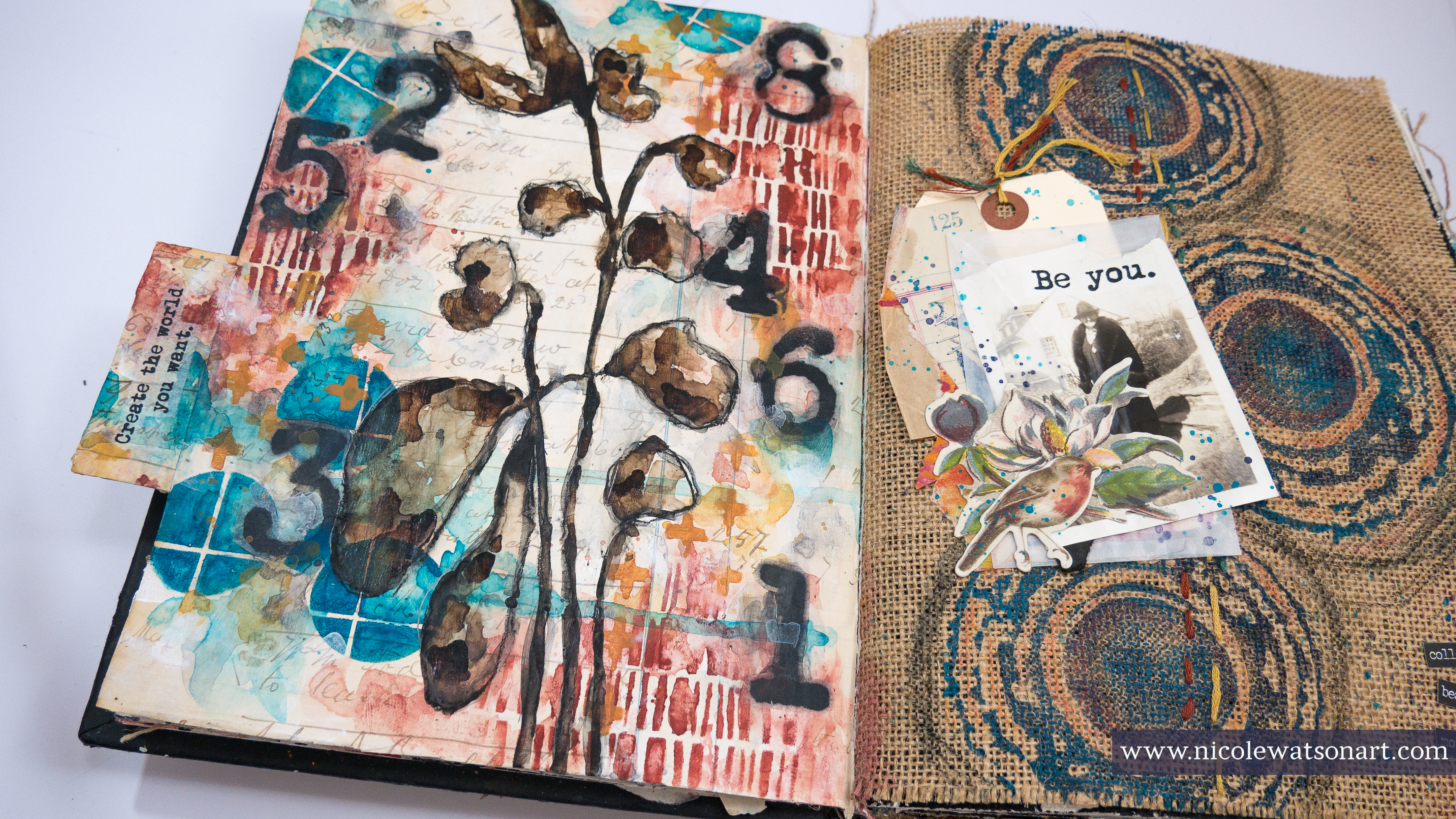
Hello artists! Nicole here, and today I’m playing in my art journal by layering six different stencils from StencilGirl® Products!
I am determined to finally fill the pages of this journal I’ve worked on for many years (Check out my previous blog post for more information on that!), but most of what I have left are single pages, really awkward spots, and pages I’ve done some clean off on and need to figure out what to do next.
Flipping through my journal, I settled on a page that was next to one previously created on. I used that page as inspiration and a starting point, because I have this weird thing that pages next to each other need to somehow match or look good together. (Do you do this??)
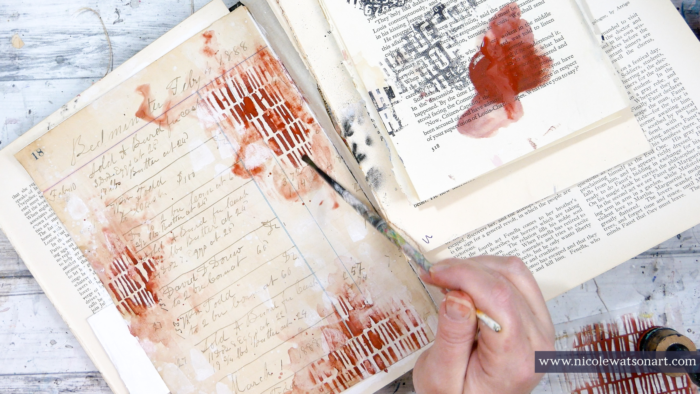
After adding gesso to the page, I decided it needed to go from stark white to something with more of a patina or aged look to match the burlap to the right. Since I wanted the background to look cohesive (The burlap is a strong cohesive statement, and I wanted this page feel the same.), I completely covered it with a single ledger page. If you don’t have an old ledger sheet, a book page would also work wonderfully! You could even stamp the journal page with ledger looking stamps, and patina the page yourself.
Once that ledger page was fully dry, I added some watered-down gesso in a few spots, because I just love how gesso looks on old book pages. Then I grabbed the Fort Hill Mini stencil to make some intentional marks with the gesso.
I pulled my color palette from the page to the right and began to layer more stencils. First, I used red-oxide with the Broken Line Columns stencil and a foam applicator. Before the stencil marks dried, I used a paint brush and water to “scruff” up a few of the marks and also spread some of that watered-down paint around. This gives the stencils not only a watercolor look, but a bit more personality and adds my own voice to them.
I continued this process with turquoise and the Abstract Color Mixing Swatch stencil. I like to be intentional with my stenciling, often times in groups of three or in odd numbers if they are larger designs. I take my time, and allow my eye to move around the page to see where the next mark or color is needed.
Since the right side of my journal has a pretty strong message in a typewriter font, I knew the Vintage Typewriter Numbers stencil would be the next perfect layer. I was way too nervous to spray directly in my journal, so I spray painted the numbers onto some patty paper (similar to deli paper), cut them out and placed them on the pages with matte medium. They are almost invisible, but I also added some extra black to help with that. I simply sprayed some spray paint on my palette, watered it down and added some around the numbers to help camouflage them more. I also eventually added some of the red, turquoise and yellow paint on the numbers later in the process.
When the numbers were dry, I looked at the two pages together and decided my StencilGirl® page needed some yellow. So, I grabbed mars yellow deep and added marks with the Grunge Marks Collection - Symbol Gridstencil using the same process again.
I forgot to mention, but maybe you’ve noticed in the photos, I kept the center pretty empty, because I have a plan for it. And, now it’s time to execute that plan!
The page on the right has a strong industrial feel in the background, with the soft floral collage of die cuts. My background on the StencilGirl® page now has that strong industrial feel, so it’s time to add the soft florals. Enter the Botanical Stem stencil.
This stencil has a mask and a stencil with it, but I am only using the stencil. I placed the stencil on my page, flipping it over and moving it about to find the perfect spot. Once I had it in place, I used my stabilo all pencils to trace the inside very loosely with graphite first, then the black.
One thing I love to do with stencils to also make them my own is to subtract parts and add more parts. Because the largest leaf covered a significant part of my page, I decided not to trace it. Next, I activated the stabilo with a little water and evaluated the floral centerpiece.
It needed a few more pieces to fill the page, so I added three more stems and another leaf using parts of the stencil with the same process.
To finish off my florals, I added some walnut ink inside the leaves.
After letting this walnut ink dry completely, I decided the page needed just a little bit of light, so I added some watered-down gesso in a few spots and around the florals.
Finally, I needed to deal with that little tab to the left of my page. This tab is part of the spread on the other side, but I think it’s perfect with my page! I didn’t add ledger paper to it initially, but that white gesso on the back was just too bright. So, I covered it with leftover ledger paper, added the watered-down red, turquoise and yellow paint so it matched the rest of the page and also a bit of waterey gesso. Then, I topped it off with the same tissue paper sayings from Dina Wakley that I used on the right side.
I just love how layering these six different stencils from StencilGirl® along with a few simple supplies came together to create this page. Honestly, I was a bit nervous as I added each layer, because this was a new color palette for me along with a few new stencils.
Art journaling is experimental play time. Even though I was nervous, in the end, I think I just might have a new favorite color palette to experiment with (especially for fall/winter). Even better, I now have a few new favorite stencils to play with, too!
Grab a few colors, a bunch of stencils, and have fun playing in your journal!