Showing posts with label wall art. Show all posts

Friday, January 20, 2023

City Love Pin Board - by Claudia Neubacher


Hi and servus, everyone! My best wishes for a creative and healthy 2023! 

I am no longer a huge fan of new years resolutions I have to admit, but I find myself still passing one or the other...this year I decided to put up a pin board in my studio to help remind me of collected (and hoarded) bits 'n pieces that I have been keeping to put them on later projects. But keeping them in boxes and out of sight mostly means I sooner or later (rather sooner I'm afraid) totally forget about them. And then cool stuff keeps piling and not getting used...not exactly what it actually is meant for, isn't it? 

So here's this year's try on making better use of my hoarded treasures by keeping them in sight on my studio wall: 
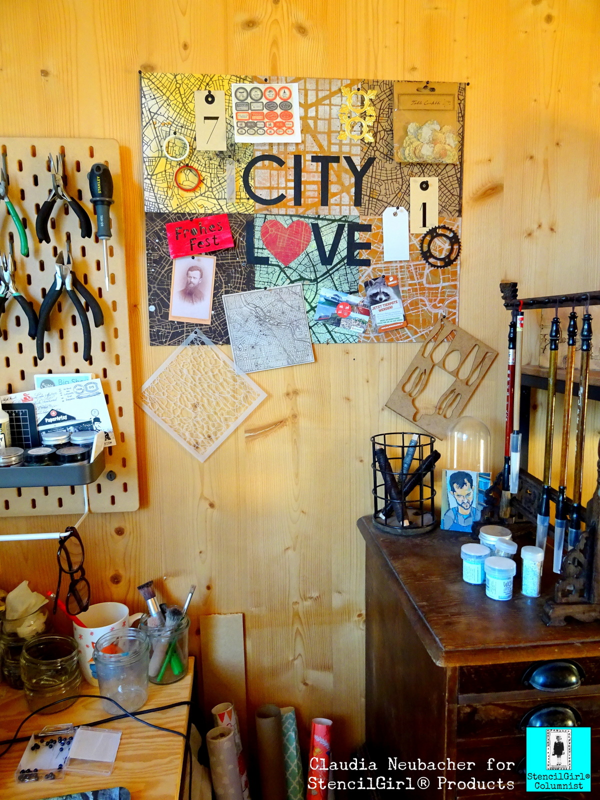


When you take a closer look at it, it reveals some scraps from older projects, one of Mary C. Nasser's awesome stencils I haven't yet used but wanted to play with asap (this one), two rolls of Washi tape that I re-discovered in a box where they definitely didn't belong at all, a printed out sheet with labels for Halloween potions, a left over gold Dresden Scrap, various tags, a copy of a vintage photograph, some tickets from a very inspiring trip to a beautiful wildlife park,...and all these treasures are being displayed on a pin board with a city travel theme - a reminder by itself to restart visiting awesome cities in Europe after all the Cov-19-lock-down-madness and my last year with mostly being ill. 


I love maps in general - so using some of the awesome StencilGirl stencils designed by fabulously creative Mary C. Nasser for this project was the only reasonable option for me, as she actually offers a wide range of gorgeous map stencils to choose from. 

I used these three gems for my self made pin board: 


I love how these three vary in scale and style, yet still they are all three typical map designs, which was important for me, as I knew the visual map characteristic would suffer as soon as I would randomly "throw" stuff on top on my pin board. 

I experimented happily (and a happy mess it was indeed that I created on my desk) with various spray inks and paints I had in my stash, trying them out on different substrates like heavy white aquarell paper, sturdy Kraft paper and black cardboard. 
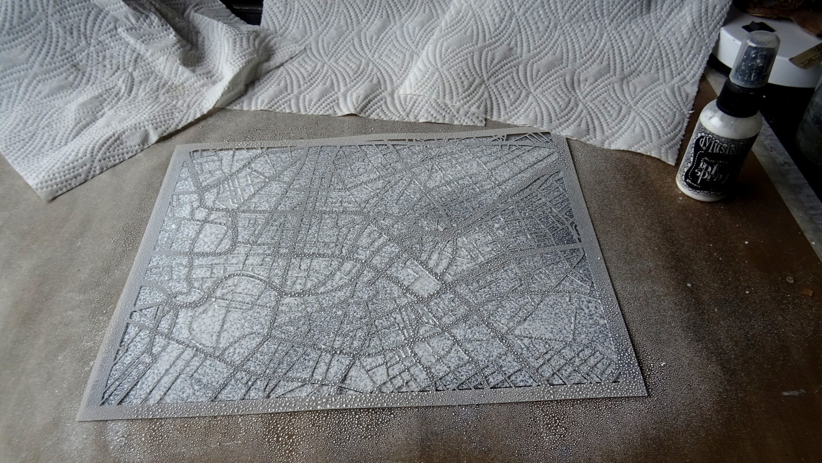

I started with some white Dylusions spray ink on the black cardboard. Then I used the left over wet ink on that same stencil to pull a print using Kraft paper. 


This way I got two results from one spray action and none of the spray ink was wasted. I continued with Distress Spray Stain, Canvas Corp Brands spray paints and Aladin I-Zink dye spray. 


I layered prints...


I misted the white map on the black cardboard with some transparent neon green spray ink in some spots...


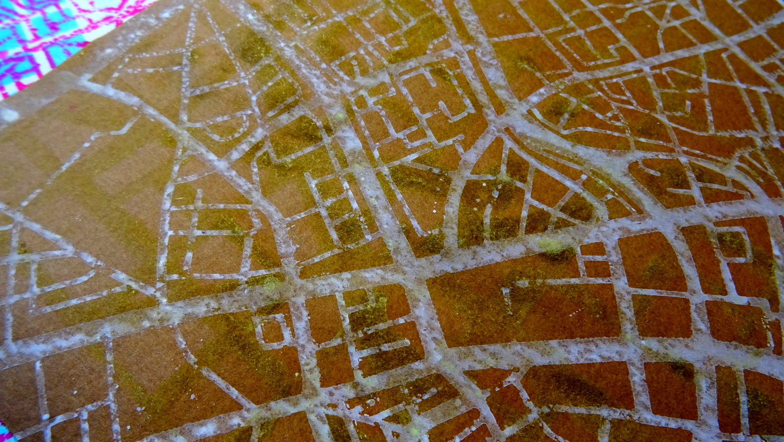
I used the nozzles of the sprays to create splatter and drop marks for a slightly weathered look (as weathered maps tell stories of adventurous travels, don't they?)


I sprayed, printed, splattered, layered and misted away until I had a lovely collection of map papers to choose from (and more papers for future projects, which is always a nice and inspiring thing to have). 


Time to mount six of these beauties onto an A2 sized sheet of thick grey board! 


I roughly cut the papers to size (on my cutting mat using a steel ruler and a small carpet knife) and glued them in place. Then I turned over the grey board and cut off any excess paper along the edges. 


For the City Love quote I used thin black paper and a soft pencil. As I had no compasses at hand I used a roll of masking tape to draw the "C"-outline and then just eyeballed the inner circle. The other letters were drawn using a ruler to make sure they were all of the same width and height. 


I played around with the heart shape until it was narrow enough to fit with the style of the other letters but still "round" enough to stand for an "O". The white cut out heart you can see in the picture was my mask that I used on one of the other map papers I had made. 


When laying out the letters I made sure to not use same distances between them as that does create a poor design that has nothing to do with a good visual typographic rhythm. Letters with round shapes or open spaces to their sides like L, V or A, can be interlaced with their neighbours to form a visual union. Letters that are straight like I, N, E,...need more space between them when standing side by side. So I moved the C slightly closer to the I than the T for example. And the L and V very close to the heart shape. This way I also made sure both words had the same width in the end. 

As the maps' designs were a bit distracting, I used my ruler to make sure my words got glued in position exactly. 


Et voilĂ ! 


As my pin board is very light weight I simply fixed it to my wall using four small nails with wide heads. 


Here are some close ups of the lovely map designs I've created:


And once more the finished pin board in its new spot: 


I hope you like it! When was your last city travel? Where would you like to go next? Ahhh...so many cool places to visit.... 

How about making a pin board to display your latest travel tickets and snap shots on? It's so easy with all the fabulous map stencils you can find in the StencilGirl Shop! Or maybe use them on cotton bags to take with you on your next travels....oh, the many possibilities.... ;)  

Stay healthy and creative! 
Claudia 
xxx


Friday, April 29, 2022

Stenciled Staircase Showcase - by Claudia Neubacher


Hi, servus and thanks so much for stopping by today! This post is actually going to cover several topics - making cheap but beautiful wall art totally from trash - in this case from various furniture- and dish wrappings (yes, I am a hoarder of packaging materials and when you get to furnish a new home you really end up with loads of these), focusing on mindfulness during the creative process and - again - wabi-sabi (which mainly means the beauty of imperfection and which I talked about in my last column HERE). 

But first let's take a look at my finished wall art piece that now decorates the staircase in our timber house. I really love how it turned out but it is difficult to capture in a single picture - so I've made a collage that hopefully makes everything clearer. 


I've actually used a long press board strip that came as part of the packaging of a long sideboard (I think it protected the outer edges of the piece of furniture inside the delivery box from being dented during transport) as a base, the ATC sized panels were all die cut from old cardboard mail envelopes and I used the lovely StencilGirl® stencils on different kinds of crumpled tissue wrapping paper (which had all been used to move dishes from the store or from our flat in Vienna to our house) and one piece of glossy tissue paper from a chocolate box- so this is a pure up-cycled project and I love the idea that this piece of wall art is as sustainable as our timber house! 

StencilGirl® stencils used: 


by Natalie Kalbach


by Traci Bautista


by Valerie Sjodin

by Valerie Sjodin


I especially fell in love with the ATC Mixup stencil from Natalie Kalbach - not just by single ATC background designs on that stencil but rather the combination of them all! I just love how they all interfere with and enhance each other. So my plan was to create a project where all the beautiful different patterns would either be shown in a grid as on the stencil (so one idea was to look at the stencil as one large design instead of nine different small ones, do variations in colour and paper and put these in frames and hang them on a wall side by side) - or shown side by side on a long narrow panel (this idea was mainly sparked by the long press board strip I had managed to save from going to the waste disposal site and by my plan to use it to decorate our staircase as it was a perfect fit there).


As I recently went through another series of stressful dental treatments and had to get an implant as well, my stress levels went up again - especially as some old traumas from complications during dental treatments were triggered - all of which brought back the shaking hands and panic attacks. So right now I am on recovery (and it has already gotten so much better during the last weeks!) and this means I have to make sure I practise awareness and good self care. 


Working with the beautiful stencil designs and all the crumpled tissue papers was a good means to heavily indulge in some visual and tactile joy. 


I also make sure I have an inspiring and calming workspace with some eye candy nearby...


...beautifully glazed cups that hold brushes and other stuff, storage that holds my favourite go-to items and can be put aside in a breath. All of this helps me to relax and enjoy myself sitting and working at my studio desk. 


The picture above shows the press board strip going to be covered with a stippled on layer of DecoArt Americana Chalky Finish paint "relic". Why stippled instead of brushed on? Well, the texture you get by stippling heavy body paint on is just beautiful and adds so much to the whole project! See?


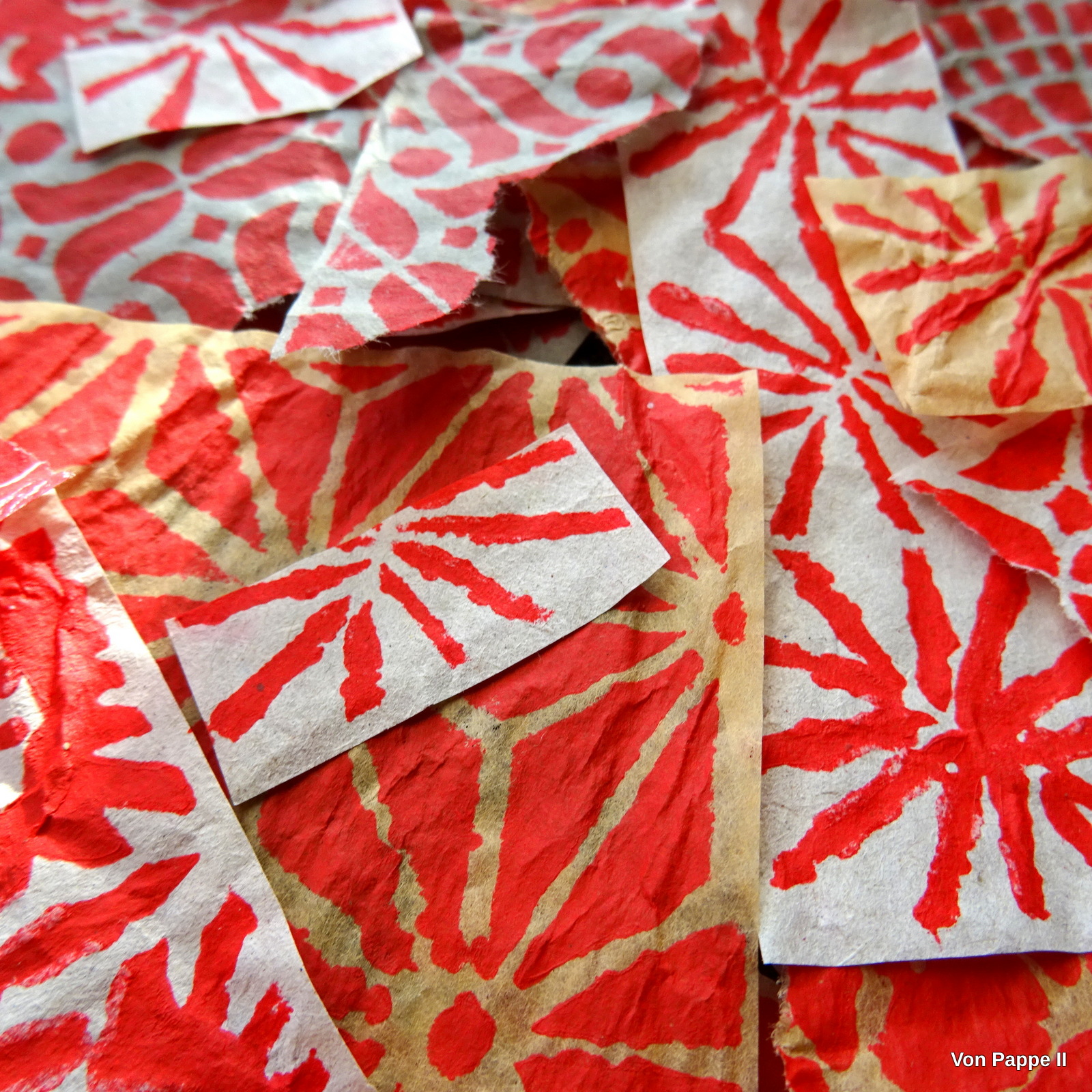
I also used a variety of stipple brushes to do the stencilling on the tissue wrap. I had several sorts of tissue paper - a brownish one, a whitish one and a blue-greyish one...I used Natalie Kalbachs Mixup stencil on all three of them so I could use them all for layering and making wabi-sabi style collages. So instead of using different acrylic paint colours I just went for a single red (a tube of cheap red acrylic paint from a no-name set) and let the different coloured papers do the "tinting". 


I cut all the different ATC designs out by hand, making sure I didn't cut too precisely (remember: wabi-sabi is about imperfection and it's uniqueness of the hand-made). While the paint had dried I had die cut thirteen (and some more) ATC panels from old cardboard envelopes using my BigShot and one of my oldest cutting dies - the Sizzix "ATC & Corners" die designed by Tim Holtz. 


What really helped with focusing on enjoying instead of having to do a lot of planning during the process, was the fact that this project's steps all were quite repetitive ones by nature - perfect to get into a flow and enjoy the rhythm: the rhythm of turning the BigShot handle and inserting a new piece of cardboard, the rhythm of stippling red and dark grey paint through the stencils, the cutting out by hand and sorting the different designs into piles of threes...all of this while feeling the crumpled paper and looking at beautiful patterns and designs. 


Making thirteen small ATC-sized collages was real fun! I just started with one base layer on all thirteen panels and then tore the other ATC sized stencilled sheets to size as needed while I let the designs and how they interfered with each other take the lead. I used DecoArt satin Decou-Page glue and sealant and a soft wide brush to layer and glue the tissue papers in place. I didn't care about smoothing out the glued on layers - more crumples = more texture! We love texture, don't we? 


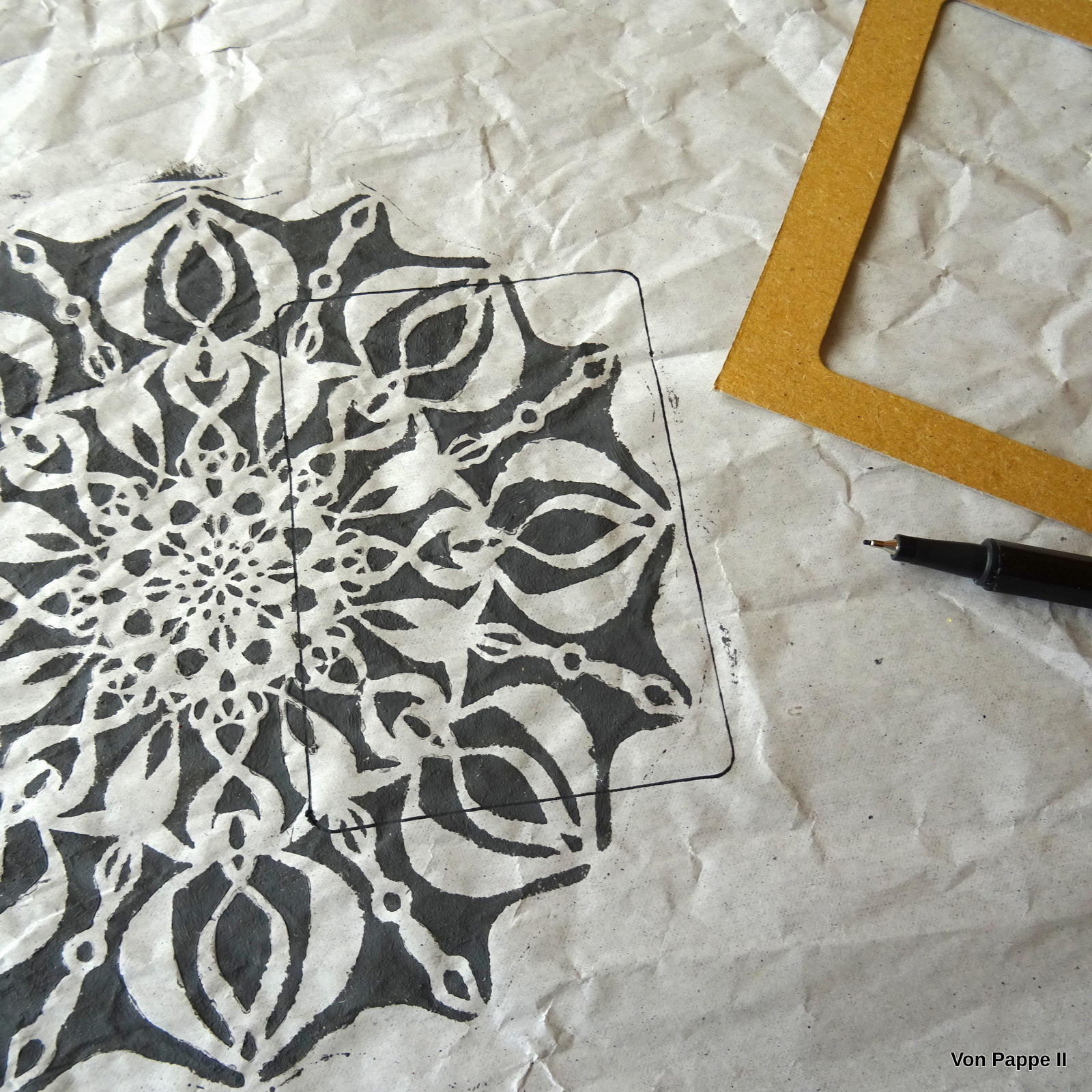
The dark grey ATC layers were done by using the "relic" Chalky Finish paint again with the whole Infinite rose stencil and then using a "seeker" (a left over frame from die cutting the ATCs earlier on) to find interesting sections in ATC format. 


The striking designs in red from the stencils of Valerie Sjodin were done on the transparent glossy chocolate box tissue paper - which is really cool for layering as it tones down the colours underneath (which adds another tone to the mix without having to use additional paint). 


Final touches were added by randomly scribbling paint from a DecoArt media "Carbon Black" Mister using its nozzle across the finished collages. That really helped fuse the designs beautifully. 


Time to mount the finished ATC sized panels to the press board strip! I played around a bit to find the order  I liked best and then fixed them to the strip using double sided sticky foam tape. I didn't measure - I just eyeballed (wabi-sabi!). 


The panel was easy to mount to the staircase wall - six small nails with flat wide heads hold it in place and as it is very light-weight this is pleasingly sufficient. 


I think I need to do more of these on more tissue paper! This is for sure one of the most relaxing and enjoyable projects I've ever made! Just seeing the lovely patterns being transferred in bright red to delicately crumpled and torn paper is a reward on its own (you know - anything weathered and textured makes me happy). I also see a lot of other ways to use this kind of ATC sized collages...on cards, book covers, gift wrapping paper, bookmarks, more wall art,....sigh...;) 


I hope you've enjoyed this post! Stay safe, creative and calm! 
(if you want to take a closer look at all the single panels simply click on the images to enlarge the view).

Claudia xxx