Welcome to another column where I study the work of a master artist and try to extract some useful lessons from it. One of the parameters I use when selecting masterpieces or master works is that something about it should lend itself to the use of stencils - that's why we're all here, right?! So while I deeply adore the work of Vermeer and Rembrandt, I'm not clever enough to be guided by their works while employing stencils. I find more modern artists easier to interpret for this column.
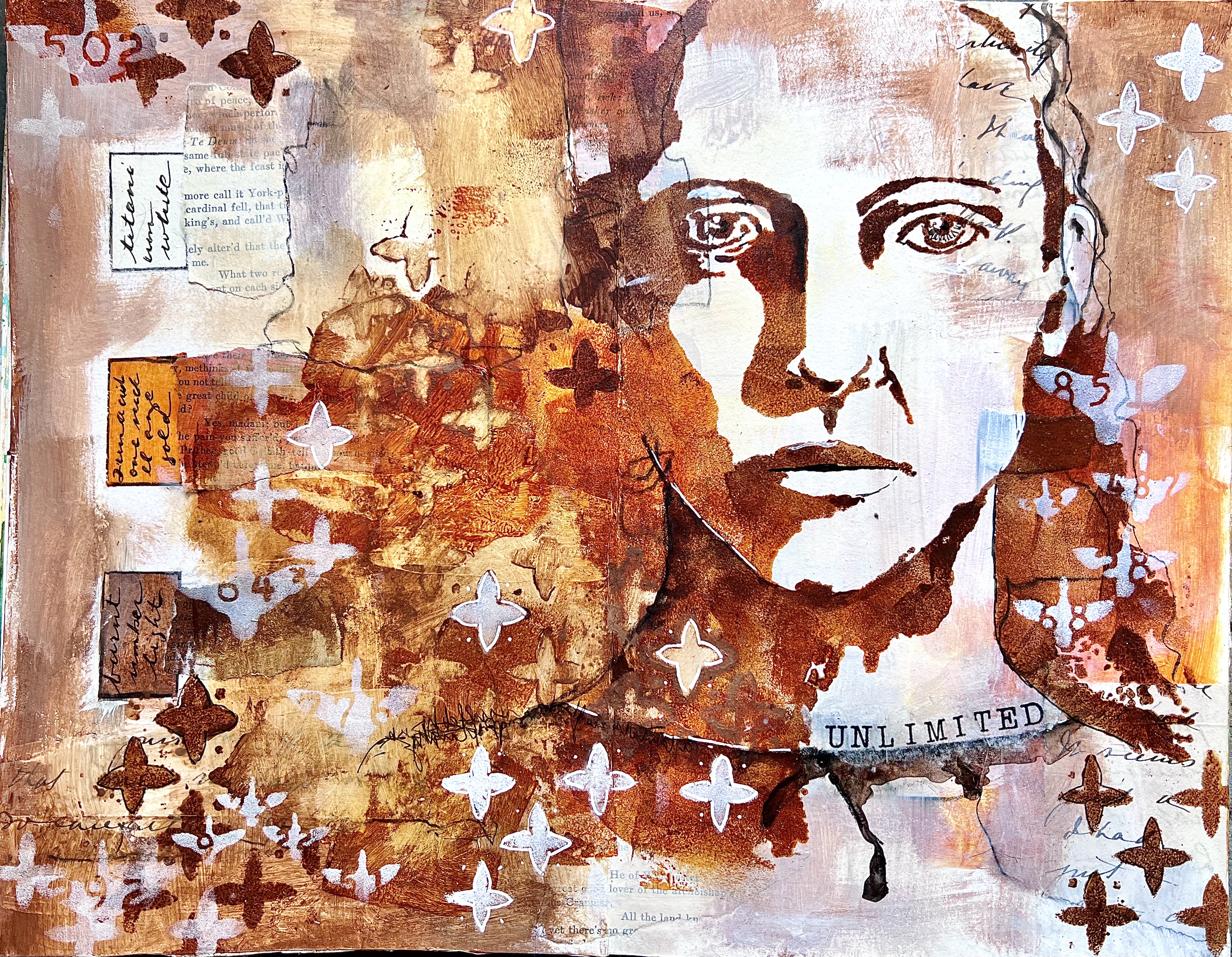
This brings me to the work of a 20th Century American artist, Adolph Gottlieb, and his "burst" paintings. They are - to me - visually arresting. Like many great works, they seem simple at first, but become more complex with deeper study.
| Transformation, 1958, Adolph Gottlieb |
Adolph Gottlieb, (born Adolf, but more on that in a bit) was born to a middle class Jewish immigrant family in New York City in 1903. His father owned a successful stationery company, and it was expected that Adolf would follow in his father's footsteps. That was not to be, however, as Gottlieb was drawn to make art, and worked his way across the Atlantic at age 17 to study in Paris. The period between the world wars was a one of dramatic innovation in the European art world, and Gottlieb was mesmerized by what he was seeing. When he returned to New York he was determined to bring that avant-garde spirit to an American art scene that had become, in his opinion, very provincial. His ambition was to invent a new style, and find a new symbolic language that would speak of universal ideas and themes. When Adolf Hitler rose to power, Gottlieb changed the spelling of his own name in protest; as the atrocities of WWII unfolded, Gottlieb was more and more in search of a way for art to respond effectively.
In times of violence, personal predilections for niceties of colour and form seem irrelevant. All primitive expression (like the myths) reveals the constant awareness of powerful forces, the immediate presence of terror and fear. - Adolph Gottlieb, 1943
The role of the artist, of course, has always been that of image-maker. Different times require different images. Today when our aspirations have been reduced to a desperate attempt to escape from evil, and times are out of joint, our obsessive, subterranean and pictographic images are the expression of the neurosis which is our reality. To my mind, certain so-called abstraction is not abstraction at all. On the contrary, it is the realism of our time. - Adolph Gottlieb, 1947
Gottlieb had by this time become friendly with Mark Rothko, and together they hashed out ideas about abstract expressionism, the picture plane, symbolism, the role of the art - all the things young artists become very passionate about. (I picture them in smoke-filled NYC walk-ups, drinking cheap wine while someone plays a saxophone - very 1950s.)The years immediately after the war saw enormous dynamism in art. "Action Painting" brought an immediacy to the New York art world in works by Jackson Pollock, and color field paintings in Rothko's work. We can see both action and the exploration of color in Gottlieb's work with a series of paintings he called "burst" paintings. Remarkably, he would continue to explore an almost identical composition for many years, sometimes playing with different colors, but often repeating the same colors again and again.
 | |||
| Penumbra, 1959, Adolph Gottlieb |
 |
| A Heavy Matter, 1965, Adolph Gottlieb |
The burst paintings all feature an orb of color floating in the upper half of the canvas, sometimes surrounded by a sort of halo, but not always, sometimes with a black center, but not always. These orbs seem almost to pulsate with force. The lower half of the picture plane is always dominated by a dynamic - almost violent - splash of black. Gottlieb resisted attempts to describe these as abstractions of landscapes. They weren't abstractions of anything, they were just themselves. They were meant to be inscrutable - filled with meaning, but not with a meaning that we might understand. As he said, his favorite symbols were ones that he himself did not understand.
To us, art is an adventure into an unknown world, which can be explored only by those willing to take the risks. - Adolph Gottlieb, 1957
This burst format was one that occupied him for many years. I was at first puzzled about how an artist could spend so many years exploring the same simple composition. But the more I looked at the burst paintings, the more interesting they became. I don't have any idea what they mean either, no more than he did, but they do feel very potent to me.
My project was to see how many ways I could follow these same instructions. I began gessoing a full sheet of watercolor paper in an off-white. I used a brayer to avoid brushstrokes. I also gessoed some strips of paper hinging tape, as I thought I might want to put the final paintings into some sort of book format. Since I wasn't quite sure yet how I was going to proceed, I gessoed both sides of the paper, and then folded and tore it into six tall panels.

I knew I would be using the same two stencils on all the panels, and to add variety and a sense of dynamism to the black "slash" element, I used a dip pen and india ink to scribble quotations from Gottlieb, letting the ink fly wherever it wanted to. The irregular line quality from the dip pen and the density of the ink seemed like a good way to start.

Then, using a sponge, I applied black gesso (I almost always use black gesso instead of black paint because I like its opacity) through Mary Beth Shaw's Curves stencil (S430), turning it into a new orientation each time to create a variety of shapes, allowing the shape to float higher or lower in the plane without any conscious planning.


It then remained for me to paint the "orb" element. I chose Michelle Ward's Fade Circle 6 stencil (S022) and just two paint colors - pink and red. Again, I allowed this compositional element to float higher or lower, and let the circle and its halo swell or contract, all without any thought to what it might mean. They were just themselves.
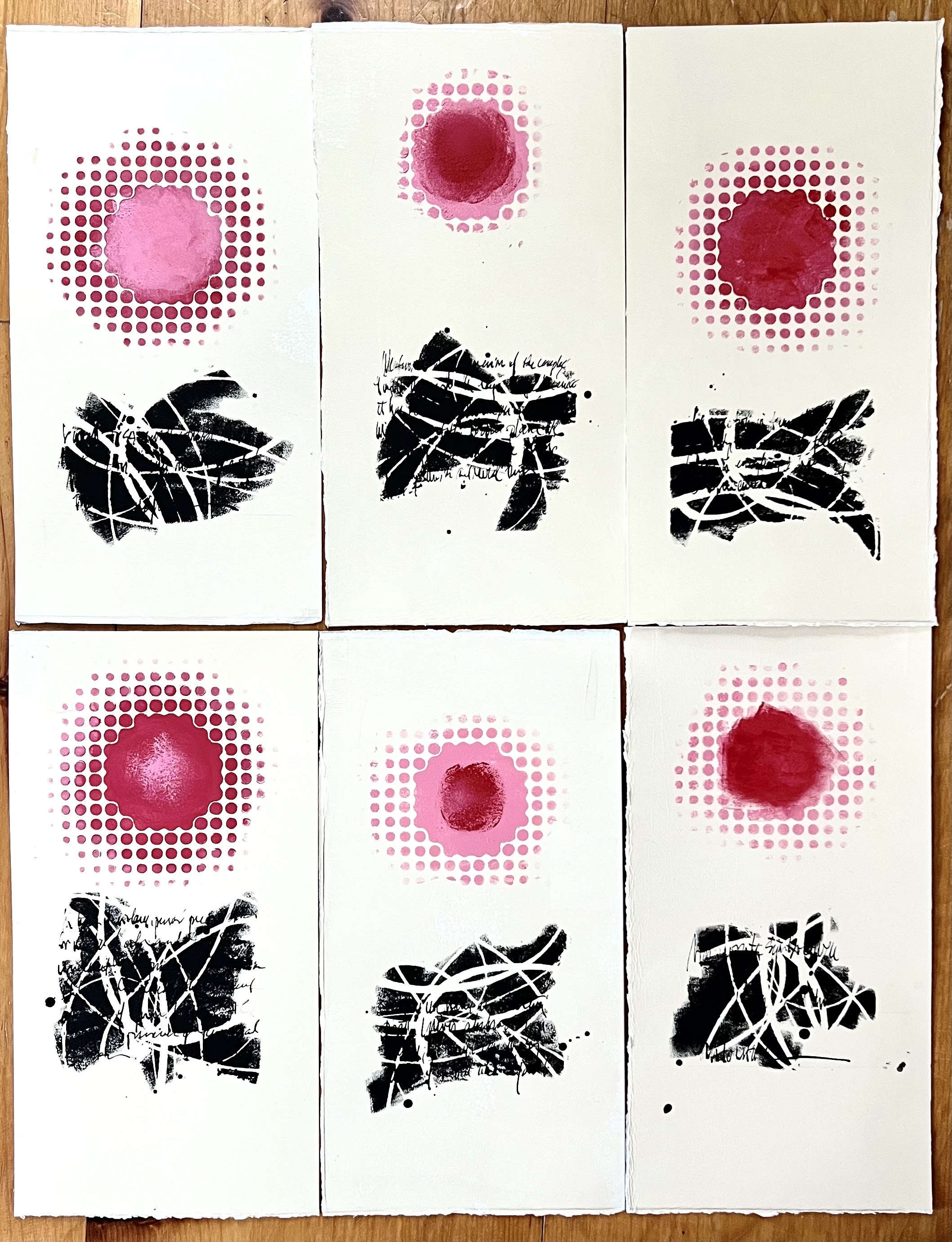
The design principle of unity with variety is very much at work here. The result is a cohesive series of images, all very similar - but in fact, each unique and worth examining. Arranging them is less a matter of meaning (there is no meaning or interpretation to make) and more a question of design. And since I had prepped paper hinging tape, I decided I would put them together into an accordion-fold book.
 | |
| "After Gottlieb" |

There is much to be learned by repeating the same instructions over and over, and I have grown to admire the dedication with which Gottlieb pursued this particular composition over the years. My paintings lack the violent dynamism of his slashes, as well as the organic pulsation of his orbs, but the lesson I drew from his masterpieces is one I hope I have thoroughly learned. Gottlieb died in 1974, and let us hope he is in the realm of universal meaning, where he finally understands it all.
 |
| Ward, Fade Circle 6 S022 |
 |
| Shaw, Curves S430 |