Jungle Love
Jungle love, it's drivin' me mad
It's makin' me crazy
Jungle love, it's drivin' me mad
It's makin' me crazy—Steve Miller Band
My first date with my future husband was to a park in the DC area. It involved a picnic with champagne, a bubbling creek, a snake sighting (with squealing), and a lot of time looking at the summer leaves that were everywhere around us. It was 1982 and I had big hair, rose-colored glasses and was shockingly in love with my best friend, a plot twist for sure. Each year I celebrate Valentine’s Day with off-the-beaten path art in the form of cards or small home décor pieces. Today’s pieces are my interpretation of that particular day. One of the strongest memories were of the leaves that we’d see every so often that were heart shaped. Some had torn around the edges and some were two leaves that had dropped on the forest floor together in that shape. To be honest, I am bewitched by nature but also a bit afraid of the creepy crawlies (hence the squealing reference, but I learned that day to appreciate the calm that nature provides even if I have to squeal once in a while. I’ll never be outdoorsy but I can appreciate my forest forays and those images translate often into my art.
Let’s head back to the jungle. I had many options to choose from when picking my substrate, but I chose to use a trio of 6” x 6” Clayboard panels (Ampersand) for this mixed media piece. Clayboard is made to grab color and while I wanted a little movement, I didn’t want the amount you would get on Yupo or tile. The background was made with Ranger Alcohol Inks and layered Golden heavy bodied acrylic. I have some shots here on creating the background, but I filmed a bit of a time-lapse to give you a stronger tutorial. You can view that here. I choose four greens, a woodsy yellow and gray to become the palette for my jungle. In the video you saw me liberally drop them and then “smoosh” together on a piece of plastic garbage bag. Once dried, the result is a variegation that you could not get if you preplanned it. If you try this technique, be sure to let it dry thoroughly. It took about 20 minutes in my studio. Once dried, I sprayed the front of the clayboard with 91% rubbing alcohol and pressed it into the dried alcohol ink, lifting immediately Repeat (without spray) if that pattern isn’t pleasing to you. Again, let dry thoroughly. I followed the process on the other two boards before continuing.
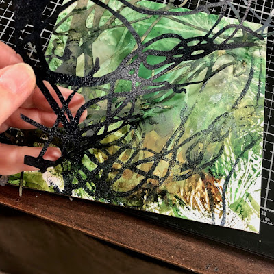
I chose one of Trish McKinney’s many stencil-masks, Looped Bare Wisteria Vine to be used repeatedly for the background. You could use several, but in my mind I liked the repetition of the one. To subtract color from the background, I sprayed the back of the mask with 91% and pressed it into the clayboard. Once dried, I removed it creating a subtle pattern.
To add contrast and texture, I brayered Payne’s Gray Golden heavy bodied acrylic onto the back of the stencil, quickly pressed it down on the board and removed immediately. You could also use a brush or sponge to apply the paint. Natural varied hand pressure created a textural element throughout the board that I love. They also gave me the perfect places to nest my hearts. I set the boards aside to dry and turned to creating some papers for the hearts.
Simple tissue paper was my choice so it would be thin enough to become part of the piece rather than sitting on top. I chose Paper Artsy Blue Oyster, Aquamarine, and Calypso for my heart palette and my metallic, Golden Iridescent Bronze. I love Paper Artsy for their matte finish and color variety and find them here. Thin layers work well on the tissue and they do take some dry well. I did some patterning but didn’t use it on this project, but included the idea here for you. I love SG’s small stencils for mark-making. These marks were done with Seeds and Seth Apter ATC Mixup #2 with a fine, water-based Sharpie marker. A Posca would do the job nicely as well. I also took the time to line the perimeter of each board with a thick black Sharpie so there is a base before the hearts are added.
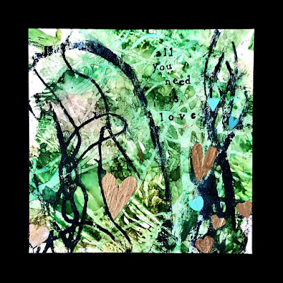
I spent some time freehand cutting hearts of various shapes, sizes and colors. My goal was to fit the size of the heart in the juncture of the vines and to mainly have the hearts in the lower half so there would be space for the verbiage. It felt very Zen-like doing these. Along the way I decided not to use the patterned ones I cut because I already had a strong composition and they interrupted the flow. I also decided I wanted the hearts to be predominantly bronze. It was a surprise for me, but one of those design decisions you make on the fly. I liked how they broke up the jungle yet the repetition of the color was soothing. I did like the matte colored smaller hearts as the supporting shapes. Once placed, they were affixed with Golden’s matte medium brushed onto the board and on top of the heart.
These boards were meant to be a love letter to my husband. We’ve been married thirty five years and together almost 40 so the verbiage I chose was important. There are many ways to do verbiage on art and I use them all. Writing on unsealed alcohol ink can be problematic but it can be done with practice and the right ink. I chose to add my phrases in two steps and began by laying out the words where “I thought” I wanted them. You’ll see the changes in the final project shots. Coming from a paper arts background, I have several sets of alphabet stamps and this one by Hero Arts is often used because of its wonky nature. That wonkiness is what I like to exploit with haphazard placement. Because I would be stamping onto alcohol ink, I chose to use Ranger’s Archival Ink because if stamped quickly it generally won’t reactivate the ink below. I didn’t pay much attention to how well stamped they were since there is a second step. Once dry, the second step uses a dip pen and India ink. I go over the letters and customize by thickening (or not) areas and closing some of the open areas. Other good options to this process would be to add words with stencils and acrylic paint, adding die cut letters, or old book pages. If hand lettering, I would use a dip pen and India ink for the blackest black.
I’m happy with how these turned out and will probably frame them as three separate pieces that are hung together. IKEA makes the best 9” x 9” frame that I just love. However, the possibilities are endless. These could be produced on watercolor paper with the addition of a ground, Yupo, Mineral, or Nara paper. These are all easily found at art stores or even Amazon.
Thanks for sharing in my declaration of love and a glimpse as to what’s behind the art that I do. Most of it is very intentional even if that is only known by me. I’ll share some reference backstory with you. Jungle Love was on the first mixtape that Jim made me our first summer. “Love Resides Here” is an homage to the quilt collaboration in How to Make an American Quilt. That movie continues to touch my heart some twenty plus years later. The other two phrases are fairly obvious. I am very blessed to have had someone who has been my rock not only through my acute cancer phase, but has looked the other way when I’m a bit out of sorts.
As always, I appreciate my time on the blog and love to share what I’m doing. To see more of my art, follow me on Instagram and Facebook at Nancy Curry Art. For my newsletter announcing art sales and class schedule, blog, and full galleries, hop over to Nancy Curry Art.


Oh em gee. Steve Miller band-my brother was a roady with him. Managed the stage stuff. Takes me back. Love the process and results. I will be playing with this.
ReplyDeleteThank you for sharing you process and your life. You are an inspiration!
ReplyDelete💕 this, Nancy! TFS!
ReplyDelete