
I'm starting a new theme for my quarterly column: Master Pieces. The idea behind this is not to claim I am making masterpieces - far from it - but to use master works as inspiration or a way to examine something about art making. The inspiration may be subject, composition, technique, mood, color palette - who knows? But I do know I have never left a museum without being inspired.
This spring I was visiting my daughter in New York City, and we decided to spend our Sunday at the Museum of Modern Art. I will confess, I'm not a huge fan of modern art, but it's always a thrill to visit some of the greats in person every few years - Les Demoiselles D'Avignon, by Picasso, The Starry Night, by Van Gogh - and so many others. One of the joys of looking at masterworks up close is the chance to glean some insights into subtleties - a passage of brushwork, a bit of dog hair caught in the paint - that rarely come through in art book color plates but that deepen our admiration of the artist's hand. We strolled the galleries, and I kept an eye out for a painting that could become the masterpiece of my first column in this series, always mindful that the work that I created from this inspiration would have to feature stencils. And there it was - the perfect master piece:

So my challenge was to make something inspired by this work. I love working with wax - or I should say, I love encaustic paintings. The wax itself somewhat fills me with dread; so much is unpredictable about working with hot wax. But one thing that I know for sure is that you can't put wax over acrylic paint; it will just peel off eventually. So right from the start, I was forced to think about surface and process. If I wanted the top layer of my painting to be wax, what would the bottom layers be? How would I achieve that thickness, that coarseness that is so dominant in the Jasper Johns work? I used a 9x12 canvas-over-board panel, for rigidity, and prepped it with white gesso - adding hints of charcoal and pale gray pastel chalks, some light ochre chalk, some graphite - any dry and gritty/dusty medium I had on hand. This would give the wax a toothy surface to grip, as well as giving the overall work some color and tonal variation within the pale gray-white-beige range.
 |
| Flourish Alphabet Uppercase by Ann Butler L644 |
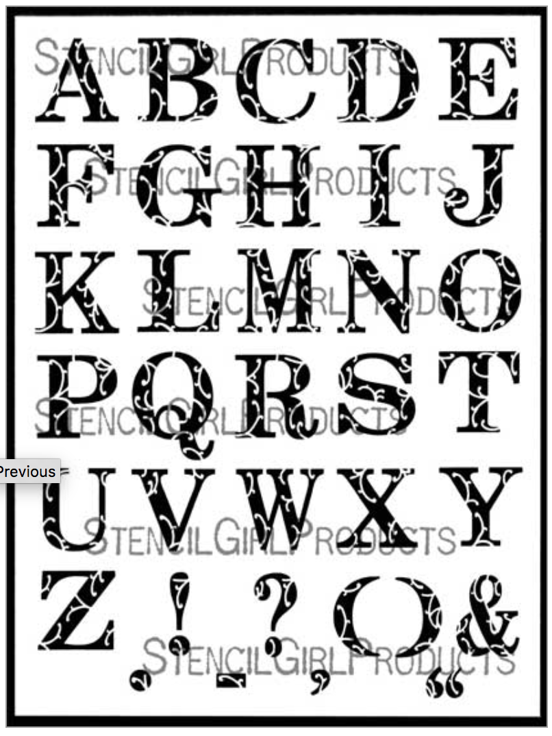
I decided to use the Flourish Alphabet Uppercase, by Ann Butler, to make my version on the Johns painting. It's not at all humdrum or mundane (look at those pretty squiggles!) but it is closest to the hardware store numbers in the regularity of the letters (in other words, they don't have a hand-drawn appearance). I used a thick and uneven application of light modeling paste through this stencil onto my board, and deciding that because the squiggles didn't exactly match the aesthetic of the White Numbers, I smudged and obscured them. I used old brushes with stiff bristles to rough up the texture, and added more modeling paste in between the letters. I had to be sure not to accidentally put the letters in their proper alphabetic order, or spell simple words. I was focused on the texture, the thickness of the modeling paste, the balance of tone, thinking ahead to how I would apply the wax. I was in the process, and deliberately avoiding meaning or even attachment to the end result. I sanded it in some places and added more dry medium - chalk, charcoal, graphite.
 |
| "White Letters" before wax was applied |
 |
| White Letters with encaustic wax |
Ultimately, I think I like my "master piece," although I doubt any visitor to my house will give it much scrutiny. I hope they do, though. In any one bit of the surface there is complexity that invites attention. Yet below the surface, a series of recognizable symbols from everyday life, as if glimpsed through the fog, is simultaneously familiar - and inscrutable. Ideally, great art presents us with familiar things in an unfamiliar way. We thought we knew what we are looking at, but we come away with questions that lure us back to look again. This is the gift of studying a master.
What interesting History behind this work...Love your results! ~ Ann Butler
ReplyDeleteLove this column! Your inspiration, your search for the right process and techniques, and your fabulous results - thank you, and congratulations!
ReplyDelete