Wednesday, January 31, 2024

Carol Ponsford: Let's have some fun in our journal!


Hello creatives, Carol Ponsford on the blog today to share a journal page I created using 
Pam Carriker's "Create Face" #S646 and an alphabet section of #L60 stencil.
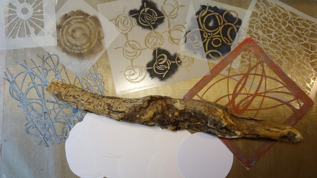
 I used several other stencils for the background which I will have listed at the bottom of this post.


To start I spread a layer of Dina Wakley Media White Gesso on the journal page with 
an old gift card. After the gesso is completely dry, I used my fingers to loosely 
spread and blend a variety of PaperArtsy Fresco acrylic paint colors all over the page except 
where I planned to put my focal point on the page. (for this page it was in the bottom left)
s

Next (while the paint is still damp), I laid a stencil on top of the paint and using a baby wipe,
I rubbed through the stencil to remove the paint and leave the stencil pattern on the page.


I then started layering some paint on top of the page by dabbing paint through a 
different stencil. I repeat this process using several paint colors with an assortment 
of stencils. Once I had the look I wanted I set this aside to dry. 


Then I went back into areas with some white gesso and lightly covered some of the areas
 (as shown below), I added an additional layer of color in some areas. This process of 
layering creates a great deal of depth that I like because I feel it gives more interest to the page.


I also used the edge of the gift card to add some vertical lines by dipping the 
edge in some paint and lightly placing it on the page and swiping it downward. I let 
this dry before going back to do some stenciling as a top layer as shown below.


To add the face I first lightly outlined where I wanted her hair to go since I 
wanted it to go beyond the edge of the stencil. I laid the stencil 
down and sponged the reddish paint for the hair and lips of the girl.


I then took the black paint and sponged the eyes, nose, and neck areas. I wasn't sure if
I wanted to have the diamond on both eyes or just one so on a separate piece of scrap paper
I sponged on the eyes and took a black Posca marker and drew the diamonds 
around them as shown in the picture below. I auditioned one, then both on the face to see how 
I wanted to finish the face then proceeded to add the diamond on the left eye only.
I also added some additional width to the neckline because it looked a little wonky, 
so I just continued the black lines as far to the left as needed to be in proportion.


I used a Micron pen to trace the letters from the alphabet stencil to say 
"Send in the clowns" and then filled them in with a black Posca marker. I 
ended up using a fine white pen to add highlights to the lettering.


To finish off the page I took an empty tape roll and dipped it into black 
paint and added some rings around the page. I also took a black Posca marker to 
outline the hair and face and sketched some lines around the edge of the page.

Here is a list of all of the stencils and PaperArtsy colors I used on this page:

Stencils                                                                     PaperArtsy Paint
S646 - Create Face                                              Snowflake                         Blueberry
S003 - Repeating Fleur de Lys                            Little Black Dress             Blew
M160 - Organic Roots #1                                    Zesty Zing                        Wisteria
M031 - Journal Texture #6                                  Slimed                               Electric Violet
L651 - ATC Mixup                                              Green Patina                     Cerise
L601 - Alphabet                                                   Smurf                                Scottish Salmon 
Jan 2022 StencilClub Pattern Party                      Peach Nectar                     Cherry Red


Thank you so much for joining me today on the blog. I hope you 
will find some of the techniques I shared helpful to jump start work 
in your journal or artwork. Until next time, happy creating!


D6859F19-84FC-4D41-9C31-F614553BCBAD_1_201_a.heic.jpg


To see more of my work please visit my Instagram page.


Monday, January 29, 2024

Journal Spread with Stenciled Background by Tracy V


Hi Eveyone!

It's Tracy V. with my final StencilGirl blog post. I have loved, loved being a part of The StencilGirl Creative Team for the past two years, but last year I returned to full time work and have had to let some things go. While I do not art as often as I'd like to anymore, this mini journal helps me keep the creative juices flowing in shorter time spurts. I also love to use my stencils to make backgrounds - a quick and gorgeous way to create a backdrop for just about anything - like these black and white images from a bridal magazine! It has been a pleasure sharing my stencil art with you all. I hope that you will follow me to catch my art ventures when I can find the time, and enjoy this last project!

Tracy V.

SUPPLIES:
STEP 1: Using the mini gel plate create a checkered pattern alternating between two paint colors, then stencil over top each square in the opposite color.


STEP 2: Use white Gesso to soften the lines between the squares of color.


STEP: 3: Stencil smaller shapes over the white areas in different colors, and soften the edges with Gesso once again.


STEP 4: Draw designs over the white area in black ink pen.


STEP 5: Adhere your black and white images with the matte medium, dry and highlight with Gesso once more.


STEP 6: Stencil over the white areas once again with a new stencil and color paint.


STEP 7: Make some outline marks and/or designs on your images using white gel pen.


STEP 7: Outline your images with white dots using the POSCA marker.


VIDEO TUTORIAL:


Follow me!
Instagram


Tuesday, January 23, 2024

Anouk (Creanouk): Inspiration is everywhere


Hello beautiful artist, Anouk here today to share another fun art journaling page. I'm a very intuitive art journaler, but sometimes I crave for some sort of inspiration to get me started. For me, inspiration can come from anywhere. Sometimes it's just the mood that I'm in or I get inspired by a song that I heard on the radio. A few months ago I even got inspire by the colours of a toy that my son played with. Inspiration is a weird thing, isn't it. It can hit at any random moment. So it would be no surprise to you when I tell you that this 
particular page was inspired by a shampoo bottle. Yes. You read that correctly.
When I was brushing my teeth and thought about this blogpost my attention was drawn to the shampoo bottle. I suddenly noticed the gorgeous etiquette with a watercolour print. I just received these two beautiful stencils from Stencilgirl® and thought it would be an amazing fit.
So the next morning I took my idea to my art desk and and I created this page.

Stencils used

Stitched Flower (M325)

01. Base Layers
 
As always I'm setting up my base layer with Gesso and Collage.
Because I wanted to use watercolour in a later stage I began with a layer of Clear Gesso. But when I started collaging I figured that I didn't want to cover up the spine with paper so I applied a very rough blended layer of white gesso on top of the packing tape that was already there from the binding.


02. Modeling Paste

Next I applied a thin layer of Modeling Paste through the Loose Mum (M334) stencil on the upper part of the page.


03. Watercolour and Stencilling

I wanted to create an abstract watercolour effect with some (almost) hidden stencilling. I wanted the lower part of the page flow in a soft way. So I grabbed the Stitched Flower (M325) and applied the watercolour through the stencil. Then I grabbed the stencil, who was still wet, and stamped it directly on the page.

To create more flow I add some more watercolour and dabbed it clean through the stencil with a baby wipe. I kept playing with it until it looked the way I wanted and realised that I didn't like the colour green. So I grabbed some coffee and I blended it until it had the colour that I prefered.


04. Gesso is my best friend

The left side of the page was a little too harsh for me. So I grabbed the Stitched Flower (M325) stencil again, and this time I used a little bit of White Gesso to soften up part with the watercolours on the left. The best part about stencilling with Gesso is that it becomes translucent when it's dry. This creates a very beautiful effect when you use it on top of watercolour.


05. Stencil Butter

TWC Stencil Butter is a hard favourite of mine. My inspiration had some beautiful golden pattern on it so I knew I had to incorporate that somehow in to my page. I also love to use a stencil in a few different ways on my page so it was no hard to decision to use  Loose Mum (M334) for this finishing touch. 


06. Finishing Touches

I have a few things that I always do when I'm done with a page. Some things are such a part of my process that I do them without thinking. I always make a few marks with my pencil, splatter some ink and of course add a few words.


And here it is! My page that I why inspired to make by a shampoo bottle. Inspiration is everywhere! I hope that you enjoyed this page and that it can lead to an inspiration on its own. I also made a reel that I'll share on Instagram.

Productlist

Handmade journal
Vintage Music and Book Paper
Tea Bags
Type Writer
Amsterdam White Gesso
Amsterdam Clear Gesso
Amsterdam Modeling Paste
Mod Podge Matt Instant Coffee Prima Marketing Tropical Watercolours
TWC - Stencil Butter Champagne Gold

~
Thank you so much for reading my blog post. I hope that I have inspired you to create today! My name is Anouk or Creanouk on social media, and I'm an all-round creative from the Netherlands. I love art journaling because I can put my heart and soul into it. You can find my work on Instagram and Youtube.


Friday, January 19, 2024

Texture Media Mobile - by Claudia Neubacher


Servus, hi and welcome to today's share of weathered textural - easy to make - goodness! 
I was in need of some wall decoration for our guest room (which is our son's room in the first place when he stays with us in the house) and as we are living in a solid wood house surrounded by mountains, lakes, fields and forests, I wanted this home decor piece to reflect all of that. 


When I made the discs for my mobile my goal was not only to create my interpretations of all the amazing textural beauty I find on my forest walks around the house, but also try out various texture mediums and how they behave when being used with stencils. Some of these experiments turned out way better than I had expected, others showed the decreasing level of control the bulkier the texture medium got...and then there were some truly happy accidents as well of course...but let me start with the first steps.

What did I use to create my mobile?


As you can see in the picture, I've used a piece of drift wood from the lake (about 40cm/16"), sixteen die cut card stock discs in two different sizes and a collection of StencilGirl stencils that provide patterns especially apt to create intriguing (abstract) detail when using only a small section of the design. 

In this case I've used Seth Apter's Urban Insiders Square Stencil (M058) and Techno Inisiders Circle Stencil (M086), Mary Beth Shaw's Curves (S430), Scribble Roses (S525) and the smallest stencil from the StencilClub October 2016 - Mary Beth's Private Collection - set, Mary Nasser's Abstract Water surface stencil (S898) and Trish McKinney's Dune Grass mask (S659) to play with. 

I die cut my sixteen circles using the two moon background cutting dies from the Tim Holtz "Moonlight" dies set. What I especially like about these is them not being perfect circles. Instead they are a bit wonky in shape and the set provides them in two different sizes - perfect for a make that was meant to have a nature feel to it. 


I primed the different pairs with different shades and mixes of beige DecoArt Chalky Gesso, brown Vintage Effect Wash and Dark Chocolate Americana acrylic paint. I also made sure there were a lot of brush strokes visible as that adds to the textural feel of the project. 


Once these had dried my texture medium experimenting session was ready to start! Using a palette knife and the Dune Grass mask I applied Goya "Antik Effekt" paste - a paste that is meant to produce cracks - the smaller the thinner the application. 


In my case I applied it too thinly, so hardly any cracks showed. To still add some texture, I fetched my heat tool and created some bubbles (which you can see in the picture below). Not too many and not too large ones though...just a hint around some of the edges (you can even spot some very tiny cracks close to my thumb, but I really love the bubbles and how they make the surface look rough and worn...so what usually is the result of an accident by overheating not yet dry pastes or paints can also be done on purpose to save texture paste results you are not content with ;)


My further experiments included various texture pastes like DecoArt media white Crackle paste together with the Abstract Water Surface stencil...


...that tore off some of the painted base layer when I removed it and revealed the rough paper surface of the die cut circle. A very happy accident from my point of view as the result reminds me of weathered bark and I think I wouldn't have got a result like this if I had tried to create this effect on purpose. 

The DecoArt media Texture Sand Paste was of course not easy to apply through the Scribbly Roses stencil. As it wasn't possible to apply it evenly with a palette knife, I rather dabbed it on here and there and tried to remove the stencil as carefully as possible. The highly textural result though was such a reward! I love it! 


Of course - REMINDER! - I immediately put all the used stencils into a pan filled with hand warm water, so none of the pastes would dry and permanently stick to the stencils (and thus ruin them). Keeping them in the pan underwater makes cleaning afterwards a piece of cake and you can go on working on your project without having to run to the sink to clean each stencil right after use each time. 

As most pastes do bubble when you use a heat tool to speed up the drying process, I decided to let my texture discs dry naturally overnight. This way I could be sure none of the pastes would react when being heavily loaded with paint washes (which was the plan for the next day). 

I used heavily diluted DecoArt media fluid acrylic Raw Umber and a wide soft brush to apply the wash quite loosely here and there to my circles, making sure the paint would create puddles here and there. I wanted an as uneven as possible result, so I got really messy and repeated the wash step several times (as sometimes you only see how much pigment has really ended up in a spot once it has dried...often the wet spot looks a lot darker and you find you have to go in again after it has dried). 


As heat drying would cause the water-pigment-mix to float and scatter, I let everything dry naturally again. This time it took about two to three hours maybe (yes, I had really soaked my circles to the point where the paper substrate needed to be handled with care to not tear it when moving it around).


But the results were so worth the wait! And I could use the heat tool for the very final drying phase to make sure all was really dry again. 


In the meantime I had die cut the other sixteen discs from various left over scraps from previous projects to use as "back" sides. 


And I also browsed my stash for three nature material "weights" to keep the mobile's strings straight. I found three little hagstones that were just the perfect fit (just look at the texture!!!). 


To fuse the circle pairs and the mobile parts, I used rough string and Tacky Glue (as that dries really fast). 


I made sure each texture circle sat at a different height compared to the neighbouring strings to add as much natural "randomness" to my make as possible. The three strings were then simply tied to the drift wood piece and that got a cord loop as a hanging device. Done! 


Our son's/guest room really needed some piece of atmospheric decoration and I was absolutely happy with how my nature inspired mobile turned out. And of course the texture-stencilling-experimenting session was great fun, too! 


I found that the loss of control that bulkier pastes bring, gets more than outweighed by the beautiful random results that give very natural looking effects. And by going by a monochrome colour scheme I really made the textures and patterns the stars on this project. Will definitely do this again. And I hope you will give it a try, too!


Hugs,
Claudia xxx