Showing posts with label texture paste. Show all posts

Friday, January 19, 2024

Texture Media Mobile - by Claudia Neubacher


Servus, hi and welcome to today's share of weathered textural - easy to make - goodness! 
I was in need of some wall decoration for our guest room (which is our son's room in the first place when he stays with us in the house) and as we are living in a solid wood house surrounded by mountains, lakes, fields and forests, I wanted this home decor piece to reflect all of that. 


When I made the discs for my mobile my goal was not only to create my interpretations of all the amazing textural beauty I find on my forest walks around the house, but also try out various texture mediums and how they behave when being used with stencils. Some of these experiments turned out way better than I had expected, others showed the decreasing level of control the bulkier the texture medium got...and then there were some truly happy accidents as well of course...but let me start with the first steps.

What did I use to create my mobile?


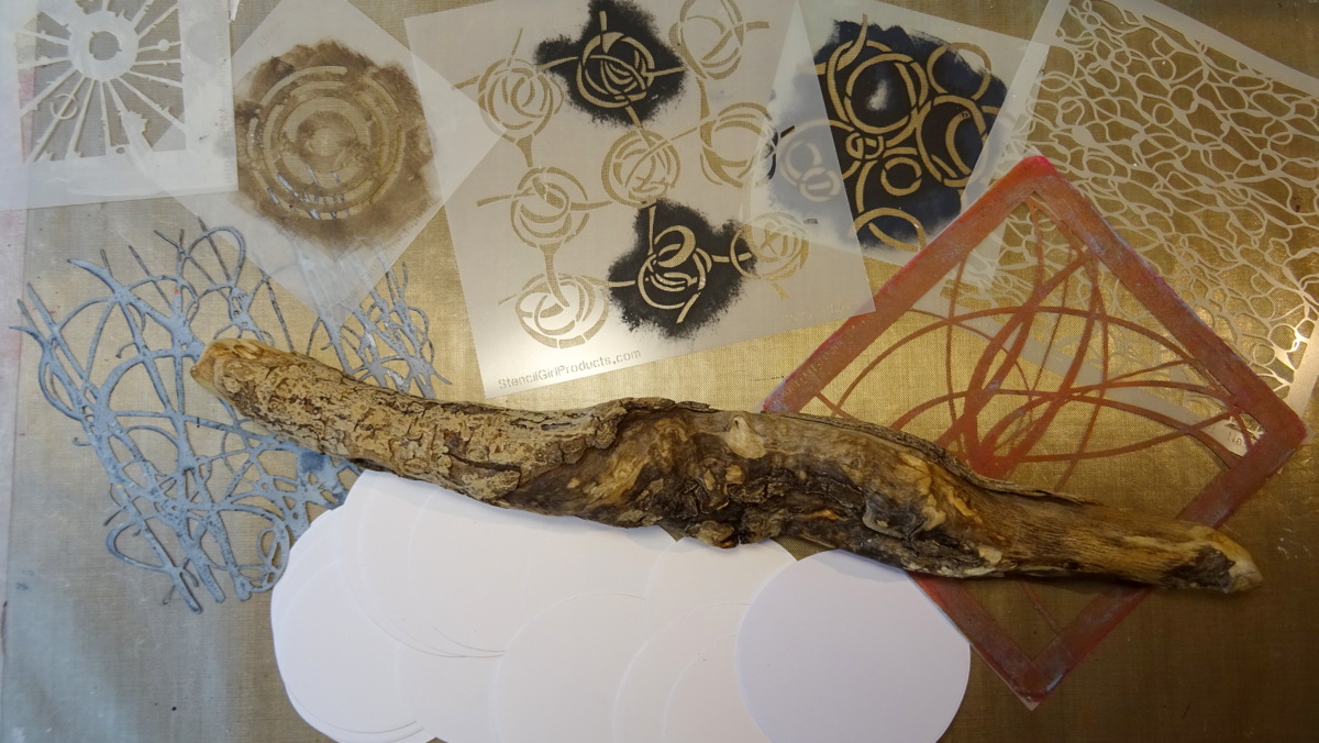
As you can see in the picture, I've used a piece of drift wood from the lake (about 40cm/16"), sixteen die cut card stock discs in two different sizes and a collection of StencilGirl stencils that provide patterns especially apt to create intriguing (abstract) detail when using only a small section of the design. 

In this case I've used Seth Apter's Urban Insiders Square Stencil (M058) and Techno Inisiders Circle Stencil (M086), Mary Beth Shaw's Curves (S430), Scribble Roses (S525) and the smallest stencil from the StencilClub October 2016 - Mary Beth's Private Collection - set, Mary Nasser's Abstract Water surface stencil (S898) and Trish McKinney's Dune Grass mask (S659) to play with. 

I die cut my sixteen circles using the two moon background cutting dies from the Tim Holtz "Moonlight" dies set. What I especially like about these is them not being perfect circles. Instead they are a bit wonky in shape and the set provides them in two different sizes - perfect for a make that was meant to have a nature feel to it. 


I primed the different pairs with different shades and mixes of beige DecoArt Chalky Gesso, brown Vintage Effect Wash and Dark Chocolate Americana acrylic paint. I also made sure there were a lot of brush strokes visible as that adds to the textural feel of the project. 

Once these had dried my texture medium experimenting session was ready to start! Using a palette knife and the Dune Grass mask I applied Goya "Antik Effekt" paste - a paste that is meant to produce cracks - the smaller the thinner the application. 


In my case I applied it too thinly, so hardly any cracks showed. To still add some texture, I fetched my heat tool and created some bubbles (which you can see in the picture below). Not too many and not too large ones though...just a hint around some of the edges (you can even spot some very tiny cracks close to my thumb, but I really love the bubbles and how they make the surface look rough and worn...so what usually is the result of an accident by overheating not yet dry pastes or paints can also be done on purpose to save texture paste results you are not content with ;)


My further experiments included various texture pastes like DecoArt media white Crackle paste together with the Abstract Water Surface stencil...


...that tore off some of the painted base layer when I removed it and revealed the rough paper surface of the die cut circle. A very happy accident from my point of view as the result reminds me of weathered bark and I think I wouldn't have got a result like this if I had tried to create this effect on purpose. 

The DecoArt media Texture Sand Paste was of course not easy to apply through the Scribbly Roses stencil. As it wasn't possible to apply it evenly with a palette knife, I rather dabbed it on here and there and tried to remove the stencil as carefully as possible. The highly textural result though was such a reward! I love it! 


Of course - REMINDER! - I immediately put all the used stencils into a pan filled with hand warm water, so none of the pastes would dry and permanently stick to the stencils (and thus ruin them). Keeping them in the pan underwater makes cleaning afterwards a piece of cake and you can go on working on your project without having to run to the sink to clean each stencil right after use each time. 

As most pastes do bubble when you use a heat tool to speed up the drying process, I decided to let my texture discs dry naturally overnight. This way I could be sure none of the pastes would react when being heavily loaded with paint washes (which was the plan for the next day). 

I used heavily diluted DecoArt media fluid acrylic Raw Umber and a wide soft brush to apply the wash quite loosely here and there to my circles, making sure the paint would create puddles here and there. I wanted an as uneven as possible result, so I got really messy and repeated the wash step several times (as sometimes you only see how much pigment has really ended up in a spot once it has dried...often the wet spot looks a lot darker and you find you have to go in again after it has dried). 


As heat drying would cause the water-pigment-mix to float and scatter, I let everything dry naturally again. This time it took about two to three hours maybe (yes, I had really soaked my circles to the point where the paper substrate needed to be handled with care to not tear it when moving it around).


But the results were so worth the wait! And I could use the heat tool for the very final drying phase to make sure all was really dry again. 


In the meantime I had die cut the other sixteen discs from various left over scraps from previous projects to use as "back" sides. 


And I also browsed my stash for three nature material "weights" to keep the mobile's strings straight. I found three little hagstones that were just the perfect fit (just look at the texture!!!). 


To fuse the circle pairs and the mobile parts, I used rough string and Tacky Glue (as that dries really fast). 


I made sure each texture circle sat at a different height compared to the neighbouring strings to add as much natural "randomness" to my make as possible. The three strings were then simply tied to the drift wood piece and that got a cord loop as a hanging device. Done! 


Our son's/guest room really needed some piece of atmospheric decoration and I was absolutely happy with how my nature inspired mobile turned out. And of course the texture-stencilling-experimenting session was great fun, too! 


I found that the loss of control that bulkier pastes bring, gets more than outweighed by the beautiful random results that give very natural looking effects. And by going by a monochrome colour scheme I really made the textures and patterns the stars on this project. Will definitely do this again. And I hope you will give it a try, too!


Hugs,
Claudia xxx


Tuesday, August 11, 2020

Happy, a mixed media scrapbook page by Sue Plumb


Hello stencil lover!
It's Sue Plumb here with you today to share my latest project for the StencilGirl Creative Team. Today's project was created for our current theme of "Passages". This theme had my mind going in several different directions; but in the end I decided to interpret the theme quite literally, and create a scrapbook layout that documented a special passage in my life. 

Here's a look at my layout, simply entitled "Happy"...


This layout not only refers to an actual passage (a corridor at the hospital) but it also marks an important passage of time for myself and my boys. I am thankful that on the day this photo was taken that I took the time to write down my feelings. (I will share my journaling with you later in this post.)


With my subject decided and photo printed, it was time to get started on my page. I began with a sheet of heavyweight white cardstock and Distress Oxides in the shades of Picked Raspberry and Seedless Preserves. I applied the first ink to my non-stick craft mat, added a spritz of water, and then swirled the water through using my fingertip before laying the cardstock over the top to absorb it. I then repeated the process with the second ink and the end result was a vibrant, watercolour style background.


Once my initial layer of colour was down, it was time to pull out my stencils and start building some layers on my page. The first stencil I chose was the 4x4" stencil included in the StencilGirl Club Rex Ray-esque collection. This collection of stencils was designed by Valerie Sjodin, and the small stencil I selected from the set features a block style pattern that is almost brick-like in appearance. I used teal Archival Ink and a small sponge to apply the pattern in three places surrounding the focal area of my layout.


Now it was time to add some texture to the page. But which stencil to use was the question? Drawing on the theme of my layout, and how the passage of time had seen my boys come "full circle" to this moment, I chose a stencil with a lovely, loose circular pattern called Circles in the Sand, designed by Roxanne Evans Stout. I then used a palette knife to apply some lilac coloured texture paste through the stencil over the top of the inks. The free flowing pattern of this stencil contrasted nicely to the structure of the first one I had used. 


Although happy with how my background was looking at this point, I really felt that it needed some contrasting highlights to provide more depth. I used one of my very favourite stencils - Organized Chaos by Cat Kerr, which I combined with gorgeous gold glaze from Vicki Boutin.  


Now satisfied with my background, I turned my attention to the focal area of my page and to creating some papery layers. I started with a heart print paper bag to act as the anchor, and it was also where I was going to store the journaling that I had written onto a couple of pieces of patterned paper.


Next, I added some pieces of patterned paper from the Cocoa Vanilla Studio 'Bohemian Dream' collection, which features pretty pink / purple / blue tones and gorgeous floral elements. I also added a couple of paper doilies and some frayed gauze, before adding my photo on top. 


I used a variety of pieces from the same collection to embellish my layout including die cuts, stickers, and a chipboard title. I also fussy cut a few pieces from a floral paper and tucked them in around the photo mat.


If you would like to hear the story behind this layout, here is what my journaling read:

A big day for us today! Back to where it all began for the boys 4 year old (and final!) development assessment as RBWH. Walking the hallway lined with photos, through that glass door and into those never forgotten sounds and smells of the NICU still made me tear up and catch my breath. I had to look away from all the tiny, fragile patients in their "boxes", and the tired, bleak faces of their anxious mothers, because it breaks my heart to know what they are going through.

It is good to know our participation in this program over the past 4 years has provided valuable data to researchers to help care for very premature and extremely low birth weight babies born in future.
Before we left I took a moment to pause in this spot with my boys. At the end of the hall behind us are rooms full of memories - the place I first saw my them, touched their skin, held them and fed them. Moments that felt like I waited forever for each one; and wasn't sure would even happen when I was first admitted. (And were it not for the expert care my boys received here, would certainly not have.)

On the day they were born I was wheeled in as the mum of premmie twins, including the smallest baby in the hospital.Today I walked out holding their hands and knowing how lucky I am.


Thanks for stopping by so I could share this with you. Until next time, happy creating!


You can also find me on my channels here:

Tuesday, June 16, 2020

Best Ever!, a mixed media scrapbook page by Sue Plumb


Hello stencil lover!

It's Sue Plumb here to share my latest project created for the StencilGirl® Creative Team. During May and June the Creative Team members have been working with the theme of "Typography". Typography in artistic terms means using type as an intrinsic part of the artwork, or in some cases (particularly modern art), it may even be the artwork itself. For my piece, I decided to demonstrate how I often like to incorporate type on a scrapbook layout - as the basis of my background.

For my page, I chose to document a special photo of my daughter that was taken at her primary school graduation last year when she was awarded Dux (or Valedictorian for my American friends) of her school. This was the perfect subject to pair with a background featuring type. 


I began my project by adding some color diagonally across my cardstock. I used Mermaid Lagoon Distress Oxide with what I call the "smooshing" technique. (This is where the ink is mixed with water on a piece of plastic and then applied by smooshing it down onto the page to give a watercolor style effect - you can see it in action in my process video below.)

Next, I selected my stencils. I wanted to use two different types of fonts that I could layer on the page as part of my background. The first one I chose was the Wall of Words 9x12" stencil designed by Carolyn Dube. This stencil is full of words of wisdom, motivation, and laughter; and due to the uniformity of the text style, I thought it would be ideal as part of my background. The second stencil I chose was one of my favorites - Rembrandt's Words Small stencil. This stencil was also designed by Carolyn Dube and I thought the flowing script would provide a good contrast against the structured text of the Wall of Words stencil.


I used a small sponge to dab ink randomly through the Wall of Words stencil along the diagonal line of color I had created on the page. In some places, I overlapped lines of text to give a random, jumbled appearance. I then used some colored texture paste with the Rembrandt's Words stencil to add contrast and subtle dimension before leaving it to dry naturally for a short while.


I then returned to work on the textural layers that were going to go behind my photo in the focal area of my page. I used crumpled tissue paper, a paper doily, patterned paper, cotton thread, and frayed gauze to create a stack, then placed my photo on top. I then fussy cut some pieces from a Cocoa Vanilla Studio floral patterned paper which I tucked in under the diagonally opposing corners of the photo, further enhancing the flow of the page.


To give the diagonal design both a start and endpoint, I created two small clusters along the top and bottom edges of the page (which also helped to balance out the heavy focal area in the middle). I used a mix of patterned papers and embellishments from the same Cocoa Vanilla Studio 'Wild at Heart' collection that the floral pieces had come from. I also added some extra embellishments around my photo.


At this point, I decided my layout needed a little bit of something extra and I really wanted to tie in the gold color from the photo as well. I reached for my Military Style Stars stencil by June Pfaff Daley and some gold texture paste and stenciled some little gold stars across the page. I also added some splatters of gold mist and pink ink; and three fussy cut butterflies. 

And then I did something I don't usually do. I decided the background text on my page wasn't defined quite enough, so I went back in with the Wall of Words stencil and added some extra stenciled type. As soon as I had done it, I then felt it looked much better and my page was complete.

If you would like to watch exactly how it all came together, you can watch my process video here:


Thanks for stopping by so I could share this with you. Until next time, happy creating!


You can also find me on my channels here: