Showing posts with label Mixed Media. Show all posts

Tuesday, April 9, 2024

Five Bold Flowers Journal Page


Hello creative friends! Nicole here with a question. What do you create when you have a bunch of new stencils and want to play with them all? How do you even decide where to start? Easy answer! It doesn’t matter where you start, because you play with them all!


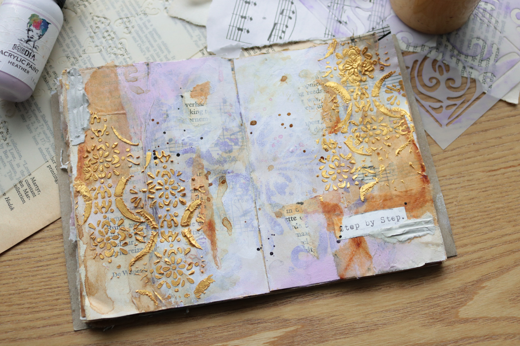
For this week’s project, I’m layering five stencils and then calming the chaos with a little reductive painting using, of course, another stencil! 


I grabbed my journal to find one of few blank pages left, and decided on one that is next to a project I created for Nathalie Kalbach’s creative team. Nathalie is also a StencilGirl® designer, so I thought it would be fun to incorporate some of her stencils on the page next door, plus a couple others. I used the finished page as inspiration for the new page I was about to create.


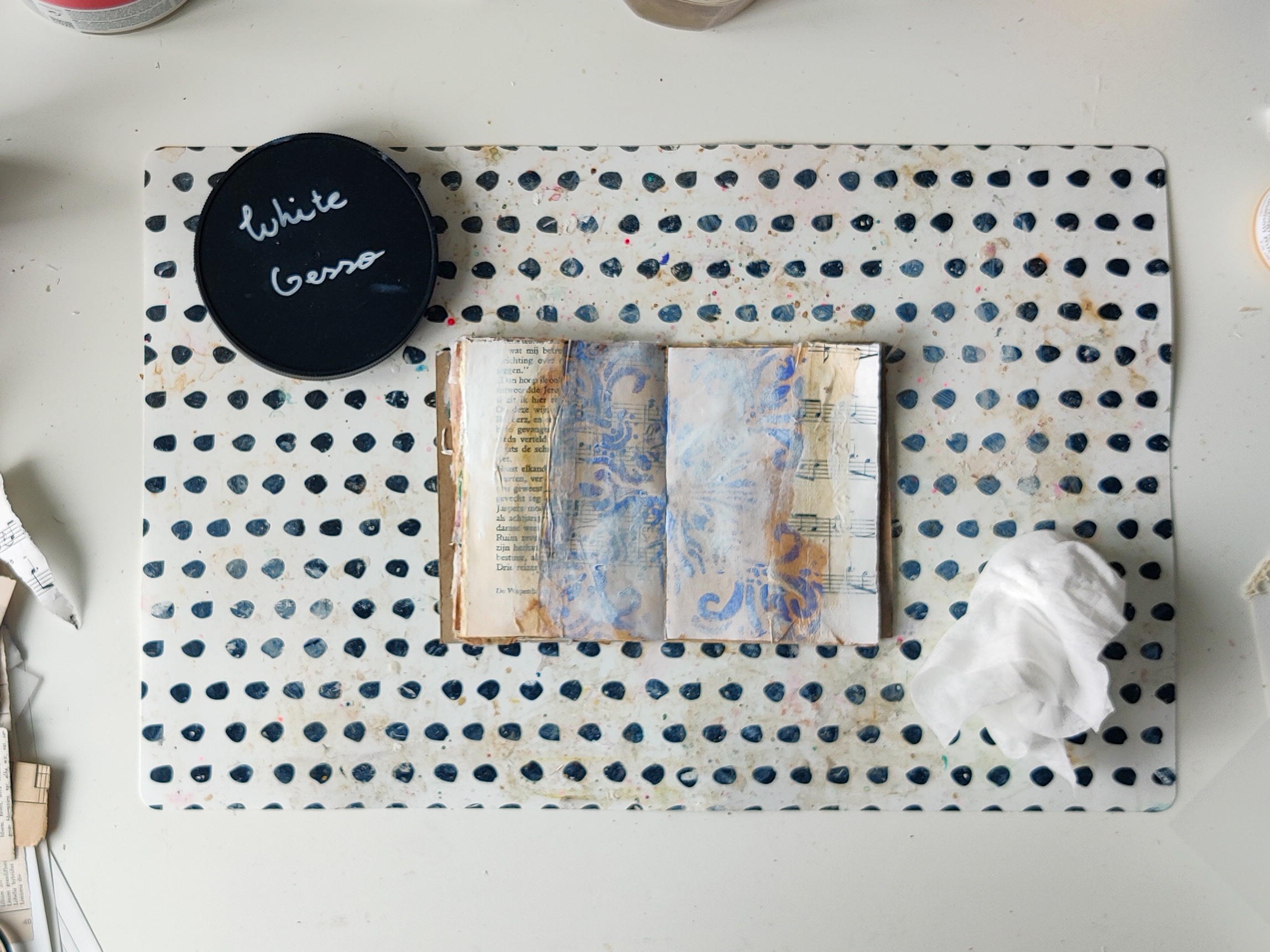
After gessoing the page, I layered it with a ledger sheet. I knew that I wanted this page to have cream with white in the background plus use the color palette of its neighbor. So, I grabbed my gesso to add some white to the ledger sheet. 


Next, I picked out the colors that matched the page next door. I even grabbed pink to match the embroidery floss. I knew I’d need a lot of colors for the stencils! I didn't use all of them, but they were ready just in case.


Once the gesso was dry, I began to layer the stencils. I used the same process for each one. First, I stenciled it with a foam applicator a few places on the page and then I distressed my stenciling a bit with some water and watered-down paint.


First Layer: Van Vorst 

I ended up adding more of this stencil after the third layer.


Second Layer: Arched Fountains 

Third Layer: What’s the Point? 

After this layer dried, I also traced around the circles with stabilo all in graphite and black to add a bit more interest.


Fourth Layer: Hash Marks 


Fifth Layer: Alpha Drips 


For this stencil, I cut my applicator foam in half so I could isolate the plus symbols only in the stencil.


Fun side note: I started using an old book to clean off my stencils and applicator. After each stencil, I cleaned it several times in this book. It's going to make a great book of ephemera!


When all my layers were dry, I grabbed the Bold Flowers stencil to calm the incredible chaos I created. This stencil was the perfect contrast to the facing page, so I knew I just had to use it! The large, bold image contrasted the delicate details of the right side and the flower petals matched the stamped crowns I gave the photos. The page on the right is about my crazy dreams, and these bold flowers look like something from a dream, too!


The stencil and mask combo is perfect for reductive painting. I used the stencil to see exactly what part of the page I wanted to keep and then put the mask inside and removed the stencil. I grabbed my foam applicator and spread black paint around the mask.


Before the paint dried, I touched it up by filling it in, distressing some, removing some, and adding more. It’s a bit of a process, but the end results are worth it.


Then, I repeated the process with a smaller flower.


Once both images were finished, I grabbed a baby wipe and some cleaning paste to distress the black and the page even more. The paste removed some of the black and some of the stenciling layers, too. Not completely, just enough that it looked like it maybe was an old fresco on a wall, worn from time. I absolutely loved the result. 


I also added a little extra black around the edges of the pages.


Then, I repeated the process on a few tags. If I was doing this again, I would have played on the tags at the same time as the journal pages. So, don't copy my order!


After the stenciled layers were dry, I added a flower to each one using the same process. On two I used the stencil and on the smaller one the mask.


Finally, I layered the tags, stuck them down with clear washi tape on the ends so they'd flip on the page, added a vintage photo and a saying and called it done!


You can watch the entire process in the video below.


Thanks for following along!

-Nicole


Connect with me on


Stencils

Supplies
  • Dina Wakley Media Journal
  • Ledger Paper
  • Golden So Flat (black, naphthol pink, turquoise, cobalt teal, fluorescent orange)
  • Golden Fluid (payne's gray, iridescent bronze fine)
  • Stabilo All (black, graphite)
  • Gesso
  • Matte Medium
  • Tags
  • Baby Wipes
  • Cleaning Paste
  • Clear Washi Tape
  • Phrase Stickers
  • Vintage Photo
  • Three different size tags


Tuesday, October 24, 2023

Reimagining an Old Journal Page


Hello StencilGirl® friends! Nicole here and I’m back with a simple journal page layering some, you guessed it, stencils to reimagine one of my older journal pages. 


I mentioned on two previous blog posts (here and here) that I am on a quest to fill up this old Dina Wakley journal, and I’m almost there. In fact, I had a hard time deciding which page to use for today’s creation. 


As I flipped through the journal, I saw a page that I created in class with Dina Wakley. Funny enough, it’s the same class that I received the journal in many (many!) years ago. I decided I was up for the challenge to create a coordinating page to the left. I thought it would be fun to create a “Nicole style” page adjacent to a page that was not only created years ago using class instruction, but so different from my current style.


It was my goal to translate each element from the right page onto the blank page in a new and different way.


To begin, I layered a piece of ledger paper on the gessoed page to mirror the handwriting on the other page. The ledger paper was left over from another project so it already had a thin layer of gesso on it. 


Next, I tackled the large white circles that have marks in them. I added elephant acrylic paint through the rows of triangles stencil all over the background. I used my paint brush to scruff some up and add grungy paint around the page. Then I grabbed some gesso and used my finger to apply it in different places around the page. I layered a few more of the triangles on the page as well.


Then, I spent some time figuring out how to translate the large ocean colored paint mark. Since it was in sort of a X or cross shape using the baby wipe through a stencil technique, I thought the New Orleans stencil might be a good option. 


I also like how using it to sort of toned down the bold ocean color. Instead of it being so strong, this stencil gave it a more delicate feel. There is also a lot of movement on that page, and I was hoping this stencil would translate that feeling of movement as well. And, I think it did! I added the stencil several places on the page concentrating mostly on the edges and purposefully making them not perfect but worn and old looking. I wanted it to look like older, worn out tile or painting on a wall.


Since the right side is so graphic in nature with lots of hard shapes, I wanted to soften this page. The New Orleans stencil started that process, but I also thought a floral as my main focal point would be the perfect contrast.  


I chose the eucalyptus stems mask small stencil with Payne’s gray since the right side has small dots stenciled in a similar color. I added this in the same way as the other stencils, but because it wasn’t long enough for my page, I layered part of it underneath to extend it. Then I decided it needed just a little friend to the right. Before each section of the floral dried, I removed paint from the flower buds to give them more dimension and interest.


Once I thought the stenciling was finished, I added a few more elements to mirror the other page:

  • Walnut ink on the page and flower centers to match the Kraft paper
  • Darkened the edge of the tag with the Payne’s gray on my applicator to make it stand out like the sketched circles around the white ones
  • Ripped out a photo and then stitched on it to match the orange scribbly circle
  • Decided I needed a bit more orange, so I stenciled on the tag and background with the New Orleans stencil (I like how this matched the shape of the orange circle, too!)
  • Added more Payne’s gray to the edge of the page with the applicator to match the dark writing circle 
  • Stamped handwriting on teal-blue paint chip as I needed a bold color for balance and to match the handwriting wash tape strips
  • Flicked Payne’s gray on page which matched the paint flicks on the right and all the circles (plus the page really needed some color pops!)

When all those details were finished, I assembled the collage and added a phrase on top in white to match the white circles.


I hope you enjoyed following along on this tutorial! You can watch it all come together in the video below.


After using my old journal page for inspiration, I decided that I really enjoyed this process. It was a great way to reimagine older work in a new style and find some creative energy when I wasn’t sure about direction. I am definitely going to try this again! 


If you're in a creative rut or stuck on where to create, find an older piece of art you created and reimagine in! And, if you do, post the before and after on instagram and tag me, I'd love to see them.


-Nicole


Connect with me on


Stencils


Supplies

  • Dina Wakley Media Journal
  • Ledger Paper (alternatively, old book pages or a printed digital file)
  • Matte Medium
  • Gesso (white)
  • Dina Wakley Acrylic (elephant, ocean, tangerine)
  • Golden So Flat Payne’s Gray
  • Walnut Ink
  • Sponge Applicator
  • Tag (from Tim Holtz)
  • Photo Strip (from Tim Holtz)
  • Embroidery Floss & Needle
  • Ephemera (ledger page bits, ticket, paint sample card)
  • Stamp with Handwriting
  • Archival Ink (black)

Wednesday, August 9, 2023

Creanouk: How to light the spark after a creative break


Hello beautiful artist, Anouk here today to share a little bit about how my creative journey is going and of course a little tutorial to get you inspired.


A little backstory for the people who are new here or who aren't following me on Instagram. I've been dealing with chronic fatigue syndrom since I've been a teenager. This doesn't simply mean that I'm tired all the time, I wish it was that simple. Some periods in my life I'm so tired that I get really sick, I'm in a lot pain and I can't properly function. When we decided to start a family we knew that it was going to be hard on my body, but we felt confident that we could handle the situation together.

After a year of being a mother I slightly know what to expect when our son is in a development leap. I know how my body reacts to big milestones like eating, crawling and currently trying to walk. I know that in these periods I need to be kind to my body and give it a rest whenever I can. But this also means that I have to sacrifice my creative time. And that's okay. I mean we have a beautiful son and I'm so grateful every day that he's in our lives. But that doesn't mean that I don't miss being creative. I miss letting my emotions and thoughts out on the paper. I miss doing something that I love. And I miss the connecting with you, the art journal community. But I know that this too, like all the other times, shall pass. I know that once we've all adjusted to the new situation my health will get better. That I will have some energy left during the day to grab my art supplies and to put every cropped emotion from the last two months out on my paper.

So why am I sharing my story here on the StencilgirlTalk blog today? Well, because I know that many of you struggle from creatives breaks sometimes. And I wanted to tell that it's okay. It happens to all of us. I promise you it will get better. Whenever that will be a few days or months, you'll feel that spark again. You'll feel your art journal pulling you in. And when this happens be mindful about it. Don't expect to create a masterpiece. Just grab a few minutes to connect with your art journal again. Take the time you need.

Don't want to wait until that spark hits you?

Well.. I'm a self claimed master in crawling out of a creative break. So let me share a few tips that I like to do when I'm struggling my way out of my creative pause. I actually did all these things in the last couple of weeks to get the spark back on and it definitely made the difference.

1. Take 5 minutes each day to spend in your journal

The thought of spending an hour at my art desk can feel a little bit overwhelming in times like this. So I suggest that you'll set yourself a 'non pressure' goal to spend 5 minutes with your art journal each day. You'll be amazed what you can do in five minutes. This might be my favorite way to get that spark on.

If you want some inspiration on what you can do in 5 minutes I've written a few blogs about it in the past. You can find them here, here and here.

2. Clean up your art space

When my art space is all messy and cluttered I don't feel the inner peace to create. So in the moments where I'm sitting at my desk staring at a wall I like to put in a song and make everything tidy. Sorting through your art supplies might also give you a bit of inspiration!

3. Follow an art journaling course or a workshop

If you want to create but don't really know how to start this is a great way to get starting. If a course is too big of a commitment to you in this time of your life, there are plenty of free Instagram/YouTube challenges out there that you can follow. Pick a few prompts that you like and you'll be back to creating in no time.

4. Make a small art journal

There's just something about making an art journal that is so relaxing to me. Searching for papers. Cutting them to the right size. Binding them together. Making a cover. It's just so mindful and low pressure. Keep it small and simple. If you want to take it a step further. You can glue down a few pieces here and there, make some marks and before you know it you're art journaling again.


5. Seek inspiration for your own work

Whenever I'm having a little break from art journaling social media feels a bit too much. I always feel a bit sad looking at all the beautiful work that people make. That's probably why you won't see me on Instagram that much when I'm having a creative break. When I feel like it's the right time to get back at it again I like to flip through my own art journals to search for inspiration. And that's what I'm doing today.


Here are the art journal pages that I drew my inspiration from. My eyes were drawn to the layering of the stencils, the gold stencil butter and the bright vibrant colour schemes. Before my 'break' I was in a very neutral phase in my art journaling so I like how these pages are lighting up the spark of colour again.

Making the Page:


First I added thin layer of clear gesso to prep my pages. I looked more closely to the pages that I picked out for inspiration and I saw that they all had some sort of stenciled underground layer. So I grabbed the stencil Douro Valley Tile (S932) and Ultramarine Vilolet acrylic paint and I used them to create the same effect.


I can't art journal without collage. It has been something that had sneaked in to my art journal practice and it's hear to stay! I just love tearing and glueing down all these tiny elements on my page. The tea bags are my absolute favourite! They are just so great at blending all the elements together.


To soften the background I used white gesso and I smeared it out with a baby wipe to create a sort of distressed look.


Now it's time to add a bit more colour. I really loved the Ultramarine Violet colour in the background but I wasn't sure what colour I liked with it that would still be me. I don't want this page to be to bold because that isn't really my style. I know I wanted to work with colour but... Baby steps. Ha! So I grabbed a light purple by Dina Wakley called Heater and I applied it with my fingers. I also threw some Titan Buff Deep and Apricot from DW in the mixture to create a bit more warmth. Using a few different shades of one colours on a page is my way to keep the page soft and balanced. It may seems boring but it works for me.


I kept building layers with glueing down a few tiny pieces of book pages and some beautiful rooibos dyed tea bags. I add some coffee splatters her and there and a large scribble that you can hardly notice. I also grabbed my watercolour Pastel pallet and I played a little bit with the purple colour.


I applied the TWC Champagne Gold stencil butter, which is just as delicious as it sounds, through the Pilgrimage to Mexico Stencil (L363) stencil and I absolutely LOVE how this looks!

For the finishing touches I add a quote with my typewriter, some bits and pieces of collage and of course a few ink splatter.

Thank you so much for reading this blog! I really hope that if you are in a creative block yourself that you can find that spark again! It's worth it. You're worth it!

Stencils Used

Productlist

Handmade journal
Vintage Music and Book Paper
Tea Bags
Type Writer
Cookie Packaging
Amsterdam White Gesso
Amsterdam Clear Gesso
Mod Podge Matt
Dina Wakley Acrylic Paint - Heather
Dina Wakley Acrylic Paint - Apricot
 Amsterdam Ultramarine Vilolet Acyrlic Paint Amsterdam Titan Buff Deep Instant Coffee Prima Marketing Pastel Dreams Watercolours
TWC - Stencil Butter Champagne Gold


~

Thank you so much for reading my blog post. I hope that I have inspired you to create today! My name is Anouk or Creanouk on social media, and I'm an all-round creative from the Netherlands. I love art journaling because I can put my heart and soul into it. You can find my work on Instagram and Youtube.