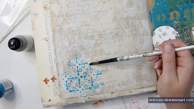
Hello StencilGirl® friends! Nicole here and I’m back with a simple journal page layering some, you guessed it, stencils to reimagine one of my older journal pages.
I mentioned on two previous blog posts (here and here) that I am on a quest to fill up this old Dina Wakley journal, and I’m almost there. In fact, I had a hard time deciding which page to use for today’s creation.
As I flipped through the journal, I saw a page that I created in class with Dina Wakley. Funny enough, it’s the same class that I received the journal in many (many!) years ago. I decided I was up for the challenge to create a coordinating page to the left. I thought it would be fun to create a “Nicole style” page adjacent to a page that was not only created years ago using class instruction, but so different from my current style.
It was my goal to translate each element from the right page onto the blank page in a new and different way.
To begin, I layered a piece of ledger paper on the gessoed page to mirror the handwriting on the other page. The ledger paper was left over from another project so it already had a thin layer of gesso on it.
Next, I tackled the large white circles that have marks in them. I added elephant acrylic paint through the rows of triangles stencil all over the background. I used my paint brush to scruff some up and add grungy paint around the page. Then I grabbed some gesso and used my finger to apply it in different places around the page. I layered a few more of the triangles on the page as well.
Then, I spent some time figuring out how to translate the large ocean colored paint mark. Since it was in sort of a X or cross shape using the baby wipe through a stencil technique, I thought the New Orleans stencil might be a good option.
I also like how using it to sort of toned down the bold ocean color. Instead of it being so strong, this stencil gave it a more delicate feel. There is also a lot of movement on that page, and I was hoping this stencil would translate that feeling of movement as well. And, I think it did! I added the stencil several places on the page concentrating mostly on the edges and purposefully making them not perfect but worn and old looking. I wanted it to look like older, worn out tile or painting on a wall.
Since the right side is so graphic in nature with lots of hard shapes, I wanted to soften this page. The New Orleans stencil started that process, but I also thought a floral as my main focal point would be the perfect contrast.
I chose the eucalyptus stems mask small stencil with Payne’s gray since the right side has small dots stenciled in a similar color. I added this in the same way as the other stencils, but because it wasn’t long enough for my page, I layered part of it underneath to extend it. Then I decided it needed just a little friend to the right. Before each section of the floral dried, I removed paint from the flower buds to give them more dimension and interest.
Once I thought the stenciling was finished, I added a few more elements to mirror the other page:
- Walnut ink on the page and flower centers to match the Kraft paper
- Darkened the edge of the tag with the Payne’s gray on my applicator to make it stand out like the sketched circles around the white ones
- Ripped out a photo and then stitched on it to match the orange scribbly circle
- Decided I needed a bit more orange, so I stenciled on the tag and background with the New Orleans stencil (I like how this matched the shape of the orange circle, too!)
- Added more Payne’s gray to the edge of the page with the applicator to match the dark writing circle
- Stamped handwriting on teal-blue paint chip as I needed a bold color for balance and to match the handwriting wash tape strips
- Flicked Payne’s gray on page which matched the paint flicks on the right and all the circles (plus the page really needed some color pops!)
I hope you enjoyed following along on this tutorial! You can watch it all come together in the video below.
After using my old journal page for inspiration, I decided that I really enjoyed this process. It was a great way to reimagine older work in a new style and find some creative energy when I wasn’t sure about direction. I am definitely going to try this again!
-Nicole
Connect with me on
Stencils
Supplies
- Dina Wakley Media Journal
- Ledger Paper (alternatively, old book pages or a printed digital file)
- Matte Medium
- Gesso (white)
- Dina Wakley Acrylic (elephant, ocean, tangerine)
- Golden So Flat Payne’s Gray
- Walnut Ink
- Sponge Applicator
- Tag (from Tim Holtz)
- Photo Strip (from Tim Holtz)
- Embroidery Floss & Needle
- Ephemera (ledger page bits, ticket, paint sample card)
- Stamp with Handwriting
- Archival Ink (black)


What a lovely update, Nicole! Thanks for showing us how you did it. The video was particularly helpful.
ReplyDeletethanks, Terry!! -nicole
ReplyDelete