Showing posts with label StencilGirl. Show all posts

Monday, February 12, 2024

StencilGirl Stencils + Molding Paste = A Match Made in Heaven!


Hey there! I am Kristin Williams of Ephemera Paducah, home of the Everyday Artist! 

Nothing goes hand-in-hand as well as Molding Paste (same as Texture Paste, Grunge Paste, etc.) and Stencils. There. I said it. If you’ve never used it or haven’t used it in a while, this is the post for you.


Molding or texture paste dries hard and adds dimension to your surface design. 


This medium provides a wonderfully adventurous and welcoming surface for inks, fluid acrylics, regular acrylics, or whatever liquid medium you want to flow through it. If precision is your jam, quit reading. You cannot control this beast. You LITERALLY have to go with the flow.  


Before we get too far, if you want to watch a super real, mistakes and all, not a lot of talking video about my process, click here. For a description and photos, keep scrolling. 


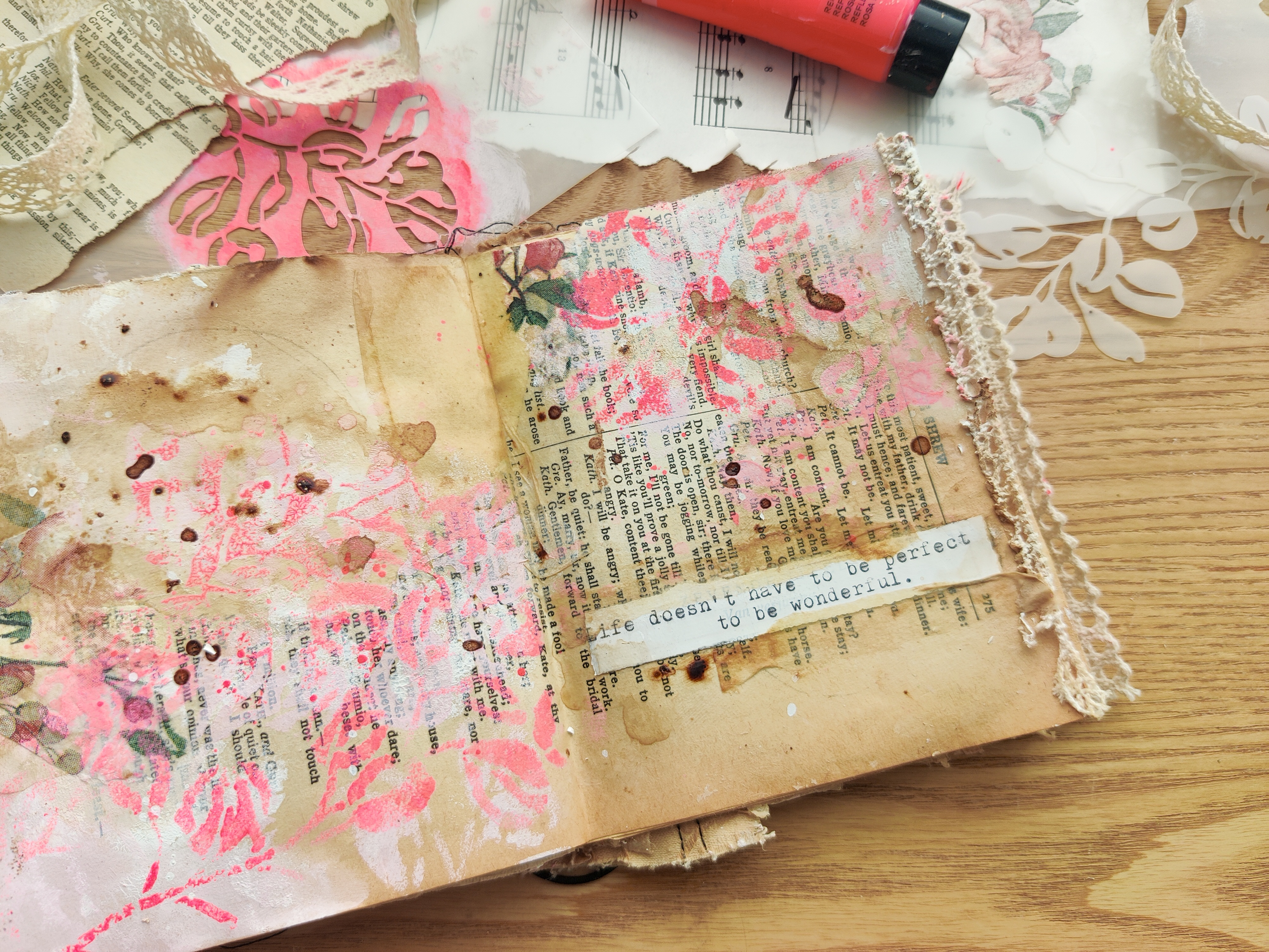
When I finish or nearly finish a journal, I ponder what I want on the front of it. Because of its versatility and interesting outcomes, most often I’ll reach for one of my favorite detailed stencils and some Molding Paste. I tend to do this at the end of completing a journal because it creates a bumpy surface and journaling, for me, is a messy process. I don’t want to mess up the front. 


You can also use it on paper (I have an affection for tags) as well as canvas or wood surfaces. I use the tags in my art journaling or collage. 


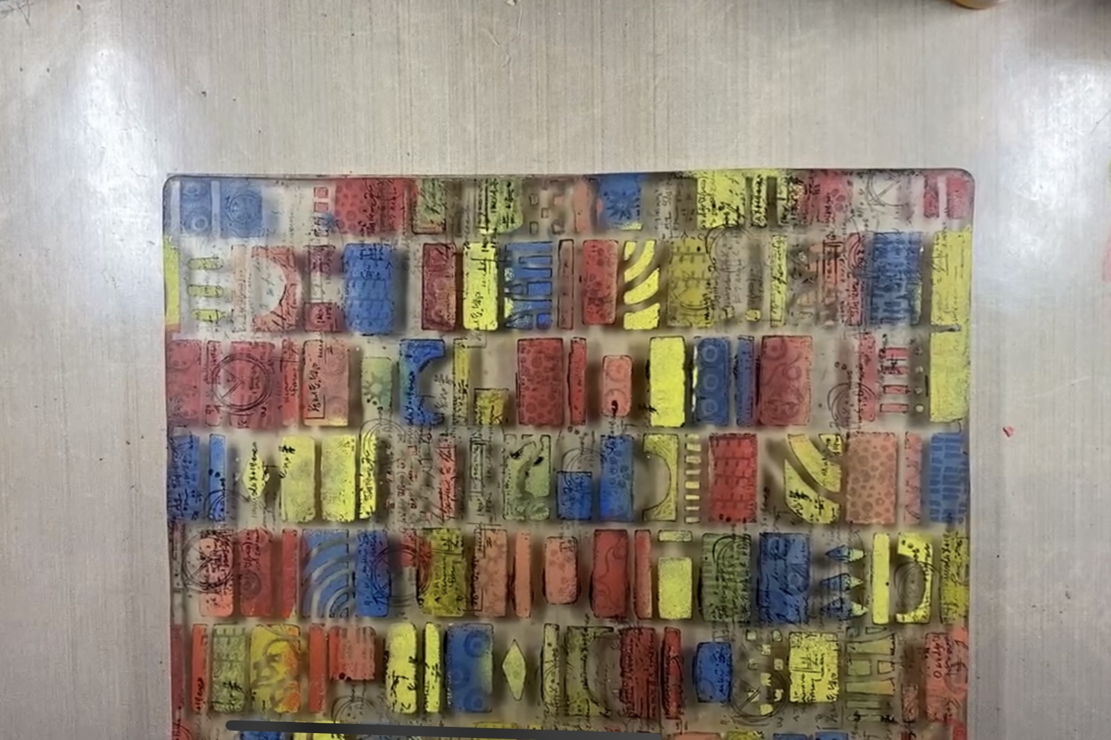
I mentioned grabbing a detailed stencil and this is my personal preference. I like all the little bits, textures, and shapes a detailed stencil provides. You can use any stencil with Molding Paste but beware the larger the area of the medium, the greater the risk for cracking or flaking during usage of it. 


Generally, I have a stack of deli paper on hand to put behind the covers of the journal creating a barrier for the pages within. It’s not foolproof, but it helps. 


Using either a palette knife or one of my favorite yellow Bondo scrapers I pick up at Harbor Freight I spread the paste through the stencil much like icing a cake. I hold it down with one hand and spread it with the other. 


OF NOTE!! Although I generally do not wash my stencils, I always have a pan of water handy when I am using stencils with Molding Paste. You don’t want that stuff to dry in your stencil and ruin it. You also don’t want to run the dirty water down your drain. Wash your stencil in the pan and then throw the pan water outside. 


Because I’ve heard of people being impatient and ruining their surfaces by painting or manipulating too soon, ahem, I let my paste dry on the surfaces overnight. A good trick is to work with it your last hour of the day making art and then leave it to dry. 


The next day I feel all over where I have applied Molding Paste without rubbing. I just lay my hand on the textured areas. If anything feels cold that means it is not yet dry. Once you can confirm all is dry, the fun starts. 


A twofer trick I’ve learned for this next step is to create a pile of book pages, ledger paper, scrapbook paper you hate, and other ephemera (10-12 pieces) and put it underneath where you are working. Trust me, there is a method to my madness. 


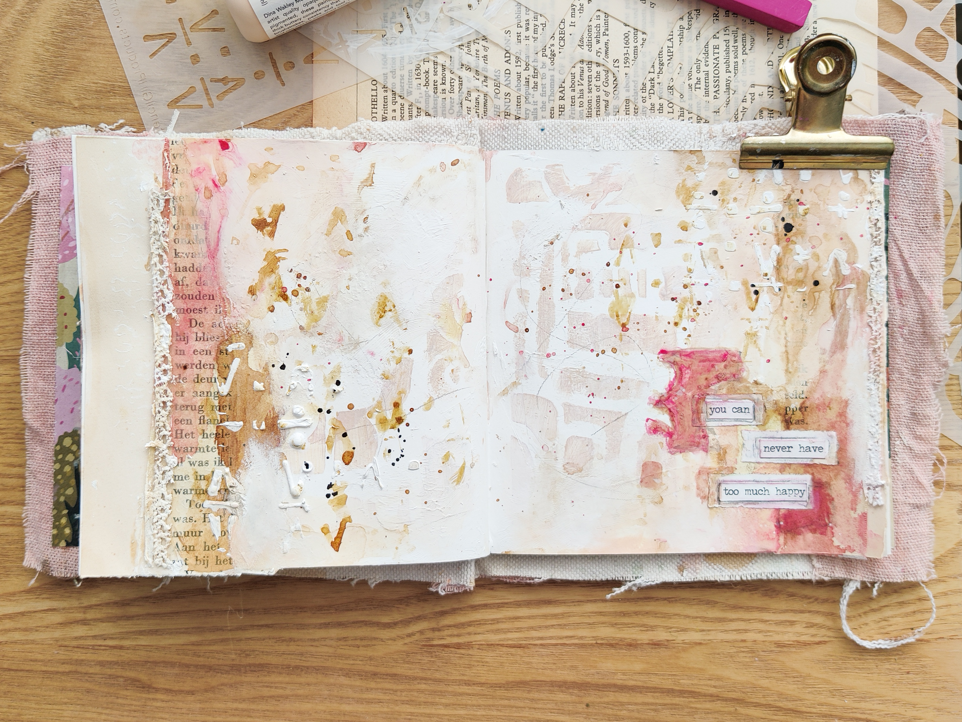
Get any kind of drippy medium - acrylic inks, sprays, fluid acrylic paints — and hold your piece above the pile. Squeeze some color directly on it and then attack with your water spray letting the drips fall where they may. Periodically toss your pile of drip-catching papers and blot your Molding Paste paper onto the pile. You can even pick up colors other than the one you are working with. 


By doing this, you end up with a great load of collage paper!


Once you get to a look you like with the runny mediums, set your work aside to dry. Separate your collage papers pile so they don’t stick together. 


Thanks for reading and as I said at the beginning, there is a warts and all process video you can take a look at here


Tuesday, June 13, 2023

Creanouk - I Love Neutrals


Hello again you beautiful artist,

Anouk here to share another art journaling page. I have a massive love for neutral colours in my art journal. This wasn't always the case though. My earlier pages contained all the colours of the rainbow. But lately my work has been all about neutral colours with the occasional pop of colour. There's just something about the colour of old book papers mixed with grounded coffee, lace trims and a bright pink that makes my heart sing!

I even dedicated a whole journal for this special combination. It's made with tea stained paper, a recycled cover of faux leather and some vintage dyed fabric. I love to make small journals to explore a certain style in. This journal is already half filled with pages full of pink, neutral pages embellished with vintage lace and fluorescent pink splatters.

For the page that I made today I used the gorgeous Eucalyptus stencils by Rae Missigman. I used gesso as base layer with the mask stencil so that the colour I would layer on top of it would pop a bit more on the background. Working with a brownish neutral background can make your colours appear a bit more dull. That's why Gesso is my best friend in art journaling. A simple layer of Gesso applied through the outline part of the mask stencil makes a huge different. You can also do this when you are working on a more busy background. Just apply a little bit of gesso on the part that you want your stencil to pop out. Now you don't have to apply the next stencil on the directly to the gesso-ed part. Keep it fun and stencil it a few millimetres beside it. This will create a lovely dimension in your page. I used two different shades of pink in this page to layer my stencil. But if you wish you can always use two entirely different colours. Just have fun! Okay. Enough taking! I hope you enjoy the video.

Productlist:

Handmade journal Vintage Music and Book Paper
Amsterdam White Gesso
Mod Podge
Tea Bags
Lace
Napkin
Instant Coffee
Dina Wakley Acrylic Paint - Heather
Amsterdam Acrylic Paint - Fluorescent Pink
Amsterdam Acrylic Paint - Titan Buff
Ranger Ink - White


Thank you so much for reading my blog post. I hope that I have inspired you to create today! My name is Anouk or Creanouk on social media, and I'm an all-round creative from the Netherlands. I love art journaling because I can put my heart and soul into it. You can find my work on Instagram and Youtube.


Wednesday, June 7, 2023

Carol Ponsford - June StencilClub Stencils - Journal Page


Hi everyone, Carol Ponsford here with my June project using the June StencilClub set 
Pathways designed by the talented Carolyn Dube. When I first received this set I 
knew exactly the direction I wanted to take this project. If you would like to see a video 
of the process click this link  Creating a Woven Journal Page youtu.be   and it will take you to the StencilGirl® Products YouTube site.


The first thing I did was to pull out my journal to prepare the surface.
I needed to have a blank page behind the page so that I could adhere the 
two pages together to hide the messy back that I would end up with. I laid 
the path stencil on top of the page to estimate where I would paint 
and painted the area with black acrylic paint. 


After this was dry, I laid the stencil on top and with a slightly lighter 
shade (I used Pewter) I sponged through the stencil to show the paths that 
I would need to add holes to for the weaving of the fabric strips. I marked with a
Stabilo All white pencil so that I would be able to remove the lines after cutting.
It took some mental energy to prepare the holes so that fabric would 
be exposed in the areas I wanted it to show the most. I cut all of the holes
as well as the bottom of the page off where the strips would hang freely.


Next I took my 9"x12" gel plate and pressed the lined patterned stencil firmly on top.
Using my brayer, I spread the black paint on top of the stencil making sure to get down 
in all parts of the stencil. I took white copy paper and removed as much paint from
the centers of the designs but left just a little around the edges.


Using some hand carved stamps and Archival ink, I stamped small 
designs in the box areas of the stenciled patterns.  


Then using the foam applicator, I added 6 different colors of paint 
randomly around the plate then removed the stencil. 


Next I took a script stamp and continued stamping in open areas with 
black Archival ink until I was happy with the design.


I used a 6"x6" gel plate as a palette and with my brayer mixed Snowflake white and Heavy 
Cream colors to get a slightly off white color to pull the print onto strips of silk sari ribbon.


I loved how these strips of fabric turned out. Some were more successful than others
but I like grungy so the imperfections didn't bother me. I repeated the process until
I had enough strips for all of the opening that I needed to fill.


The next step was to weave all of the strips into their places. I started on the left 
side of the page and wove each strip towards the bottom of the page in their respective path.
I left a small amount of fabric at the top of each path because I wasn't sure if I wanted fabric 
sticking out of the top or not. Ultimately I chose to cut those ends off. Just a warning that you 
will have paint chip off of the fabric during this step but if you go slow the amount will be 
minimal (it just makes a little mess). I had not painted the back page because I was unsure if I 
wanted it white or black but after seeing the fabric strips dangling down, I decided I wanted 
to go with black to bring out the colors on the strips of fabric so I painted the back page black 
where that page would show.
 

While the paint was drying, I began working on the wording I wanted to add and figuring 
out the spacing of it. Then I used masking tape to secure the top ends that I had cut off. 


I used a palette knife to spread regular gel matte medium on the back of the top page 
(I applied generously) and then folded the back page over onto the 
back of the front page. Turned the front page up and rubbed until it was adhered firmly.


I drew lines to mark the placement of my script with the Stabilo All 
white pencil and then took my white Posca Pen and added my saying.

I hope you enjoyed this post and would love to see what you do with these stencils. I 
appreciate StencilGirl® Products providing me with this free StencilClub set 
so that I can play in advance and share what I create each month with you. Check 
back in next month when I will share what I have created with the July StencilClub set! 


Here is a list of supplies that I used:
Dylusions 8 1/2" x 8 1/2" journal
9x12 gel plate
brayer
Silk sari ribbon
scissors
ruler
paint brush
palette knife
Stabilo All white pencil
white Posca Pen 
sponge applicator
Stampers Anonymous Tim Holtz stamp #P4-2189
some handout stamps
Ranger Archival stamp pad in Jet Black
and Golden Regular Gel Matte medium
Master's Touch - Permanent Black
PaperArtsy Fresco Acrylic paints in these colors:
                                                                    Southern Skies             Limelight
                                                                    Zesty Zing                   Tangerine Twist
                                                                    Coral                            London Bus
                                                                    Pewter                          Snowflake
                                                                    and Heavy Cream


Join StencilClub by June 15 to receive these exclusive stencils and accompanying video tutorial with PDF (both downloadable!), and 20% OFF STENCILS EVERY DAY!!


Happy Creating!


D6859F19-84FC-4D41-9C31-F614553BCBAD_1_201_a.heic.jpg


To see more of my work please visit my Instagram page.


Tuesday, April 18, 2023

Anouk (Creanouk) - Outside the box??


Hi you beautiful artist, Anouk here today with a new blogpost full of Stencilgirl® inspiration! I'm sorry for the misleading title. My intention for this blogpost was to make a page that was
completely outside my box. But.. Halfway through this project I started to wonder if that was even possible. Ha!

For someone who has an allergy for the word 'style' I discovered that I can no longer deny that I have a personal art journaling style. Shocking right? Ha! I have nothing against having a style. On the contrary, I think it's so awesome if you find a way of creating that defines you. But in my own art journal journey I find it very difficult to stick with just one thing. My art is always changing and evolving that I find it hard to label it. But if you are following me on Instagram or even if you read some of my blogpost on here you'll know that certain elements always come back in my art. And that, even though I don't like to admit it, I have a significant style.

Anyways, I did try my best to make something different, to experiment a little and think outside my floral, floral and a bit grungy box. But if you are wondering how everything went back to me figuring out that it looks exactly like the hundred pages that I made before, please keep on reading!
I'll also add a little recipe down below on how I made this page, so that you can play along if you like to!

Journal recipe

1. Apply Gesso with a pallet knife
2. Use a Stencil with some acrylic paint
3. Collage with old book papers and teabags
4. Add some texture with lace
5. Apply gesso on parts of the page that you'd like to soften up 6. Add some pop of colour with watercolour and coffee 7. Apply a stencil with gesso or matt medium 8. Use the same stencil and apply is with a damp brush and watercolour
9. Add some more colour with watercolours 10. Time to add small details with ink splatters, pencil, marks ect. 11. Write, stamp or glue down some journaling My Process


It all started when I saw the Wild Dreams stencil by
Tiffany Goff Smith. I fell completely in love! It reminded me of those fancy cabinets with all different kinds of shapes in them that you see all over Instagram. As I said earlier I'm more of a floral, script and marks stencils kind of girl so even though this stencil didn't really fit in that description I felt inspired to create.

To prep my page I applied Gesso with a pallet knife to create some interesting texture.
Then I grabbed Wild Dreams and created the base for my spread. My intention was to create vibrant and happy spread using this stencil.
I didn't picked a vibrant colour to start with, because in the end I always make the base layer softer with gesso. So I decided to start with the colour Apricot by Dina Wakley and skip the gesso part. See, trying to think outside the box here! Or... is this the part were I went back in?


Next I glued down all the good stuff like book papers, tea bags and lace. I grabbed some gesso and the apricot paint to blend all the elements with the stenciled background layer.


I used coffee to grunge up the part were I glued down the teabags and sprinkled down some splatters in the process. Then I grabbed the Glyph Grid stencil by Seth Apter, applying it with gesso to create some more dimension. After the gesso was dry I wanted to experiment a little with using watercolours on my stencils. I don't do this often enough! I really love how watercolours looks through a stencil! I'm obviously not an expert, but what works for me is to use a slightly damped brush.


The pink watercolour made this grungy page pop! It looks so nice with the apricot colour on the background. It crossed my mind to colour over the centre part of this page, but I didn't want to cover up the stencilled part too much. I just really like to keep the centre of my pages light and airy.


  After I glued down the Tim Holtz phrase I looked at my page and I wondered if I could add something different. I grabbed my Wild Dreams stencil again and I outlined it with a grey watercolour pencil. It wasn't really what I was hoping for. So I used my watercolour set again and with the pink shade that I used before I coloured the shape making sure I didn't colour over the phrase sticker.

In the end this page wasn't as vibrant and outside the box as I wanted it to be. But I had fun playing with the stencils and trying to use watercolours with them. Apparently a vibrant colour scheme isn't what I'm drawn to at the moment. And that's okay. My intentions were the starting point that got me making this page. I really like it and I hope you do too!
This goes to show that having a personal style is something you can't force out of you. It's just something that happens when you create and give yourself the permission to play.

Just let things happen. Have fun in your art journal!


Stencil used: Wild Dreams Glyph Grid

Productlist:

Handmade journal Vintage Music and Book Paper
Amsterdam White Gesso
Mod Podge
Tea Bags
Lace
Instant Coffee
Dina Wakely - Apricot
Tim Holtz Stickers
Prima Marketing Watercolour set Tropical


Thank you so much for reading my blog post. I hope that I have inspired you to create today! My name is Anouk or Creanouk on social media, and I'm an all-round creative from the Netherlands. I love art journaling because I can put my heart and soul into it. You can find my work on Instagram and Youtube.