 |
Jay DeFeo, The Rose, 1958-1966
|
The study of masterpieces necessarily involves some consensus about who the masters are or were. In my first year of college in the late 70s, the year-long survey course in art history exposed me to perhaps three female artists - Mary Cassatt, Frida Kahlo, and Georgia O’Keefe. The museums I visited, and the art history books I studied, displayed a nearly unbroken line of male artists stretching back through time. It pains me now to realize how seldom I questioned that dominance.
Two unrelated events this summer turned me around. The first was a visit to the Whitney Museum of American Art in NYC on day trip in July to meet some good friends for lunch. We’d hoped to walk the High Line after lunch but it was so infernally hot we couldn’t bear the thought of it - so instead we went to the Whitney, which is at the bottom of the High Line, and which would be a good starting point if it cooled off enough later to take a stroll. While in the museum we were mostly occupied with chatting and
catching up, but at one point I found myself in front of a massive work that was new to me. This was The Rose, by Jay DeFeo, a monumental painting with incredible dimensionality and texture. Arresting, to say the least.
The second event was attending a lecture/book talk at the Hyde Collection in Glens Falls, New York about the book Ninth Street Women, by Mary Gabriel. This prodigious tome chronicles the work and experiences of Lee Krasner, Elaine de Kooning, Grace Hartigan,
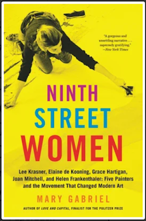
Joan Mitchell, and Helen Frankenthaler - women who were in at the dawn of the New York abstract expressionist movement after WWII. They were there along with the male artists whose voices and visions always insisted on the lion’s share of attention, (deserved or not), sharing gallery space with Jackson Pollock, William de Kooning, Robert Rauschenberg, Robert Motherwell, and other rising stars of the New York scene. It wasn’t until I got home from the book talk that these two events converged to bring me to my Master Piece for this column.
I was chagrined and angry about the gap in my art education that
Ninth Street Women illuminated for me. Down the Google rabbit hole I went, learning more and more about the female artists of the post-war era who contributed so much to the world of abstract art, and who had to fight so hard for recognition. Across the country from New York, the vibrant Beat scene of San Francisco brought together poets, painters, and musicians for an exchange of exciting ideas and innovations. Jay DeFeo was one of those vibrant creatives.
Her work
The Rose, which I encountered that day at the Whitney, took her seven years to complete - it is an accretion of paint and mica, layer upon layer, that she carved into, making it, in her words, “a marriage between painting and sculpture.” At 11 feet tall and almost two thousand pounds, it was so large that one exterior wall of her apartment had to be opened up in order to extract it. The Rose was first exhibited in 1969 at the San Francisco Art Institute, and eventually acquired by the Whitney in 1995. The surface is highly textured, both dark and glittery. During the seven years she labored on this painting, she developed a habit of sticking her paintbrush in her mouth, gripping it with her teeth while she used her hands to manipulate the surface. As a consequence of repeatedly chewing down on the paint-laden brush, she developed gum disease and even lost some of her teeth.
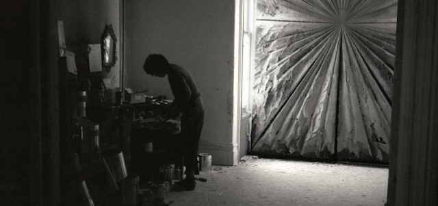 |
Jay DeFeo working in her San Francisco apartment, with The Rose in the background
|
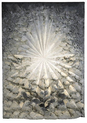
Which brings us to her painting,
Crescent Bridge I. These pale, rock-like forms, smooth and polished, seem to rise out of the white of the paper, with dark shadows or reflections beneath them. It seems both abstract and realistic, and also deeply mysterious. Where does it lead? Why does it stop? What kind of a bridge is it?
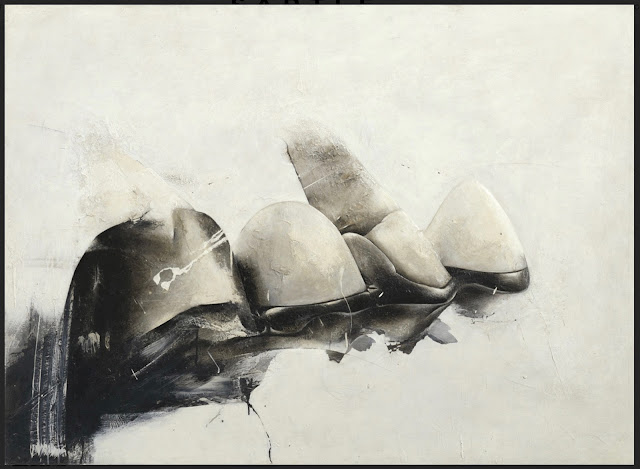 |
Jay DeFeo, Crescent Bridge I, 1970-1972, Whitney Museum of American Art
|
Well, as it turns out, it is her dental bridge, which replaced the teeth she lost working on The Rose. Crescent Bridge II makes it more explicit. Now we can see they are teeth. Jay DeFeo also made extensive use of photography in her later work, making dramatic photos of her own paintings as well as objects in her studio that stood alone as separate works.
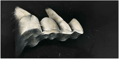 |
Jay DeFeo, Crescent Bridge II, 1970-1972, Whitney Museum of American Art
|
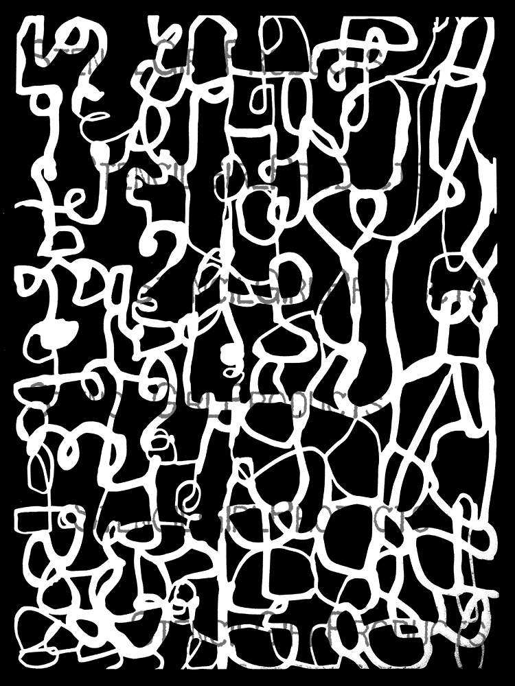
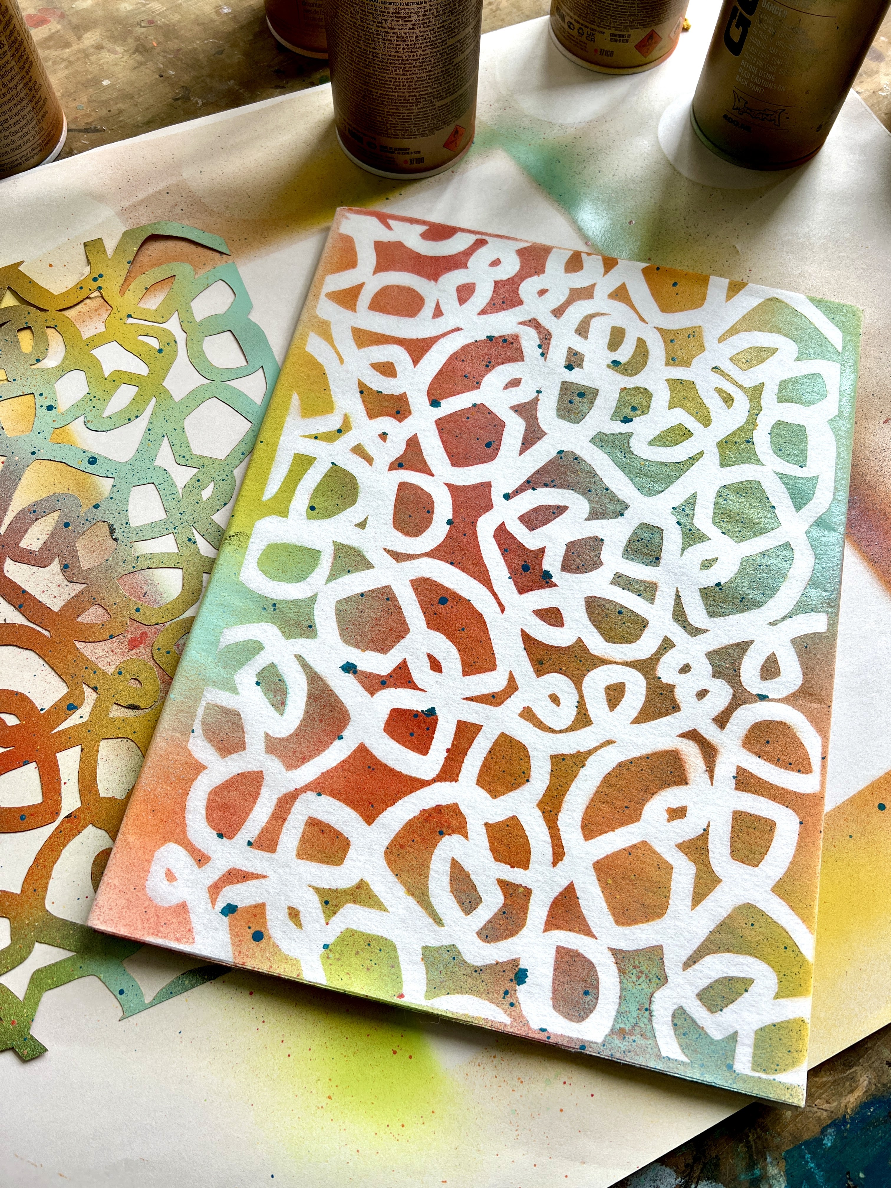
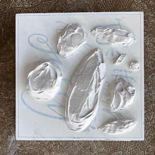
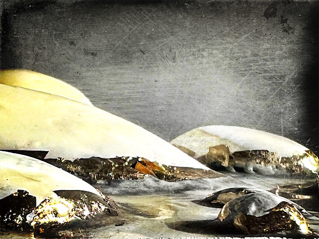
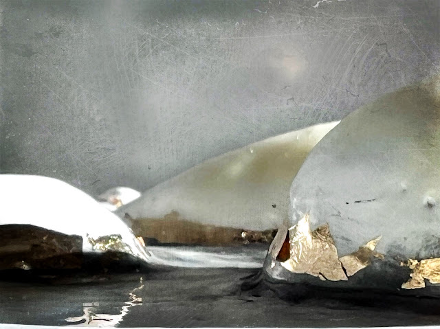
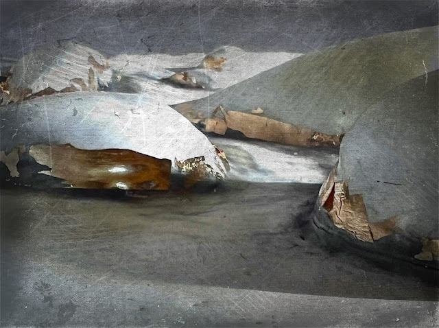
As the project for this column I decided to pay tribute to both The Rose, and Crescent Bridge I, by creating a photo series of a dimensional work I call Archipelago. I used just one stencil for this - Stone Stack, by Jane Monteith L929. This is a 9x12 stencil but I decided to use a 6x6 square cradled panel (a repurposed wall decor piece from the craft store). I suspected this project could end up being heavy, so I needed a sturdy substrate. I had already given the panel one coat of gesso; now I needed to lay out the stencil to fit, and tape over the shapes that I didn’t want to use as part of the composition. This stencil comes still attached to its mylar matrix so you can carefully cut it loose and use the outline as a mask. I needed to keep it all intact, so that I could build volume inside the openings and keep the rest of the surface clean. To build up the “islands” of my archipelago I used joint compound in multiple layers, removing the stencil each time to let the compound cure. After the islands were as big as I wanted them to be, and had dried, I very carefully sanded them smooth to mimic the smooth teeth of Crescent Bridge I, and then applied several coats of gesso thinned with water to give it all a smooth, enamel appearance. I used gesso rather than paint, so there would be enough tooth (no pun intended) to hold wax, graphite, and gold leaf. I’ve used encaustic before for a project in this Master Pieces series and I knew encaustic medium would give me exactly the smoothness and ivory color I wanted.
As usual, the process of painting with melted wax presented its own challenges, especially as melting wax wants to flow downward as it is reheated. The mounds of gessoed joint compound slowly began to assume the abstract organic forms I was going for. I dusted powdered graphite around the bottom of each island, and then added a patchy strip of gold leaf just above the “water line.” I then photographed the work from a few different angles to find the ones I liked best, and treated them to some digital editing with the Distressed_FX Pro app.
 |
process step 1
|
 |
process step 2 or 3...
|
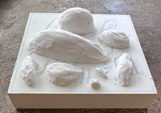 |
another view of the Archipelago before sanding
|
 |
After sanding and several coats of thinned gesso
|
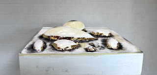 |
the archipelago shown with wax, graphite, and gold leaf
|
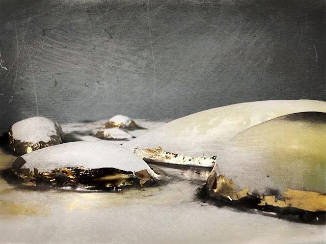 |
Archipelago I
|
 |
Archipelago II
|
 |
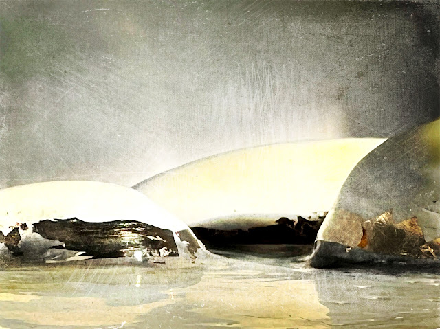
Archipelago III
|
 |
Archipelago IV
|
 |
Archipelago V
|
This project took quite a long time. There was considerable amount of drying time for the thick mounds of joint compound. I didn’t try to speed up the process with a heat gun, because I was worried it might lead to cracking. Each coat of watered-down gesso took half a day to cure completely, and of course applying multiple layers of wax requires heating up and cooling off periods (as well as periods of walking away in a fit of anxious frustration). Painting with powdered graphite and applying gold leaf were finicky and tense - it’s hard to undo when working on wax! And finally, the photographing and digital editing is a process that can go on and on, endlessly trying out different angles, lighting, formats, filters, and layering effects. With each stage of the long process, the piece underwent transformations of shape, size, texture, hue, tone, and weight, from a two dimensional plane to a three dimensional sculpture back to two-dimensional photos in electronic form. The model itself is a very physical thing, inviting touch, whereas the digital image is virtual and untouchable. The effects of time and transformation are the lessons I learned from Jay DeFeo while working on this, and they are lessons I am grateful for.
Learn more about Jay DeFeo at The Jay DeFeo Foundation