Showing posts with label David Daniels. Show all posts

Friday, April 21, 2023

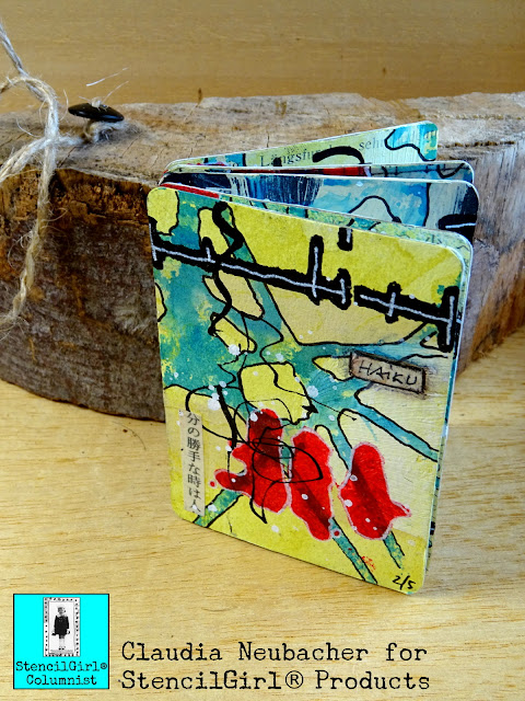
Haiku ATC Booklet to Add On - by Claudia Neubacher


Servus, hi and thanks so much for stopping by today! 


I am sharing a small (you could almost call it tiny) project with you today that I have created using large stencils only. And I did so on purpose. Why? I recently found I have been narrowing down myself in my creative thinking as I have for a long time considered large stencils only going with large format projects. Which makes sense when you are using stencils that have a rather specific design like a scenery or portrait for a example. But when it comes to abstract stencil designs only using part of the stencil is not only an option but also a great way to add some creative randomness to your project designs. And they are great fun to use for mark making. 


So I decided to take that idea to the top and pick the smallest format I know - ATC size! 
The beautiful large format StencilGirl® stencils I picked to create a set of five abstract ATCs were these: 


by
Dave Daniels


by
Seth Apter


by 
Seth Apter

and


by
Jane Monteith


I didn't plan any of the designs for my ATC set. Actually I tried to kind of surprise myself, so I decided to let the results from each step lead the way to the next choice of design, colour or medium. To prepare the ATC backgrounds I picked some old book pages and papers from my stash (the black ATC in the middle shows an old gel plate print done with another StencilGirl® stencil (for this project here). I glued these to the die cut ATCs using DecoArt matte Decou-Page and a soft wide brush. 


Then I "primed" the ATCs by adding random brushstrokes using DecoArt "beige" Chalky Gesso and DecoArt premium White Gesso. I didn't overthink this step - I just made sure I had both colours on each ATC and that these overlapped in some spots. 


Once that had dried I added a layer of translucent PaperArtsy Fresco Finish Chalk Acrylic "Chartreuse" on top. Before the paint dried I wiped most of it back using a baby wipe. This way the ATCs got kind of "tinted" and all the detail underneath still showed through. 


I wanted my first stencil-layer to contrast the cold yellow-ish tint, so I picked the "Teal High Heel" Chalkboard Glimmer Mist from Tattered Angels for the next step.


On my craft mat I misted the stencil with the spray paint and then pressed the ATCs face down into spots I thought would create a great pattern. This way I got some really cool random designs! 


I repeated that step with a different stencil. The picture below also shows that I always try to use up all the paint that I have used. In this case I also pulled a print using a sheet of printer paper (the one to the right). The paper to the left is the one I had in my splatter box when misting the stencil. 


It's always nice to have some self made papers for future projects, isn't it? 

Time to add some focal elements! I used DecoArt media Carbon Black acrylic paint and a small stipple brush to only use single elements from Seth Apter's stencil. I thought they looked a bit like calligraphic elements - which was a perfect design to use for my little Haiku ATC Booklet. 


In some spots I only used half of an element to create an interesting border...


Finally I needed a colour that would really pop and contrast the cool blue and yellow - so I went for a bright Cadmium Red (I grabbed a cheap acrylic paint from a set bought at the dollar store as I knew it was translucent too). 

For more interest I added some doodling using black and white pens.


I found my ATCs still needed some texture - so I used the left over Asian book page and cut out some strips to glue in spots that I thought were missing visual interest. 


To finally visually fuse all the elements I added some scribbling in black (using the nozzle from the DecoArt "Carbon Black" Mister) and sprinkled on some "White Linen" ink (again using the nozzle) from the Ranger dylusions ink spray paint. 


During drying times I had die cut five more ATC blanks from lightweight sketching paper and written five of my own favourite haiku on them. 


I glued these to the ATCs' backsides using matte DecoArt decou-page again. 

I wanted to create a binding for my ATC booklet that would allow me to add more pages whenever (and how many) I wanted to without having to take the book apart or something like that. So the easiest way was to create fabric hinges and always hinge the following page to the previous one. My search for a thin ribbon wasn't successful, so in the end I cut some pieces of fabric from one of my painting rags. 


The first and second page were easy to assemble....I used more matte Decou-Page as it dries really fast and holds really well. 


While pages one and two were drying, I already glued the hinges to all the following pages and let these dry thoroughly (I also used my heat tool to make sure they were completely dry).


Adding the following pages made me search for something I could stack so the two pages that were going to be fused would lie evenly. I found some MDF blanks to stack and these worked pretty well. 

It was a bit of a fiddly job, first adding the glue to the exact spots on the pages, then to the fabric "tab", then putting it all together in the right spot and adding more glue on top, but I knew I wanted all the pages to really hold together as fast as possible, so I could add a lot of haiku pages in the future. 


I made sure I let the fabric hinges dry in a way so they would not get glued together accidentally (which would make flipping and opening a page impossible without tearing some part of a page off) - so I let my booklet dry like this - with all pages opened: 


Once all had dried, I "faked" some stitching on the fabric hinges by doodling it on with a Faber Castell PITT pen. 


This is how the binding looks once all is done and dry: 


And this is the finished booklet (well, actually it was really finished once I had glued a little strip saying "haiku" to the front page). 


To keep my Haiku ATC Booklet closed I fixed a vintage button to one end of a piece of rough string and wrapped that around the pages. 


You can "read" the book in two ways...holding it in portrait format to look at the ATCs, or in landscape format to read the haiku. 


I love how the first five pages form a visual unit - bound by colour scheme and design - and that the next set of ATC pages will add a different "block" of visually fused pages...and so on. My haiku collection will grow slowly but steadily and I hope for the booklet to become really thick one day...a chunky collection of visual art and poetry...


You could also use this kind of booklet to collect affirmative quotes for example...or to note your favourite peoples' birthday dates in...well, I am sure you will find a lot more creative and useful ways for a booklet like this. But in the first place it is a beautiful way to display and collect your own ATC art - created using large stencils. ;)

Claudia x


Tuesday, June 14, 2022

Wildflowers

 
W   I   L   D   F   L   O   W   E   R   S

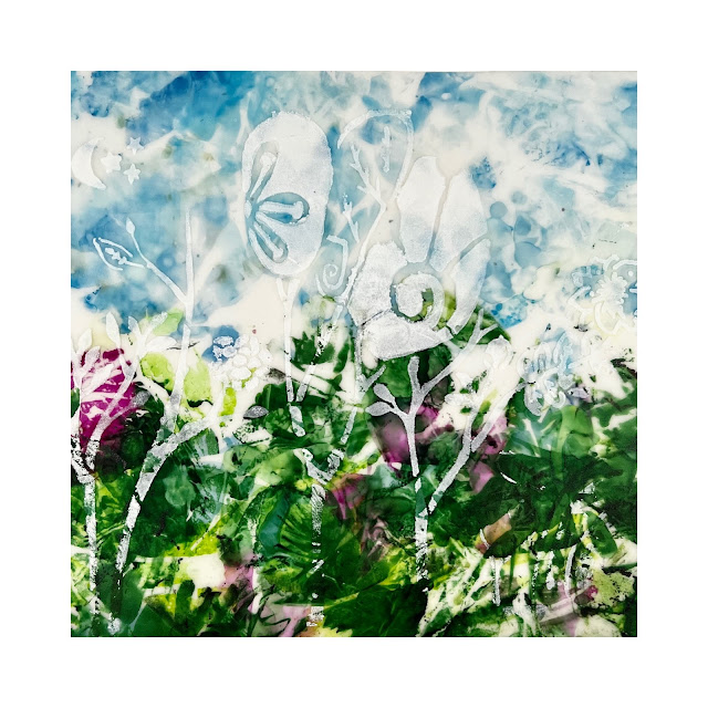
I am so happy to be back on the blog and to spend another year on ®StencilGirl's design team. I am Nancy Curry coming to you from the suburbs of St. Louis.  I'm in pretty dazzling company on the team and look forward to every Tuesday when new inspiration drops. I also love all the guest artist posts.  We all have a different artist voice that sings loudly and I love to hear them all.   For those new to my blog projects, almost all of them are titles of songs.  This one happens to be a Tom Petty song, but my choices head across all genres.  I also paint and design a lot of pieces that are floral related so I didn't leave my wheelhouse this time.  This project came about when I wasn't even thinking about it.  I was walking around my local Michael's looking for frames that weren't dented a few weeks ago, but, of course, I browsed the art materials and did a general loop around the store.  I also needed some foam board for  mailing so I headed off to find that and lo and behold I saw a 22" x 28" piece of translucent polyethylene  (mylar is a brand) plastic that was a nice weight (12 pt) and decided to get it and some day I'd have a spin around it.    Fast forward to this week and that's exactly what happened.  A few minutes in,  the lightbulb went off and this project was born.

I delved into my vast stencil stash and got four out to play with.  The main project and the one featured on the video tutorial was done with a favorite of mine, Cathy Nichols' Love Story (L341).  I knew immediately it was the perfect stencil for me to curate parts of for the ideas going on in my head. I love to use parts of larger stencils.  The others I chose were David Daniels' Rooted in Nature Large Caladium (L810) which is more abstract yet still intriguing, Traci Bautista's organically patterned,  Circles Circles (L301), and one of the most interesting SG stencils, Moths by Jane Dunnewold (L520). All of them were approached in the same matter.  Without further adieu, here's the materials list and then the video tutorial.  
 
MATERIALS:
plastic sheet cut into working size
gesso or white paint
cosmetic sponge
stencils
91% rubbing alcohol in a spritz bottle (good ventilation is recommended when you are using alcohol inks)
Ranger alcohol inks:  wild plum, everglades, botanical, glacier, cloudy blue, sailboat blue, boysenberry
paper towels
plastic wrap or white plastic trash bag cut down to size
mats/frames or deep cradle
Krylon Kamar varnish & Krylon UV Archival spray (spray in well-ventilated area)


I hope you enjoyed the process.  It is one I have used for years on clear acetate with varous types of ink or paint.  It was really fun to work it with a translucent substrate that was inexpensive so I could save my more expensive Yupo for other projects.  Below you will see a close up of the original piece that really shows how much visual texture comes from the alcohol ink on the backside.  It would have overpowered the gesso to be on the front, but from the back it allows the white flowers have enough high contrast to shine.  I have also included the other pieces I mentioned in the introduction.  This process will work for many genres and I love processes that can be versatile.  I'd love to see what you do with these should you head down the road to try this.  


Rooted In Nature Large Caladium
 
Moths

Circles Circles

 
As promised in the video, I said I'd share the finishing process.  I do two-three light coats of Kamar as an isolation coat and then two coats of UV Archival in whatever finish you want. I am partial to satin.  Let it thoroughly dry in between layers and keep the can 12" away.  Even with this finishing, do not hang in direct sunlight.  Indirect should be fine.  They mat well or you can go the deep cradle route.  Both look great.  I'm sure there will be more great options floating around. 
 
As always it's a pleasure sharing my meanderings with you.  Should you want to see what I am up to more frequently, I post most of my tutorials on Instagram on my grid and reels page and post art almost daily.  I post most of it also on my Facebook art page.  My regular Facebook page includes some art, no politics, and lots of standard poodles.  My website is always a little behind, but when I get a chance I update it.  It does have my online store that carries originals and prints available any time.  To get updates about classes, art sales (one coming in June), please sign up for my low volume newsletter.  

Have a wonderful rest of June.  I'll be back on the blog later in the summer. 


xoxo

Nancy

Friday, March 5, 2021

Leaca Young: Exploration in Textures with StencilGirl® Products

Hi, everyone! Leaca Young here!
In an effort to explore more, this is a practice that you focus on visual textures.
This exercise is meant to relax you and spark your creativity.
Keeping it abstract and without a focal point. Enjoy!

Stencils used:
Pine Cone Woodcut Mask
ATC Mixup Missigman #1 Art Marks
Classic Feather Retake Stencil and Mask

Rooted in Nature Palm


Other supplies:

3-5 pictures from nature

Watercolor Palette

Brushes

Daniel Smith Transparent Watercolor Ground

Catalyst scraper or Key Card

Espresso Instant Coffee

Liquitex Paynes Gray and Unbleached Titanium


Leaca Young

Website

Instagram

YouTube

Saturday, August 29, 2020

Stencils for Watercolor Delight or the Paints of Your Choice


Greetings! There is plenty of art to see in this post because Dave Daniels, aka Mr. Watercolor, is sharing his inspiration as well as techniques.

Remember, no matter if you call these "stencils" or "masks" the white part is the mylar and the black part is where the paint goes. 

Large 9" x 12" or small 6" x 6" designs available.

The Rooted in Nature Butterflies Mask is a combination of many butterflies and flowers. Just when you think you are sure what you are looking at, your vision shifts, and you see something completely different.

This was a new technique for Dave. He placed the mask on card stock, and spread “light dimensional ground” (a Golden product) through the mask openings with a palette knife. When the ground was dry, he flooded the surface with watercolor. after the watercolor dried, he lightly sanded the surface, revealing the image.

Dave used Izink Ice (by Seth Apter). He applied the paint with a palette knife through the openings in the mask, then turned the mask 180 degrees and again applied paint with a palette knife creating a double exposure.


Rooted in Nature: Caladium

The intricate patterns on the Caladium leaves have always fascinated Dave. Not quite random, not entirely predictable. He captured the delicate nature of these intricate patterns in this Rooted in Nature Caladium Mask.

This was another new technique for Dave. He placed the mask on Yupo paper and sprayed it with clear water. He then grated watercolor crayons using a “micro grater” (kitchen utensil) into the openings of the mask.


Dave applied Izink Ice paint with a soft sponge roller through the openings in the mask.


Rooted in Nature: Begonia

Big bold and very structured. This begonia caught stencil designer Dave's eye because of its repetition of bold patterns. Rooted in Nature Begonia Mask is ready for your watercolors.

Using a natural sponge, Dave stamped acrylic paint through the openings of the mask.


Dave placed the mask on Yupo paper, sprayed it with clear water then dropped watercolor paint into the opening of the mask. 


An option with these stencil-masks: You can cut off the border. It is totally a matter of preference. Keep in mind that cutting off the border will make the design bit more delicate to use and to store.

Rooted in Nature: Monarchs

In this Rooted in Nature Monarch Mask, Dave tried to capture the thousands of upon thousands of Monarch Butterflies that migrate each year. Separately they are beautiful, but collectively they create textures and beautiful patterns. 

Using a brayer, Dave rolled Izink Ice directly onto the mask placed on watercolor paper making a print.


Dave placed the mask on 140lb watercolor paper and sprayed it with clear water. He dropped watercolors into the opening of the mask.


Rooted in Nature: Coleus

A coleus plant grows just outside Dave's studio window. A recent black and white photograph of the plant revealed the beautiful symmetry of its leaves and inspired him to design inspired this Rooted in Nature Coleus Mask.

Dave used a soft sponge roller filled with acrylic paint over the mask.

Dave placed the mask on Yupo paper, sprayed it with clear water. He dropped watercolors in the mask openings and allowed the colors to mingle.


Rooted in Nature: Window

Are we looking in or looking out through the window? You are probably familiar with this everyday scene. The combination of architecture and organic plants makes a great mix of shapes in this Rooted in Nature Window Mask.

As mentioned earlier, whether you call it a "stencil" or "mask" the white part is the mylar and the black part is where the paint goes. 

Dave placed the on Yupo paper and sprayed it with clear water. He then graded watercolor crayons using a “micro grater” (kitchen utensil) into the openings of the mask.


Dave placed the mask on card stock, and with a palette knife, spread “light dimensional ground” (a Golden product) through the mask openings. When the ground was dry, Dave flooded the surface with watercolor. After everything was dry, he lightly sanded the surface, revealing the image.

Butterfly Window (the painting at the beginning of this post and the Two Crows painting (below) were created using several different stencils. 

  1. Place the masks on Yupo paper and pour liquid watercolor though the openings. 
  2. Wipe out the butterfly shape and repaint. (Yupo paper is a synthetic paper, actually, it is plastic. You can remove the paint completely by wiping it with a wet sponge.) 
  3. Make a butterfly stencil out of cardboard. 
  4. Place it over the now dry stencil painting.
  5. Wipe it clean and sponge “white absorbent ground” through the opening. 
  6. Remove the cardboard and let dry.
  7. Paint the butterfly.


Dave used a similar technique for Two Crows.

The branches upon which the hand-painted crows are perched were created using frisket. Here is an example of frisket branches:


In love with Dave's Rooted in Nature series? The entire collection is available from StencilGirl.