Showing posts with label embossing powder. Show all posts

Thursday, September 17, 2020

StencilGirl® Products & Seth Apter WOW! Blog Hop

Welcome to the
Blog Hop!

We are getting creative with
StencilGirl® stencils and Seth Apter's WOW!
Embossing Powder Trios and Mixed Media Embossing Brush!

Hop along with these talented designers! You’ll be inspired AND for every comment you leave on each blog, you’ll earn a chance to win our GIVEAWAY! YAY! Please share some feedback with these artists who worked hard to inspire and excite us!


And be sure to check out the blog posts and creations by
WOW! Embossing Powder's Creative Team HERE, too! 

What would a Blog Hop be without a GIVEAWAY??!!!
A $35 Gift Certificate to StencilGirl® Products
A $35 Gift Certificate to Seth Apter’s Shop
AND a $25 Gift Certificate to WOW!

Enter to win by leaving a comment below.
Then be sure to visit the other blogs in the hop and comment to win.
The more blogs you comment on, the more chances you have to WIN!
Three winners will be chosen at random from all blog comments!
(One comment per blog please.)

You have until Tuesday, September 22nd at 11:59PM Central Time to leave your comments.
Winners will be announced on Wednesday, September 23rd.

If you don't already, we would LOVE if you would sign up
for The Scoop HERE
for more inspiration!

Thank you for hopping with us!

Tuesday, July 28, 2020

Passages Through Time by Linda Edkins Wyatt


Hello.

Time travel has fascinated me for years. I wonder about past lives, wonder if I have lived before, and if so, who I was. I have sometimes had the experience of being in a new place, yet feeling like I know it, like I have lived there or been there before. I often watch films and television shows about time travel, and one of my very favorite books is Time and Again, by Jack Finney.

This feeling overcame me when I moved to New York City 40 years ago and was exploring different neighborhoods. On the Lower East Side, I saw a park and a row of old houses that I felt I knew. I hadn't seen a photo of it, or read a book about it. But I did feel like there were memories of the park and houses inside me waiting to be discovered. I had the same feeling in Paris, when I visited Montmartre. It seemed so familiar, and I wondered if I had lived there and been part of an art scene from yesteryear. I felt that odd familiarity with a new place driving through an old tenement area, which was under renovation, near Albany, NY. Most recently, that "I know this place" feeling hit me when working in Harlem.

So to illustrate the StencilGirl® travel/passages theme, I thought, "Time Travel!" and decided to create a little old-fashioned city-scape to illustrate the idea.

Here's a video which shows my process:


The woodblocks and matchboxes were painted with a few coats of white or black gesso.
I have been collecting cardboard boxes that hold wooden matchsticks. Paired with some house-shaped wooden blocks that I snapped up for $1 each at a discount store, I had a good foundation for the project. I painted one of the blocks white, and the other black, and did the same with the matchboxes.

Next, I used the December 2018 StencilClub set, Fancy Houses, designed by Valerie Sjodin, to create the buildings. I stamped a Versamark pad through the stencil, then sprinkled the white shapes with black embossing powder, and the black shapes with white powder, then zapped it with a heat gun. On the back of the blocks, I got a little more experimental, using gold embossing powder on one, and on another, adding color with Derwent Watercolor Blocks.


Areas from the Fancy Houses StencilClub set were used to decorate the blocks and boxes.
I had to be verrrry careful with the matchboxes...there was a fine line between melting the embossing powder thoroughly and burning the box! I also had a little trouble getting a crisp image on the box, especially on the sides where there was a textured strip for striking the matches. Since I was using mostly black and white, I touched up any unwanted blobs and speckles with a black sharpie or a little bit of paint on a small brush.

My stencils were larger than the boxes and blocks, so I selected strategic areas of the stencil, like using just the light post on the edge of one of the blocks. On the other sides of the boxes and blocks, I used the windows or doorway areas, and also a key stamp to add interest. On the back of the blocks, I got a little more experimental, using gold embossing powder on one, and on another, adding color with Derwent Watercolor Blocks.


The sides of the boxes and blocks were also painted and embossed.
The cabaret paper doll fits inside the matchbox. Here, she dances atop the backside rooftops.
I couldn't resist making a little cabaret-inspired black and white paper doll to live in--and dance on top of--my time-travel village.


The old-fashioned doll was made with a Rubber Moon stamp and a Graphics Fairy vintage hat image.
A subtle detail was flipping the clock image before printing to give the idea that time was going in a different direction. I used a vintage image from The Graphics Fairy.


While I may never actually time travel, my little village makes me think about the possibility, and definitely makes me want to read my old favorite book again.

Linda


Friday, March 20, 2020

Embossing with StencilGirl® Stencils

Hi, everyone! Ann Butler here! I like being able to use my stencils and supplies in a variety of ways…today I am going to share how easy it is to Emboss with Stencils.  I will show several techniques and a final card to get your creative juices going…

Step by step to emboss with stencils.

StencilGirl® Stencils used:
Other Supplies:
Embossing Ink
Embossing Powder
Cardstock or Watercolor Paper
Heat gun
Makeup Sponges
Pixie Spray (optional)
Baby Wipes
Copy Paper
Step 1:
Spray the back of the stencil with Pixie Spray (optional).  Place stencil onto cardstock and then, apply embossing ink using a makeup sponge.
Step 2:
Pull stencil up, wipe off with baby wipe.  Place the cardstock onto copy paper and then, sprinkle embossing powder onto cardstock.
Step 3:
Shake excess powder onto copy paper and place back into container.
Step 4:
Heat set the powder with heat gun. 

Note: At this point if you missed any area, you are able to see exactly where to replace your stencil and apply some more embossing ink if needed and repeat step 2 and 3.

Here is a link to a Facebook Live I did with this technique:
Now you can create a quick care with the wonderful embossed background with a sentiment stamp set and a card base.
There is so much more you can do…
Step 5:
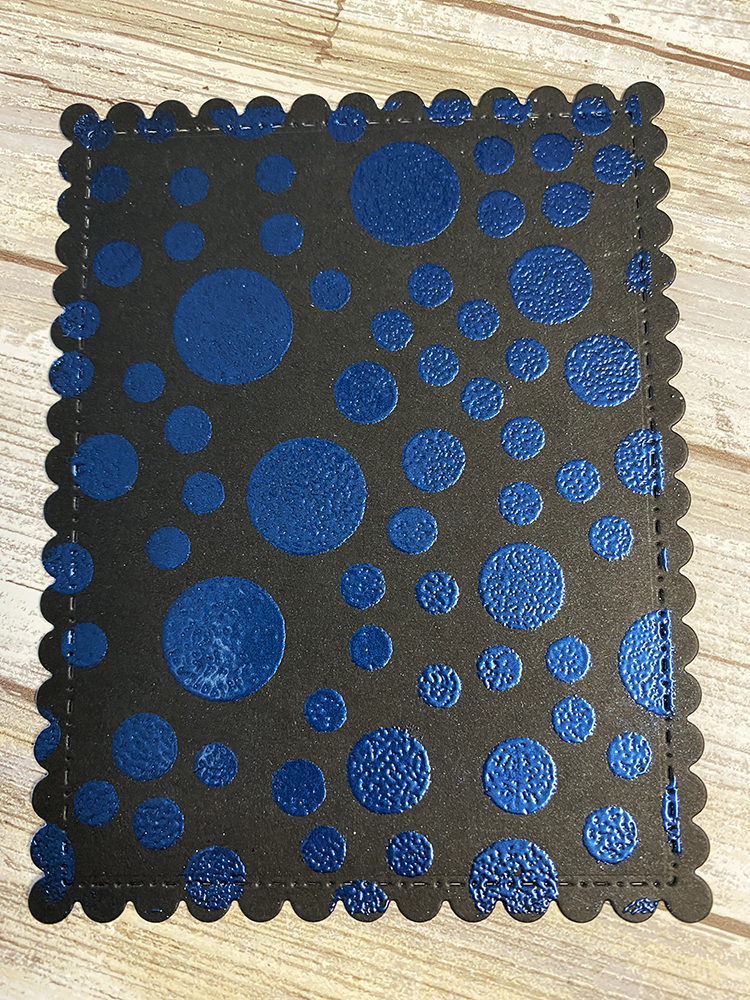
Here is what it looks like embossed.

The above example I did on white cardstock, but it looks fabulous on Black cardstock, too!
Use clear embossing powder with pigment inks to create any color you want.
Follow the steps above using the desired color or colors of pigment in and cover with clear embossing powder to create your own colors…
You can even use White embossing powder to create a white on white effect or to have the embossing stand out and add color to the background as in these examples:
Have fun creating embossed background papers for cards and more with StencilGirl® stencils!
Ann Butler

Ann Butler’s Blog: https://annbutlerdesigns.com/

Tuesday, January 7, 2020

Elegant Distressed Frame


Hello from Linda.

I love having framed artwork on my walls. Even better, I love giving commercial frames my own personal touch. So, when I saw the StencilGirl Creative Team theme choice, "Frame It or Fill It With Circular Shapes", I knew just what I wanted to do.


I had a frame on hand with a very wide (4") plain black mat. It was just the surface to suit Seth Apter's "grunge" technique. I had taken a class with Seth a few years ago and learned how to combine his Paper Artsy paints with his line of Emerald Creek embossing powders for a wonderful aged and distressed look.

I pulled out my paints and got started, applying each of the four colors one at a time until I got the effect I wanted.


Next, I added a spritz of distress stain and shimmer gold spray.


Then it was time for the magic:  I added more texture with stencils and embossing powder.


Ancient Amber embossing powder before heating.
I started with a mash-up StencilClub design by Seth Apter and Mary Beth Shaw, using Ancient Amber embossing powder.


Ancient Amber embossing powder after heating.
Another club set, Aboriginal, was used with the patina oxide embossing powder. It looked much darker dry, but once I hit it with the heat gun, the color softened.


Patina Oxide embossing powder before heating.

For more texture, I used a circular strip from another of Seth's StencilClub designs, again using the ancient amber powder.


It is always a little tricky to photography shiny artwork, but above you can see the finished frame.

I keep a painted box on my desk, filled with my "go-to" stamps, ink pads, and small art supplies. 
The finished frame went perfectly with my box, which I had made last year using the same technique.

I was so excited to realize that I had made a companion piece to the box! Here they are together on my worktable.


(Click HERE to see the blogpost on how I transformed an ordinary shoebox into a faux-wood distressed art piece.)

Usually people have a photo or painting, then select a frame to match it. This time I worked backwards, rifling through my boxes and bins and electronic files to find just the right photo to go with the frame.

Here's a few I considered:

I love my parent's wedding photo (from 1944!) but the pinkish tone of the sepia photo didn't quite work with the frame.

This punky painting from last year's ICAD (index card a day) looked kind of cool, but it was too small, and also had a hole in it that I punched to keep it on the ring with all my ICADs.

I finally settled on a piece that I had created in Photoshop a few years ago. I had used the artwork to make some 4" x 4" trading cards as well as some ATCs. However, for that project, I overprinted the photoshop artwork with stamps and white printmaking paint. (Click HERE to see the old post.)

The Photoshop document was created by combining some images from The Graphics Fairy with an old photo of my mother, circa 1937.


It was a small (1.75"x 2"), vintage sepia toned photo taken in an old-fashioned photo booth. In Photoshop, I took out the background curtain, replaced it with the vintage script and botanical floral, then added some soft color to her cheeks and lips. The flower is upside down intentionally.


I loved the contrast between the pink, feminine image and the earthy frame. Even better, the colors and textures were strikingly similar to shingles on the house we grew up in, so the framed piece is a double homage to my mom, my siblings, and our family memories.