Showing posts with label texture. Show all posts

Friday, April 4, 2025

Cry Wolf Canvas - by Claudia Neubacher


Hi, servus and welcome back to some messy grunge and texture fun! 


This time I entered my studio after what feels like ages without holding a brush or palette knife - and ages it has been! So even if I knew I was up to having some creative fun, I also knew I hadn't  been in touch with my creative mojo for quite a long time. So how do you tackle this? What are good ways to make sure you'll be ending up enjoying yourself and the process?


One way that really works for me is to gather "favourites" - designs, materials, colours and objects that make me feel good by just looking at them. So I picked stencils without thinking at all about how these would go together or create a specific theme. I went for a mix of paints, pastes, brushes, palette knives I thought I might use and in my pants' pockets I found some used rough garden string in black and white, nicely weathered during the winter (as it had been outside, holding protective jute bags in place). When clearing my desk I also kept some tiny snippets of Asian text paper strips from an earlier project for a possible use. 


Also a good way to take off any pressure of having to succed in creating something "special and precious" is to use up old paints and pastes that have already started to dry out a little but can still be applied through stencils, cheap paints and media and some low price substrate to work on like a cheap canvas or some left over cardboard. 

But let's take a look at the stencils I've used:


S861 - Abstract Marks - by Jeanne Oliver
L455 - Wolf - by Roxanne Coble
L792 - ATC Mixup Missigman #1 Art Marks - by Rae Missigman
L433 - Clustered Leaves - by Cecilia Swatton
S621 - Totally Triangular - by Wendy Aikin

There's one more stencil in the picture, but I didn't use that one in the end. It is always good though to have more stencils to choose from. 

I started without having any idea of a theme or look in mind. I only knew I wanted to go by a reduced colour scheme, having black, grey, beige and white as my main colours and adding yellow, maybe orange or rusty tones later. The bright pink somehow demanded to be used during the process. 


But let's start at the beginning! Breaking the clean white of a canvas can be an intimidating moment. Especially when you start without any concept for your piece of art. 


So what I did was use some cheap grey outdoor acrylic paint from a dollar store that needed some good stirring. For that I used the handle of a long old soft brush. When I started scraping off the excess paint afterwards, I found there was still so much of it left on the brush handle, that I decided to scrape that onto the canvas, twisting and turning the handle during the process. I actually liked the result! 
Next I masked a stripe to add some slightly transparent yellow acrylic paint to with a palette knife. 
I heat dried everything thoroughly, before I went on.


Using a second stencil on top of another is a great way to create a textured shape in one go. I used the large open oval shape from Rea Missigman's "ATC Mixup" stencil on top of the "Totally Triangular" stencil and applied carbon black acrylic paint using a stencil brush. 


So far, so good!


Honestly, one of the main goals for this project was to experiment and use the stencils in different ways.
For example, I applied thick white Gesso (that had already started to dry out a little) with a small bristle brush in random circular motions through the oval and circle shapes of my stencil. This way the added shapes looked random and loose, but still had a sharp outline. I heat dried, then  put the stencil back in place again and added some black lines, using the stencil as a mask so the lines' ends would line up with the previously added shapes. 


I also had a small pot of black modeling paste I wanted to use up (or at least save from drying out almost half full) and I decided to use that alongside the lovely "Fallen Leaves" stencil. I applied that to the left side of the canvas and as there was a lot of paste left on the stencil afterwards, I rubbed that residue off the stencil and onto the bottom right corner of my canvas using a baby wipe. 

I found this is a great way to not waste any paint residue and get a soft fading effect at the same time. 


You can see it close up in this picture, which shows me using some dry herbage (or moss?) to "stamp" with. Remember, I was in experimenting mode...

If the outcome of the project isn't of much importance, this is also a great time to practice particular techniques. I used the opportunity to get a bit better at using modeling gel for example. But first I applied some (also a bit dried out) rust paste using the geometrical design on the "Wolf" stencil. 


As you can see I had previously added part of the "Fallen Leaves" design using the baby wipe technique in this corner too. I let the rust paste dry a little (but not fully) and then sprayed on some orange acrylic paint. I created some drip lines and while these were left to dry, I applied the garden string using the modeling gel and a fine tip palette knife. Later I carefully heat dried everything, before I added some white spray paint on top. 

At that point I found my canvas needed its "star" - my beloved wolf (one of my all-time favourites...see HERE). Instead of stenciling it in place with white paint, I used the stencil to draw the outlines using a black archival ink fine tip pen and later filled in the paint using a small bristle brush. I also added some spying eyes (from the same stencil) for a bit of a mystery touch. 

Before I went to sleep and let my canvas sit for a while, I also added more white spray paint in some spots where I found I had added too much texture in black. That was followed by some tiny yellow dots (through the stencil from the October2016 StencilClub set) and more yellow (scraped on, using a palette knife). 


A new day - some new ideas!

I found my garden string looked like a cloud - so I added some falling rain here and there. Now a story started to unfold! 


Suddenly there was a mysterious hand...dangling in the wind...a sign from above? A warning? Food for my poor hungry wolf? 


I went in with an ordinary graphite pencil and traced or filled in some of the stencils' shapes by scribbling randomly and outlining. I also added some scribbling around the rain cloud. 

Finally I added some handwritten text in spots that I found still needed more interest. I adapted a quote from a very successful Neue Deutsche Welle (New German Wave) song from the Swiss band Grauzone (Grey Zone) that goes: 

Ich möchte ein Eisbär sein (I want to be a polar bear)
im kalten Polar. (in the cold polar circle)
Dann müsste ich nicht mehr schrei'n (then I wouldn't have to cry anymore)
Alles wär so klar! (Everything would be totally clear)


Of course I had to change the "Eisbär" (polar bear) into "Eiswolf" (polar wolf), but the text definitely tells the story, doesn't it? And those who know the song, know that the famous refrain says that "polar bears never need to cry!" - so there's some poetic depth in it, don't you think? ;)


I didn't like the plain white wolf body, so he got some red and white banded Angora hip warmer (at least that was my husband's interpretation, which I am happy to go by)...


All in all the canvas maybe lacks in consequence compositionwise, but I really loved where this journey took me and had a lovely time messing in my studio. Taking some close ups and editing these on my lap top made me realise, I love a lot of the detail shots and can well image these as little paintings or canvases on their own...so this canvas also is a kind of catalogue for further inspiration and directions to explore creatively. And there's loads of yummy texture and layers whereever you look! But take a look yourselves!


Thanks so much for stopping by!!!!
Hugs and happy creating!
Claudia
xxx


Monday, November 13, 2023

Use Your Travel Photos for Inspiration


Hello! I am Kristin Williams, a mixed media artist and stitcher who's been taking a "Gap Year" this year to travel, make art and renew friendships. 


I wish I were as observant of my everyday surroundings as I am when I am in a new city, town, or country. My head & phone whip from side to side capturing beauty, graffiti, textures, landscapes, and beautiful color combinations.


I love the feeling of being hyper-aware of the scenery and drinking it in. I take the most random photos which end up being my absolute faves. My photo quantity is exceeding quadruple digits on my phone. Yikes. 


I don’t like them just to be pretty pictures taking up space on my phone. 


As someone who thrives on color, I love it when a photo gives me a roadmap for a palette for a new piece of art. 


Sometimes it is overwhelming to choose which colors you want to extract from a photo. If you have Procreate or Canva there are ways to generate a color palette from a photo in those platforms. 


If not, I found a successful way to accomplish it through the online app COOLORS.CO. Under tools choose “Image Picker” to upload a photo and generate a color palette from it. You can add colors by clicking the + sign and even rearrange their order on your palette. It’s a pretty handy and, so far, free tool. 


Swoonworthy colors in Porto, Portugal

The Pink Street in Lisbon, Portugal.

Porto, Portugal

Lisbon, Portugal

You may or may not need this, but I think it’s helpful to identify what you like about the photos you’ve taken. 


I definitely have color themes and I’ve realized that my favorite photos or journal pages have an Aha! Pop of color. The analogous colors hang out in harmony and then the complimentary color boldly says “Howdy!”


Textures also soothe my soul. When I see images like these, Mary Beth’s voice rings in my head saying “I see stencils everywhere!” I like to print these texture-rich images on text-weight paper in a variety of sizes and use them in my collage. You can also find sites to upload images and have them printed on tissue paper or fabric. Spoonflower.com is a favorite site of mine for printing on fabric. 


Even if you can’t travel right now, take yourself on an “Artist Date” and snap a ton of photos around your area that make you smile. The Autumn leaves produce beautiful palettes and the hardware store has the opportunity for endless texture photos. 


There is a satisfaction in using your photos in your mixed media work that brands it truly as your own.


Happy Photo Snapping!

Thursday, May 20, 2021

Watercolor, Gouache, and Acrylics with StencilGirl® Products

Hi Everyone, I'm Brenda Townsend of Brilliant Spectrum Art, and I'm so delighted to be with you as the StencilGirl® Products Guest Blogger today! Honestly, I'm primarily a painter who works in watercolor, gouache, and acrylics. I had used three beautiful stencils created by my awesome teacher, Helen Shafer Garcia (Echevarias, Echevaria Ballet, Filigree Sprigs) to create my series, "Critters Who Will Eat Your Succulents."

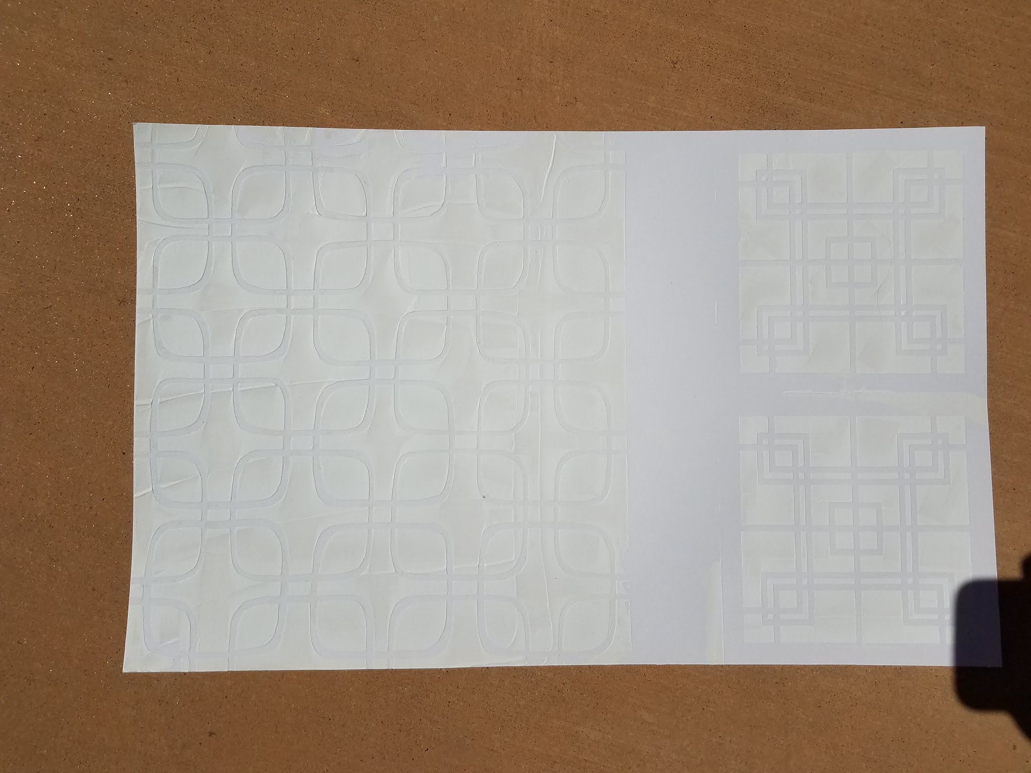
In the two paintings pictured above, I used gesso with the stencils, but needed something to create more contrast between my gouache and the stenciling.  I love to play and experiment, and for some reason, leaf rubbings came to mind.  I scanned my workspace for a suitable material that I could use to rub across the raised surface.  I ended up trying a Conte crayon on its side and was quite pleased with the results!  I began to consider what other materials might also serve the same purpose, and that is the idea behind my blog post today: Experimenting to see which other art supplies could be used to get similar results with stencils and gesso.


If you choose to use this simple technique, here are a few tips for best results:

  • Don't be shy with the amount of gesso you use... The more you use, the higher the gesso will be raised, and easier to capture with the medium dragged on its side.
  • Use a credit card to scrape the gesso through the stencil.  I tried sponging the gesso, and it didn't allow the gesso to create a raised relief effect.  Ideally, you want to be able to feel it underneath your fingertips when dry.
  • I used Golden Gesso bright white acrylic primer. It's a bit more expensive, but it allows you to achieve the best results possible.

Overall, I experimented on cold press watercolor paper, linen-finish watercolor paper, and Bristol Board using acrylic ink, goauche, regular watercolor, and concentrated watercolor for the stenciled backgrounds.  To create contrast, I used Conte crayon, square pastels, soft pastels, oil pastels, and Marabu Art Crayons which are a type of watercolor crayon.


As a fan of all things Mid-Century Modern, I used Square Clover Leaf 6, Lattice Full, and Centered Circle which remind me of the "breezeblock" walls, so prevalent in Mid Mod architecture. 


First, I used a credit card and gesso to stencil the various designs onto the paper.

Next, I layered a variety of mediums and on the backgrounds to see what kinds of effects could be achieved.


Each combination ended up with quite a different feel, depending upon materials used, so the outcomes are nearly endless!  I hope this post inspires you to experiment with this simple technique and discover which styles you like best, to enhance the great work you’re already doing.  It’s an effective technique to pull out when you just want to add some quick contrast to your 3-D piece.


Ideas for further exploration:

·         Colored pencil 

·         Prismacolor Nupastels

·         Crayola crayon


Happy Creating!

Love, Brenda @BrilliantSpectrumArt


I am Brenda Townsend of Brilliant Spectrum Art. I'm a California-Credentialed Arts Educator, working in watercolor, acrylic, colored pencil, pastels and more on paper, murals, and theatre sets. Some of my favorite subjects include lights, tikis, mermaids, birds, flowers, and/or shells in a fantasy setting, with an exotica/retro vibe. Major artistic influences include Disney artist, Mary Blair, The Artist SHAG, Oceanic Art and the Natural World. I work in multi-media, and my process often involves using hand- made stamps and stencils and using found objects to print. I paint my current thoughts and discoveries on top of these backgrounds, in a semi-realistic style, using exciting and surprising color palettes.

I feel passionate about creating uplifting, fun, and beautiful works with broad appeal to provide viewers an emotional respite from everyday life. My work is escapist, joyous, and unapologetic, exuding positive energy which allows viewers to recharge and be transported while experiencing an enhanced reality.

Friday, March 5, 2021

Leaca Young: Exploration in Textures with StencilGirl® Products

Hi, everyone! Leaca Young here!
In an effort to explore more, this is a practice that you focus on visual textures.
This exercise is meant to relax you and spark your creativity.
Keeping it abstract and without a focal point. Enjoy!

Stencils used:
Pine Cone Woodcut Mask
ATC Mixup Missigman #1 Art Marks
Classic Feather Retake Stencil and Mask

Rooted in Nature Palm


Other supplies:

3-5 pictures from nature

Watercolor Palette

Brushes

Daniel Smith Transparent Watercolor Ground

Catalyst scraper or Key Card

Espresso Instant Coffee

Liquitex Paynes Gray and Unbleached Titanium


Leaca Young

Website

Instagram

YouTube

Sunday, January 17, 2021

Textural Art Journaling with Stencils


Hi all, it's Gwen with a new project and tutorial featuring different ways to use paint and texture with stencils in your work. This month I've created a heavily textured background using found fibers from around the house to create a background that's the perfect place to insert little nuggets of stenciling, journaling, and embellishments.

Textural Art Journaling Tutorial - Gwen Lafleur

Ready to get started?

For my first step, I prepared some uncoated tissue paper by stenciling all over first with my Collage Textures and Patterns - Medieval Cyrillic stencil and then with my new Suzani Flower Medallion stencil. I followed up by stamping a few of the coordinating images from my EGL12 stamp set with PaperArtsy to add a bit more detail. I used Archival Ink for both because you want it to be permanent and I wanted something quick-drying. (Other inks will work - just be sure to let dye inks dry completely and I recommend heat setting pigment ink so it doesn't smear later.)

While I used uncoated tissue paper, you can use other thin papers... uncoated will collage best, but regular tissue paper is fine and I also frequently use rice paper or thin mulberry paper for this type of work. For a different look you could also try deli paper or another thin paper, but the texture and appearance will vary.

Textural Art Journaling with Stencils - Tutorial Step 1 - Gwen Lafleur

Now to start on the background...

I picked a blank page in my art journal (my paper was dark gray) and then put down a quick coat of paint - I used PaperArtsy paint, but you can use other brands or a colored gesso or skip it altogether if you just want the tone from the substrate. You could also use this technique out of your journal on paper, canvas, a panel, etc...

To create the basis of my texture, I took scrap pieces of hemp twine and adhered them onto the background in a grid with a few large circular openings using Tacky Glue - you can see a peek of how that looked below. You could also use string or a thick yarn or other, similar fibers. I like the hemp because it gives me very obvious texture without being too bulky - this added a depth of just under 1/8." 

When the twine grid was dry, I took my stenciled and stamped tissue paper and collaged it onto the background with matte medium. As you can see here, I crinkled up the sheets so that it wasn't perfectly straight so that I could mix up the background pattern a bit and work in some more texture.

Textural Art Journaling with Stencils - Tutorial Step 2 - Gwen Lafleur

As I went over the top of the tissue paper during the collage process, I made sure to really work my brush into the seam along the hemp to make sure that the paper got down in there and created nice, clean square wells. (This is why it's important to make sure the glue is dry on your fibers so that it doesn't move them around while you collage.)

Textural Art Journaling with Stencils - Tutorial Step 3 - Gwen Lafleur

At this point I let the collage dry completely and then came back in to start adding color and images into the different openings of my grid. First, I used some ShinHan water soluble metallic pigment powder along with painting glue to put some gold accents in some of the squares. You can also use metallic paint or a paint pen for a similar effect or skip metallics completely if that's not your thing.

Textural Art Journaling with Stencils - Tutorial Step 4 - Gwen Lafleur

Next I used just a touch of gouache paint (which is a kind of watercolor but generally more opaque) and put just a bit of pure color straight from the tube into the corner of one of my squares and then spread it out to fill the whole area by getting my brush damp, but not soaking wet. I continued to spread and thin it out until I liked how it looked. You could use acrylic paint as well (regular consistency or thinned with water,) but I like gouache because you get vibrant color and a bit of opacity but you still have the translucency of watercolor, allowing the patterns from the background to show through.

I continued to add different colors until I felt like I had a balanced mix of hues and I liked the way they filled out the grid. I didn't fill all of the spaces, but you could certainly do so if you wanted to.

Textural Art Journaling with Stencils - Tutorial Step 5 - Gwen Lafleur

I built a few large circular openings into the background thinking that first, the circle would be a fantastic contrast with the grid and that second, it would create some great larger openings where I could put in some focal images. I did this using my new Boho Daisy Mini stencil. 

I continued to add some more stenciled imagery into the smaller openings using my Suzani Circle Flowers and Suzani Circle Medallion stencils (and I only used one of the Circle Flowers and the center of the medallion stencil - I love using just bits and pieces of stencil designs in situations such as this.)

Textural Art Journaling with Stencils - Tutorial Step 6 - Gwen Lafleur

With all of the basic components of the page in place, it was time to start adding details and creating a bit more depth. I put a few pieces of collage into the circular areas, including some scraps of papers that were stamped with some more of my PaperArtsy stamp designs to create centers for the flowers.

I also took a black Stabilo All pencil and a water brush and used them to create some shadows that emphasized the texture of my background. (The Stabilo All is a must-have for me - it's a water soluble pencil that dries permanent, so it's great for creating quick and easy shading in your work.)

Textural Art Journaling with Stencils - Tutorial Step 7 - Gwen Lafleur

I love to add writing to my art journal pages (even if you can't read it,) both because I like the process of freeing thoughts and feelings in the moment to become a part of my page and because I love the look of text as a design element. In this case I wrote illegibly - I got the catharsis of writing what I was feeling at the time but the look of asemic writing. (And if you're curious, that's an Easterbrook fountain pen with some red ink - it's a dye ink so I new it wouldn't be permanent in the next steps, but I'm okay with that - I like the look.)

Textural Art Journaling with Stencils - Tutorial Step 8 - Gwen Lafleur

Next I pulled out a few pieces of scrap paper - in this case collage papers left over from other projects. These particular papers were made with deli paper and various marks with my stamp and stencil designs. I tore out a few small pieces to add into the background for a bit more visual interest and color. I just adhered with an Avery glue stick.

Textural Art Journaling with Stencils - Tutorial Step 9 - Gwen Lafleur

I wanted to highlight the texture on this page just a bit more, so I got out some gold wax just used my finger to lightly rub it across the raised surface of my grid and the circular openings. I love the effect that created and how perfectly it brings out the dimension and ties in with the metallic powder I used in some of the squares.

Textural Art Journaling with Stencils - Tutorial Step 10 - Gwen Lafleur

Finally, I wanted to turn those circular openings and a few of the smaller squares into windows. To do that, I made sure the page itself was resting at a flat level and then took some Judikins Diamond Glaze and filled each of the selected openings to the brim, using a toothpick to try and pop any bubbles (if you don't, they'll dry that way.) 

This is basically a clear glaze (very similar to Ranger Glossy Accents which also works great here) and it contracts as it dries and the water evaporates out of it, so I poured the openings as full as I could without overflowing so that the final coat is still nice and thick. I set it aside to dry for 12-24 hours. Once it was dry, I bent the pages to crack the glaze and get some nice subtle lines in the windows. It's hard to see the impact of this in the photos, but the camera picked up a bit of the glare so you can see what a nice contrast it creates with the other elements on the page.

Textural Art Journaling with Stencils - Tutorial Step 11 - Gwen Lafleur

That's it! Here are a few more photos so that you can better see the dimension and how everything plays together on the finished art journal page.

Textural Art Journaling with Stencils - Closeup 1 - Gwen Lafleur

Textural Art Journaling with Stencils - Closeup 2 - Gwen Lafleur

And here's the finished page again so that you can see it all together:

Textural Art Journaling with Stencils - Tutorial by Gwen Lafleur

So there you go! I hope you enjoyed today's project and tutorial - I certainly had a lot of fun coming up with this one and putting it all together for you. Make sure to link me up if you try this at home so that I can see how it came out... this is one of my favorite paint and texture tutorials so far and I'm sure you're going to love it just as much if you give it a try.

Until next time, happy stenciling!
Gwen Lafleur