Thursday, June 30, 2022

Guest Designer: Andrea Garvey

Hi, everyone! Andrea Garvey here! I'm so excited to be on the StencilGirl® Talk blog today!

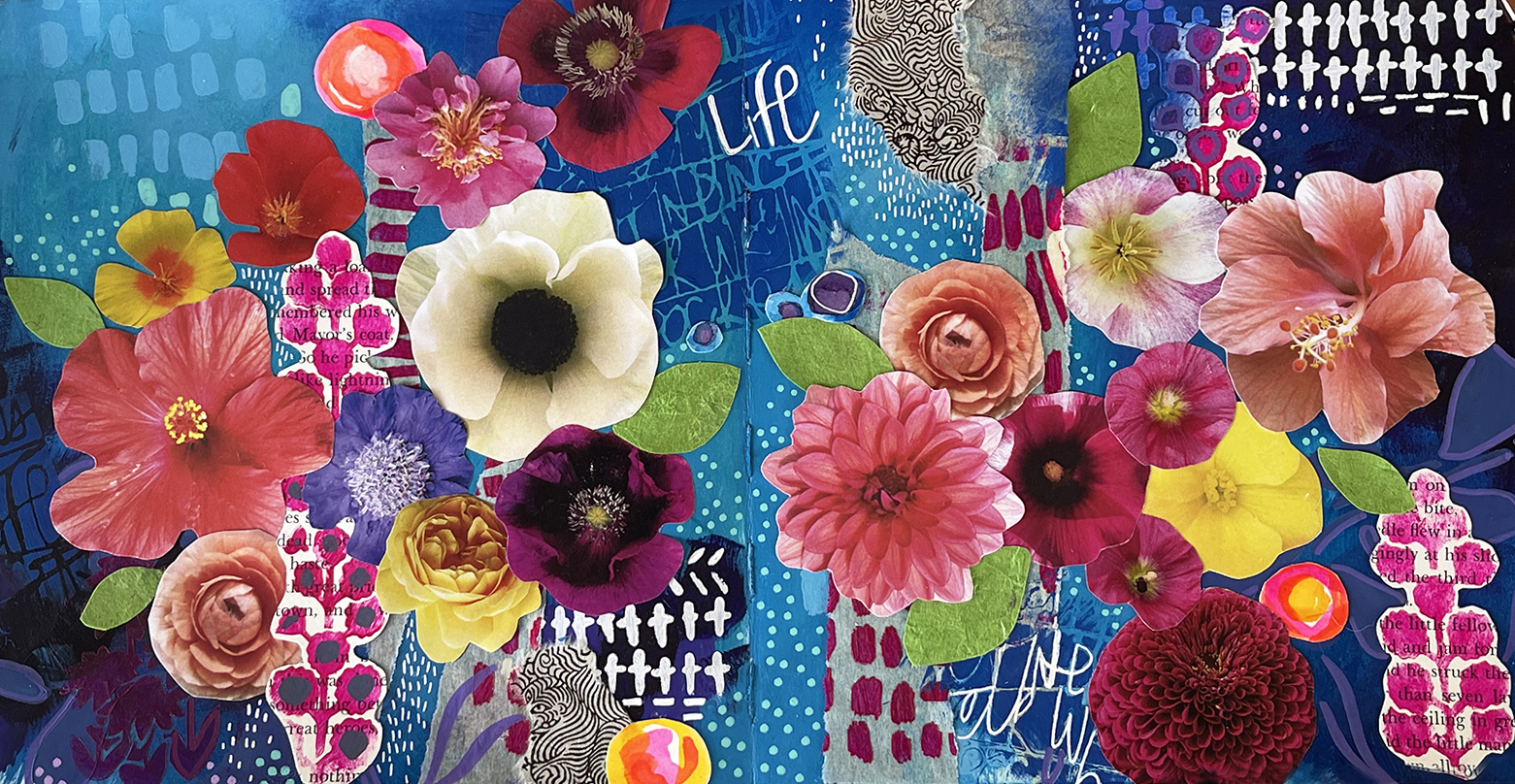
Here's a look into one of my art journal spreads that I created with some of my favorite StencilGirl® products! I love StencilGirl® so much for its quality and variety of designs.


When I get ready to create in my art journal, I make sure all my supplies are nearby. Paints, papers, and stencils. I usually don't know how it will look initially, but I have an idea of the theme before I start. 


Flowers and bright colors are usually my "go-to," which makes me happiest when I look in my journals. I like to work in layers on canvases when I paint and work that way in my art journals. A lot of magic happens in the layers!


I have many different journals that I use, handmade and store-bought, but I especially love Ranger Dylusions journals because of the thickness of the paper – it handles all the wet media like paints and inks!

Materials + Stencils

I listed all the paints I used but feel free to use anything you have handy – any brand or color of acrylic paints will do!


Ranger Dylusions Creative Art Journal - Square


Acrylic Paints

Nova Blue Green

Nova Carbazole Dioxazine Violet

Nova Titanium White

Nova Cerulean Blue

Nova Fluorescent Magenta

Liquitex Professional Brilliant Blue


High Flow + Inks:

Golden Titanium White

Golden Phthalo Blue (Green Shade)

Golden Teal High Flow

Amsterdam Ink Turquoise Blue

(replace any of the high flow with inks)


Flower collage materials – magazines, catalogs and laser printouts from my garden photos.


Vellum paper

Art Paper scraps

Scissors

Tombow Mono adhesive tape

Uniball white pen

Posca Paint pens in a variety of sizes and colors

(I love pastel colors in 3m and 5m)

Stencil Brush - Royal Stencil 5/8 brush

Sponge Brushes

King Art Original Gold Brushes 

5/8" Angle Shader 

3/8" Angle Shader 

½" Flat 


Stencils by StencilGirl®:

Bouquet Greenery 

Tall Flowers 

Soulful Scribbles Dots Dash

Boro 

Travel Note Mini


Creating the background:

I love the color blue and thought adding some bright flowers and different StencilGirl® stencils among the layers would be fun!


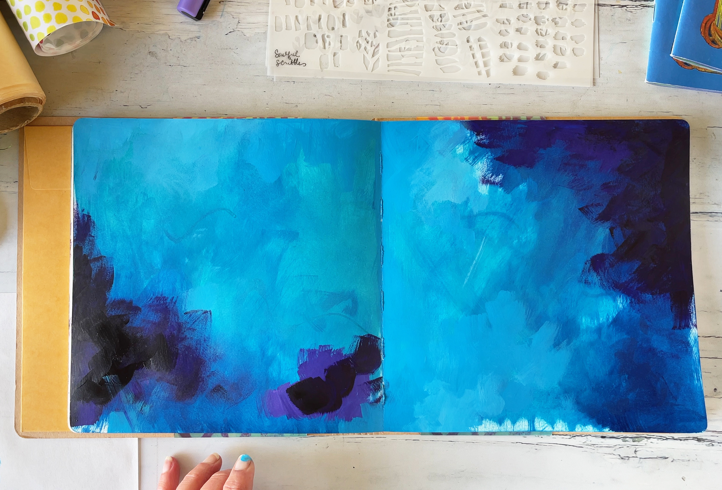
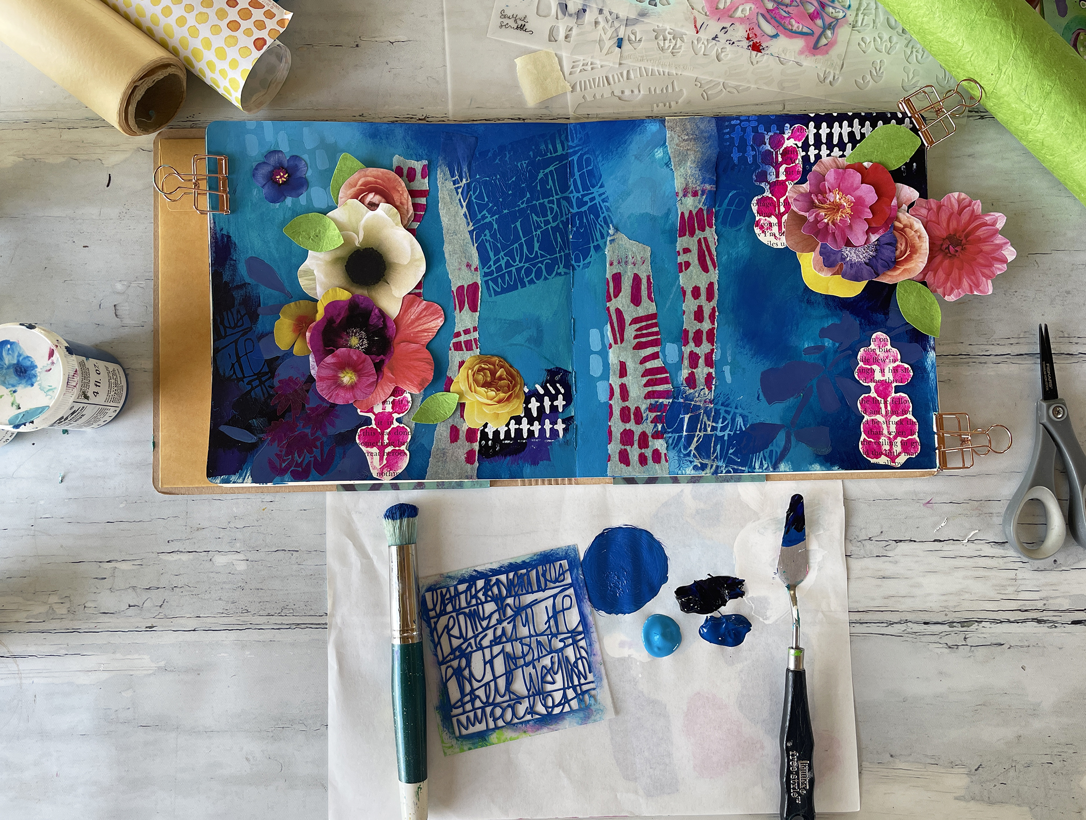
I started this double-page spread with a couple of different blue inks (high flow fluid paints), mixing as I went with a sponge brush. Moving the brush haphazardly to create some interesting marks (this may get covered up, but I like the look of the brush strokes in different directions). 


I usually work with multiple sponge brushes on the same page so that everything is not blended perfectly. When things start looking too blended in, I grab a new brush. I am using Amsterdam Turquoise Blue Ink, Golden Phthalo Green Shade High Flow, and Golden Teal High on this layer.


Tip: Sometimes, when I don't know what to art journal, I pre-make my backgrounds, and then they are ready to go for another time. Pick some colors you like, grab a few journals, and paint the first layer on a few pages. 

Next, I added in some Nova Dioxazine Violet to make some the blues even darker plus a touch of Golden High Flow White Titanium to create a gorgeous purple to paint over some areas as well.

I usually create rich backgrounds by working tone-on-tone for subtle effects. I used Liquitex Professional Brilliant Blue (a great substitution for Nova paints, especially for those who do not live in the States). Make sure you let the paint dry before moving to your next layer, which won't take long with acrylics.

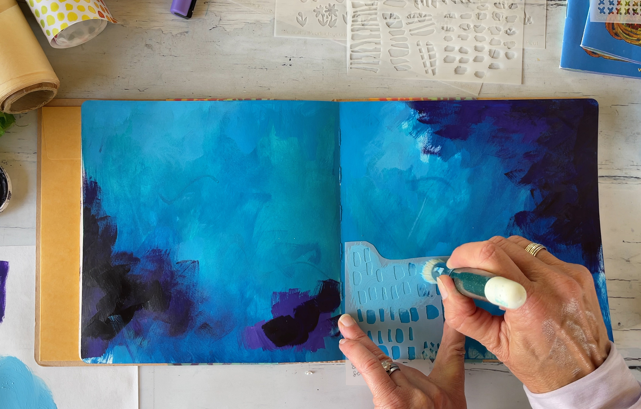
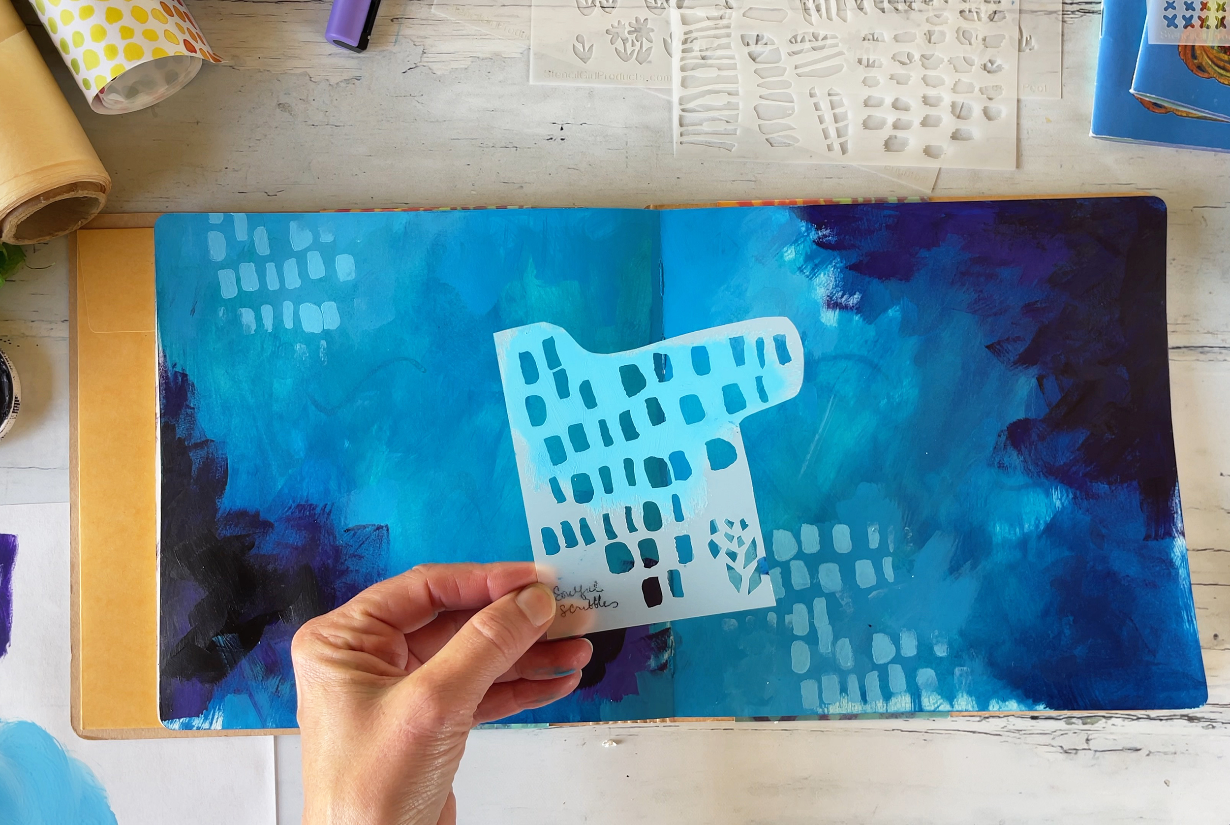
I'm using Soulful Scribbles Dots Dash for my first stencil, and I am crazy about this stencil as you can cut it up (easier to handle) and have multiple stencils from a large one. I love mark-making, so this stencil is perfect for adding interesting shapes and lines.


I mixed up some light blue by adding Nova White Titanium, Brilliant Blue, and White Titanium high flow. More tone on tone! You don't want it to be too thin as it will get under the stencil.


I just used parts of the stencil and then repeated it in a few areas.

The second stencil I am using is Boro. I move my brush in a circular pattern with White Titanium Paint (not high flow). Another great stencil for mark-making!

And then I bring in some floral elements - I am using Bouquet Greenery. I love all of Wendy Brightbill's stencils – I am a huge fan of her art. Continuing to work tone-on-tone, I mixed up Nova Blue Green Paint with Nova Violet and High Flow White. I am using a regular brush for this stencil, and I love how dramatic this turned out!

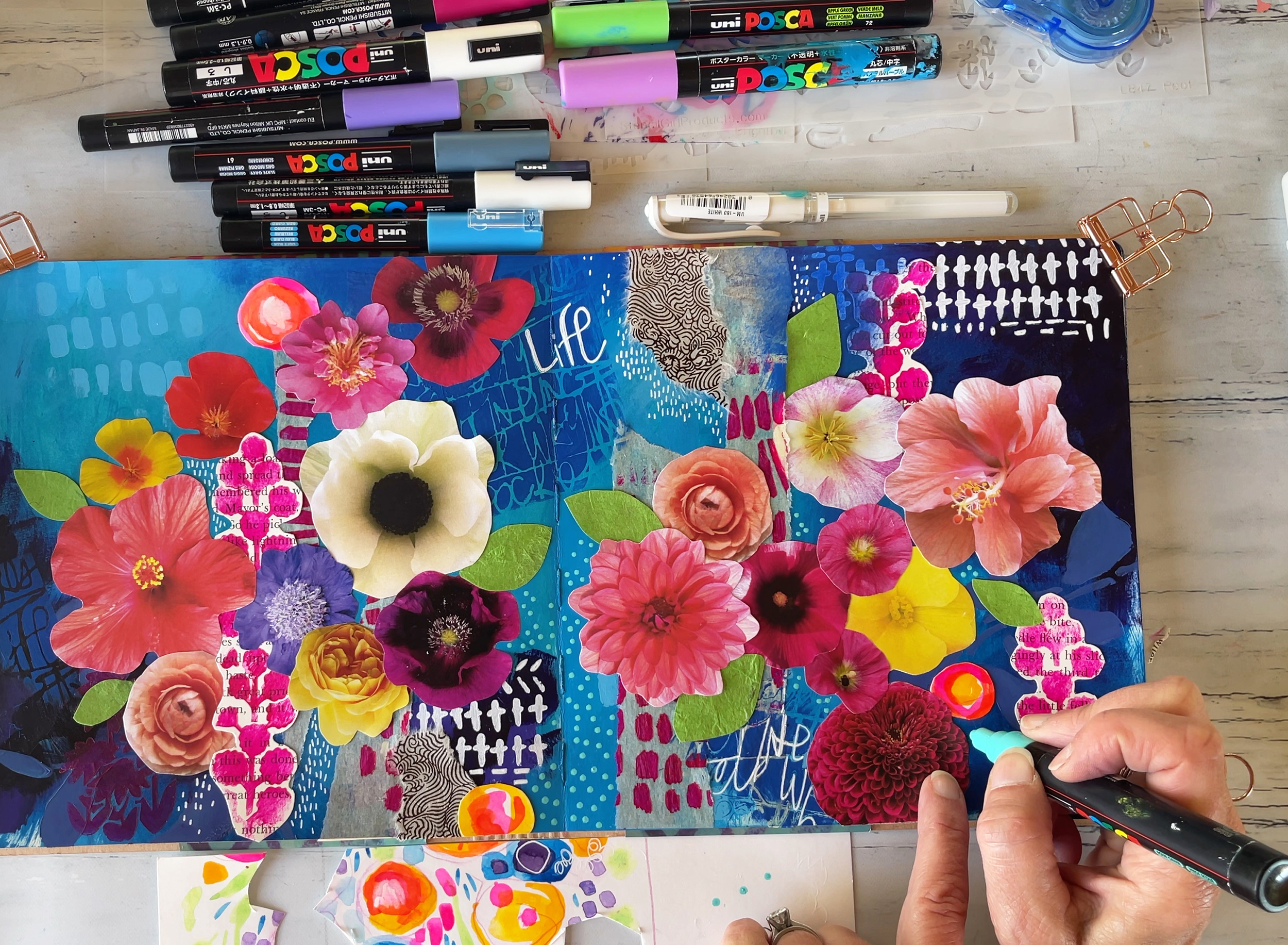
Next, I made collage material from the stencils on different papers. I found an old children's book and a vellum roll in my basket, so I thought I'd try them to see how they look. Changing up colors to pink, I went with a Nova Florescent Magenta straight from the tub!


I am using Tall Flowers and Soulful Scribbles Dots Dash. The Tall Flowers remind me of English cottage garden flowers that I love.

I love to experiment on different art papers like vellum or parchment paper; it's so fun to rip and incorporate into my design. I cut close around the tall flowers on the children's book paper and then pulled the vellum into strips. All the collage work is adhered with a Tombow MONO Permanent Adhesive Applicator that I love. I find it not as messy as matte medium, and then I can also tuck in collage pieces underneath.

Magazine and Photo Flower Collage:

I always save gardening catalogs or magazines. My favorite is from Annie Annuals, a great nursery that I order from, and they ship all over the US!

I love to go through magazines and catalogs and find a bunch of flowers I like; even if I don't use them all, I will save them for a different project. I look for bright flowers in all different sizes with a similar angle. Or I take photos of the flowers I want and then get them printed at a local copy place on good stock laser prints (asks for bright premium paper, usually 32 lb. weight). I cut out a bunch at first before picking the final ones I will use.


I think about what I want for my next layer and the composition. I love to play around and not tape anything down yet; this helps me know if I need to add anything more to the background. After doing this exercise, I realized I had a big hole in the middle, and I thought one of my favorite stencils would be perfect here! 

Probably one of my most used stencils is Travel Note Mini. I love it so much! I mixed in some Brilliant Blue, Cerulean Blue and Dioxazine Violet and repeated the stencil in a few areas.

And then start adding to tape down all my different flower cutouts. I start with a few of the bigger ones. I love the Tombow tape - you can tuck in the smaller flowers along the edges. I work on both pages simultaneously to get a good balance and then go to the next size down flowers and continue.


I felt I needed a bit of green on my pages, so I added some leaves by cutting up some art paper. When I add on my flowers, I tape down about 4-5 and then really look before I start adding more to make sure my composition is looking good.

As I near the finish I realized I need to add in a few more flowers, plus I want to create some brighter areas. I found some old art paper scraps (I never throw these away). I added in some more flowers by cropping a couple over the edges.

It's all about balancing – so keep looking at your spread and see what's missing.

Last but not least, one of my favorite layers is adding details with paint pens and markers! I love white Signo Uniball pens, which are great for making small marks, and perfect for tiny details that could bring this page to life! I use this pen to pull out some of the stencils – it's very meditative and hard to stop.

I have so many different sizes of Posca Pens, but I always seem to choose the same ones. I am crazy about the Pastel Posca Set in 3m or 5m. I always have a scrap piece of paper handy to press down and get the paint flowing. I love adding dots or outlining stencils in different paint pen colors!

This journal spread was so much fun to make – and that's the most important thing. Art journaling is all about having time to create a story or idea with all sorts of art supplies. For me, it's a meditative practice and one I like to do often!

Andrea has a Free mini class on this journal spread called Color Bloom, where you will see every layer and technique that she uses! Enjoy!
And she has also just released her new online art class, Bella Flora, featuring some of her favorite StencilGirl® stencils!

Andrea Garvey

Facebook Creative Community

Instagram

Website

YouTube

Pinterest

Wednesday, June 29, 2022

Mary Beth Shaw's VLOG: June 2022

Get your copy of Art Supplies here

We hope you enjoyed this episode of Mary Beth's VLOG!

Stay tuned!
Mary Beth Shaw will be back again next month with another new VLOG post!

Tuesday, June 28, 2022

Art Journaling: Layering Three Stencils


Do you ever get the chills when you create something magical? Sometimes it’s not even what you create in the end, but it’s the process or the emotions and feelings that needed to come to the surface for you to explore them through paint, or in my case stencils.


Let me back up a tiny bit. 

Several months ago, StencilGirl® asked me if I’d be interested in posting on this blog as a Guest Designer. I of course said yes! I spent hours mulling over the website searching for the perfect stencils to create with. 


When I found them, they sparked an idea that felt so personal and yet so me. These stencils sat on my desk for a bit, almost causing me to feel paralyzed at the idea of creating with them, just hoping this vision I had would come to life.


However, as nervous as I felt, I grabbed my Dina Wakley Media journal, gessoed a page (and a bit of the canvas page next to it) to start creating. I began this journey with some of my favorite ephemera: small, old ledger pages that are penciled on and some old dictionary pages. I love the scratchy pencil marks that are not perfect and the story they tell. I added bits of the ephemera to the geoosed page and a few to the canvas page as well using matte medium.


Once that ephemera layer was dry, I added some gesso and scribbled a Lyra graphite stick all over eventually activating with a bit of water. 


Afterwards, I began to add some color: cobalt teal, turquoise, and mars yellow deep. I used a bit of water to create a “watercolor” look with the acrylic paint, allowing some white space and also some of it to find its way to the canvas page.


Next, I grabbed the stencils, placed them on my pages to visualize where I wanted to them go. As you can see below, I had a few options I was considering!


Then, I stopped, left my studio, and took a break.


The next day, I cleared my head to get to work. It was time to bring this lady’s story, my story, to life. First, I added some number stickers around the pages, picking spots where they wouldn’t interfere with the silhouette stencil. I used my focal point stencil as a guide.


Unsure of how to accomplish my vision, I decided that stenciling the laugh face stencil would be where to start. I used Payne’s Gray with a sponge applicator to add the lady to my pages. Since I wanted the empty space of the stencil to be inside, I flipped the stencil over and stenciled every part but the “3” because I didn’t want it backwards. Later I added the 3, and also another wing with the stencil flipped over to the right side.


I used some watered-down Payne’s Gray to feather the paint out and add sort of a cloud around her. Then, I added the birds from the flock stencil using the same process so they would look as though they were flying free from her head. 


Using a gel plate and brayer, I added the flower mask stencil to the bottom of the page. This was a bit of a messy process as I used a brayer over the mask and papers to push it down on the pages. The mess was worth it though, as I love the result of using the stencil mask as a stamp!


Both of these images are so symbolic to me, representing growth and flight And, that’s where I got those chills. Those three stencils came together to tell a story.


A few other touches included: adding mars yellow to the wings and some more above where the birds were taking flight, spatters of teals and more layers of color, “grunging up” the pages with some more Payne’s Gray (especially the canvas side), lightening up the face a bit with some gesso, and re-stenciling the wings. 


As my head was flooded with words and meaning to this page, I didn’t feel I could write about it. So, I looked through the Dina Wakley typed ledger sheets for a quote that might stand out and found it:


Art is you being free from all the world’s heaviness.


(Insert more chills.)


You can watch the entire process come together in the video below (or click here!).


I hope this has inspired you to create in your art journal today! If it does, give me a shout on Instagram so I can see your magic.


-Nicole


Find me on Instagram @nicolewatsonart

Over at YouTube

And, my website


Stencils:


Other Supplies:

  • Golden So Flat (Payne’s gray, mars yellow deep, cobalt teal, turquoise)
  • Dina Wakley Media Journal
  • Sponge Applicator
  • Dina Wakley Media Ledger Sheets
  • Number Stickers
  • Gesso
  • Matte Medium
  • Ephemera (dictionary pages, ledger pages)
  • Small Gel Plate
  • Brayer
  • Lyra Graphite Stick (2B)


Monday, June 27, 2022

White Numbers - White Letters

I'm starting a new theme for my quarterly column: Master Pieces.  The idea behind this is not to claim I am making masterpieces - far from it - but to use master works as inspiration or a way to examine something about art making.  The inspiration may be subject, composition, technique, mood, color palette - who knows?  But I do know I have never left a museum without being inspired.  

         This spring I was visiting my daughter in New York City, and we decided to spend our Sunday at the Museum of Modern Art.  I will confess, I'm not a huge fan of modern art, but it's always a thrill to visit some of the greats in person every few years - Les Demoiselles D'Avignon, by Picasso, The Starry Night, by Van Gogh - and so many others.  One of the joys of looking at masterworks up close is the chance to glean some insights into subtleties - a passage of brushwork, a bit of dog hair caught in the paint - that rarely come through in art book color plates but that deepen our admiration of the artist's hand.  We strolled the galleries, and I kept an eye out for a painting that could become the masterpiece of my first column in this series, always mindful that the work that I created from this inspiration would have to feature stencils.  And there it was - the perfect master piece:

     
    This painting is White Numbers, by Jasper Johns, painted in 1957.   As you can see, the canvas is entirely filled with stenciled numbers!  How great is that!  The painting is quite large, and painted in white and off-white tones.  The surface is heavily textured, painted in encaustic (hot wax).  The brushwork is thick and aggressive.  This may be due to the nature of the encaustic which he would have had to apply quickly, before it cooled and solidified.  The stencils were most likely the paper or cardboard kind you could pick up at the hardware store to stencil a phone number on a "For Rent" sign.  They are completely mundane, humdrum, mechanical, unartistic.  The numbers are not in order.  There is a formal grid to the layout but there is no pattern or information in the sequence of numbers. Try as you will, you will search in vain to discern meaning.
       Johns was said to be focused on the process of painting at this point in his career, and deliberately sought materials that did not come from the art world - such as hardware store stencils.  Although many painters in the 1950s were working abstractly, this is not abstract.  The numbers are clearly numbers, clearly themselves.  And yet they have no meaning.  It's not a painting about numbers.  The painting just means itself.  We are thus invited to contemplate the surface, the subtle shift of white to gray to beige, the curves, the shapes, the parallel scratches of bristles through cooling wax, while the numbers resist telling us anything. There is no code, no secret math.  They are just white numbers shaped in wax.

       So my challenge was to make something inspired by this work.  I love working with wax - or I should say, I love encaustic paintings.  The wax itself somewhat fills me with dread; so much is unpredictable about working with hot wax.  But one thing that I know for sure is that you can't put wax over acrylic paint; it will just peel off eventually.  So right from the start, I was forced to think about surface and process.  If I wanted the top layer of my painting to be wax, what would the bottom layers be?  How would I achieve that thickness, that coarseness that is so dominant in the Jasper Johns work?  I used a 9x12 canvas-over-board panel, for rigidity, and prepped it with white gesso - adding hints of charcoal and pale gray pastel chalks, some light ochre chalk, some graphite - any dry and gritty/dusty medium I had on hand.  This would give the wax a toothy surface to grip, as well as giving the overall work some color and tonal variation within the pale gray-white-beige range. 

Flourish Alphabet Uppercase by Ann Butler L644

    I decided to use the Flourish Alphabet Uppercase, by Ann Butler, to make my version on the Johns painting.   It's not at all humdrum or mundane (look at those pretty squiggles!) but it is closest to the hardware store numbers in the regularity of the letters (in other words, they don't have a hand-drawn appearance).   I used a thick and uneven application of light modeling paste through this stencil onto my board, and deciding that because the squiggles didn't exactly match the aesthetic of the White Numbers, I smudged and obscured them.  I used old brushes with stiff bristles to rough up the texture, and added more modeling paste in between the letters.  I had to be sure not to accidentally put the letters in their proper alphabetic order, or spell simple words.  I was focused on the texture, the thickness of the modeling paste, the balance of tone, thinking ahead to how I would apply the wax.  I was in the process, and deliberately avoiding meaning or even attachment to the end result.  I sanded it in some places and added more dry medium - chalk, charcoal, graphite.


 "White Letters" before wax was applied

 
     The nature of some of the materials I used was very challenging - applying the modeling paste through three or four letters and then moving the stencil and applying more, trying to maintain the regular grid structure - while not smearing the first application of wet modeling paste was, again, something that kept me focused on the process rather than on questions like,  Is this nice?  Do I like this?  How will this look on Instagram?  Is this good? Will people think this is weird? Should I try to remove that dog hair?  It was the same when it came time to apply the wax.  I used a combination of plain encaustic medium and some white encaustic, and I tried to achieve a textured surface but wax is the devil!  Too much heat gun and you lose the texture, too much wax and you hide the letters underneath - it was like doing one of those blacksmith puzzles with the twisted bits of iron - just when you think you've got it, you don't.
 
White Letters with encaustic wax

       Ultimately, I think I like my "master piece," although I doubt any visitor to my house will give it much scrutiny.  I hope they do, though.   In any one bit of the surface there is complexity that invites attention.  Yet below the surface, a series of recognizable symbols from everyday life, as if glimpsed through the fog, is simultaneously familiar -  and inscrutable.  Ideally, great art presents us with familiar things in an unfamiliar way.  We thought we knew what we are looking at, but we come away with questions that lure us back to look again.  This is the gift of studying a master.


Friday, June 24, 2022

Guest Designer: Diane Adams

Hi! It's Diane Adams from @twospotteddogs! I was so excited when I was asked if I would be interested in doing a guest blog post on StencilGirl®Talk. I knew immediately that I wanted to use some of Rae Missigman’s amazing color swatch stencils!

I have always loved color swatches, although I have never created my own since I don’t do a lot of painting. There is something so appealing about the grids and geometric shapes! I have been using landscape images in my artwork since I was in art school many years ago. My first thought was that it would be fun to paint a landscape image over the grid. I also love the variety of bird and butterfly stencils offered by StencilGirl®. My original project plan included creating a stenciled bird to add over the landscape. I also wanted to try to come up with a unique way to use the stencils. I really enjoy trying to find new ways to use products or materials. Like many of my favorite projects, this one went in a different direction from my original plan, and I ended up using the stencil in an unexpected way. I decided to use the 6 x6 stencil on a 6 x 6 square of patterned cardstock. I love using papers that look like vintage ephemera, especially old ledger paper. I thought that the cardstock would also work well with the acrylic paint I wanted to use with my stencil. My favorite tool to use when applying paint to a stencil is a foam cosmetic wedge. For this project, I used inexpensive jars of acrylic paint. I used a variety of blues and greens to create an abstract landscape using the 20 Color Swatch Grid Stencil.

When I removed the stencil, I made the best discovery! I loved how the grid landscape looked, but I also really loved how the landscape image looked on the stencil itself.

I tried laying the stencil on another square of patterned paper and I knew I wanted to create another piece using the actual painted stencil. I glued the stencil to my paper using a glue stick.

I love using antique landscape postcards in my art. The abstract landscape grids reminded me of the postcard landscapes, and I decided to layer the vintage postcards over the grids.

I used foam tape to attach the postcards to add dimension to the finished pieces. I also outlined the grid squares and postcards with pencil. I was so excited with how this project turned out that I decided to try it with the Color Gradient Swatch Wheel stencil and see if I could use the same concept, but in a circle format. I followed the same process and once again, I loved both the stenciled landscape and the painted stencil.

I cut antique postcards into a circle, and I was really happy with the way they worked with the stenciled image and the painted stencil.

When I started this project, I didn’t really plan on finishing the pieces, but I was so happy with how they turned out that I decided to mount them to gesso boards. I glued scraps of the patterned paper to the edges of the gesso board.

Now that I have completed this project, I will definitely be ordering more of the color swatch stencils and plan to include more of the actual painted stencils in my work. I hope you enjoyed this project and I hope it will encourage you to think outside the box and look for new ways to use your stencils.