
I am no longer a huge fan of new years resolutions I have to admit, but I find myself still passing one or the other...this year I decided to put up a pin board in my studio to help remind me of collected (and hoarded) bits 'n pieces that I have been keeping to put them on later projects. But keeping them in boxes and out of sight mostly means I sooner or later (rather sooner I'm afraid) totally forget about them. And then cool stuff keeps piling and not getting used...not exactly what it actually is meant for, isn't it?
So here's this year's try on making better use of my hoarded treasures by keeping them in sight on my studio wall:
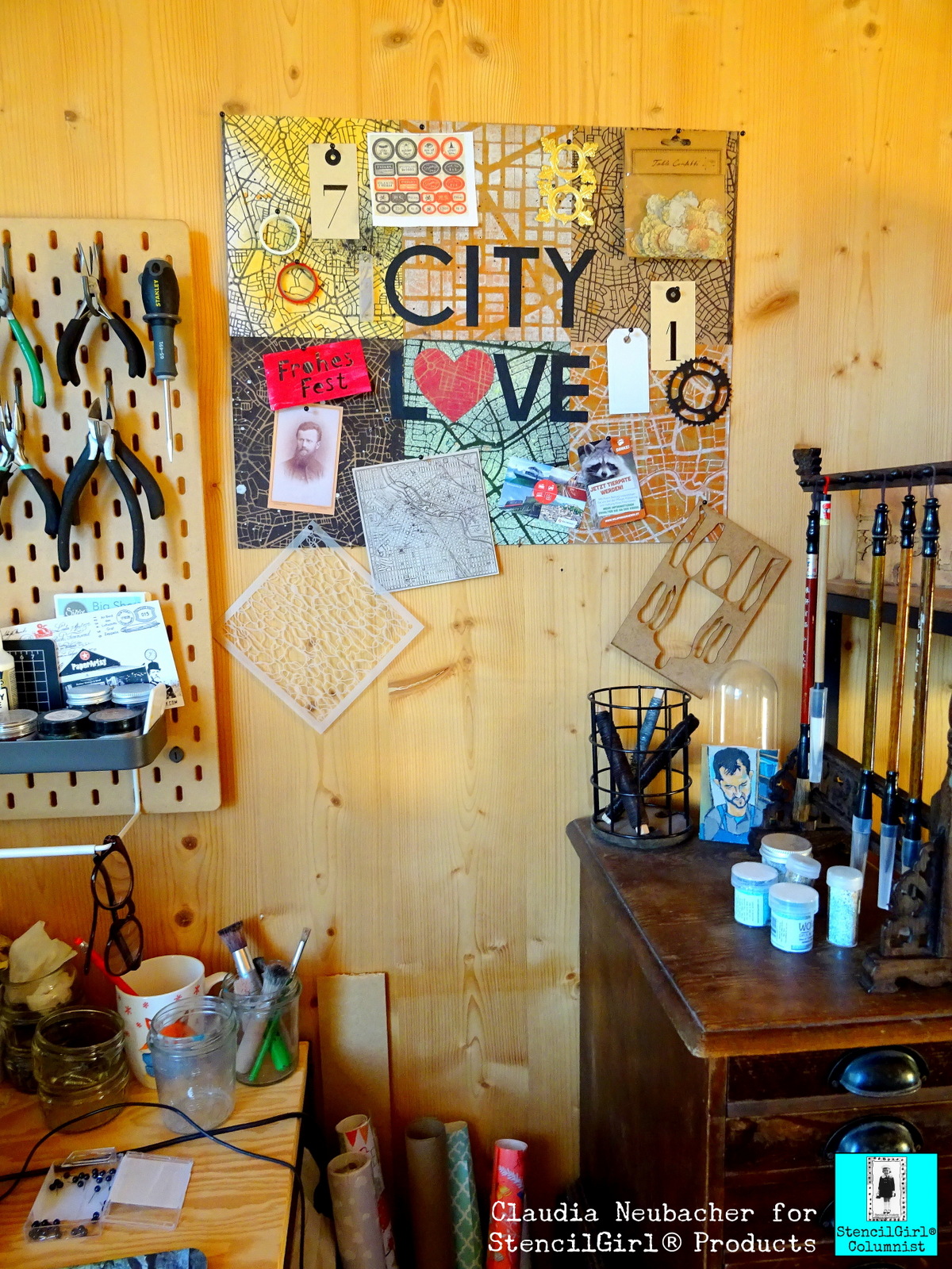
When you take a closer look at it, it reveals some scraps from older projects, one of Mary C. Nasser's awesome stencils I haven't yet used but wanted to play with asap (this one), two rolls of Washi tape that I re-discovered in a box where they definitely didn't belong at all, a printed out sheet with labels for Halloween potions, a left over gold Dresden Scrap, various tags, a copy of a vintage photograph, some tickets from a very inspiring trip to a beautiful wildlife park,...and all these treasures are being displayed on a pin board with a city travel theme - a reminder by itself to restart visiting awesome cities in Europe after all the Cov-19-lock-down-madness and my last year with mostly being ill.

I love maps in general - so using some of the awesome StencilGirl stencils designed by fabulously creative Mary C. Nasser for this project was the only reasonable option for me, as she actually offers a wide range of gorgeous map stencils to choose from.
I used these three gems for my self made pin board:
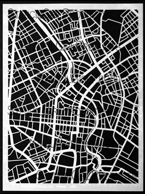
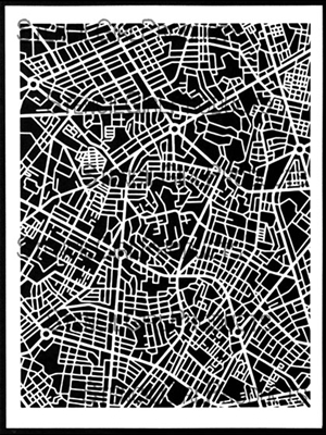
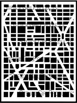
I love how these three vary in scale and style, yet still they are all three typical map designs, which was important for me, as I knew the visual map characteristic would suffer as soon as I would randomly "throw" stuff on top on my pin board.
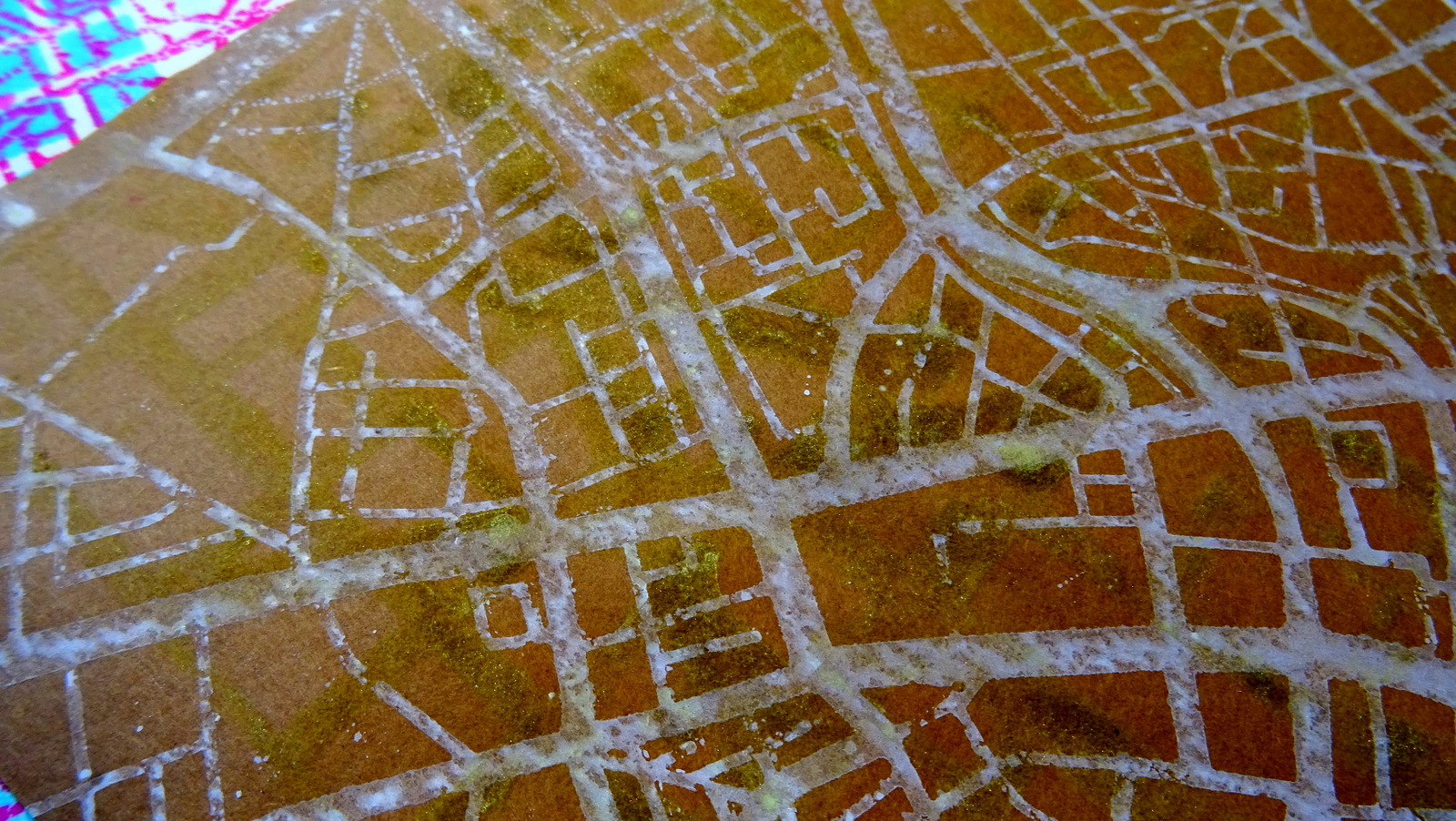
I experimented happily (and a happy mess it was indeed that I created on my desk) with various spray inks and paints I had in my stash, trying them out on different substrates like heavy white aquarell paper, sturdy Kraft paper and black cardboard.
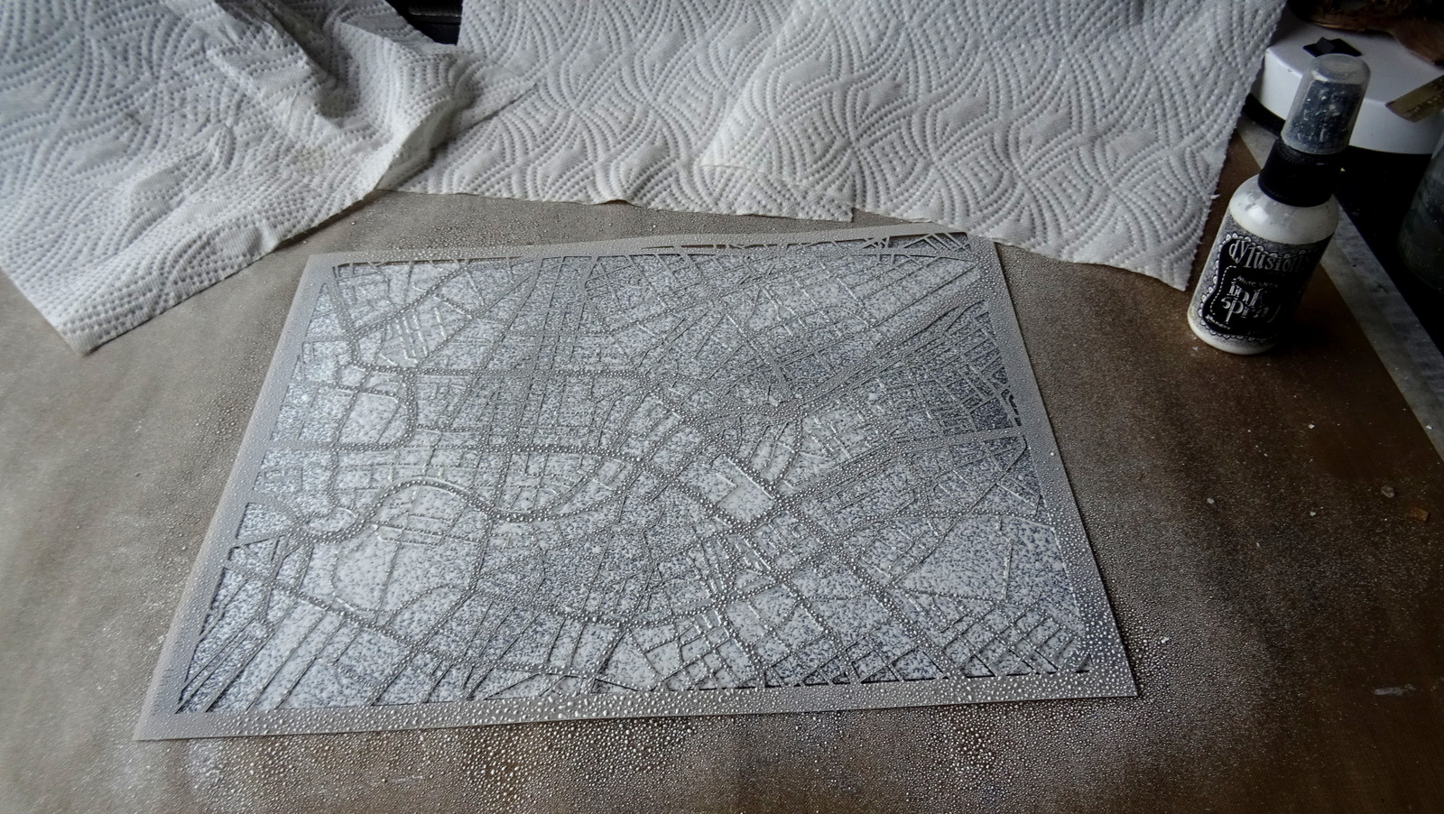
I started with some white Dylusions spray ink on the black cardboard. Then I used the left over wet ink on that same stencil to pull a print using Kraft paper.

This way I got two results from one spray action and none of the spray ink was wasted. I continued with Distress Spray Stain, Canvas Corp Brands spray paints and Aladin I-Zink dye spray.

I misted the white map on the black cardboard with some transparent neon green spray ink in some spots...

I used the nozzles of the sprays to create splatter and drop marks for a slightly weathered look (as weathered maps tell stories of adventurous travels, don't they?)

I sprayed, printed, splattered, layered and misted away until I had a lovely collection of map papers to choose from (and more papers for future projects, which is always a nice and inspiring thing to have).
Time to mount six of these beauties onto an A2 sized sheet of thick grey board!


I played around with the heart shape until it was narrow enough to fit with the style of the other letters but still "round" enough to stand for an "O". The white cut out heart you can see in the picture was my mask that I used on one of the other map papers I had made.

When laying out the letters I made sure to not use same distances between them as that does create a poor design that has nothing to do with a good visual typographic rhythm. Letters with round shapes or open spaces to their sides like L, V or A, can be interlaced with their neighbours to form a visual union. Letters that are straight like I, N, E,...need more space between them when standing side by side. So I moved the C slightly closer to the I than the T for example. And the L and V very close to the heart shape. This way I also made sure both words had the same width in the end.
As the maps' designs were a bit distracting, I used my ruler to make sure my words got glued in position exactly.

Et voilà!

As my pin board is very light weight I simply fixed it to my wall using four small nails with wide heads.

Here are some close ups of the lovely map designs I've created:


And once more the finished pin board in its new spot:

I hope you like it! When was your last city travel? Where would you like to go next? Ahhh...so many cool places to visit....
How about making a pin board to display your latest travel tickets and snap shots on? It's so easy with all the fabulous map stencils you can find in the StencilGirl Shop! Or maybe use them on cotton bags to take with you on your next travels....oh, the many possibilities.... ;)
Stay healthy and creative!
Claudia
xxx
.jpg)
These are so interesting. I appreciate the narrative with the good tips! Thank you
ReplyDeleteThank YOU, Barb! x
Delete