
Hello StencilGirl® fans! Nicole here, and I’m back with a fun way to create unique papers for your mixed media collages and art journaling.
I have long admired cyanotypes. There’s just something about those mysterious blue and white images that draw me in. In fact, when a local art gallery had a class last fall to learn how to cyanotype, I was there! In class we used hot press watercolor paper and fresh flowers to play with layers and the sun to create a few different pieces of art. Here is what I made in class:

After taking the class, I knew I just had to try the process with stencils. And, I failed. Miserably. I don’t know what I did wrong, but nothing worked. All my images washed away in the developing process.
However, I am determined! So, I am here several months later trying this again.
The basic process of creating a cyanotype is simple:
1. Mix up the solutions as directed (allow to rest 24 hours)
2. Mix one part of each solution (I use the lid to measure) and put into a cup (only mix what you need as the solution is only stable for a short time)
3. Lightly paint the solution on your papers in a darkish room with limited UV light

4. When dry, protect the papers from light until you are ready to develop them
5. Place the stencil on top the paper and expose it to the sun (3-30 minutes)


6. Once developed, process the print in water


7. It will take about 24 hours for the print to completely oxidize, or turn the deeper blue
Note: More detailed instructions are on the cyanotype solution package, and there are a lot of websites and videos to also help in the process and include even more ways to alter prints.
Creating cyanotypes my way.
Instead of plain watercolor paper for my substrate, I wanted to use vintage book pages and ledger pages, two of my favorite papers to use in my artwork. In keeping with the cyanotype tradition, I did also use some hot press watercolor paper and a white tag (pictured below) as well to have some of the true blue and white images.

One of the fun parts of cyanotypes is the unpredictability and layering. On the other hand, it’s also one of the most frustrating parts. They take a few minutes to develop, and you don’t always know what you’ll create until the end. During the development process, you can move the flowers (or stencils in my case) about every 30 seconds or so to add interest and different intensities of blue.
Since I failed miserably the first time, I practiced before my official blog. And, yay! It worked, plus I learned a few things to tweak.

I learned that not all paper works the same.
When using vintage papers, you have to be ok with the unpredictability! Not all papers are created the same, and some just don’t work as well. But, I’m making collage material, so in the end there is always something to use no matter how well it works.
Sometimes the vintage paper itself reacts with the solution so that the cyanotype doesn’t darken as much. Also, since vintage papers are not white, the final outcome colors are varied. It can be frustrating, but occasionally you develop amazing results that you have no idea how it occurred.

For some reason, several of my papers partially developed soon after I spread the cyanotype mixture on them. I’m not sure if it was a reaction to the vintage papers or that I let too much light get to them. Since I didn’t want to waste the papers, I still printed on them with interesting results.
On a side note, when using papers with handwriting, choose ones that won’t react with water, such as ledger pages written in pencil only.

I learned, or realized, that my previously used stencils that were full of paint worked the best.
Since new stencils are clear(ish), they don’t block the UV rays 100%. However, with that, the clear stencils were also fun because they let light in causing a lighter shade of blue with the darker images of the stencil. Both are fun! It just depends on what type of images you are wanting to create.


Since I had some new stencils I picked out specifically for cyanotypes, I solved that problem by spray painting them with black paint first.

As an added bonus, this created some more collage papers!

Most importantly, I learned to just enjoy the process.
I am certainly not an expert at cyanotypes. Over the course of a couple days and sessions printing my papers, no results were alike. Some turned out absolutely amazing and others, well, let’s just say they will make great background layers.
As frustrated as I was in the sunshine and 100+ degree temps here in Austin, I am truly excited to play again! I have so many more amazing StencilGirl® stencils I want to explore.
If you are like me and always admired cyanotypes but thought they would be difficult to create, I hope this tutorial inspires you to have fun and play. I cannot wait to add these papers to my mixed media art and collage.
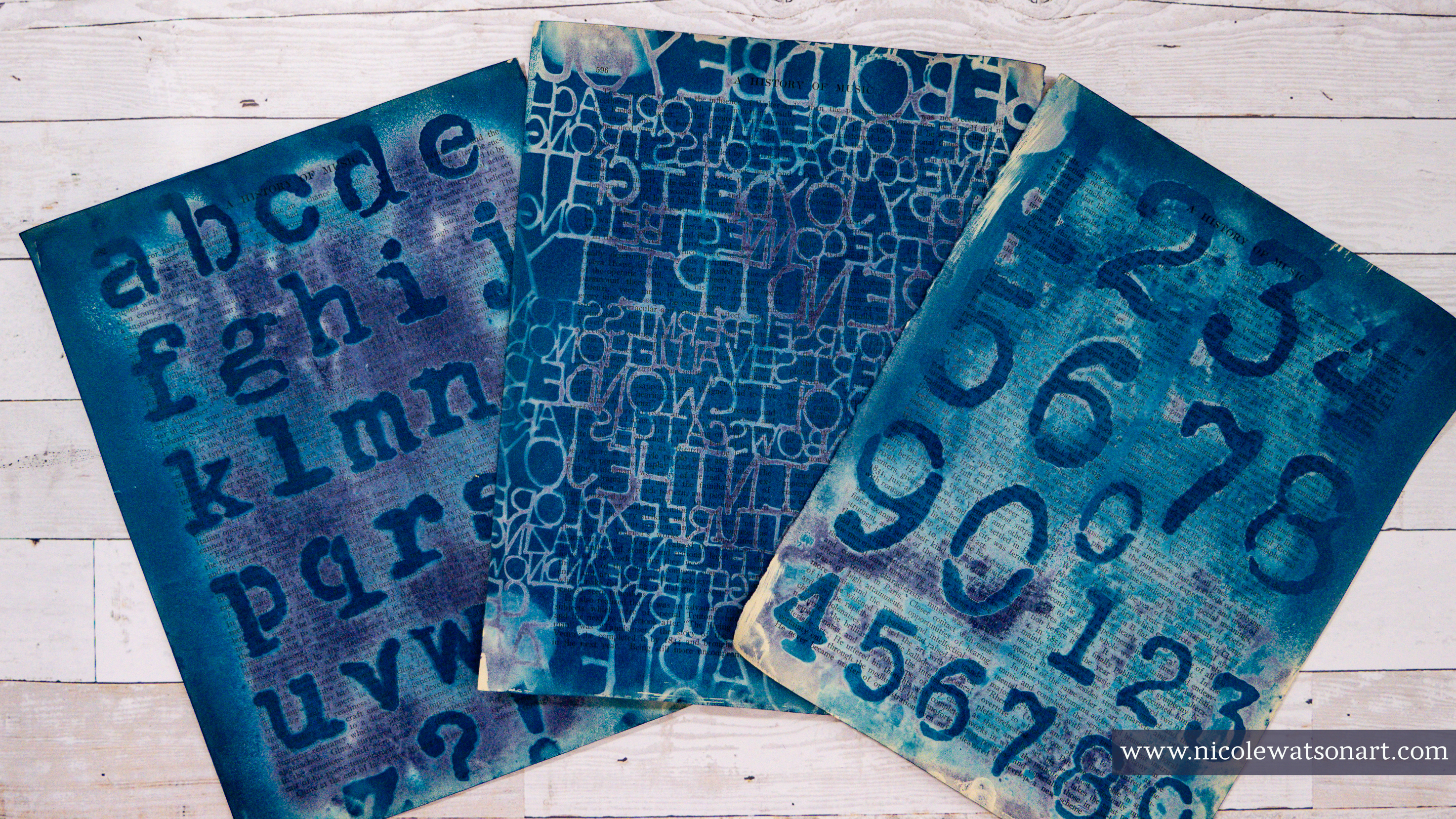
I posted my favorite result throughout the blog above, and here are some more of my favorites playing with stencils and cyanotypes:


And, you can watch some of the process in the video below, with additional commentary and a flip through of all the papers I made.
-Nicole

Connect with me on
Stencils Used (some are only shown in YouTube flip through)
- Arrows within Rounds
- Art Deco Fairview
- Batik
- Black Birds in Trees
- Blades
- Boro
- Botanical Stem
- Circle Play
- Circle Tile 6
- City Map Mask
- Flock
- Garden Botanical Mask
- Gears
- Grate Full
- Grunge Strips and Borders
- Imaginary Boom
- Journal Texture #12
- Layers of Scallop
- Let Yourself Bloom
- Mikki's Flowers
- Mikki's Flowers Mask
- Monet's Foyer
- Picasso's Words
- Playful Bloom
- Poppy Seed Stems
- Scribble Scratch Handwriting
- Silhouette of a Wildflower Bouquet
- Symbol Grid
- Tall Flowers
- Vintage Typewriter Alphabet
- Vintage Typewriter Numbers
- Winter Berries
- Winter Berries Mask
- Words to Live By
Supplies
- Cyanotype Solution by Jacquard
- Foam brushes
- Disposable cup
- Access to water/sink or a large container of water
- Hot press watercolor paper (90 lb or thinner for easier collage making)
- Vintage book and ledger pages
- Liquitex black spray paint (optional)
- Sunshine! Or a UV light


