Hi there! It's Marsha Valk here today with a new column!
For the past 11 years, I've started the new year creatively, spending time watching the Creative JumpStart videos and creating alongside them.
If you're reading this, you're probably familiar with Nat Kalbach's Creative JumpStart, and perhaps you've even seen me mention it before.
However, if you don't know what CJS is: it's an annual monthlong online mixed media art event meant to inspire and motivate you to get creative.
It's like an advent calendar with a new video every day in January (this time it went into February) by outstanding teachers like Mary Beth Shaw, Kristin Williams, Martice Smith, Rae Missigman, Carolyn Dube, Gwen Lafleur, Jane LaFazio, Kae Pea, Nancy Curry, Seth Apter and Tina Walker.
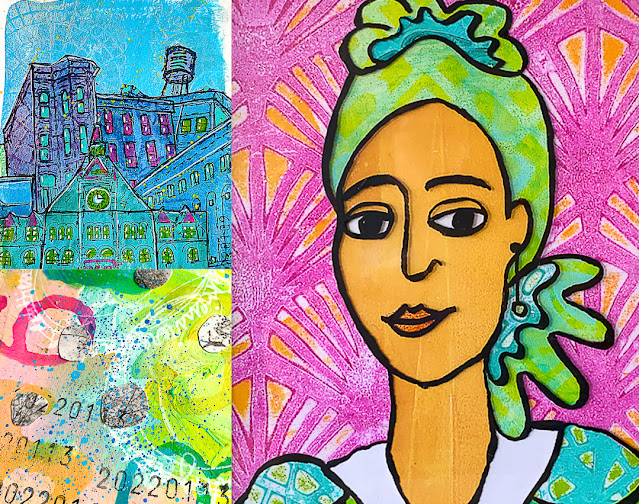
So on January 1st, I grabbed a new art journal and started to follow along and/or create inspired by what each teacher shared in their video.
And this year, I really took stock of what supplies I enjoyed working with, which techniques made me want to dive right in, what I liked and did not like doing and what aesthetic I liked and did not like.
I tried to create one page after watching each lesson; however, I did allow myself to skip a few. Creative JumpStart isn't a challenge, and I did not want to make it into one either.
Besides, I was in the middle of (another) studio reorganisation, which did not allow me to pull out every supply needed.
Anyway, the lessons I enjoyed most were the ones that involved painting with acrylics. You know, the kind you do with a brush and perhaps a palette knife. Which surprised me, and it's something that I could potentially explore more.
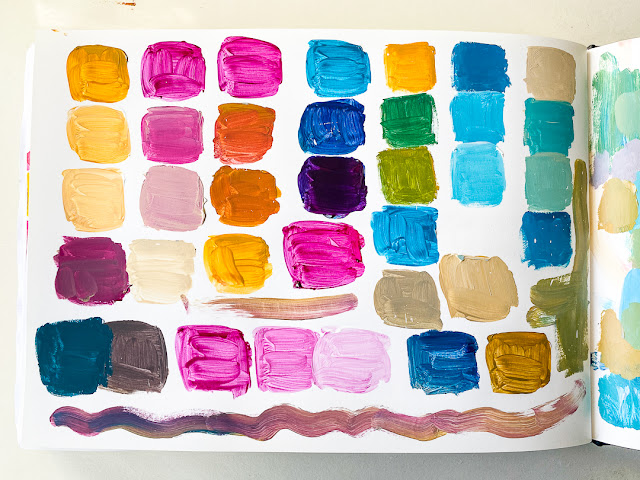
The second realisation was that I love colour (no surprise there); however, it turns out that some colours fail to make my heart sing, no matter how hard I try.
Watching the other teachers and participants use colour palettes outside my comfort zone somehow convinced me to experiment with different colours. And… it didn't work. They don't feel like 'me', and I struggle with making them look good.
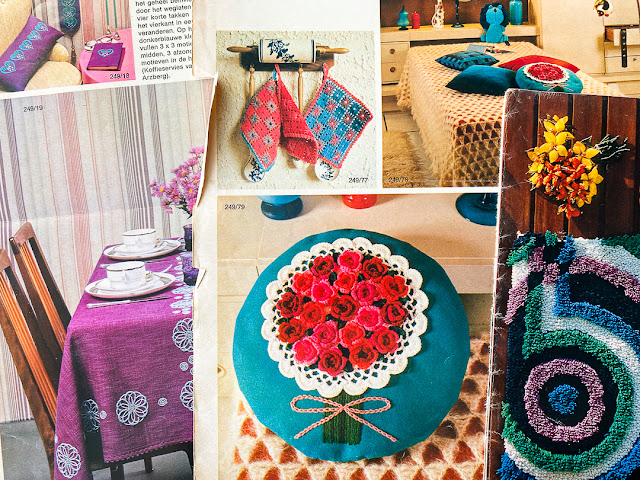
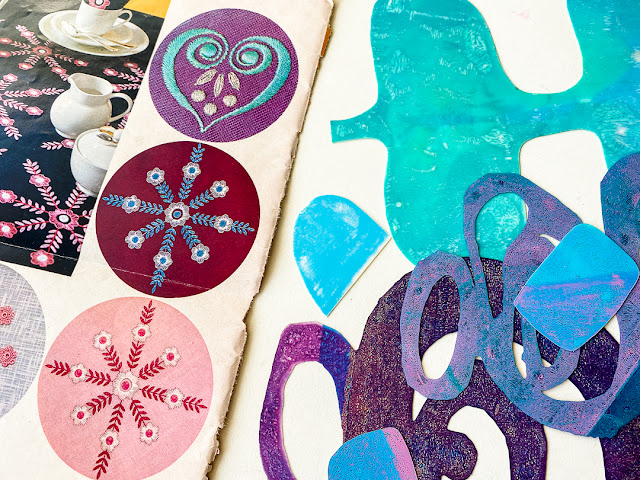
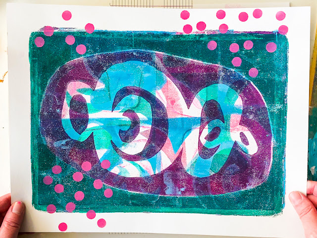
So… just for my enjoyment, I decided to take cues from a vintage magazine I found while decluttering. These colour combos excite me, inspire me and make me sooo happy!
Marsha Valk
Featured masks and stencils:
Graphic Mod Mask 1: 70s Play by Martice Smith

What fun, Marsha! You have such great ideas for experimenting with gel plates, stencils, and color!
ReplyDeleteThanks so much, Terry! :-D
DeleteWhat was that corner tool you were using to place your papers each time? Did you make it yourself? It looks quite useful.
ReplyDeleteSo much fun Marsh, this says happy to me, thank you!
ReplyDelete