Showing posts with label gel plate printing. Show all posts

Tuesday, December 19, 2023

Gel Printed Holiday Tree Cards


Hello! Nicole here back for my last blog post of 2023! What? This year has flown by, hasn’t it? If you’re anything like me, it’s the middle of December and you either ran out of time or completely forgot about sending some holiday cards. I always like to have a few on hand for neighbor gifts and friend get-togethers plus some for mailing.

Ever since I began making my own cards, I just can’t purchase them. I think that also adds a bit of pressure to create a work of art on a card. 

Recently, when I was playing with some StencilGirl® stencils, I applied paint through the Butterfly Rouen Tile stencil and thought it looked like snow and/or the pattern on one of those ugly Christmas sweaters. I immediately wanted to spray paint white through it and brainstormed how I could make that work for a card design. Then, it hit me. Trees! 


I could add some trees and make a snowy winter sky background. So, for this year’s card I had the idea to gel print some papers and turn them into trees with the spray-painted background of course!


My first step was to gel print a variety of papers in all shades of green. I wanted to layer different patterns, colors and sizes of trees in the foreground.


I printed on white and kraft colored card stock to add to the variety and for a tiny bit of pop and thickness to the trees.


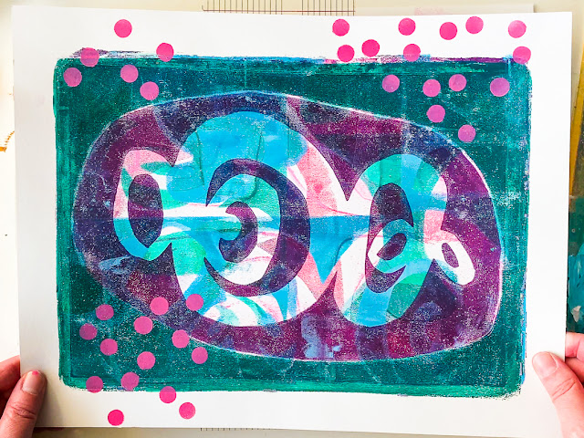
The gel print process was simple. First layer down some green(s) on the plate and brayer them to a thin coat. 


Place a stencil down and pull a first print on top the stencil. 


This print isn’t always a great one, depending on the stencil style, but it makes a great first layer!

Then, remove the stencil and pull a second print. 

I repeated this process several times with different shades of greens and stencils.  Once in a while I pulled a third print to layer on one that just didn’t look right or flipped the stencil over to use the paint again on that side. I let the paint, stencil, and results determine my next steps each time. There are no rules, and you can watch my simple process in the video tutorial.


Sometimes when I was unsure of how the pattern would look for a tree, I isolated it with a piece of paper that I had cut a triangle out of. It’s amazing how different just a slice of the print looks and makes the perfect little tree.

While I waited for the prints to dry, I cut my base cards and spray painted through the Butterfly Rouen Tile stencil.


And, while those dried, I added some white splatters to the envelopes. I just simply sprayed some of the paint in a small cup and added some water to it. I repeated this process on both sides of the envelopes and also the back of the cards.


Finally, it was time to cut out the trees! I cut out some small tree patterns to make this process easier. Using the patterns, I was able to ensure that the trees would layer ok on the card fronts.

Once I had millions (ok, maybe just a hundred) trees cut out, I placed a large one on each card and then picked out all the little ones to go with it. I originally planned to put three trees on a card, but I couldn’t resist changing that to five trees. 


When the trees were perfectly placed, I quick snapped a photo just in case. Then I carefully piled the cards up and began the process to stick them down.


Looking back, I wish I had printed a few more trees that were a little more solid in color with small pattern. I like how they anchored some of the card fronts. 
 

To finish the cards, I knew I wanted to add a “Merry Christmas” sentiment with my typewriter, but I also decided to add some red berry garland to one tree on each card. If you don’t have a typewriter, you can print words from your computer or find some stickers. 

I added the simple berry dots with the end of a paintbrush.

I really enjoyed how these came together, even if my husband calls them mountains instead of trees. Maybe that’s one reason I decided to add the berry garland! 

The best part? Besides the fact that I have a bunch of cards to send, I have a lot of leftovers. So, I think I’m going to also make some small tags for packages as well.

Check out the entire process in the video below!


I hope you have a wonderful holiday season, and maybe I just helped remove a little of the holiday stress by not only giving you a card idea, but some moments to just sit down and create.


-Nicole


Connect with me on


Stencils

Supplies

  • Card stock (white, dark blue, kraft)
  • Green acrylic paint of all shades
  • Red acrylic paint
  • Typed sentiments 
  • White spray paint (I prefer the Liquitex brand)
  • Gel plate
  • Adhesive tape
  • Scissors
  • Brayer
  • Envelopes


Wednesday, December 6, 2023

Carol Ponsford - December 2023 StencilClub - PaperArtsy Infusions with stencils


Hello stencil lovers! Carol Ponsford here today to share one way to use 
PaperArtsy Infusions with your stencils. I will be using my gel plate along with the 
December 2023 StencilClub set "Faraway Gardens" designed by the talented 
Rae Missigman. Rae's stencils lend themselves so well with this technique to achieve some 
beautiful papers you can use in your journals, as collage papers, or the perfect
backdrop to add a sentiment to for a greeting card anyone would cherish.

I have created a video that you can watch and follow along to create some of these
beautiful papers for your own use. Just click the link below to go to the video.

https://youtu.be/6L5_Pe0W50M


The supplies I am using are my 8" x 10" gel plate, a brayer, several colors of 

PaperArtsy Infusions, 4 sheets of watercolor paper, spray bottle filled w/water, a couple 

sheets of deli paper or thin copy paper to pick up excess color on plate, and a roll of paper towels.


To begin, I laid the stencil onto my gel plate and pressed it down to create good contact 

with the plate to prevent the color from seeping under the stencil too much.


I then began sprinkling the Infusion colors on top. Start with a small amount 
because these powders are very highly pigmented and it is easy 
to put too much pigment, you can always add more if you choose.


Once you are happy with the amount of pigment on the plate, spritz the whole thing 
with water until it is lightly moistened (hint: spray the water from a 
distance so that the water is evenly applied). You want enough water to activate 
the pigments but not so much to cause it to run heavily when you lift it off of the plate.

You can spray again after the stencil is removed. Before removing the stencil, set a blank sheet of

watercolor paper to the side of the plate and spritz an even coat of water on the paper.


Gently lift the stencil off of the plate and lay upside down on the moistened

 paper. This will allow the reverse image to be printed on this sheet. 

Leave the stencil on the paper while you pull the print off of the plate.


Lay a second sheet of watercolor paper on the gel plate to pick up the remaining pigment.


While this doesn't show the pattern of the stencil, it turns out to be a beautiful 

vivid paper to add other elements onto. You could even roll acrylic paint on 

the gel plate, lay the stencil back down on top of the acrylic and pull a print leaving 

the background in the spaces where the stencil is a solid image.


Using a thin piece of paper, I laid it on the plate and soaked up the remaining color.

I will use this as collage paper of add other images on top of this.


Before removing the stencil from the other paper, I use a paper towel 

roll and rolled it over the stencil to pick up and water remaining. This will help keep the 

image crisp and keep the pigment from bleeding into the white area.


If you want the pigment to spread a little more after you pick up the stencil you can 

lightly mist it again with water remembering that the color may spread into the white areas 

so be sure to use a light mist, let it do it's work, and then add more in small increments.


The two images above were done with the same technique using the second stencil 
from the set. This had a floral pattern so as I sprinkled the pigment on, 
I tried to place colors in a more specific areas to get the flowers pink and leaves green, etc.


Thank you for joining me today and I hope you enjoy trying this technique.

I look forward to sharing projects with you in the future on the StencilGirl® blog.

Thank you StencilGirl® Products for providing me with this free StencilClub set so 

that I could play in advance and share what I create each month with you.


Join StencilClub by December 15th to receive these exclusive stencils, an accompanying 

video tutorial with PDF (both downloadable!), and 25% OFF STENCILS EVERY DAY!!


Happy Creating!


D6859F19-84FC-4D41-9C31-F614553BCBAD_1_201_a.heic.jpg


To see more of my work please visit my Instagram page.


Monday, February 14, 2022

Colour-coordinated Gel Printing with StencilGirl® Masks

Hi there! It's Marsha Valk here today with a new column!

For the past 11 years, I've started the new year creatively, spending time watching the Creative JumpStart videos and creating alongside them.

If you're reading this, you're probably familiar with Nat Kalbach's Creative JumpStart, and perhaps you've even seen me mention it before.

However, if you don't know what CJS is: it's an annual monthlong online mixed media art event meant to inspire and motivate you to get creative.

It's like an advent calendar with a new video every day in January (this time it went into February) by outstanding teachers like Mary Beth Shaw, Kristin Williams, Martice Smith, Rae Missigman, Carolyn Dube, Gwen Lafleur, Jane LaFazio, Kae Pea, Nancy Curry, Seth Apter and Tina Walker.


So on January 1st, I grabbed a new art journal and started to follow along and/or create inspired by what each teacher shared in their video.

And this year, I really took stock of what supplies I enjoyed working with, which techniques made me want to dive right in, what I liked and did not like doing and what aesthetic I liked and did not like.

I tried to create one page after watching each lesson; however, I did allow myself to skip a few. Creative JumpStart isn't a challenge, and I did not want to make it into one either.

Besides, I was in the middle of (another) studio reorganisation, which did not allow me to pull out every supply needed.


Anyway, the lessons I enjoyed most were the ones that involved painting with acrylics. You know, the kind you do with a brush and perhaps a palette knife. Which surprised me, and it's something that I could potentially explore more.

The second realisation was that I love colour (no surprise there); however, it turns out that some colours fail to make my heart sing, no matter how hard I try.

Watching the other teachers and participants use colour palettes outside my comfort zone somehow convinced me to experiment with different colours. And… it didn't work. They don't feel like 'me', and I struggle with making them look good.


So… just for my enjoyment, I decided to take cues from a vintage magazine I found while decluttering. These colour combos excite me, inspire me and make me sooo happy!


Watch me gel print with a limited 70s colour palette and StencilGirl® masks by Mary Beth Shaw and Martice Smith!


Until next time!

Marsha Valk

Featured masks and stencils: 

Graphic Mod Mask 1: 70s Play by Martice Smith


Paint colours used: Deep Turquoise, Mixing White, Phthalo Green (Yellow Shade), Process Magenta and Titanium White.


Monday, November 8, 2021

Monochromatic Gel Printed Art Journal Spread by Marsha Valk


Hi there! It's Marsha Valk here today with a new column!

What do you do when your creative mojo has left the building? Well, one of my top tips is to watch a film. In my case, any movie will probably do; however, if you need ideas, I suggest you start with a Wes Anderson film.

I went to see his latest, 'The French Dispatch', at the cinema the other week and it was marvellous!

Without giving anything away: 'The French Dispatch' is about the French outpost of a fictional Kansas newspaper in the 60s/70s. The plot follows different storylines, each reported by one of the journalists.

I've included a link to a YouTube playlist with trailers and clips at the end of this blog post, just in case you haven't seen it yet.


I'm always in awe of the typical Anderson choice of colours in each of his films. 'The French Dispatch' is no exception; however, I was intrigued most by the black and white parts of the movie this time.

So I decided to challenge myself and use only Paynes Grey, with Titanium White or Mars Black acrylic paint.


To lure my mojo back, it's essential for me not to get fixed on the outcome. So one of the things I do is that I start with mixing paint. 

A gel printing plate is an excellent tool for colour play and colour mixing, so in this case, I just started gel printing in one of my journals to see what would happen. And… this is what happened:


The stencils I used are ones that I picked because they somehow felt like they suited the film's vibe. 


The collage pieces are typewritten and notebook papers from my collage stash.

The blackbird is a nod to something in the film.

And, the text I wrote in pencil is the lyrics to a song by Charles Aznavour that is on the film's soundtrack. 


So is my creative mojo back after I created this page? Hmmm… the jury is still out on that one. But I know I can always try watching another film!

Until next time!

Marsha Valk

Stencils and mask used:
Art Deco Wallpaper Stencil by Nathalie Kalbach
Granada Stencil by Nathalie Kalbach
ATC Mixup Stencil by Mary C. Nasser
Circuit Stencil by Nathalie Kalbach
Manhattan Stencil by Nathalie Kalbach
Hamilton Stencil by Nathalie Kalbach
Stencil Font 4x4 Stencil by Mary Beth Shaw
Emotions and Feelings Alphabet Stencil by Carolyn Dube

Link:
'The French Dispatch' playlist on YouTube


Monday, February 8, 2021

Mixed Media Gel Printing with StencilGirl® Stencils and PanPastel by Marsha Valk


Hi there! It's Marsha Valk here today, and I'm excited to share a new StencilGirl® Column and video with you!

I often share something about my latest little solo expedition or something that I've seen or read recently in this column. However, it's been months since my last visit to a museum, and by now I'm kind of bored of just strolling around the neighbourhood. 


All I want to do is to create. Something. Anything!

Luckily for me, there are online courses and events to help and inspire me. I'm still able to fill my 'creative well' even in lockdown.


One of my favourite past-times right now is Creative JumpStart. If you are reading this blog, you've probably heard of it before, and you may even be one of the participants!

If not, Creative JumpStart is an annual online event that is hosted by StencilGirl® designer Nathalie Kalbach. This years edition is even bigger and better than ever because of its tenth anniversary.

I'm lucky to be one of the 45 teachers this year, along with Mary Beth Shaw, Seth Apter, Nancy Curry, Carolyn Dube, Rae Missigman, Gwen Lafleur, and Jane Lafazio, Kae Pea, Kristin Reese Williams and Tina Walker.

I always try to create along with at least some of the daily video lessons. Some years I fill a whole journal, other editions I only manage to do a couple of projects. And, that's totally OK. CJS isn't a challenge. Its purpose is to spark inspiration!


This year's theme is 'Storyteller', and for some reason that prompted me to dive into some of the art, I created as a child. So for my video lesson, I kind of did a collab with my younger self.

The fun thing is that my childhood art came in handy for the embroidery project Kristin Reese Williams shared in her CJS lesson too.


So with the StencilGirl® Creative Team theme 'Mixed Media Pastiche' in mind, I could not help but wonder what would happen if instead of looking at the style or character of the work of one or more other artists, I would look at the style or character of my art as a kid.


Watch the video to see me create a mixed media gel print using a technique I learned from my friend Birgit Koopsen, combining lots of StencilGirl® stencils and PanPastel.


I realise I'm super lucky to have access to the art I created as a child. However, I feel the need to stress that even though I'm happy that my mom kept these, I don't want you to feel sad because you haven't hung onto every single item of kids artwork you've ever made or received.

Most of my childhood art only exists in digital form these days. The physical artworks are long gone. I did not enjoy them half as much when they were collecting dust and taking up space in my attic!


You can always use your (grand) children's art or create something new in the spirit of your younger self instead! Have fun!

Until next time!

Marsha Valk


Stencils used:
Interesting Dots Repeating Pattern by Jennifer Evans
Oval Grate Stencil by Mary Beth Shaw
Fragmented Line Columns stencil by Cynthia Silveri
Mid Century Modern Rocks and Leaves stencil by Jennifer Evans
Stone and Mortar Version 2 by Mary Beth Shaw
Ornamental Floral Screen stencil by Gwen Lafleur
Deconstructed Cabbage Rose, designed by Traci Bautista

Stitch a Doily Stencil by Maria McGuire
Midcentury Modern Elements #1 by Kae Pea
Central Ave stencil by Nathalie Kalbach
Teardrop Doily Stencil by Maria McGuire
Seeds Doily Stencil by Maria McGuire