Thursday, July 27, 2023

Fabulous New designs From Jennifer Evans and an In-person Workshop!

Check out Jennifer's latest designs and the Paint with Periwinkle Workshop Jennifer is co-hosting this fall in Colorado.  


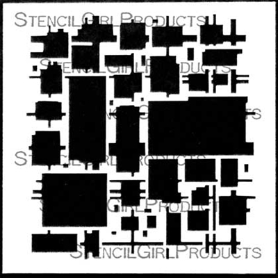
When I begin an abstract, I usually start with mark-making. I create a series of expressive wide and rough marks made with charcoal or pastel, followed by thin and whispy pencil marks. Before the addition of paint, I stand back and look at the main shapes created by the overlapping marks. Although we recognize geometric shapes, I prefer a rougher, more organic look. These stencils are the result.


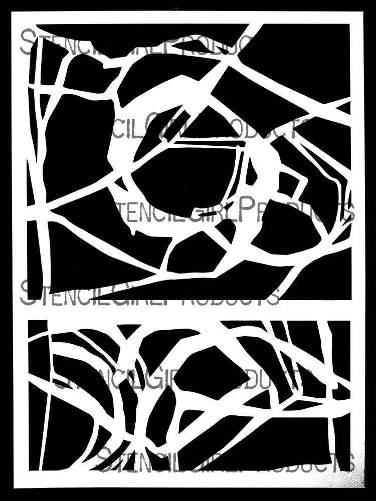
These rectangular shaped designs include spheres and curved intersecting lines. Use this stencil to block off areas by using just a portion, or the whole design. Play with negative space by adding color around the spheres. If you're working on a large substrate, continue building the abstract out from the center (like a web).


If you're working on a long vertical (or horizontal) canvas, stack these stencils on top of one another (or side by side) to continue the movement of lines. As you build your abstract, notice what you "see" -- what shapes could be combined and which should stand out? My example uses pastel and colored pencil to outline shapes for emphasis.


I love a square abstract. Especially ones that can be used on a 6"x6" canvas or on a Gelli plate. This abstract introduces triangles to the rough sphere shapes.


Cherry Blossom - S966


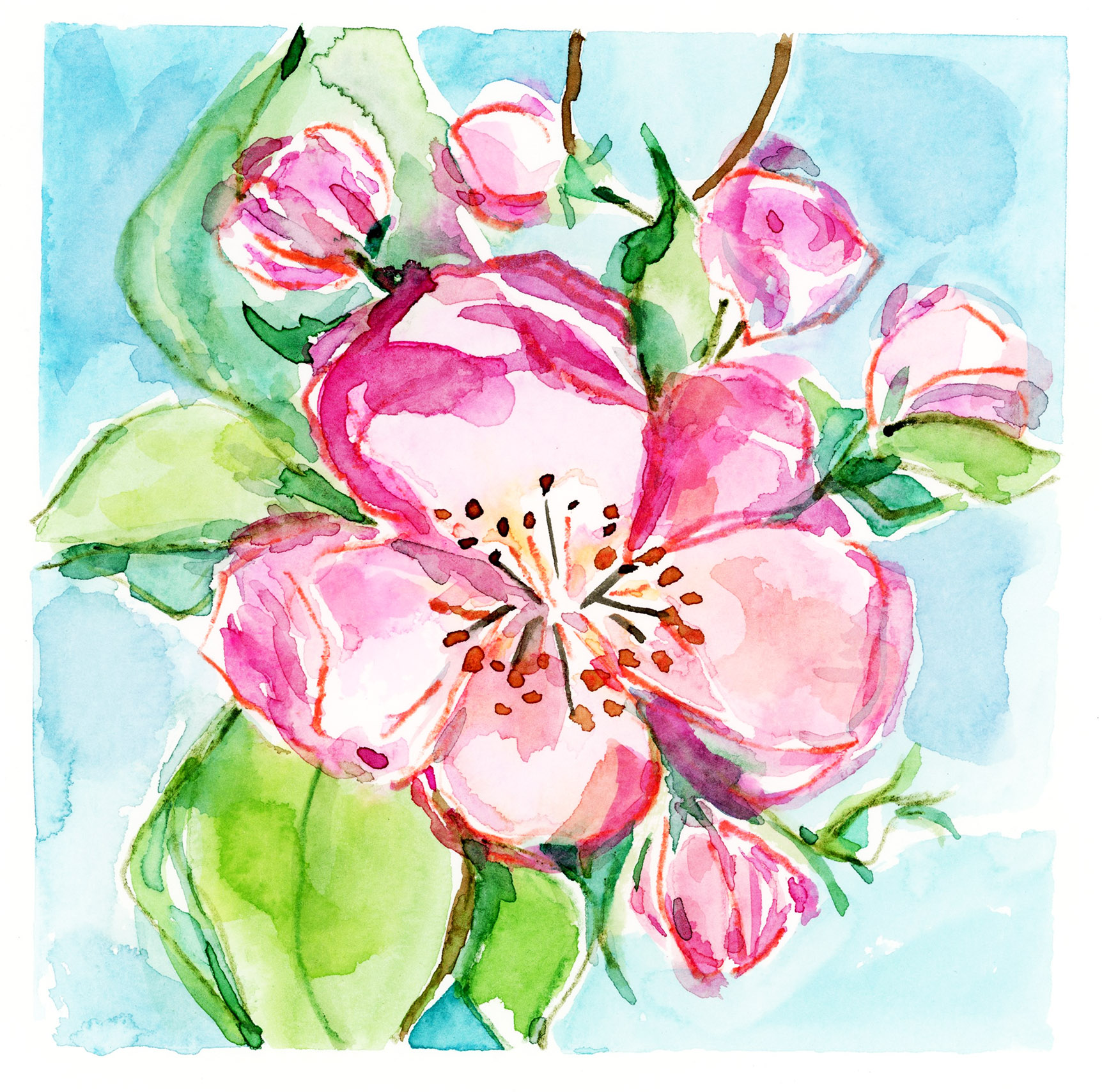
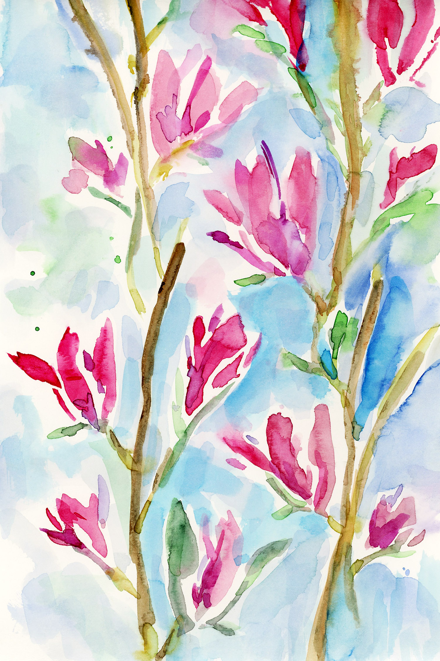
I love to paint cherry blossoms, both the full tree in bloom and the individual blooms. They are so vibrant and cheerful. Although this stencil could be used for any blooming branch by altering the color palette, my artwork sample is inspired by the traditional bright pink flowers.


This stencil design was inspired by yellow loosestrife from my mother's garden. It grows in a vertical spire. Yellow flowers always brighten the mood. For this design, I zeroed in on one single bloom (macro style). It's amazing what details you can see using the zoom feature on your camera phone or using a macro lens on a traditional camera.


Inspired by the point of view of looking up a single cherry blossom branch, this stencil can be repeated for a border. Use the design in typical fashion, then clean your stencil, flip it over and repeat the design at the top or bottom of your first imprint. (Refer to example for visual).


Jennifer's stencils are available now at stencilgirlproducts.com.


Tuesday, July 25, 2023

Heal & Grow an art journal page


Hello creative friends!

Summer is here in full bloom.
For todays pages I will be focusing on the garden, the miracles of Mother Nature and the great outdoors.

To celebrate the beauty I see in my garden I gathered up three stencils that spoke to me for this project.
I love the softness of acrylic ink and decided that it will be used on the circle and the floral aspects of the project. 
The words and image were stenciled with black acrlyic ink for contrast.


Supplies:
Stencils~

Stencil L422 Herbs Stencil designed by Jessica Sporn.
This stencil is fabulous~ I love the variety of herbs and words.
For this project I selected the herbs I would work with as well as the words heal & grow.

Stencil L214 Wheel in the Sky designed by Kae Pea.
Let’s talk design choices because this one has an abundance and I reach for it frequently.
I decided on using the large wheel.
The blank space in the middle is the perfect frame for the floral.

Stencil S807 Delicate Face  stencil designed by Andrea Matus DeMeng.
Andreas’ face stencils are so expressive and the perfect addition to mixed media and art-journal pages.

Acrylic inks
Paint brush
Water
Black acrylic paint
Cosmetic sponge
Gel pen

The process:

With your favourite acrylic ink and paint brush - transfer the circle image on to your journal page. 
As you can see from the picture I placed it off the left side of the page.
Feel free to experiment and place it where you prefer.


Now it's time to add the herb background. Using acrylic paint stencil your selected herbs.  I added them within the cirlce and turned them upside down on the top of the page. 
Allow paint to completely dry before proceeding to the next step.


With the acrylic ink stencil your herbs of choice within the cirlcle and along the bottom of your page. Feel free to add as many layers as you like as well as use a variety of colours for a luscious garden.


The herbs can be left soft and watery or they can be loosley outlined with a jell pen for more structure (see next photo).


For the final step of this spread I used acrlyic ink for both the face stencil and the words.
I placed the face stencil half on the page- I find this image so strinking and seeing only half is such an impact.     


I love how this spread came together.  
Enjoy the process of creating your very own healing garden page.


I also created a process video for further inspiration. I used the same techniques but made it slightly different.


~tina


Monday, July 24, 2023

StencilGirl® Altered Mini Apron Collaboration Challenge

Hello and Welcome to July - Tina Walker here and can you believe summer is half way over?  Where does time go?


I am here today to share my latest collaboration challenge.  Today, we are altering mini, waste sized up-cycled aprons with our favorite StencilGirl® stencils.

I often watch and follow (okay, who am I kidding...and SHOP) auctions almost weekly.  In a recent auction win, I won the mother lode of bingo cards, chips, and balls.  It was truly a magical find.  Included in the auction was several used aprons that I believe the bingo hall volunteers had used.  I thought it would be fun to hand them out to fellow artists to see how they could transform the aprons into a OOAK, unique piece of art!.  Here's what the aprons looked like, prior to their transformations.

Let's check 'em out - - - 

KIM COLLISTER

"It was so fun to be a part of this collaboration and a joyful reminder that Stencil Girl Stencils are just as easy to use on fabric as they are paper!"

Stencils Used:

Pretty as a Peacock

Gross Anatomy Listen to your Heart

Thistles & Ribbons


MICHELE KOSCIOLEK


"I turned my apron into a functional part of my storage in my studio that can also be portable.  A place to keep the supplies I use the most to do what I love doing."

Stencils Used:

Vintage Typewriter Alphabet

Fade Horizontal

StencilClub April 2022


LAURA DAME

"I've recently been getting more into gardening, and I thought it would be awesome to have an apron I could use for art and digging around in the dirt. I'm super inspired by flowers and floral motifs, so this was a perfect combo for me!"

Stencils Used:

Bouquet Greenery

Daisy Daisy

Hyacinth


TRACY KRUEGER

"When I started this project, I knew there were 2 things I wanted to incorporate additional pockets (because you can never have too many) and sewing/hand stitching. StencilGirl® has so many great stencils to work with and I was able to find the perfect ones for sewing and stitching"

Stencils Used:

StencilClub Dec 2021

Floral Fascinations

StencilClub July 2019


These turned out so beautiful!  I would almost be afraid to wear them.  But, I think they ARE meant to be worn, admired, and seen.  ♥♥♥

I had so many ideas for what I wanted to do with my mini apron, but most involved a lot of hand stitching and I didn't think my arthritic hands would have been up for that challenge, so I opted for the COLORS OF THE RAINBOW for a bright, cheerful, and positive feel.  I didn't ignore my desire for hand stitching tho....I added a blanket stitches on all edges of the apron, in a coordinating thread.  Loved how it finished off the pockets and sides.  


Stencils Used:

Wildflowers Botanical Mask

Imaginary Botanical Mask

Next time you are in an antique store or at your local hardware store, snatch a utility apron and give it go!

Till next time!  Too Da Loo!

Tina

Friday, July 21, 2023

Judge a Book by its Cover - by Claudia Neubacher


Yes, yes...I know...the actual quote says the exact opposite, but I am talking about real books here and I had some at home where the covers didn't do the content any justice...so I decided to change that and give them new covers.


I am talking about these little fellas.


The Reclam series is (greatly feared by pupils and) meant to provide literature classics (like "The Nibelungenlied", Ovid's "Metamorphoses" or poetry collections for example) at a very cheap price (so they were affordable for use at school) and their signature look has always been this bright yellow and a pocket size paperback format with very thin paper, so you can carry them with you easily and at any time. Most people I know associate these books with boring High School German lesson reads...but there were some works I and my husband liked so much that we kept the books until today as we still love the content. If only the covers looked a bit more inviting and did its contents justice...


Much better now, aren't they? 

I indulged in some happy playing around with stencils, layering and using various tools to apply paint and create different marks. 


I mixed different kinds of paints and inks as well and from the pre-selected pile of StencilGirl® stencils these were the ones that I used in the end: 


by
Valeri Sjodin


by
Tracie Lyn Huskamp


by
Pam Carriker


by
Mary Beth Shaw


the smallest stencil from the 
StencilClub set 


and the smallest stencil from 
June Pfaff Daley's


I always gather more stencils than I will really use to not only have a wide variety to choose from but also browsing through my stencils often inspires me or helps me define the direction in which I want my project to go. Often I only use a very small section of a stencil design because during the process I find it is the perfect fit. Especially when you want to build layers you often need a bit of texture in a particular corner as a contrapposto (=a contrasting detail that visually emphasizes an already built part of the compostion). 


The picture shows all the tools and paints I had prepared, two water bowls to put the used applying tools in (one for tools I applied black and dark greys with and the other for the brighter colour tools), and a spool with a grey linen ribbon that I planned to put on the books' spines. 


That grey from the ribbon defined the grey base colour to start with. 
I mixed that on my palette using Titanium White and Lamp Black DecoArt Americana acrylic paint and applied it with a sponge paint roller. 


Using another sponge paint roller I applied pure Titanium White right through the stencil onto the prepared book covers. 


That was followed by a little rabbit and a face's half in Lamp Black. This time I used a stipple brush to apply the paint. 


Time to use translucent colours - so I switched to Ranger Distress Stain Sprays (salvaged patina and rusty hinge). I used the 


I used the Circuits Mini stencil like a stamp - I simply misted it with Salvaged Patina, then put it on the cover face down, covered that with a clean sheet of printer paper and rubbed across that with my flat hand. To dry the layers I used a heat tool. 

For my next layer I misted the Stone Tilings stencil with the Spray Stain, then removed the wet stencil and pressed one of the covers partially into the residue on the palette. 


That led to a beautifully smudged layer! Yummily grungy and a great contrast! It also mixed beautifully (layering-wise) with the Golden Straw marks I had applied before that using the specially shaped sponge paint roller (I later used the same roller to create the black right border on the cover...I really love the marks it created!!!). 


But back to the rusty hinge layer - it was the perfect contrasting colour to use and its translucency created great depth!


The left over Distress Stain on the stencil got "stamped" onto the books' back covers (no paint should be wasted, right?). 


As I had covered up part of the rabbit's silhouette during adding more layers, I put the stencil back in place and traced the lost part with a fine tip Faber Castell PITT pen. Afterwards I added some swirls in black using the lovely small stencil from Mary Beth's StencilClub set. 


Final touches (a bit of scribbling and some marks here and there) were added using a white acrylic paint marker and then I sprayed on a thin coat of matte DecoArt Acrylic Sealer to prevent the inks from being reactivated by any moisture. 


The grey ribbon got glued in place using DecoArt matte Decou-Page...


...et voilá!


Finally my beloved collection of Modern Nature Poetry and the Nibelungenlied looked as worthy from the outside as they truly are a read! The ugly (sorry, Reclam!) yellow is gone and I now love having these little gems lying around at home, looking as inviting as possible! Now one can finally correctly judge the books contents by their covers! ;)


Thanks for stopping by (and maybe you also have some particularly loved books at home that have covers that don't do their contents any justice and therefore get misjudged...). Enjoy a lovely summer with some good reads and a lot of creative fun! 

Claudia xxx