For about 30 years, I made my living as a children's book author. I wrote quite a lot of books for children and teens, and many of the books I wrote were illustrated, although not be me. In addition, all my books had covers (obviously) designed by either the in-house art director or a free-lance illustrator and/or designer. As an author, I was never consulted on matters of book design and interior art. I did, however, learn a great deal over the course of my children's book career about illustration and cover design, and about some of the key concepts related to narrative art. Because many of us in the mixed media community are working in art journals where we have some narrative component, I thought it might be helpful to share one of these concepts as it relates to faces and figures: direction.
At its most basic, direction in illustration or narrative art is determined by the direction of text. In other words, if you read from left to right, anything moving to the right, facing right, pointing to the right, can be interpreted as heading forward. This is the direction we go when we read - we go to the right. Typically, people who read from left to right also "read" artwork from left to right, read a crowd of people from left to right, inspect a room from left to right, and so on. The left side is presumed to be the beginning, and the right side is presumed to be the end of a sequence, or a pause in the sequence. (Incidentally, in cultures where text is read from right to left, the opposite is true; for example, the cover illustration of one of my books was reversed when published in Japanese.)
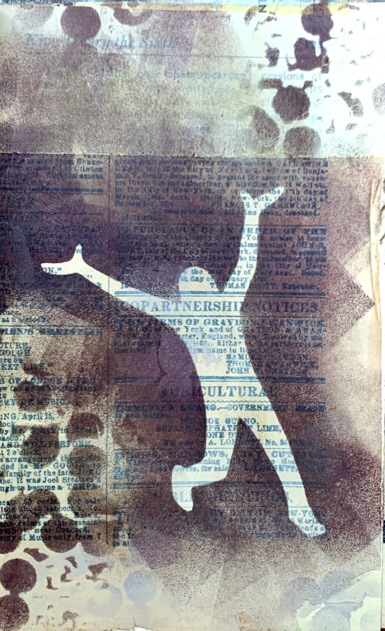
In the art journal spread below, featuring the Angel Circle Stencil by Kate Thompson and the Near Miss figure by Wendy Aikin, the figure is at the right side of the spread, facing right and leaning right. With printed text above to reinforce the direction, and crows also facing right rather than retreating in alarm, this figure can easily be presumed to be focused intently on something interesting up ahead, rather than something behind.
Taking the idea of forward, ahead, and right a little further, we can manipulate this design choice to imply an emotional content for faces or figures pointing or facing right. Figures in this orientation can indicate optimism, progress, hopefulness, success. Conversely, faces and figures moving toward the left can imply return, regression, regret, the past, and so on. Take for example, the two figures below, using the same mask from Figures Praising by Valerie Sjodin. In both cases the background and colors are the same, but depending on other choices (color, line work, contrast, composition, massing, etc.) you could make the first figure seem to be bounding joyfully into the future, and the second figure running away from danger to safety.
Now, I do not mean to imply that every face or figure in your artwork is doomed to carry this kind of subconscious baggage depending on what direction it's going. However, sometimes when narrative art featuring a face or a figure doesn't feel right, it's due to this - the brain is getting mixed signals. Our brains are hard-wired to read images this way (for left-to-right language readers); we have this 'right is right' unconscious bias whether we like it or not. As a test, try holding your work up to the mirror and see if it strikes you as emotionally or psychologically different. A great advantage to using stencils is that they can be flipped in either direction. So a composition that doesn't quite seem to hit the right note can be given another go by changing direction of the stencil.
Of course, when there are two figures or faces in a composition, they might be facing each other, in which case no particular psychological reading is especially pertinent - they are interacting. The interaction may be negative, neutral, or positive, but the orientation is probably not going to factor into that reading. However, if the faces or figures are not interacting, but oriented away from each other, there is a lot of room for inference. With Jeanne Oliver's Thougtful Face, we also have the advantage of playing with scale, because this stencil comes in two sizes. Now, with the smaller face on the left, facing left, and the larger face on the right, facing right, it is not hard to read this as the past and the present (or future) in an autobiographical composition.
It would be an interesting exercise to use these two stencils in all possible configurations simply to see how different the compositions feel. Obviously, many additional factors go into the emotional or psychological content of a piece of art - but going in the appropriate direction is one you don't want to miss if that's the one that can get you where you want to go.
Stencils used in these examples:
Angel Circle Stencil S271 by Kate Thompson, Three Crows Stencil S207 by Kimberly Baxter Packwood, Circle Up 6x6 from Club set March 2016 by Suzi Dennis, and Near Miss Stencil and mask set, S622 by Wendy Aikin
Figures Praising L727 by Valerie Sjodin, Dancing Lights S355 by Daniella Woolf
Thoughtful Face Large L839 by Jeanne Oliver, Thoughtful Face Small S862 by Jeanne Oliver, Periodic Table L837 by MaryBeth Shaw


I love the pieces you used to illustrate the important concept you were talking about. Thanks!
ReplyDelete