Hello you beautiful artist,
Maintaining a daily art journal practice can be quite a challenge. Sometimes life can get so busy that there isn't any room for hours of playing in your art journal. That's why I like to keep my daily art practice quick and easy.
For me, it’s my health that makes my daily art practice a struggle. On good days I like to take my time to create big layered pieces of art, to join a challenge, or follow a course. But unfortunately, there are periods that my health only allows me to create for 5 to 15 minutes a day. In the past, I would feel so frustrated about only having so little time to create. But in the last year, I have learned that those 5 to 15 minutes are just as important as those long creative sessions.
For me creating is something that nurtures my soul. It's like meditation. It makes me feel good, satisfied, happy, and energetic even when my health is at its worst. So allowing myself to create, even for a few minutes a day, is the greatest gift I have ever given myself.
My daily practice also has a huge effect on my art journaling skills. My art feels so much more free and intuitive!
I like to grab 5 to 15 minutes in the morning to do my daily practice. For this, I'm using an A6 journal. Small journals are great for when you don't have a lot of time. There's no room for overthinking, so it allows you to let go and to really enjoy the process. My small A6 journal is a place for quick and fun journal spreads. It's a place to play in when I don't have the energy or time to create big spreads.
For this blog, I like to give you some of my tips for creating in a limited amount of time by sharing the recipes of three pages that I made during my daily practice.
Page 1: Collage

Collage is one of my favorite techniques in the art journaling world. Tearing paper is just so relaxing! In my normal work, I use it a lot in the background to create texture and layers, but in my daily practice, I like to use it more as a focal point.
Having a stash of scraps or collage fodder is really helpful to use in your daily practice when you don't want to spend hours waiting for your modeling paste to dry. The book papers also give your page a nice texture, so it's a win-win!
In my first guest designer blog I shared how I used my extra modeling paste on vintage book papers so I could use it on another page. When you do this on a regular base your pile of collage material will be ready for you when you need it!
Another fun thing to use in your daily journal is your failed Gelli prints. You know, the print that didn't really worked out the way you want to and didn't find the way to the trash can because you couldn't say goodbye. Now is the time to tear it apart and glue it down!

Step 01
Start by gluing down a big piece of book paper with modeling paste.
Start by gluing down a big piece of book paper with modeling paste.

Step 02
Collage with pieces of your scrap pile.
I used a failed Gelli print with Floral Frolics by Wendy Brightbill,
I used a failed Gelli print with Floral Frolics by Wendy Brightbill,
a teabag with a and another piece of the book paper with modeling paste.

Step 03
Add some texture.
Fabrics, drywall tape, teabags, washi tape, and cookie packaging are some of my favorite things to add texture.

Step 04
Finish off your page with some ink splatters to create an extra layer of spark and definition.
And add a quote, word, or some random thoughts.
Page 2: Use your stencil as a starting point

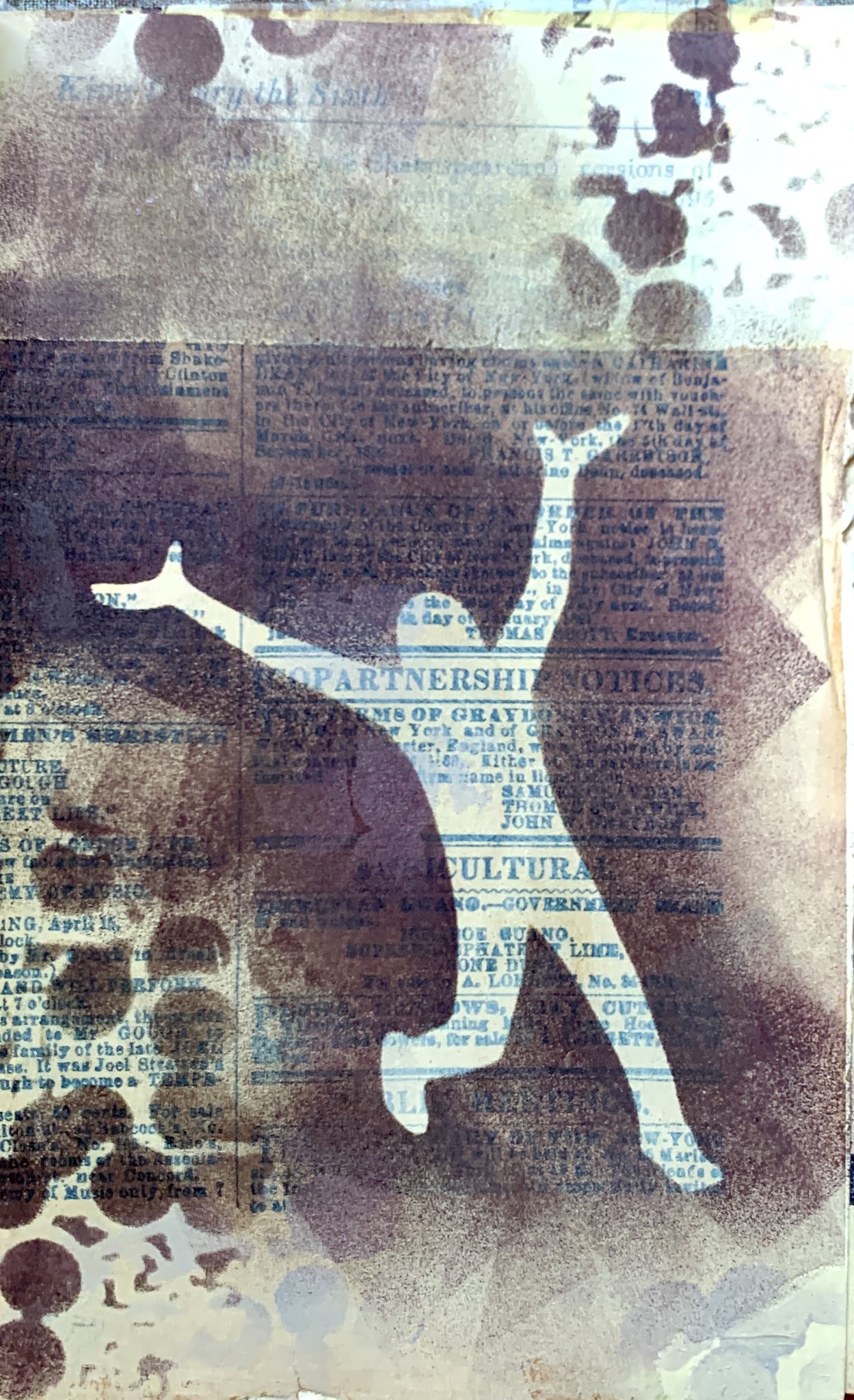
Using a rather big stencil for the size of your journal is a great starting point for when you only have a few minutes to spare. To make the process even quicker, clean your dirty stencil on a random page in your art journal. This way you’ll always have a few pages with a starting point in your journal that you can continue working on. Large stencils with a big and bold pattern are magical for this way because they don’t need much more to become a beautiful page.
In my daily art journaling, I like to use mediums and techniques that dry fast. But I’ve become addicted to using watercolors, ecoline, and inks. And as you know those don’t really dry fast. That’s why I have become best friends with my heat gun. Seriously, I don’t know why it took me so long to love this tool. It makes my life so much easier because I don’t have hours to wait for my pages to dry, but I also like how it moves my fluid mediums. Every drop goes on its own adventure and it’s so mesmerizing to watch. So I believe that you can definitely use those pretty intense fluid mediums in your daily short art practice as long as your heat gun is there with you.

Step 01
Stencil your preferred stencil on the page with acrylics.Try to use a stencil that can be the focal point as well, or use a big and bold pattern.
Mark Making with Floral Embellishments by Jeanne Oliver

Step 02
Collage on the next page leaving some white space where the stenciling is done.

Step 03
Build up your page by using gesso and acrylics.Apply the mediums with a pallet knife or a gift card helps to create thin layers that dry quickly.

Step 04
Play around with watercolors, ecoline, and inks.Use a heat tool to dry it faster.For the inks, I used Colour Blast ink in walnut.

Step 05
Make some marks using the same stencil as you used as a starting point.

Step 06
Finish off the page by adding some textures using collage materials and a quote.
And of course, ink splatters.
Page 3: Stencilling on transfer paper

I wasn't very familiar with this technique until recently. Here in the Netherlands deli, tissue, and tracing paper isn’t something you see in stores very often. But after I tried to trace a pattern for one of my sewing projects I got a lot of tracing paper scraps that I didn’t want to throw away. So I did what every art journaler would do, I found a way to use it in my art. And here’s the best part, same as for the other techniques that I showed you, you can make a bunch of these papers and use them later!
Another thing that I like is that when you glue these papers down with mod podge or gel medium is that they dry completely transparent. I have a very big love for using napkins in my art, and now I can basically make my own! These papers are great for layering, adding texture, and experimenting with colors. I would encourage you to make a bunch of these papers by using one stencil. You can play with different colors, make a gradient, or create your own pattern by using different pieces of the stencil. When you are done you’ll have your favorite stencil by hand and ready to go when you need them.

Step 01
Stencil on a piece of transfer, deli, or tissue paper.

Step 02
Build the foundation of the page by gluing done some collage.

Step 03
Use a pallet knife to add gesso and acrylics.

Step 04
Add more texture by layering teabags on top of the collage.

Step 05
Glue down your paper with mod podge or gel medium.

Step 06
Do I need to write this down? As always Finish off the page by adding some textures using collage materials and a quote.


And that's it three quick and fun ways to incorporate your favorite Stencilgirl® stencils in your daily art journal.
Thank you so much for reading my blog post. I hope that I have inspired you to create today! My name is Anouk, or Creanouk on social media, and I'm an all-around creative from the Netherlands. I love art journaling because I can put my heart and soul into it. You can find my work on Instagram and Youtube.


Using a rather big stencil for the size of your journal is a great starting point for when you only have a few minutes to spare. To make the process even quicker, clean your dirty stencil on a random page in your art journal. This way you’ll always have a few pages with a starting point in your journal that you can continue working on. Large stencils with a big and bold pattern are magical for this way because they don’t need much more to become a beautiful page.
In my daily art journaling, I like to use mediums and techniques that dry fast. But I’ve become addicted to using watercolors, ecoline, and inks. And as you know those don’t really dry fast. That’s why I have become best friends with my heat gun. Seriously, I don’t know why it took me so long to love this tool. It makes my life so much easier because I don’t have hours to wait for my pages to dry, but I also like how it moves my fluid mediums. Every drop goes on its own adventure and it’s so mesmerizing to watch. So I believe that you can definitely use those pretty intense fluid mediums in your daily short art practice as long as your heat gun is there with you.

Step 01
Stencil your preferred stencil on the page with acrylics.
Stencil your preferred stencil on the page with acrylics.
Try to use a stencil that can be the focal point as well, or use a big and bold pattern.
Mark Making with Floral Embellishments by Jeanne Oliver
Mark Making with Floral Embellishments by Jeanne Oliver

Step 02
Collage on the next page leaving some white space where the stenciling is done.

Step 03
Build up your page by using gesso and acrylics.
Apply the mediums with a pallet knife or a gift card helps to create thin layers that dry quickly.

Step 04
Play around with watercolors, ecoline, and inks.
Use a heat tool to dry it faster.
For the inks, I used Colour Blast ink in walnut.

Step 05
Make some marks using the same stencil as you used as a starting point.
Make some marks using the same stencil as you used as a starting point.

Step 06
Finish off the page by adding some textures using collage materials and a quote.
And of course, ink splatters.
And of course, ink splatters.
Page 3: Stencilling on transfer paper

Another thing that I like is that when you glue these papers down with mod podge or gel medium is that they dry completely transparent. I have a very big love for using napkins in my art, and now I can basically make my own! These papers are great for layering, adding texture, and experimenting with colors. I would encourage you to make a bunch of these papers by using one stencil. You can play with different colors, make a gradient, or create your own pattern by using different pieces of the stencil. When you are done you’ll have your favorite stencil by hand and ready to go when you need them.

Step 01
Stencil on a piece of transfer, deli, or tissue paper.
Stencil on a piece of transfer, deli, or tissue paper.

Step 02
Build the foundation of the page by gluing done some collage.
Build the foundation of the page by gluing done some collage.

Step 03
Use a pallet knife to add gesso and acrylics.

Step 04
Add more texture by layering teabags on top of the collage.

Step 05
Glue down your paper with mod podge or gel medium.

Step 06
Do I need to write this down? As always
Finish off the page by adding some textures using collage materials and a quote.


And that's it three quick and fun ways to incorporate your favorite Stencilgirl® stencils in your daily art journal.
Thank you so much for reading my blog post. I hope that I have inspired you to create today! My name is Anouk, or Creanouk on social media, and I'm an all-around creative from the Netherlands. I love art journaling because I can put my heart and soul into it. You can find my work on Instagram and Youtube.