Showing posts with label Kimberly Baxter Packwood. Show all posts

Monday, July 12, 2021

Watercolors & StencilGirl® Stencils

Good Day!

My goal for this presentation is to show you how I use StencilGirl® Stencils and the process I went through to be able to re-use the same stencil within a series but producing a new feel to the pieces.

My name is Alexandra Treadaway-Hoare (as in Hoar Frost). I was born in S.E. Asia, of Canadian Parents, educated in North Africa, Europe, UK, and Canada. I spent my adult years in the Corporate World in Canada and the US.

Ten years ago, I started serious Art Studies in my chosen medium of Watercolor, under David Daniels at The Smithsonian Institute, and continue to study under his tutelage. As of five Years ago I have been a professional Artists. I have earned 4 Honorable Mentions from Juried shows over the last two years from regional, national and international competitions. I have had two One Woman Shows and will be in a Two Women Show October 2 & 3 2021 at The Yellow Barn in Glen Echo Park.

Three years ago, I was introduced to ‘StencilGirl®’ stencils and now they are in a sizeable number of my works.

I painted a series of Birds using StencilGirl® stencils as the background:
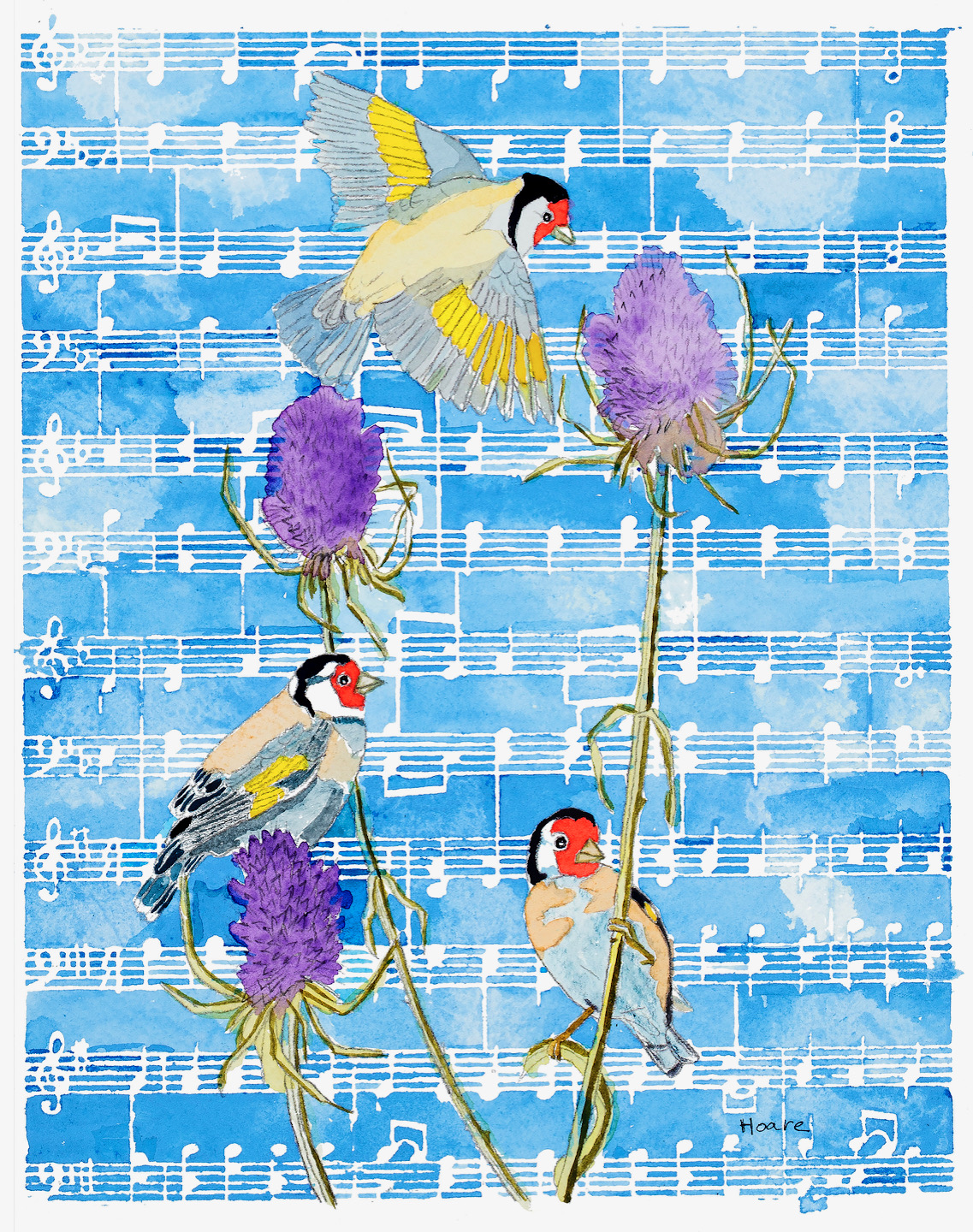
Morning Song
Music Score Mask by Valerie Sjodin

Bluebirds in a Barn
Window Ledger 9 Stencil by Pam Carriker
          

I also painted a series of flowers using StencilGirl® stencils as the background:

Calla Lily

 Morning Glories
Greek Key Stencil by Mary Beth Shaw
                 

In the next painting I used a 12x24” StencilGirl® Stencil where I used only Tertiary colors in the background:

Swallowtail’s Feast
Circle Tiles 12x24 Stencil by Mary Beth Shaw
Honorable Mention RAL Juried Spring Show 2021

Much as I enjoyed using the stencils, I was finding one problem…… I was not having much success re-using the same stencils no matter what the subject of my painting!

So here are my thoughts as I completely changed how I used the same StencilGirl® stencil.

I went back to my Flowers series…….

First, I chose the flower, a rich deep purple (*Amethyst Genuine/Cobalt Violet) lily and I tinged the leaves to reflect the flower resulting in a strong purple central focus!  I lightly sprayed the back of my Black Birds in Trees Invert Stencil by Kimberly Baxter Packwood with Krylon Easy-Tack, let it dry and placed it over the central focus. Now I filled in the blank areas with different values of yellow (*Permanent Yellow Deep), being very careful not to paint over the purple flower or leaves. I let it dry and peeled off the stencil. I now had blank white areas depicting branches and birds. Choosing to cover my paper with paint, I chose a pale blue (*Duochrome Cabo Blue), to represent the sky.

Purple Lily
Black Birds in Trees Invert Stencil by Kimberly Baxter Packwood

Now to use the same stencil to achieve a very different ‘look’!

I stayed within my flower motif, this time starting with my version of a few humble Dandelions, which I painted yellow (values of *Hansa Yellow Medium) and added green stems and made-up leaves. I laid the still tacky (months later!!) stencil over the central flower. I then took a ‘Micron” pen with archival black ink in a size 0.3 (felt like nib) and outlined the StencilGirl® stencil Black Birds in Tree l.  Again, I peeled off the Stencil. Now I had a lot of white paper, my version of dandelions and black line drawings! I started by painting the tree branches brown (*Raw Siena & Burnt Umber) and added sporadic green (variety on my palette) shoots at some of the branch ends and painted in just the visible beaks of the birds (brown as above).and stopped!  What I believed I now had was a minimalist representation of flower and flight!

 
Dandelions and the Spirit of Flight
Black Birds in Trees Invert Stencil by Kimberly Baxter Packwood
Honorable Mention Beacon Journal Fine Art Competition 2019

In this experimental piece for me, you’ll notice a bird head in lower left corner that had to have the ‘brown bark’ sponged away… I did want the birds head to be in back of the trunk, but the black ink showed thru, so I ‘fixed’ it. In the same general area you’ll spot a brown smudge; I knew that I couldn’t get it out so I added a stroke to imply a beak and left it alone!

The most powerful lesson that I learnt was to allow myself to leave white space in my painting!

All paint colors are Daniel Smith watercolor tube paints.

Alexandra Treadaway-Hoare


Monday, June 28, 2021

Going in the Right Direction

   
     For about 30 years, I made my living as a children's book author.  I wrote quite a lot of books for children and teens, and many of the books I wrote were illustrated, although not be me.  In addition, all my books had covers (obviously) designed by either the in-house art director or a free-lance illustrator and/or designer.  As an author, I was never consulted on matters of book design and interior art.  I did, however, learn a great deal over the course of my children's book career about illustration and cover design, and about some of the key concepts related to narrative art.  Because many of us in the mixed media community are working in art journals where we have some narrative component, I thought it might be helpful to share one of these concepts as it relates to faces and figures: direction.
    At its most basic, direction in illustration or narrative art is determined by the direction of text.  In other words, if you read from left to right, anything moving to the right, facing right, pointing to the right, can be interpreted as heading forward. This is the direction we go when we read - we go to the right.  Typically, people who read from left to right also "read" artwork from left to right, read a crowd of people from left to right, inspect a room from left to right, and so on.  The left side is presumed to be the beginning, and the right side is presumed to be the end of a sequence, or a pause in the sequence.  (Incidentally, in cultures where text is read from right to left, the opposite is true; for example, the cover illustration of one of my books was reversed when published in Japanese.)  
    In the art journal spread below, featuring the Angel Circle Stencil by Kate Thompson and the Near Miss figure by Wendy Aikin, the figure is at the right side of the spread, facing right and leaning right.  With printed text above to reinforce the direction, and crows also facing right rather than retreating in alarm, this figure can easily be presumed to be focused intently on something interesting up ahead, rather than something behind. 


    Taking the idea of forward, ahead, and right a little further, we can manipulate this design choice to imply an emotional content for faces or figures pointing or facing right.   Figures in this orientation can indicate optimism, progress, hopefulness, success.  Conversely, faces and figures moving toward the left can imply return, regression, regret, the past, and so on.  Take for example, the two figures below, using the same mask from Figures Praising by Valerie Sjodin.   In both cases the background and colors are the same, but depending on other choices (color, line work, contrast, composition, massing, etc.) you could make the first figure seem to be bounding joyfully into the future, and the second figure running away from danger to safety. 


    Now, I do not mean to imply that every face or figure in your artwork is doomed to carry this kind of subconscious baggage depending on what direction it's going.  However, sometimes when narrative art featuring a face or a figure doesn't feel right, it's due to this - the brain is getting mixed signals.  Our brains are hard-wired to read images this way (for left-to-right language readers); we have this 'right is right' unconscious bias whether we like it or not.  As a test, try holding your work up to the mirror and see if it strikes you as emotionally or psychologically different.  A great advantage to using stencils is that they can be flipped in either direction.  So a composition that doesn't quite seem to hit the right note can be given another go by changing direction of the stencil.  
    Of course, when there are two figures or faces in a composition, they might be facing each other, in which case no particular psychological reading is especially pertinent - they are interacting.  The interaction may be negative, neutral, or positive, but the orientation is probably not going to factor into that reading.  However, if the faces or figures are not interacting, but oriented away from each other, there is a lot of room for inference.  With Jeanne Oliver's Thougtful Face, we also have the advantage of playing with scale, because this stencil comes in two sizes.  Now, with the smaller face on the left, facing left, and the larger face on the right, facing right, it is not hard to read this as the past and the present (or future) in  an autobiographical composition. 

    It would be an interesting exercise to use these two stencils in all possible configurations simply to see how different the compositions feel.  Obviously, many additional factors go into the emotional or psychological content of a piece of art - but going in the appropriate direction is one you don't want to miss if that's the one that can get you where you want to go.


Stencils used in these examples:

Angel Circle Stencil S271 by Kate Thompson, Three Crows Stencil S207 by Kimberly Baxter Packwood, Circle Up 6x6 from Club set March 2016 by Suzi Dennis, and Near Miss Stencil and mask set, S622 by Wendy Aikin

Figures Praising L727 by Valerie Sjodin, Dancing Lights S355 by Daniella Woolf

Thoughtful Face Large L839 by Jeanne Oliver, Thoughtful Face Small S862 by Jeanne Oliver, Periodic Table L837 by MaryBeth Shaw


Friday, February 26, 2021

Book of Birds by Kimberly Baxter Packwood

Supplies:

  • Black Birds in Tree Stencil
  • Three Crows Stencil
  • Craft Paint
  • *Gesso
  • *Stencil brushes
  • Paint Brushes
  • Utility Knife
  • Leather awl or a drill
  • *1/8” round paper punch
  • Cardboard
  • Gel Medium or Glue
  • Pencil
  • *Watercolor Pencils
  • *Leather cord, small diameter for binding the book
  • *Heavy Thread
  • *Paper scraps for embellishing

* Optional

For this project I decided to make an unconventional birdhouse out of recycled cardboard.

You can use my structure design, or make a structure style to your liking. I went with a square hole and doors for my birdhouse, though many have round holes and no doors, I liked the element of surprise the doors give my structure.

SAFETY NOTE: I use a traditional utility knife, I discourage the use of Xacto knives or utility knives with the snap off blades for projects like this one as it is too easy for the blade to get stuck in the cardboard and you could potentially cut yourself.

Using the template, or a design of your choice, cut two pieces of cardboard one for the front of the book and one for the back of the book.

Once they are cut out paint the fronts and back with gesso or white craft paint, allowing to dry thoroughly between layers. I prefer gesso as it prevents the acids in the cardboard from seeping through, which can damage any treatments you add to your covers.

While the gesso was still wet I rubbed moss green and red iron oxide charcoal sticks onto the cardboard, and used a wet paint brush to spread the charcoal around and thinned it down for a more sheer effect.

Lay the Black Birds in Tree stencil on your back cover and trace out a portion of the stencil onto the cardboard. I then filled in my design using watercolor pencils in a dark indigo, sepia, wine, and yellow ochre colors. I filled in the birds using a soft grey color.

Once I had the design filled in I used a #2 round paint brush that I dampened to spread the watercolor around.

Once that side of the cover was dried, I painted the reverse side and added some texture using a sewing pattern marking wheel, and then some color with charcoal sticks, pastel pencils, and watercolor pencils.

For the front of the Birdhouse Book I decided to cut square doors, see dimensions on template.

I used a steel ruler and utility knife when making my cuts. If you should accidentally over shoot your cut lines you can, if desired, glue a decorated sheet of paper or card stock to the front of the book to hide the cut marks.

I gessoed the front of the book cover and applied some charcoal while the gesso was still wet, moving it around with a wet brush. After it dried I added sunflowers and Queen Anne’s lace to add a garden theme to the cover using watercolor pencils. When that was dried I applied one of the birds from the Black Birds in Tree stencil to the top of one of the sunflowers using a dark indigo watercolor pencil.

Once the front of the book cover was dry I gessoed the back of the cover and while wet added some moss green charcoal, I used a wet brush to move the color around while the gesso was still wet. I will probably add a design to the inside of the cover at a later date.

I then cut six more pieces of cardboard, the same shape as the covers, and glued them together using mat gel medium, and added small clamps to keep the cardboard compressed. You could weigh the stack down with some heavy books for the same affect.

Once that was dried I cut a section out of the stack in the same location as the doors on the front cover, I removed four layers of cardboard.

I then painted the back ground using some earth tone colors, with craft paint.

I then added a piece of paper, to which I added a hole the same dimensions as the cardboard piece, and stenciled my Black Birds in Tree design on part of the paper. I then attached it to the cardboard piece using gel medium.

Once that was dried I added paint to the back of the cardboard piece, and then added holes using a needle awl for the binding.

Finally, I added a bird, which I cut out of cardboard and painted with craft paint, from the Three Crows Stencil, to the niche in the cardboard piece, and a small piece of paper rolled up to make a perch for the bird.

To make the bird I traced the stencil design onto two separate pieces of cardboard, and then removed the excess bits from around the bird so that I could easily cut the bird design. Once cut out I glued the two pieces together, and added two pieces of scrap cardboard to the back of the bird so that it wasn’t laying against the niche background.

To bind the book I used a 1/8th inch hole punch and placed holes on the left sides of both covers and the middle section approximately every inch, and ¼ inch in from the edge, yielding four holes. I created the holes in the using a sewing needle awl. If necessary you could use a drill with a 1/8th inch drill bit to create the holes in the middle section.

I bound the sections together using approximately 7 ½ inch pieces of thin leather cord. I pushed the cord through the holes and then tied them together with a slip knot to finish the binding. Trim cord ends if desired, I liked mine long.

Wednesday, April 29, 2020

Painted Leather Cuff with StencilGirl® Stencils

Hi, everyone! Kimberly Baxter Packwood here to show you how to create a painted leather cuff with StencilGirl® Products!
Here are the supplies you'll need:
Leather cuff blank 3” wide
Acrylic paints
Paint Brush
Sponges or an old rag for distressing the paint
Water for rinsing brushes
Pen or Pencil or a fine tipped marker in a color similar to your color palette
Sand paper for distressing paint and leather
Sealer: Top Kote, Tan Kote, or Super Sheen
***Markers or pens for adding details if desired.
Snaps and a snap setting tool if your cuff didn’t come with any, and a snap setting tool.

NOTE: If you buy a cuff blank that has already been dyed, you will want to distress the surface with sand paper so that your paint will adhere to the leather surface.
Lay your cuff out flat on your work table, you may find using double stick tape to get it to lay flat to be helpful.
Apply your top coat of paint, I went with a medium value turquoise color and then added in three other values of turquoise, both blue based and green based along with ivory and a maize color for the cuff base, and plum and black for the crow.
I painted both sides of the cuff along with the edges.
Allow paint to dry completely between layers of paint.

NOTE: If your cuff has a snap already attached you can cover it up with painters tape, unless you want it to be painted as well.

After allowing the paint to dry, I used my lightest value turquoise paint and my Black Birds in Tree stencil to apply the initial layer of birds.
I used the corner of a paper towel to remove any raised paint areas from the leather, you could also sand those back once this layer of paint has dried.
Once that layer of birds had dried I took the next darker value of turquoise paint and using the same stencil I applied the next layer of birds, shifting the stencil so it angled a little bit to give the cuff added interest. And allowed that layer of paint to completely dry.
While the paint was drying I experimented on some scrap pieces of leather to see which distressing techniques I wanted to use for this cuff. I decided to use an ivory and a maize yellow chalkboard paint to create the distressed layer.

To distress the previous layers take some ivory maize colored chalk board paints and blend together, yielding a very pale yellow color. Apply in large strokes in a couple of places across the face of the cuff and then immediately remove most of it using a damp paper towel or shop rag.
I placed my stencil onto the cuff to see where I wanted the crow to be placed once I found a spot that I liked I used a pencil and lightly drew the crow onto the cuff.
Place the larger crow stencil back onto your cuff and lightly stencil the crow, I did several layers and finished the crow using a fine round brush.
After the crow design paint dried I applied more paint to the crow using a small paint brush to even the look out.
Once the paint is dry and you’re satisfied with the final design seal the paint using a leather sealer such as Tan Coat, or one of the ones listed above in the materials list.
It takes about 12 to 24 hours for the sealer to completely dry, once dry add any hardware you want to your cuff. Once the sealer has dried you can use a soft cloth like tee shirt material, to buff the sealer and improve the sheen of the final coat.
If  you want to add more paint after you’ve sealed to cuff just add it on top of the sealer and when that paint is has thoroughly dried add another layer of sealer.

Tuesday, March 17, 2020

Stenciled Poetry: Love in Nontraditional Colors


Greetings and Salutations!

Carol Baxter looking up from a book of poetry waving at you! Do stories and poems you read and songs you hear inspire your art? They often do mine.

"Ditty of First Desire" inspired this art journal spread. The idea of love and soul in nontraditional colors of green and orange intrigued me.


I started out with a page I'd previously painted on an excess of Payne's Grey, Navy, and Powder Blue.

I scattered and glued my gelli printed stash paper scraps.


I used Lemonade, Salty Ocean, Chipped Sapphire, and Lucky Clover Distress Crayons to color in and draw a heart, then I painted each color individually starting with the yellow accents.


Next up I used Kristie Taylor's hand-mixed Sparkle Spirits Ink in Helios Orange to draw around the heart. It's pretty dry with the heater on in my office so I was not quite as quick as I might have liked spritzing it and getting it to drip. But I did turn it upside down and I like the subtlety of the drips. (And you know sparkles make me happy.)


The stencil on the lower right is Dancing Lights by Daniella Woolf from the public collection -- I used it for the little paper rhombus elements. Above it is the small stencil from the exclusive StencilClub set: Borderlines by Seth Apter. You'll see below it is from the previously gelli printed paper I used to fussy-cut the bird. The bird is the mini from another club set, Boho Collection by Cathy Taylor. Black Birds in Trees & the Reverse are stencils in the public collection by Kimberly Baxter Packwood.


I highlighted the birds with PaperArtsy's White Fire and then used black and brown pens to give them a little detail. I wrote the poet's name over and over to create the branches. I think it makes them look thorny. (If I wanted a thicker branch, I could write two lines next to each other in opposite directions... a technique I shall remember.)


Adding lines from the poem and gluing down the heart and the bird. I thought about writing them on the orange heart but ultimately, decided not.


Watching Andy Garcia portray Federico García Lorca in the film "Death in Granada" prompted me to seek his poetry.

Theatre director, playwright, and poet, Federico García Lorca brought surrealism, symbolism, and futurism into his work. A rebel on many levels, outspoken and often anguished, he thrived in the 1920s art community in Spain and is presumed assassinated at the beginning of the Spanish Civil War.

This poem has been in my head for a bit.


Ditty of First Desire 
by Federico García Lorca

  In the green morning
I wanted to be a heart.
A heart.
  And in the ripe evening
I wanted to be a nightingale.
A nightingale.
  (Soul,
turn orange-colored.
Soul,
turn the color of love.)
  In the vivid morning
I wanted to be myself.
A heart.
  And at the evening's end
I wanted to be my voice.
A nightingale.
  Soul,
turn orange-colored.
Soul,
turn the color of love.


Is it morning or night in your life? What color(s) will you paint & stencil your soul?