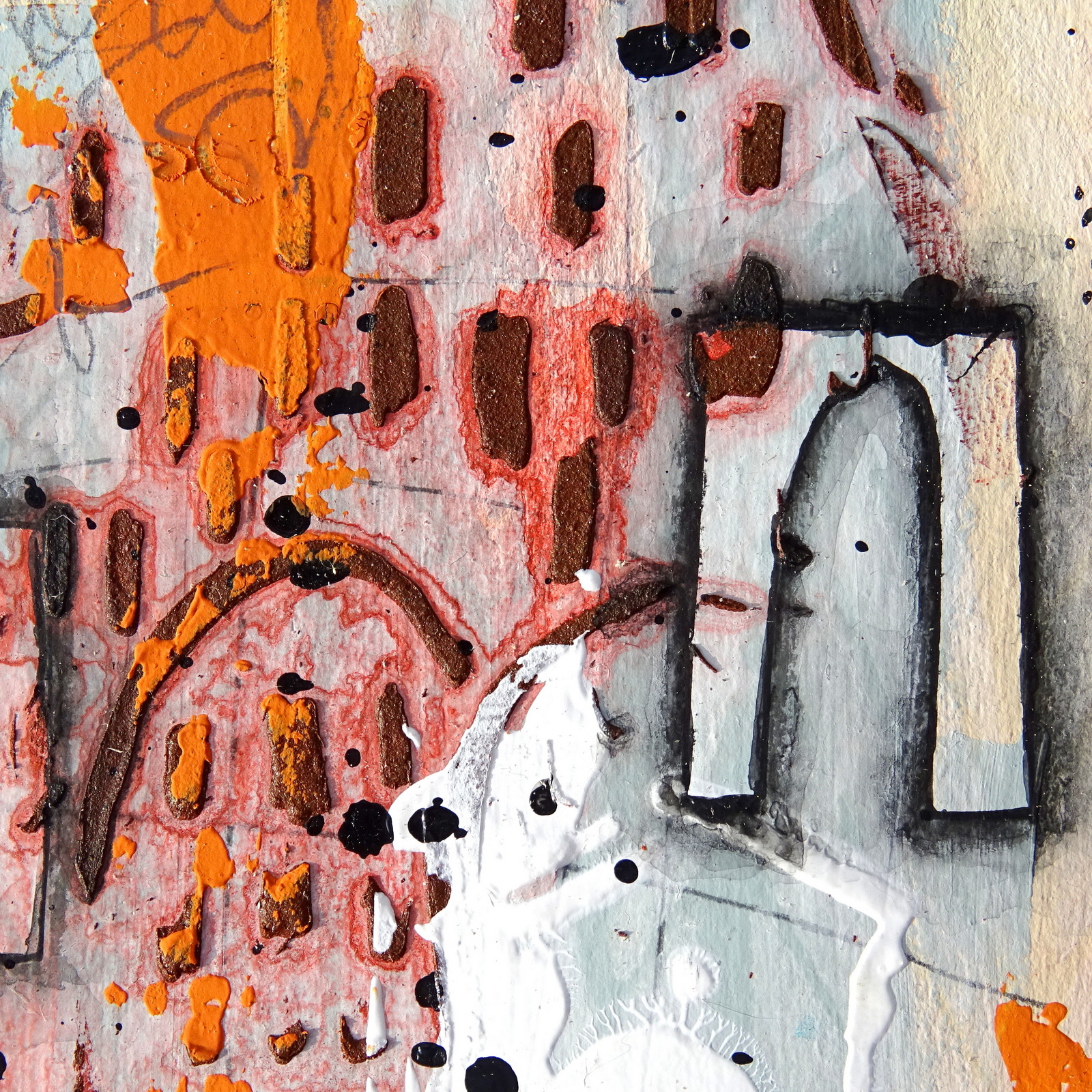
Hi, servus and welcome to today's share of a good dose of grungy, weathered mixed media goodness!
Claudia here again and this time I thought I'd provide you with some simple techniques hat can help with starting an abstract mixed media project as I take it that quite often people feel a bit lost with where to begin when they are taking their first mixed media steps.
It is always good to start with something that feels inspirational or "speaks" to you, be it on a logical or an intuitional base. Something you can connect with or feel especially at home with. Or the exact opposite - something that means a challenge for you as it forces you to leave our comfort zone. New (artsy) territory frees us from the pressure of avoiding making mistakes and means adventure on new creative paths. There we can embrace the - oh, - so feared mistakes as something to learn from and we will find that happy mistakes bring a wonderful way of randomness to our projects.
Some smudged paint from a stencil "failure"? Look closer - you will find that you couldn't have created that quite interesting shape of this smudge intentionally, right? Happy accidents also free us from wanting to follow a thoroughly planned through path with a project and bring new ideas and open new directions to where a piece could evolve. We just need to stay open to this kind of parting of ways and let go of a too strict plan. That way the final piece that you come up with will surprise you and I promise - in a good way!
Of course there are a few rules to keep in mind (composition-wise), but as long as you embrace each adventurous journey a new project can take you on, you actually cannot go wrong. You will always learn something on this journey - even if you end up with something you do not feel is "you" at first. If you look closer you will find a lot of "you" in the piece. It is just not the "you" you are used to. It is parts of "you" in yet unusual spots. You will very likely find that you have tried a new technique and during the process have adapted it in a way that makes it yours without even having had to think about it. You just did. That's what art does - it invites you to learn more about yourself during each creative journey. So do not overthink - just take the first step. Then the second...and the third...and you are on your way.
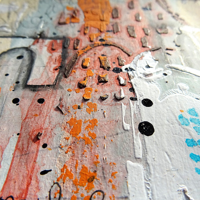
It is always a good thing (and also fun) to work in series like I did with this tryptic (or trio) here. Repeating a step several times but in slightly different spots (composition-wise), gives you more opportunity to learn and take a process in than by just doing it once. You will also end up with three (or five) variations of the same theme that you can then compare. This way you automatically learn about composition and which contrasts and shapes work together well and which work less.
So let's get you started with a recipe for the first layers!
Once you have accomplished these, the project and your initial idea for it will start to come together quite smoothly (and almost by themselves) and very likely take on the lead - and then each step inspires some possible next ones. So it is always a good idea to gather more stuff (stencils, paints, pencils, pastes, texture tools, brushes, palette knives, spray paints, brayers, sponges, old credit cards,....) for starters than you will use in the end. Having the option of choice, helps you become more secure in picking the stencil you think fits best instead of just the one you had originally planned to use.
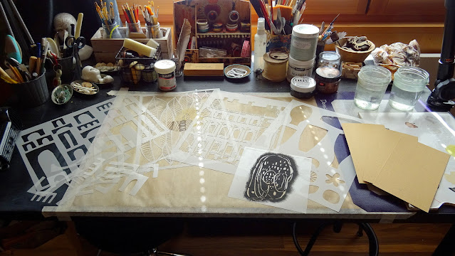
On my desk you can see I've prepared a selection of stencils that "spoke" to me while browsing my StencilGirl® stencils collection. The ones I picked do not follow a specific theme or any idea of how a finished project might look like - I focused on picking a mix of stencils I liked: one that I could use for a focal element (the arches to the left), another one to work as a kind of "aid" to mimic some random background pattern or "doodling" (as I know not everyone feels safe with using the own handwriting, scribbling or doodling), some to create different random texture layers with and some to add the final small pattern touches here and there. Some of these are stencils that have actual motives (in my case a house front, vases and leaves), but my focus was on the patterns and shapes these provide and I often use stencils upside down or sideways - totally ignoring the actual imagery.
I cut to size some packaging grey board to create three panels of the same size as my substrates to work on. Starting out on cheap substrates takes off any pressure of having to "succeed"!' Then I primed these with a thorough layer of DecoArt beige Chalky Gesso. In the picture you can see the texture the grey board with the Gesso already provides. Going for a substrate that gives tooth for media to adhere to is always a good choice when working with mixed media.
Also varying the tools to apply paints and pastes with is not just great fun but makes sure you get slightly different stroke patterns and texture. I applied the DecoArt Americana Chalky Finish paint "heritage" with a silicone brush (or colour shaper) for example. This second layer was still quite simple and smooth, as I wanted to add some self made spray paint through a stencil a bit later and wanted good visibility.
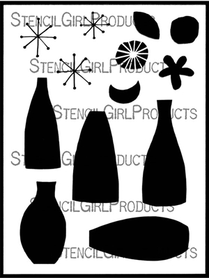
The next layer were some random lines added with a simple soft grey pencil. "Random doodling" - that sounds easier than it is - I too often do not like what I doodle by hand. Still too neat, not random enough, too awkward or stiff,...so I have this trick that helps me kind of "surprise" myself: I use a stencil that provides shapes to trace and vary in position and angle:
(Lucie Duclos)
What I did was to only trace parts of the vase shapes, twisting and turning the vases stencil with each new layer of traced lines.
This way I ended up with a web of lines that formed a lovely random layer that would peek through here and there once the project would be finished. With this step you can use any kind of shapes and lines - only make sure they are not too detailed as this will mostly get lost anyway and will also make to much "visual noise" and be too dominant at a point when you still want to stay as open as possible to new shapes, lines, patterns and other elements. Going for "simple" is recommended at that stage. ;) You can (and will) create wonderful colourful noise later. This is just "the background singers" for now.
If you haven't yet, try something new like making your own spray paints - it's so much fun!!!! I had a pot of quite dry chalky finish paint and during trying to re-moist it had added too much water. But I wondered how a spray paint might look like, that was rather a sprayed on "wash" (=a lot of water with little pigment) than an opaque paint. So I used a Ranger Mini Mister and filled that with what was "swimming" on top of the paint.
(Cecilia Swatton)
I picked a stencil design that would cover most of the surface evenly and add a beautiful even background pattern. Actually the result turned out even better than I had expected!
I heat dried everything and then added my
next layer - this layer should
contrast the previous ones - colour-
and shape-wise. Concentrating a contrasting colour
in a small area is something you should keep in mind here (this works best with complementary contrast colours). Here a small amount of bold orange makes a lot of pale blue look even more blue (and more pale). You can also use this step to add a
first textural element to your make. I did so by using Viva Rusty Paper paste through one of my favourite stencils (as it is so versatile - I used it in a totally different way with this project
HERE for example).
Before the Rusty Paper Paste started to dry, I heavily it on the three panels with clear water to make the colour pigments from the paste bleed out and create drip lines (by tipping the panels in the direction needed).
As there was a lot of water on the panels, I heat dried them using my heat tool, so I could continue and not lose my flow.
Next Layer! This is also a good time to maybe try out some yet unopened medium pot from your shelves - like in my case the DecoArt Americana Decor "Texture" white Dimensional Acrylic Paint. On the label it read that the medium would dry to a smooth, almost glossy finish - which was a perfect textural contrast to the rough rusty paste from the previous layer! Again I used a stencil with an actual image design only partially to create a random pattern.
See the smudges from the acrylic paint medium seeping under the stencil in the bottom left corner? They go together really well with the jagged drip lines, don't they? And they just feel natural as they add to the grungy feel of the make. So no "mistake" made, right? Just happy accidents.
With this layer the stage for the focal elements was prepared. I had picked some arches - a simple but bold shape that leaves room for interpretation by the viewer. They could be houses, arches that hold doors to new worlds or even a quote of
Paul Klee's "Revolution of the Viaduct". They tell a story - or rather nudge the spectator to tell the story she or he "finds" in the painting.
I introduced another medium to my project - a Faber Castell PITT black artist pen with which I traced some of the arches to transfer their shapes to my panels. Next I outlined these arches with my beloved Stabilo All Aquarellable black pencil...
...before I used a fine tip brush loaded with clear water to smudge the drawn lines and create some shading around the arches' edges.
The shading creates depth and adds dimension to the project. This way the arches - even if they do not have an outstanding colour - actually they have no colour on their own - become the eye-catching elements and the focus gets drawn to them immediately, no matter how "noisy" and vibrant their "surroundings" are.
At that point you could stop adding more layers if you want to stick to a rather subtle look - which is totally fine. Actually I already liked the panels at that stage, but I was in the mood for some joyful mixed media mayhem (a controlled one of course ;). So I did one of my favourite things to do - I splattered on some black paint using the nozzle of the black DecoArt media Mister as my application tool. I used the masks to cover the arches so they would stay "clean" (the masks are there, you just cannot see them well in the picture below).
The little paint splatters always help fuse all the elements in the composition so far and they repeat the black colour from the arches. Repetition (of colour and/or shape) is always a good means to tie elements in.
Next I searched for a contrast against the rusty red, so I added some teal little dots using a stencil from my "mark-making" section and a make up sponge to apply the DecoArt premium Cobalt Teal Hue with.
(Seth Apter)
At that point I realised I had opened the stage for another colour, if I wanted my project to not look boring. The teal and the rusty red against the pale blue-grey background looked kind of dull to me. Too evenly spread contrasts have such an effect. So I needed something to "unbalance" things again. A contrast to the teal that wasn't too close with the rusty red was what I needed - orange and dark yellow were the perfect candidates.
I picked more of my favourite pattern and mark-making stencils, DecoArt Chalky Finish "heritage" and Americana acrylic paint "Butterscotch'", a stencil brush and a palette knife and added paints and patterns where I felt I needed them.
medium size stencil from the
(Mary Beth Shaw)
The tone of the scraped on warm "heritage" Chalky Finish paint finally gave the effect I needed, as the yellow "Butterscotch" patterns weren't enough to do the job.
Some finishing touches like a bit of scribbling or adding tiny dots are always the best way to add interest to spots on your projects that you feel still look a bit "forgotten during the process" (but do not need a lot). You can also use this step to add scribbled "text" pattern blocks to fix unbalanced compositions. Less is more though! "Horror vacui" (the term for "fear of the empty (untreated) space") often leads us to add too much and again too evenly to our projects, which destroys the necessary visual tension between interest and background space, to make a painting intriguing for our eyes.
If you are unsure to whether add an element in a certain spot or not, you can use transparent paper with some scribbling on it and put it in the place you think it should go and see how it "behaves" there. Follow your gut - if you think it looks awkward there (and impacts your painting in way that you do not like), it does.
I also added a hand-scribbled thin border to my panels and distressed the grey board edges to go for a maximum of weathered and grunge, but the latter is a question of taste rather than composition. Both are great options though for adding a border if you feel your panels need one.
If you let your project show you the way, you will know when to finish. Always taking a step back and looking at the progress so far between steps, helps you avoid overloading your make. If at one point during the process a step sparks a new idea for a variation of a technique or pattern, rather save that for a new, separate make than add it right away to the current project. If there is too much different "noise" of variations going on on your project, each steals attention from the other and dulls the impact it can have. Avoid placing elements in spots where they create symmetry of spaces in the composition, as symmetrical designs are very static and boring for the eye. Create a world for the eye to wander and wonder in and -most of all - have fun!


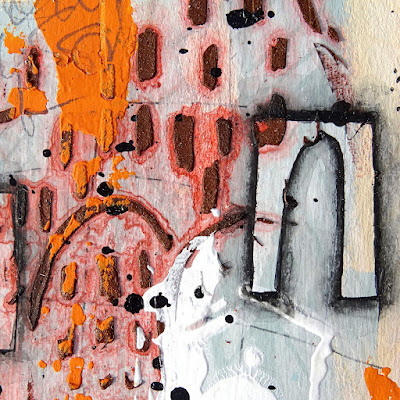


The "wonders for the eye" kind of "happen" by themselves, if you enjoy your process and let your painting take the lead at times and spark new directions and ideas (though you are still the one who should hold the leash). Combine one of your favourite techniques or colour schemes for example with something new you have already for a while been planning to try out - so you feel safe on the one hand and adventurous on the other - and you cannot go wrong! I promise!
Hugs,
Claudia xxx