Showing posts with label acrylic paint. Show all posts

Thursday, February 24, 2022

StencilGirl® Stencils and Spackle by Jane Dunnewold

I’ve used spackle for a number of years. But not just any spackle. Fast ’N Final is a lightweight spackling product that is actually a kissing cousin to gel medium because it is acrylic based. It’s the only product you should use for this stenciling technique, unless you are planning to work on a very stiff substrate. Fast ’N Final is perfect for papers and fabrics that have been stabilized with a backing like craft felt.

As you can see in the picture, spackle is thick, about the consistency of very stiff icing! It spreads easily with a credit card, but I use a small squeegee that we sell on my website.

For this demonstration I am using a large stencil from StencilGirl. This is a particularly good stencil to use because it has a lot of detail, but not a lot of large open areas with little bits that might not lay flat when I squeegee the spackle over the stencil. In general, small, overall patterns are easier to use than large open ones.

For example, in the picture of my StencilGirl expanded square “spider web” stencil, you can see how much the spackle smeared because the large areas were too open and had thin elements that didn’t stay flat when I pulled the squeegee. As much as I adore that stencil, it isn’t a good choice for this, although I could put down a flat layer of spackle and allow it to dry, and then add my stencil on top in paint later. Keep that tip in mind, if you have stencils you would like to use that aren’t a great choice for spackling applications.

Follow steps to make spackling through the stencil easier. The first pull of the squeegee across the stencil should be almost parallel to the surface, as you see in this picture. That helps spread the spackle out on the surface of the stencil.

Once the spackle is spread out on the stencil, hold the squeegee so it is at 90 degrees to the surface, as you see here. Pull the squeegee lightly across the surface to remove excess spackle that’s on top of the stencil. This ensures a complete and even image once the stencil is removed.

Peel the stencil back carefully to reveal the spackled pattern. I didn’t print the entire stencil on this project, because I was planning to work into the image and wanted it to be incomplete.

You can color the spackle with acrylic paint. The more paint you add the less depth you will get when you print the spackle. Add a little paint at a time, especially if you want a tint more than a deeper color.

Stir the spackle and the paint together to mix thoroughly. Print just as you did when using the white spackle. You can see how vivid the color is here, using just a little of the acrylic paint. Don’t worry, though. If the color is too strong or bright, you can always paint over the spackle when it dries, to knock the color back.

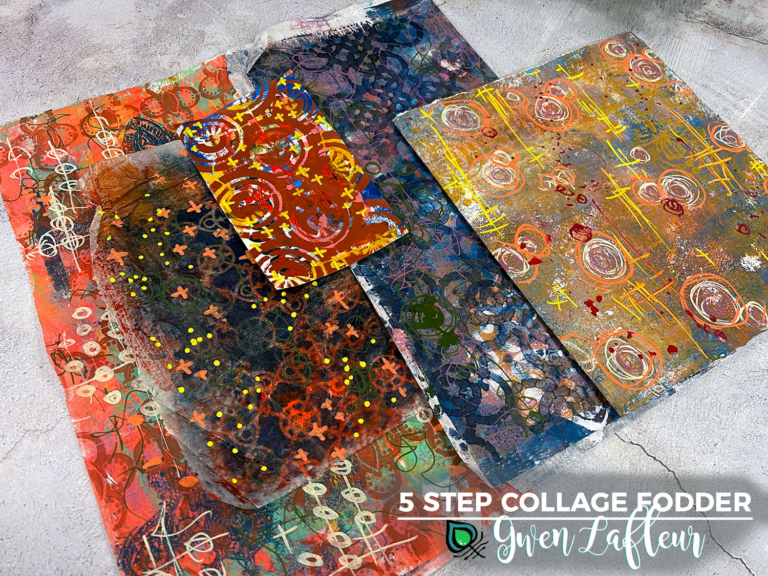
I’ve used spackled paper and cardboard pieces in many of the mixed media collages I make. Here are two examples of vase forms I’ve created, with raised patterns, thanks to the stencils. Before they are painted they look like milk glass as you can see in the picture.

Try putting spackle over gelli-plate printed papers and card stock. And remember, you can always paint over the spackle once it dries, because it is an acrylic product. So the coloring options are endless.

In this still life example, made with some of my botanical prints, and collaged with vintage silk embroidery and gold leaf, I used a stencil I cut myself, to apply spackle to the wall behind the vase of flowers. It adds dimension and another level of interest.

Here are a few tips to keep in mind if you would like to try Fast ’N Final with stencils of your own.

         Remember to lean the squeegee toward the substrate to get the first layer positioned and then straighten the squeegee up to remove extra spackle that might prevent the print from being clean and crisp.

         Always let spackle dry before coloring or altering.

         Spackle can be sanded once it’s dry.

         If you want to apply spackle to fabric, it must be stabilized with some sort of backing. It will chip or flake off if the fabric is too flexible. This is not a suitable process for clothing or fabric that is functional.

         You cannot sew through spackle with a sewing machine as it will gum up the machine. However you CAN hand stitch it to add details or interest!

         Never iron over spackle without using a pressing cloth or parchment paper as it could melt onto the iron and make a mess.

         Clean up tools with water before the spackle dries, as it will ruin anything it dries on.

I was intrigued by the fabric piece that had the bright magenta spackle on it, but I really didn’t like the color. So I decided to try using Inktense blocks on top of the spackle. The trick is to spray the surface lightly with water first, so the color will blend easily.

I was pleased with how it looked so I decided to be daring and add some additional color.

Then I got a wild hair to add a portion of a doily I’d dyed previously. So I used Misty Fuse to fuse the doily to the background. The purple was pretty intense and the stencil pattern ended abruptly, so I got out the stencil and added more spackle.

Once the spackle dried, I added more color with the Inktense blocks to blend the elements together.

I had planned to add stitching to the doily's lace edge, and when I did, and flipped the piece around, it suddenly became a mountain or a cathedral! So I grabbed the lid from my vitamin bottle, and used it to add a circle. I colored in the “sun” with Inktense, and the piece was finally complete.

What I find most joyful in my own work is the spontaneity of discovery. I hope this essay grabs your imagination, and that you have some fun with this! Let us know how it turns out!

I hope you’ve enjoyed my blog post and found it inspiring. If you would like to see more of my work and be entered in a drawing for the artwork I created for the blog, sign up for my newsletter here! Shipping included. Looking forward to connecting with you!


Sunday, October 17, 2021

5 Step Collage Fodder... With Stencils!


Hi all! It's Gwen back this month with another installment of my Paint & Texture column. 

DIY collage fodder has been all the buzz on Instagram lately, so I thought it would be fun to add another technique into the mix and share Five Steps to Collage Fodder... with stencils!

5-Step Collage Fodder with Stencils - Tutorial by Gwen Lafleur

I know that a lot of us, which definitely includes me, have piles of papers that we can't bear to throw away but haven't found a use for. They're either too busy or not the right color or, I'll just own it, downright ugly. 

5-Step Collage Fodder - Pile of Scrap Papers - Gwen Lafleur

To start my tutorial for today's post, I browsed through my pile of less-than-pretty collage and background papers as well as a few failed gelli prints and pulled out a few of them to turn into collage fodder. With those selected, it was just 5 easy steps to a great collage! Ready to see how it came together?

Step 1. Tame & Tone

5-Step Collage Fodder - Step 1 Tame and Tone - Gwen Lafleur

The first of the five steps in this process is what I call "Tame & Tone." For this, I took a dark, opaque color of acrylic paint and a nice all-over stencil pattern to tone down the color and tame the crazy. In the image above, I used my Collage Textures & Patterns, Circles stencil and you can see on the left where I also used the 6x6 from Jill McDowell's December 2000 Block Prints StencilClub collection.

Step 2. Make Your Mark

5-Step Collage Fodder - Step 2 Make Your Mark - Gwen Lafleur

For the next layer I added some marks. For this step I pulled out my trusty Posca paint markers, but you can use whatever you'd like or use your favorite mark-making stencils for this step.

Below you can see all five of the pieces I worked on here and how just the first two steps have already transformed them quite a bit!

(Here you can see three more of the stencils I used in step 1, including my Decorative Flower Stamen Medallion, Ornamental Compass Screen, and Ornamental Circle Cluster Screen stencils.

5-Step Collage Fodder - Step 2 Make Your Mark Samples - Gwen Lafleur

Step 3: Lighten & Brighten

5-Step Collage Fodder - Step 3 Lighten & Brighten - Gwen Lafleur

Step three is a bit of a cheat since it's kind of two steps in one, but whether you do one, the other, or both is up to you. Here I used a color tint (Titan Mars Pale in the sample above) with a smaller scale all-over pattern and then stenciled with white in the top layer to lighten and brighten the papers. This also pushes some of the busyness of the previous layers into the background.

Below you can see the result of this step on all five papers. Additional stencils used on this step include the 4x4 from my February 2021 Feathered Tribe StencilClub collection as well as part of the 9x12 from my December 2016 Heraldry set. I also used the Patterned Circles and X Rows stencils by Michelle Ward.

5-Step Collage Fodder - Step 3 Lighten & Brighten Samples - Gwen Lafleur


Step 4: Cut it Out

5-Step Collage Fodder - Step 4 Cut it Out - Gwen Lafleur

These papers are still quite busy, but that changes when you cut them into smaller pieces. If you have shapes that are go-to elements, that's a great place to start. I know that I will always use circles, squares, and leaf shapes, so I cut out several of each of those.

5-Step Collage Fodder - Step 4A Cut it Out w/ a Stencil - Gwen Lafleur

If you aren't so keen on just freehand cutting into your collage papers or if you want a bit of a different shape, you can pull your stencils back out again. Above you can see where I used my Ornamental Circle Clusters Screen stencil to trace the outline of the base shape on the back of one of my collage papers and then cut it out.

Here you can see the shapes I cut from all five sheets (and I also have some paper leftover to use later.)

5-Step Collage Fodder - Step 4 Samples - Gwen Lafleur

Step 5: Collage It!

5-Step Collage Fodder - Step 5 Collage It - Gwen Lafleur

The last step... collage it! Pull out the glue or matte medium or whatever you want to use and collage your new bits and pieces into your work. Above you can see that I painted rectangles on some Canson drawing paper and then collaged all or half of my petal shaped pieces into the center of each rectangle and then colored and smudged around them with some of my handmade art crayons. 

On the rectangles with the half petals, I took some of my stenciled cut-out shapes and cut those in half and added them on the other side to create some visual interest. 

5-Step Collage Fodder - Step 5 Collage Sample - Gwen Lafleur

When I first started working on the painted rectangles, I'd envisioned that as the final piece. But once I collaged the pieces on and then stepped back, it just called out to me to cut them into individual rectangles... so I did! Sometimes collaging the collage fodder just makes more fodder. lol. 

I pulled out some stamped and colored images from my EGL19 Build-A-Collage, Birds stamp set with PaperArtsy and layered them on top, then added a few marks and adhered it onto a previously completed background in one of my mini art journals. I finished the page with a fun little clip and some washi tape.

5-Step Collage Fodder - Final Art Journal Page - Gwen Lafleur

So just that quickly and easily, I have a completed art journal page, five more fun collage pieces, more fodder shapes that are cut and ready, AND some more paper ready to cut into new shapes.

5-Step Collage Fodder - Final Page with Extras - Gwen Lafleur

So that's it! I hope you enjoyed today's tutorial and that you have fun making your own 5-Step Collage Fodder to use in your projects.

Until next time, happy stenciling!
Gwen Lafleur Headshot


Tuesday, August 17, 2021

Larger Than Life with Nancy Curry


I wonder if you have noticed that I have a different blog title (music-themed again) than what is on the photo that's supposed to attract your attention?  It is intentional and alludes to today's process. I'm Nancy Curry and today on the blog, join me in a journey of layers and choices.  We'll start with large format substrates (an anomaly since my wheelhouse is smaller formats) and will add random paint (limited palette) marks, motifs, and drawing without clear intention or attachment, before we finally curate the fate of the created pieces.  Cryptic? Just a bit. 

Before we dive in, it's important that I give you the backstory and inspiration. I love Jeanne Oliver's work and her class site.  If you haven't explored it, you should. Interspersed in affordable, explorative classes, there are also a few "tastes" of classes.  A mini abstract one caught my eye during the late winter and once I got up the courage to rethink my scale which is second nature, I set out to dip my toe in. The abstract below in neutrals/metallic was my first attempt. 

Surprisingly, once I got going I had a lot of fun working this piece in a gestural, emotionless, flurry of layers and media way. Once I adjusted my workspace (that's code for studio purge/cleanout) to fit the 22" x 28" piece of 140 lb watercolor paper, I found the neutral color exploration quite interesting and not as daunting as I expected. You'll see more of this piece (or is it pieces) later.

For today's blog, I chose a somewhat limited color palette and added motif and abstract StencilGirl® stencils.  For mark-making, I focused on a wide variety of brushes, varying the width and bristle type and adding in the often-used hotel key cards, Catalyst wedges, BBQ skewers, and bubble wrap. I also, brought out old rubbing plates by Canyon Textiles to add some heavy texture (also used in the first piece).  My fingers were also used here and there.  I continued with the same middle of the road watercolor substrate (Bockingford) but you could use a medium weight mixed media sheet or put it on a hardboard.  Rounding out the materials list as shown below are acrylic paints, clear gesso, cosmetic sponges, paper plates, white pastel, water cup, Amazon bubble wrap and, a Stabilo All water-soluble pencil. 

Diptych Materials       
 

Canyon rubbing plates

Stencils Used

                                     Stencil Links (L-R)

                                Hyacinth

                                Daisy Daisy

                                StencilClub June 2021 (Info)


                                Abstract Comp Backbones Mask1

                                Soulful Scribbles Flourishes

                                Collage Texture/Patterns Leaves


Let's roll:    

Begin by adding a layer of clear gesso with a large regular or foam brush. This can also be a textural tool besides making paint application smooth.  If you have the time, vary the coat from thin to medium. When dry, start with two or three colors and begin blocking out color on your substrate.  Vary the brushes, the pressure, the trajectory of the paper (I changed that a lot), and get some paint on to create the first layer.  I went neutral first and then headed into the dark teal and aqua.  The darker values can be overwhelming so I deliberately did smaller areas with that dark teal.  If you overdo it, those dark values can be pushed back with a layer of white later on.  You can be a little heavier-handed with the dark values if it's a neutral. Move quickly.  Don't overthink.  Don't be involved. 


Continue with your limited palette until you have color throughout.  You can scratch through the wet paint with the end of your brush for added visual texture.  If the color is too vibrant, use a paper towel and pull off or dilute the paint on the paper with water and blot. You can use a Stabilo All or other graphite water-soluble pencil to loosely draw into partially or completely dry paint. I like to do that to add some detail to the background.  In my first painting, they were largely abstract marks, but since I knew I was going with a subtle abstracted floral theme for the diptych, I went with drawing simple floral and leaf shapes in different directions. 
 

I continued adding and sometimes subtracting with paint over other paint or over the marks until I was satisfied.  Here is what mine looked like before moving to the next layer.  


The next layer has many options.  I chose to use stencils, rubbing plates, pastel, bubble wrap, more drawing, and more paint. Be sure your first layer is completely dry. I began by adding white stencil marks in different areas to support areas that I was already finding interesting.  Sometimes I used stencil parts that were more mark making than obvious objects.  Other times, I used parts that were quite obviously flowers or flower parts.  I used white because I knew I liked it for unity in the first abstract.  I didn't overuse, leaving lots of areas of negative space to give the viewer a chance to breathe and make sense of the piece. I also used the rubbing plates by brushing on a thin layer of paint and pressing onto the paper.  You can vary the thickness and actually apply in an impasto (thick layer).  I did this in the first piece and then allowed it to dry before brushing black on top to create highly textural areas. 


Bubble wrap works the same way and is a wonderful way to change the color-blocking vibe. I'm a sucker for some organic-looking circles.  Since I'd already scratched some of those through the paint or painted them old school in the first layer, I decided to repeat that design motif in this layer.  I also darkened my original Stabilo line drawings with water.


This is how they ended up.  I thought my phone took a picture of adding the white blanket over some of the sections on the piece on the left, but it didn't.  What you didn't see is that I used a Princeton Wedge 4, a straight wedge to apply thick or thin areas of paint for movement, and pastel (rubbed in with a finger) in areas I wanted to push back the intensity of the first and second layers. I also speckled by tapping a brush on top of a heavily watered brush full of paint in a few spots.  

So we've had the "larger than life" part of the blog entry and now we move to curating, also known as "life in pieces."  I knew all along I wanted to cut these two large pieces into smaller frameable art, I just tried to stay in the moment and not compose as much as possible.  I found that came more naturally with the neutral palette.  I cut four sizes of viewfinders 1/4" larger than inside mat size for these frames: 4" x 4", 6" x 6", 8" x 10", 11" x 14" and 12" x 12". I went through each piece first, playing with all the different shapes and sizes, and then found the areas that I knew I wanted to include and penciled in the perimeters for each.  Those decisions will differ with each artist.  I typically love areas that include high contrast, asymmetry, surprising placement of elements,  so I looked for those areas first. I've compiled those pieces and the target areas from the neutral abstract (still uncut) into a slideshow video so you can see how the composition changes with the change in size.  They all have different personalities yet all are unified by the process and materials.                                                                 


I hope you find this process as interesting and freeing as I have.  We are all unique in our point of view so the possibilities are endless.  I look forward to seeing some of your explorations.  If you choose to give this a try, tag me on Instagram or Facebook, and on Instagram, use the hashtag #stencilgirlcurrylifeinpieces.

As always, it's a pleasure being on the blog and sharing some of my journeys with you.

xoxo,
 
Nancy