Showing posts with label Golden Paints. Show all posts

Sunday, October 17, 2021

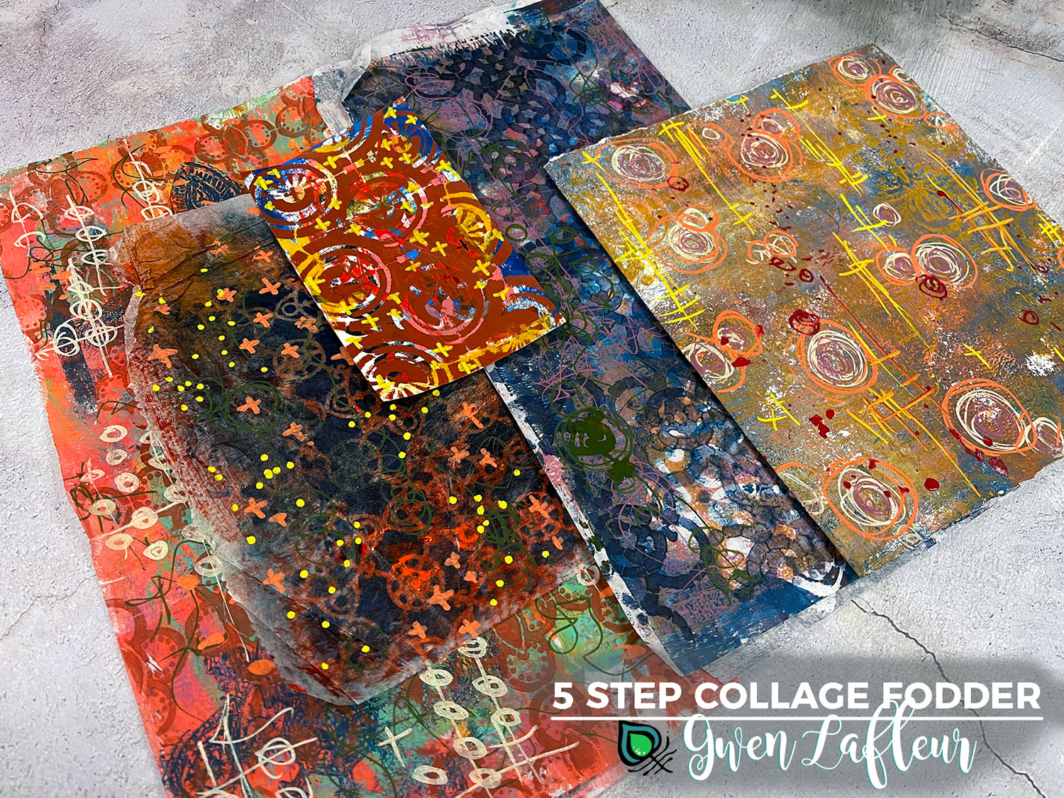
5 Step Collage Fodder... With Stencils!


Hi all! It's Gwen back this month with another installment of my Paint & Texture column. 

DIY collage fodder has been all the buzz on Instagram lately, so I thought it would be fun to add another technique into the mix and share Five Steps to Collage Fodder... with stencils!

5-Step Collage Fodder with Stencils - Tutorial by Gwen Lafleur

I know that a lot of us, which definitely includes me, have piles of papers that we can't bear to throw away but haven't found a use for. They're either too busy or not the right color or, I'll just own it, downright ugly. 

5-Step Collage Fodder - Pile of Scrap Papers - Gwen Lafleur

To start my tutorial for today's post, I browsed through my pile of less-than-pretty collage and background papers as well as a few failed gelli prints and pulled out a few of them to turn into collage fodder. With those selected, it was just 5 easy steps to a great collage! Ready to see how it came together?

Step 1. Tame & Tone

5-Step Collage Fodder - Step 1 Tame and Tone - Gwen Lafleur

The first of the five steps in this process is what I call "Tame & Tone." For this, I took a dark, opaque color of acrylic paint and a nice all-over stencil pattern to tone down the color and tame the crazy. In the image above, I used my Collage Textures & Patterns, Circles stencil and you can see on the left where I also used the 6x6 from Jill McDowell's December 2000 Block Prints StencilClub collection.

Step 2. Make Your Mark

5-Step Collage Fodder - Step 2 Make Your Mark - Gwen Lafleur

For the next layer I added some marks. For this step I pulled out my trusty Posca paint markers, but you can use whatever you'd like or use your favorite mark-making stencils for this step.

Below you can see all five of the pieces I worked on here and how just the first two steps have already transformed them quite a bit!

(Here you can see three more of the stencils I used in step 1, including my Decorative Flower Stamen Medallion, Ornamental Compass Screen, and Ornamental Circle Cluster Screen stencils.
5-Step Collage Fodder - Step 2 Make Your Mark Samples - Gwen Lafleur

Step 3: Lighten & Brighten

5-Step Collage Fodder - Step 3 Lighten & Brighten - Gwen Lafleur

Step three is a bit of a cheat since it's kind of two steps in one, but whether you do one, the other, or both is up to you. Here I used a color tint (Titan Mars Pale in the sample above) with a smaller scale all-over pattern and then stenciled with white in the top layer to lighten and brighten the papers. This also pushes some of the busyness of the previous layers into the background.

Below you can see the result of this step on all five papers. Additional stencils used on this step include the 4x4 from my February 2021 Feathered Tribe StencilClub collection as well as part of the 9x12 from my December 2016 Heraldry set. I also used the Patterned Circles and X Rows stencils by Michelle Ward.

5-Step Collage Fodder - Step 3 Lighten & Brighten Samples - Gwen Lafleur


Step 4: Cut it Out

5-Step Collage Fodder - Step 4 Cut it Out - Gwen Lafleur

These papers are still quite busy, but that changes when you cut them into smaller pieces. If you have shapes that are go-to elements, that's a great place to start. I know that I will always use circles, squares, and leaf shapes, so I cut out several of each of those.

5-Step Collage Fodder - Step 4A Cut it Out w/ a Stencil - Gwen Lafleur

If you aren't so keen on just freehand cutting into your collage papers or if you want a bit of a different shape, you can pull your stencils back out again. Above you can see where I used my Ornamental Circle Clusters Screen stencil to trace the outline of the base shape on the back of one of my collage papers and then cut it out.

Here you can see the shapes I cut from all five sheets (and I also have some paper leftover to use later.)

5-Step Collage Fodder - Step 4 Samples - Gwen Lafleur

Step 5: Collage It!

5-Step Collage Fodder - Step 5 Collage It - Gwen Lafleur

The last step... collage it! Pull out the glue or matte medium or whatever you want to use and collage your new bits and pieces into your work. Above you can see that I painted rectangles on some Canson drawing paper and then collaged all or half of my petal shaped pieces into the center of each rectangle and then colored and smudged around them with some of my handmade art crayons. 

On the rectangles with the half petals, I took some of my stenciled cut-out shapes and cut those in half and added them on the other side to create some visual interest. 

5-Step Collage Fodder - Step 5 Collage Sample - Gwen Lafleur

When I first started working on the painted rectangles, I'd envisioned that as the final piece. But once I collaged the pieces on and then stepped back, it just called out to me to cut them into individual rectangles... so I did! Sometimes collaging the collage fodder just makes more fodder. lol. 

I pulled out some stamped and colored images from my EGL19 Build-A-Collage, Birds stamp set with PaperArtsy and layered them on top, then added a few marks and adhered it onto a previously completed background in one of my mini art journals. I finished the page with a fun little clip and some washi tape.

5-Step Collage Fodder - Final Art Journal Page - Gwen Lafleur

So just that quickly and easily, I have a completed art journal page, five more fun collage pieces, more fodder shapes that are cut and ready, AND some more paper ready to cut into new shapes.

5-Step Collage Fodder - Final Page with Extras - Gwen Lafleur

So that's it! I hope you enjoyed today's tutorial and that you have fun making your own 5-Step Collage Fodder to use in your projects.

Until next time, happy stenciling!
Gwen Lafleur Headshot


Sunday, April 18, 2021

Stenciling with Paint & Textural Stitching


Hi All, it's Gwen back again with the April Paint & Texture column. This month I'm sharing one way that you can incorporate stitching as a textural element in your work. I'll share the basic technique and then review how I used the sewn design in a larger piece of mixed media artwork.


I've long enjoyed stitching and embroidery and so I'm always thrilled when I find ways to use it in my artwork. For this piece, I decided to use one of my stencils as the template for some painted and beaded embroidery that would become the focal point of the finished piece.

You don't need to know any fancy stitches and you can make it as simple or as elaborate as you'd like; the idea is simply that different weights and types of threads and stitches, along with a few beads if you're so inclined, are a fantastic way to add texture into your work and also a great opportunity to really customize stencil designs and make them your own.

To start, I used one of my most recent stencil designs, the Boho Faces stencil, since I thought it lent itself really well to this technique and I could practically picture the finished piece in my mind. I took a piece of linen fabric with a looser weave (because I wanted to use thick thread,) and stenciled the design with Jet Black Archival Ink and a blender brush. I like Archival Ink for stenciling on fabric because it's permanent and doesn't smudge or fade too much while I'm working over it with thread. You can use any color - I went with black so it would stand out and because I knew I wanted a dark thread outline over top and so it wouldn't noticeable if any of the ink was peeking through.


You can use embroidery fabric, linen, cotton... whatever works for you. I also frequently use vintage or upcycled fabrics because they add such a unique look as part of the finished project. But because I was going to paint this one, I went with a plain white linen.

Speaking of paint, that was my next step. Golden recently released a new line of So Flat Matte Acrylics. They already have some fabulous matte fluid and heavy body paints in their lineup, but this new line is more of a soft body paint - a really perfect consistency for painting on fabric. Of course you can use any paint you'd like (I also use a lot of PaperArtsy Fresco Acrylic paints,) but I love Golden's rich, saturated color.

I just took a paintbrush and filled in the openings of the stenciled design with paint, making sure to work on top of scrap paper (I used parchment paper) since the paint can and usually will seep through the cloth. You may want to tape down the fabric to keep from moving it around while you work since that can smear any wet paint that seeps through and get it all over the back of the cloth - that runs the risk of seeping back through to the front, usually in a very inconvenient place.


One I finished with the paints, I let it dry completely; stitching into wet paint is a good way to make a mess! When it was dry, I put my painted design into an embroidery hoop to keep the fabric taut while adding in the stitching. I don't always do this, but for a larger project that I wanted to make the focal point of a piece of artwork, I wanted to make sure that the fabric didn't pucker (that generally happens when you have uneven tension on the fabric while stitching.)

For the sewing, I used a size 3 perle embroidery thread by Wonderfil to outline the design... again, you can use whatever you'd like. If you're using a stranded thread like DMC or other similar brands of floss you can just use all six strands. Or go with a thinner thread or fewer strands if you want a different look. I wanted bold and that's what I got!


I used a split stitch here - it's one of my favorites for outlining, but you can also use a backstitch or a straight or running stitch. Outlining the painted areas is really the main way that I brought in texture and definition with the thread, although I did add a few beads (because I just can't help myself!) as well as a few other types of stitches. This is where you can really go crazy with details or keep it simple based on your level of comfort and / or the look you want for your piece.

Here you can see how I've added some satin stitching to a few areas and also stitched on some beads where there are dots in the original design. It's a great fit for the vibe of this stencil and also another great and fairly easy way to get more texture.


I also went through and added some outlining with metallic gold thread because I love a good metallic!

Once the stitching and beading were done, I took the piece out of the embroidery hoop, tore off the excess fabric to get it to the size I wanted (you can also just cut it if you want a cleaner look,) and then used some gold ink and the 4"x4" stencil from my February 2021 StencilClub collection to add a bit more stenciled pattern to the background. I also edged the borders of the fabric with Sepia and Jet Black Archival Ink.


As you can see above, I also took a larger piece of heavy-weight paper (about 600 gsm) and stenciled it with my Collage Textures and Patterned - Medieval Cyrillic stencil as well as my Art Deco Sunburst Background stencil. I added a bit more texture by stamping with one of the designs from my EGL10 stamp set from PaperArtsy. This paper would end up being the background for the stitched piece - most would be covered, but I wanted to have more layers of pattern peeking out from behind the cloth.

At this point I knew that my final piece was going to be hung and that I wanted a few dangling accents, so I took a drilled stone and stenciled again with the 4"x4" stencil from my February 2021 StencilClub collection and some VersaFine Clair pigment ink and then heat embossed the design using my Turkish Bronze Boho Blends embossing powder.


You can absolutely emboss rock and stone - just make sure to wait a while before attempting to touch or handle it (or make sure to use copper tongs) as the rock will hold the heat for quite a while longer than paper.

With the stenciled and stitched components complete, I wrapped and added beads to a piece of driftwood and made a few little dangling accents from beads and coins. I stitched my focal point onto the background (with some black lace paper behind) using gold thread and then added some more accents using pieces of Indian sari trim and African sandcast beads. I also stitched a large Dogon or Dutch Donut bead over the eye with the plus sign as a bit of a frame and yet another dimensional / textural element.


Here's a bit more of a close-up so that you can see the texture from the different threads as well as the beads:


There you go! I hope you enjoyed today's project and tutorial and that you'll maybe even try out combining paint and stitching and also exploring using threads (and maybe a few beads) to add some texture into your work.

Thanks for stopping by... see you next time! Until then, happy stenciling.

Friday, October 9, 2020

Guest Designer Sally Hirst: Video Tutorial with StencilGirl® Stencils


Hello, everyone! Sally Hirst here! I have been using stencils in my artwork for many years now. I am a painter and printmaker creating abstract painting using acrylics, oil and cold wax medium as well as intaglio and monotype prints. Often the same stencil will appear in a range of pieces, visually linking them together. I particularly like how using a stencil can provide an area of interest in a painting or a print that draws the viewer’s attention. So, I was delighted when Mary Bath asked me to be the guest artist! It also gave me the opportunity to explore some new StencilGirl® products.

I met Mary Beth at a GOLDEN function a while back, I was impressed by her creativity, passion, and her products. She creates stencils with and for artists, she understands what artists want, and StencilGirl® provide us with what we need

Much of my work explores texture and I like building textures with stencils and a range of GOLDEN acrylic pastes and gels. Stencils are an ideal way to create a texture that is subtle, often only seen when the area is cast in shadow.

Here is an example of one of my paintings, you can see how I have used stencils to create raised patterns under the surface of the paint. 

A particularly nice way of using stencils and texture products is on watercolor paper. This has its own texture and is absorbent, but has a different absorbency to the GOLDEN pastes and gels that I love to use. By playing with this difference I can get interesting yet subtle contrast in values. I mostly work on paper but then I attach it to a panel with GOLDEN Heavy Gel, putting textured pieces behind glass loses the shadows cast by the textures. Why not straight onto panel? I find I am freer, and looser if I work on paper, and I can always just cut out a smaller piece, a dynamic ‘found’ composition. Often one large painting will provide me with six smaller ones!

Rolls is a stencil by Daniella Woolf. The design rolls across diagonally, increasing the sense of movement. I was particularly drawn to the fractured nature of the design which enabled a textural effect.

Here you can see where I have pushed GOLDEN Fiber paste through the stencil, the fractured nature of the design is enhanced by the highly textured paste. When dry I painted it with GOLDEN High Flow, allowing the paint to run through and around the stencil.

You can see how the differences in texture and absorbency really create an interesting affect.

Switchbacks by Daniella Woolf reminds me of journeys; train tracks, wooden shuttering, endless roadway. For this stencil I used Fiber paste again. It is one of my favorite pastes as it has such a lovely texture and is flexible on paper.

Not only did I use my favorite paste but also my favorite GOLDEN paint. This is Bronze which is an iridescent paint that when you water it down ‘splits’ into two colors; pthalo green and bronze. I love it! It creates an aging effect, a patina reminiscent of old Venetian walls.

Layers by Mary Beth Shaw has quickly become a favorite stencil. The subtle shift in texture left trails across the paper. 

I pushed Golden Light Molding paste through the stencil and once dry I flooded it with GOLDEN Transparent Red and Quinacridone Nickel Azo Gold. The two colors mixed together to give a delicious blend reminiscent of rust.

Once it was dry I rolled Burnt Umber lightly over the surface which picking up texture and provided more contrast. In areas I didn’t want it I wet it down to blend in with the oranges.

Shape Shifter by Mary Beth Shaw is a geometric delight! I used a cradled panel for this piece as I wanted to use GOLDEN crackle paste and it is too fragile to use on paper. I used the stencil with a GOLDEN Heavy Gel which, once dry I knew would give me a range of fabulous large areas to fill in with the crackle paste.

Once the gel was dry, I coated the panel with black gesso and a layer of black GOLDEN High Flow, allowing it to dry between layers and after. GOLDEN Crackle paste likes a non-absorbent surface, and I knew the black underneath would really highlight the cracks!

Once all dry and fully cracked, which takes at least a couple of hours, I painted the panel with a watered down GOLDEN Bronze which dispersed into bronze and pthalo blue when diluted. These close up shots really show the amazing shapes from the stencil and the lovely crackle effect.

Mark Making by Traci Bautista is a delightfully loose and free, stencil so I decided to push the idea of mark making and use GOLDEN Fine pumice gel. This created a delicate rough surface that once dry picked up the charcoal that I smeared over the surface. I worked into the charcoal with ArtGraf, a water-soluble graphite.

Art Party by Daniella Woolf provides that geometric structure that I love. I used GOLDEN absorbent ground with this stencil, it’s similar to gesso but more absorbent and gives a lovely matte texture.

I worked over it when dry with sepia GOLDEN High Flow.

MB Makes Marks Pipette was also designed by Mary Beth Shaw. This is the second of these stencils I have owned. The first was given to me by Mary Bath at part of a workshop for GOLDEN Artist Educators. Unfortunately, it became someone else’s ‘favorite’ after a monotype workshop I ran recently! The loose scribble design created using a pipette has such a lively energy. For this stencil I used GOLDEN Heavy Gel Matte.

I knew it would not be as absorbent as the paper, it would act a ‘resist’ to the GOLDEN High Flow, being matte it would ‘stain’ but not be as clean a surface that you would get with a gloss gel. Once dry I flooded it with GOLDEN High Flow sepia and black and watched it flow into the paper. Pushing over the stenciled area with a spreader cleaned off most of the High Flow, leaving a lovely contrast.

I thoroughly enjoyed playing with these StencilGirl® stencils, it’s always a delight to try a new one and to see what I can get out of it! These papers will become the basis for further work using either Oil or Cold Wax medium or more acrylic gels and colors, but the stencils from StencilGirl® have given me a starting point.


Friday, October 2, 2020

Collage Cairns with Dar James

Hello! I’m Dar James, a painter and GOLDEN Artist Educator, living in eastern PA. Today I’m sharing what I hope you find to be a relaxing, “zen-like” project that celebrates cairns, or rock stacks. Cairns are human-made piles or stacks of rocks that have had navigational, spiritual, religious, cultural and decorative significance since ancient times. One of the things I like best about cairns is that, when I encounter one in the world, I think of another human making it for the enjoyment and delight of a stranger, and this fills me with a sweet kind of hope.

I’m also going to show you to something really cool that you can do with stencils that have a CIRCLE theme and go along so well with the idea of collage cairns…stenciling acrylic skins! Acrylic skins can be created with either Heavy Body or Fluid acrylic paints, as well as a wide array of acrylic mediums and gels. Once dry, they are fabulous to cut into shapes and use in a variety of collage and mixed media work.

Supply List at my Amazon Storefront: https://tinyurl.com/yxv7mhbg

To get started, you will need page protectors, acrylic paints and a palette knife. The page protectors will allow the skins to be peeled off once they are dry. Other kinds of plastic do not work as well.
I like to insert a piece of paper inside my page protector, with the “recipe” I am using written underneath the area it will be spread. You can be very inventive with colors, mediums and various specialty gels and pastes when creating skins. Experiment and see what happens!
For my Heavy Body skin, here, I am using GOLDEN’s Light Violet. For the Fluid skin, I am using GOLDEN’s Cobalt Blue with a bit of Titanium White. Squeeze or spread the paint onto the page protector and use enough of it to get a nice, thick application. If you make the layer too thin, it may tear when taking it off after drying. Depending on the thickness of your paint, temperature and humidity, skins can take 24+ hours to fully dry. Let them dry completely in a place where they will not be disturbed. Make several, using different colors and different thicknesses. Try things like not mixing your paints completely to have subtle swirls or adding paint to mediums to get more translucent effects. The sky is really the limit on these!
Once they are completely dry, carefully peel them off the page protectors and place onto a work surface. Then, use stencils to create pattern, texture and color on your skins!
Here I am using cut outs from Stone and Pebble Tilings with light blue fluid acrylic on a dark blue skin applied with a make-up sponge.
This is orange heavy body acrylic on a green skin with a slanted stencil brush, again with a section from Stone and Pebble Tilings.
This is metallic acrylic spray paint on a black skin with a lovely, delicate design called Puddles.
And, here, is magenta spray paint on an orange skin with a stencil called Organized Chaos.
You can also use mediums with color to create raised, acrylic patterns on your skins. For this mixture, I’ve used Soft Gel Gloss with Heavy Body Micaceous Iron Oxide. (If you have not experimented with MIO, it is some of the coolest paint ever!) Press your stencil onto a dry acrylic skin and then, with a palette knife, spread the mixture carefully and gently over the top. Scrape off any extra (which you can use to create another skin!) so that you do not have big blobs of paint. This design is Organic Zen Circles.
Carefully peel up the stencil to reveal the pattern in relief! Set aside to dry fully.
Once your skins are completely dry, you can use them for collage and mixed media work. Be sure to store your skins so that they don’t touch each other or fold onto themselves. They will stick and be very hard to separate. Parchment or “deli” paper works well between them, or leave them on their page protectors and stack separately.
Use Pinterest to explore different cairn designs and configurations. Get out the skins and papers that inspire you for this project and lay them out around your substrate. Here I am using a 4x8” Cradled Birch panel by DaVinci, but you could use any kind of substrate that strikes your fancy—paper, canvas, even a wood round would be interesting. I have taped off the edges with blue, painter’s tape because I like them clean, but you could leave them open and paint them as well if you prefer. The panel is primed with black gesso because I love the way that black peeks out beneath just about any color, but you can prime with white too.
I’m using a variety of whites and off-whites to create a dry-brush background that is “quiet.” Because the skins and paper I am using are patterned, I want a background that is less busy so that it doesn’t compete with my design. Also added is a tiny bit of GOLDEN’s Iridescent Pearl with Starlight Mini. Whenever you use iridescent or iridescent colors within your layers, they add luminescence and light to your work! Pearl is one of my favorites because it can be used as-is, diluted, or tinted with any color for amazing shine and glimmer.
Last, but not least, I’m adding an ethereal bit of detail with and GOLDEN’s Titan Green Pale. GOLDEN makes a line of “pales” that are absolutely wonderful for subtle color hints on whites and neutrals—or just about any color, really.
You can work from a photo to create a design that resonates with you, or make up your own. Jump in and begin cutting your rock shapes! Think about what color, size and shape arrangements reveal your own personal sense of balance. Avoid adhering anything just yet and know that if something doesn’t look quite right, you can remove it and save it for another project. You can even work on more than one at a time and create a series.
When you have a design you are happy with, use Soft Gel Gloss or Matte to adhere your pieces by brushing some down beneath the shape, placing the shape and then brushing more on top. Finish the piece with dots and detail if you’d like and, when that is dry, add another coat of soft gel—a palette knife can be helpful to make it even and smooth.
I used a gloss gel to adhere, but my final layer was a matte finish. Details were done with fluid acrylics and “nail art” dot tools.
Square substrates offer different ways of designing your cairns.
Cool and warm colors have different vibes!
One of my favorite ways to finish these is with a coat of shiny, resin. (ArtResin)

Wouldn’t these collage cairns be fabulous in a collection or as a soothing gift for someone special? I hope you have fun with this project and share your results on Instagram by tagging me! @indarsworld

This lesson comes from my upcoming Online Course, “Circle Celebration,” a three-module course that is a playful, open-ended exploration of technique and materials that informs our personal preferences and styles. Join my mailing list at www.darsworld.com  to be notified of specially priced, early registration which will be available on November 2, 2020.

Each module is three weeks long and contains nine exercises and three projects, a total of 12 videos, accompanying downloadable pdf files, and eight bonus mini-lessons on specific types of acrylic materials. The three modules will be available separately as well as a bundle. A private Facebook group will be where we will all interact and share our work, brainstorm and inspire each other.

The course will begin on December 7, and came very much from being an artist in quarantine, as well as from a deep searching in my own artist’s heart and soul. New things come from pushing ourselves out of routine, from trying new tools, from slowing down and focusing on very small but poignant moments. I have concerns about the hyped up type of art courses that promise unattainable creative outcomes without addressing the foundational experiences that allow us to understand our own preferences for such simple things like line, color and medium before we even attempt technique. My hope is that, through this course and the small moments within, participants will be able to slow down and notice what they love about art supplies, making marks and their own feelings and preferences about things like color, texture and shape. 
Dar James