

Hello stencil lover!
It's Sue Plumb here, and I am very excited to share my first project created for the StencilGirl® Creative Team. To kick things off, I was tasked with the theme of "an abstract or summer artwork". Both of these sounded fun to me, so I was torn between the two. My answer? Combine aspects of both themes into a single project!
Before I launch into explaining my process for this mixed media piece, I should probably tell you that I LOVE working with color! My favorites to work with are blues and greens, but I generally enjoy working with any colors that are bold, bright, and beautiful.
I began my artwork by gathering a variety of papers to create a collaged background - book paper, music paper, and tissue paper; and tore them into pieces. Working on an A4 sized piece of 270 gsm cardstock, I adhered them randomly around the page using matte gel medium. The collage provides an interesting background to work over, adding extra depth and texture to the piece.

Now it was time for color! When I think of summer I picture the tropics. Lush greenery, brightly colored flowers, and the sun shining down. I decided to translate this into my piece by using bright acrylic paints. I chose warm tones to start - pinks, orange and yellow - and applied the paint using a silicone spatula in an entirely random fashion.

With my abstract color layer complete, it was time to think about the composition of my piece. I wanted to introduce some of the imagery that came to my mind when I thought of summer. I started with the Dream of Palms Mask by Cynthia Silveri to begin building my foreground layers. I applied green acrylic paint using a sponge in the diagonally opposing corners.

To build further on the foreground, I applied a darker shade of green paint with my spatula around some of the edges of the page.

After the paint had dried, it was time to switch to ink to further build my layers. I selected the Floral Mandala Lace stencil by Kristie Taylor, as it had a section I thought would add some interesting detail to my piece.
Using only a selected area of a stencil (rather than use the image as a whole) is something I often do when creating artwork like this. It also influences my choice when purchasing stencils; as I find smaller details within larger designs that I know will give me more value from my stencils.

I used a sponge to apply teal ink through the section of my stencil; layering it over the green paint to mimic the foliage of my summer-inspired lush greenery.
I then repeated the same process, this time masking off a single image from the Blades stencil by Terri Stegmiller to represent a flower; which I stenciled several times on my piece.

Now it was time for a focal image for my artwork. I had a printed paper napkin that featured beautiful colored parrots on it that I thought would be ideal for my tropical inspired piece. I carefully cut around the larger parrot and a few of the leaves before separating them from the backing layer.
To ensure that the image was not lost against the background, I lightly sponged some white acrylic paint onto the page where the parrot's head would be. I also sponged some randomly over several areas in the center of my page, just to strip back a little of the color.

The parrot and leaves were then adhered to the page using matte gel medium.
To add further depth and variation to the foreground, I used a small paintbrush to add some teal paint amongst the foliage.

At this point, the page was all quite flat and needed some dimension to help lift it. I chose the Heartfelt stencil by Desiree Habicht, as it had some leaf shapes I wanted to use to finish off the foliage.
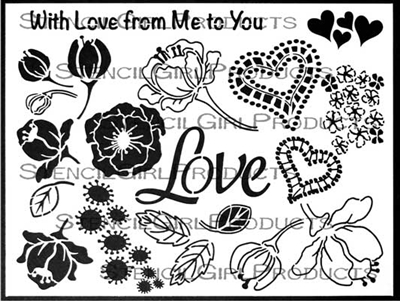
I masked off the first leaf I wanted to use and applied some shimmery teal colored texture paste through the stencil using a palette knife. I repeated the same leaf several times on each of the foliage areas before drying it off with a heat gun.
I then repeated the process with the other leaf design and a light green texture paste, layering it over the teal paste before again drying it off with a heat gun.

From the same stencil, I was also drawn to the cluster of abstract style flowers and decided to use this shape to add further textured detail and some contrast in color using a lilac colored paste. I repeated the same flowers on three separate areas of my piece.

After the lilac paste had dried I could see the piece needed some shadowing to help bring the focal image to the front. I used a water soluble pencil to draw around the outline of the parrot, then blended it out with water.
I also added some small stamped dot detail to the background using black ink, which helped to tie in the black from the shadow outline.

At this point, I wanted to add some extra stenciled detail to help lighten the piece and tie it all together. I used the Organized Chaos stencil by Cat Kerr and white acrylic paint to sponge some random spots over the top.

To finish off, I felt it needed some text, so I added the large embrace your flaws quote and the two smaller phrase stickers. I also added some hand-drawn scribbles with a black pencil.

I am so happy with the result of this piece - all the bright colors and layers just make my heart sing!

Despite my love for this piece, I decided that keeping it for myself wasn't the best use of it. A good friend of mine is running a charity art auction in July to raise funds for "United in Compassion". This Australian organization advocate on behalf of cancer patients for better access to medicinal cannabis as an alternative therapy to alleviate their suffering.
Here is my finished framed piece, which will be passed on to be auctioned and hopefully raise some funds for this very worthy cause.

Don't forget that you can play along with the StencilGirl® theme challenges too!

Thanks for stopping by so I could share this with you. Until next time, happy creating!

You can also find me on my channels here:
YouTube 


