It's March in St. Louis and I, Nancy Curry, am all about the next seasons coming. Apologies to those reading this who are approaching the colder times of year, or are still in the cold now. The only season I really don't like is winter, but I really enjoy spring into early summer when things seem all new again. I enjoy the spring holidays of Easter and Mother's Day especially, and always try to find interesting ways to share what I do with family members. To that end, I plotted this project starting in January. Luckily, the big box stores seem to be ready to move on to spring quickly so I was able to find what I needed easily. I'll list materials and stencils here before you watch the video.
This project could easily be done with many types of stencils and have any kind of vibe you'd like. Let your imagination go wild and think outside of the box looking at all sizes of stencils. So many stencil parts will shine when used by themselves. You can prepare these sets in all quantities for gift giving so it makes them a convenient and interesting practical gift.
Without further adieu, please enjoy my foray into functional art:
As always, it's been my pleasure to create for all of you. For more of my tutorials, follow me on Instagram or Facebook, and for artwork to purchase, my store.
It's Nancy Curry back on the blog with my first projects for 2023. Even when I've worked with a medium for a long time, I love to find new (to me) ways to apply that lend themselves to different outcomes. This week's exploration was applying watercolor with a household sponge. Using a sponge through a stencil helps to control the amount of water leading to less seepage and adds an interesting texture as well. The three pieces in the top photo were all done with the same palette of colors. All are done on craft paper that had an application of gesso, but you can also do this with watercolor paper or even a good mixed media paper.
M A T E R I A L S L I S T:
artist grade watercolors
gesso
household sponges cut into parts
plate
watercolor paper or paper treated with gesso
black gouache, acrylic paint or permanent black ink
I like to use a large stoneware plate that I found at Wal-Mart for my palette. It is non staining and the flat surface is good for a number of different applications. I bought a few and let the watercolor dry on them so I have palettes ready. I transfer the watercolor with an old brush a few minutes before I am starting to paint. Its surface area can hold a nice array for colors. You'll see me use it often in my Instagram videos. I also prepped some craft paper with gesso. I generally apply it in a thick and thin manner and leave some areas bare for a distressed look. Complete coverage is also fine.
I spritzed the dry watercolors with a light fine mist of water and pressed my sponge into it. I then used a light-medium pressure to pounce through the Paperwhites stencil. If there are areas that you want to use different palette colors, place a piece of printer paper in those areas. In this case, I did the leaf areas first and later returned to do the flowers in purple. I decided the flowers needed centers and added them with a brush.
To finish, I mounted it on dimensionally striped cardstock.
I had paint left over so I continued playing. For the second piece, I chose a rectangular format and parts of Capture the Journey. I began by using washi tape to mark off a place for a wordand then sponged on the background florals and leaves. Originally, I was going to add a word in the masked area directly onto the background, but changed course and did it on a separate piece of paper. I finished it off by sponging black gouache with Emotions & Feelings #3 and attached to the background with a glue stick.
I mounted the background on coordinating green cardstock
My final piece was a stencil I'd been dying to use, Twisted Forest. I cut paper into a 3.75" square and sponged into the stencil. Once finished, I attached it to tumbled stone coaster, cut out letters from a National Geographic, and used a glue stick to affix.
I had a great time playing with kitchen sponges. They clean up well, are reusable and easy to find. Be sure to use highly pigmented watercolors for the best color. Acrylic ink will also do well if you're looking for something else to try. Just don't leave it on your sponge overnight! As always, it's a pleasure to share my projects with you. For more of my work, head here, or my main website where my store is.
Hello! I'm StencilGirl® team member, Nancy Curry, and I am here to "mix up" my own use of stencils and hopefully yours, too. I am all about having stencils that can be used in their entirety or in a subtler manner. This project may help you look at your stencils in a whole new way. I know it impacted me that way as the project left my head and hit the paper. I wanted a stencil that was busy and did choose one that was more representational rather than abstract, but you could use one of those, too. Mary Beth Shaw and Traci Bautista are masters at that type of stencil. I chose Margaret Peot's 9" x 12" floral heart stencil L846, which is a giant heart full of so many interesting twosomes. Even if you choose a stencil with a distinctive, recognizable object design, it will change when cut into a bunch of repeat shapes.
I began the project by grabbing my media and paper. I chose a piece of mixed media paper (watercolor paper is perfect, too) that would fit the stencil and a selection of watercolors. I am smitten with all kinds of artisan and artist quality paints. These happen to be by Jazper Stardust. I promise I am not trying to enable you. I lightly sprayed water through the stencil and wet the paints. If you tend to be heavy-handed with spray bottles, I would advise using watercolor paper rather than mixed media. Mixed media paper will only take so much water. I let both sit for a few minutes to settle in.
My goal is to add watercolor through the stencil in different ways. Sometimes I use a mid-sized brush and flick or splatter to make marks on the paper and then I loosely brush through the stencil with more paint on the brush. Varying the amount of water used will change the saturation and I like the look of that as well. I did not affix the stencil with Pixie Spray, but you could if you don't want any movement. I continued using a palette of two or three greens, and four other colors of choice until the pattern was painted to my satisfaction. Before pulling the stencil off, I let it sit a few minutes. Alternately, you could let it dry thoroughly before the reveal. I'm always a little impatient.
Design Reveal
Once dry, I cut around the heart to allow closer proximity to the chosen punch. My daughter just chose her wedding gown yesterday so I decided to stay with the hearts theme and just happened to have an old punch that would work with some minor adjustments. I began punching out the design without a lot of thought. I love the randomness that just doing without thinking brings. I do like to use the punch backwards to make sure I get the whole piece of paper in and don't have a half heart. This punch had a lack of symmetry to the heart, but I used the first one I punched out as a stencil to even out the lobes of the hearts. It was an extra step but for this project, I wanted more symmetry.
I like to lay the pieces out and play with positioning. I had a lot of extra hearts for the mat size so I save them to use for single images on cards or tucked in with art orders from my shop. Hearts never go out of style. Once happy with the organization, I attached some of them with ScorTape to green cardstock and finished with and 8" x 8" mat. Size is definitely artist's choice. I've been on a tear with these types of compositions all summer. They are easily found in my Instagram feed under the hashtag #artinpieces. I've gone as large as 11" x 14" and as small as 8" x 8" mattted. These are all paint only but the concept is the same. Here's one of my dimensional favorites for inspiration, Tossed. Yes, I'm still on the wedding theme.
I hope you enjoyed this process and will look at your stencils with fresh eyes. I have plans to continue this series done both ways. I am always happy to be on the blog and this project was a joy to do. Happy creating until next time! As always, you can find me on all social media as Nancy Curry Art or on my comprehensive website/store.
It's the middle of summer and we're sweltering in St. Louis. I think many who read this are in the same boat. The flowers are blooming and so far our grass is surviving. I'm huddled in my studio listening to vintage Bruce Springsteen (hence the project name) trying to stay cool. I often use July as a reset before the busier fall and the preparations for next year. This year I decided to do a deeper dive into Nitram's products, specifically their Liquid Charcoal and Fusain Aquarelle. I've done several paintings with them, but really didn't know all the possibilities. Layering was at the center of my exploration. I decided to reach into my tile stash and have a go. Tile has long been a favorite on mine with alcohol inks, but what would this highly pigmented charcoal do on it and would it be layer-friendly?
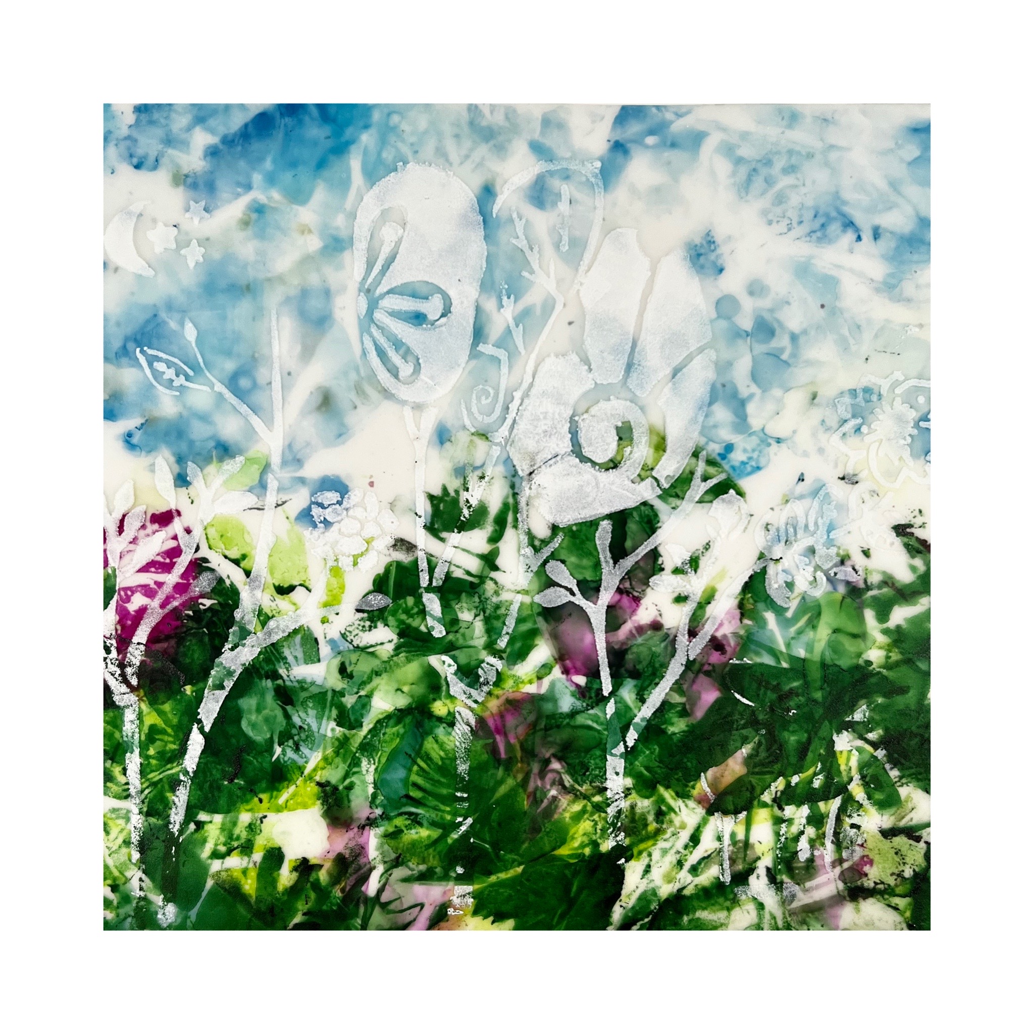
These paintings here show how pigmented Nitram's products are.
I decided that a video would be best to showcase what you can do, but here's some intel from choices that I made along my experimental way. First, this process works best with a matte or satin coated tile as opposed to a glazed tile. It's okay with a bit of sheen but a glazed white tile will not produce the best results. I used the Liquid Charcoal as a grayish base and the Fusain Aquarelle for the second (and third layers). You could use a brush as I did or scrunch some plastic wrap on and do an all over "smoosh". It would be a little quicker and would add to that grunge look. Be sure to dry the layers thoroughly and asI mention in the video that they can be air dried. This advice applies to the sealing process (three coats of Kamar varnish and two coats of UV Archival (both by Krylon).
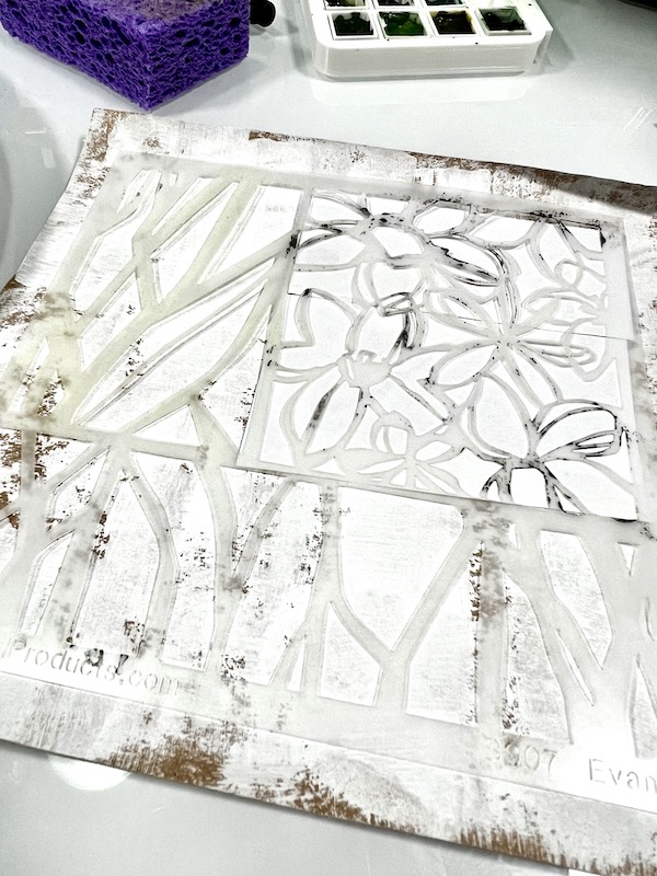
I chose Jennifer Evans' Paperwhites to play with today. I love all her abstract flowers but this one spoke to me for my vision of this project. I chose only to use the floral portion but I love the vibe of the stencil. Other stencils would work. Look for abstracted stencils.
My process video is below. Be gentle with me and my thoughts. I was dealing with a refrigerator crisis the day I filmed. I include a materials list after the project, but here's a photo of the media (without the ultra large white gesso bottle.) I prefer Liquitex Professional.
I enjoyed this project a lot and think there's a lot more you can do with this layered technique. I hope to have more time this fall to play with it. Below is the original piece that I did as a test. I also created it in portrait orientation but can be situated either way. I took this picture in my studio and the lighting shows the shadowy nature of the liquid charcoal better than the photo above of the video project. That picture was taken in indirect light and the camera didn't pick up on that layer as well. Both in person look much more like this one and I love that grayed out layer a lot. Thank you so much for coming and viewing my project. It's always a pleasure to be on the StencilGirl blog as a project designer and as a viewer. For more of my exploits, you can find me on Instagram here, Facebook here, and on my website. Until next time and the next song inspiration.
I am so happy to be back on the blog and to spend another year on ®StencilGirl's design team. I am Nancy Curry coming to you from the suburbs of St. Louis. I'm in pretty dazzling company on the team and look forward to every Tuesday when new inspiration drops. I also love all the guest artist posts. We all have a different artist voice that sings loudly and I love to hear them all. For those new to my blog projects, almost all of them are titles of songs. This one happens to be a Tom Petty song, but my choices head across all genres. I also paint and design a lot of pieces that are floral related so I didn't leave my wheelhouse this time. This project came about when I wasn't even thinking about it. I was walking around my local Michael's looking for frames that weren't dented a few weeks ago, but, of course, I browsed the art materials and did a general loop around the store. I also needed some foam board for mailing so I headed off to find that and lo and behold I saw a 22" x 28" piece of translucent polyethylene (mylar is a brand) plastic that was a nice weight (12 pt) and decided to get it and some day I'd have a spin around it. Fast forward to this week and that's exactly what happened. A few minutes in, the lightbulb went off and this project was born.
I delved into my vast stencil stash and got four out to play with. The main project and the one featured on the video tutorial was done with a favorite of mine, Cathy Nichols' Love Story (L341). I knew immediately it was the perfect stencil for me to curate parts of for the ideas going on in my head. I love to use parts of larger stencils. The others I chose were David Daniels' Rooted in Nature Large Caladium (L810) which is more abstract yet still intriguing, Traci Bautista's organically patterned,Circles Circles (L301), and one of the most interesting SG stencils, Moths by Jane Dunnewold (L520). All of them were approached in the same matter. Without further adieu, here's the materials list and then the video tutorial.
I hope you enjoyed the process. It is one I have used for years on clear acetate with varous types of ink or paint. It was really fun to work it with a translucent substrate that was inexpensive so I could save my more expensive Yupo for other projects. Below you will see a close up of the original piece that really shows how much visual texture comes from the alcohol ink on the backside. It would have overpowered the gesso to be on the front, but from the back it allows the white flowers have enough high contrast to shine. I have also included the other pieces I mentioned in the introduction. This process will work for many genres and I love processes that can be versatile. I'd love to see what you do with these should you head down the road to try this.
Rooted In Nature Large Caladium
Moths
Circles Circles
As promised in the video, I said I'd share the finishing process. I do two-three light coats of Kamar as an isolation coat and then two coats of UV Archival in whatever finish you want. I am partial to satin. Let it thoroughly dry in between layers and keep the can 12" away. Even with this finishing, do not hang in direct sunlight. Indirect should be fine. They mat well or you can go the deep cradle route. Both look great. I'm sure there will be more great options floating around.
As always it's a pleasure sharing my meanderings with you. Should you want to see what I am up to more frequently, I post most of my tutorials on Instagram on my grid and reels page and post art almost daily. I post most of it also on my Facebook art page. My regular Facebook page includes some art, no politics, and lots of standard poodles. My website is always a little behind, but when I get a chance I update it. It does have my online store that carries originals and prints available any time. To get updates about classes, art sales (one coming in June), please sign up for my low volume newsletter.
Have a wonderful rest of June. I'll be back on the blog later in the summer.
Hi! It's Nancy Curry back on the blog. Last time I was here it was snowy and I was obsessed with b/w hearts, but now I've moved on to channeling the spring that is trying desperately to come. I do a lot of floral paintings in several mediums and have taught floral painting a few times. I get a lot of nervousness from people due to the wonky nature of flowers. They get caught up in trajectory, perspective, shadows, etc. I've been trying to come up with something that would ease them into creating so they could enjoy it. That's where the seed of this process came from.
While I totally enjoy the crispness and beautiful imagery that stencil use allows, I sometimes
like to push the envelope to enjoy a more painterly outcome. Sure,
you can use paint through the stencil for a perfect effect, but I really
enjoy having an under layer of media that is just a guide that I can
use or veer off on my own to create a painting. Using soft pastel
as the media base allows me to lose that crispness you would have with a
painted underlayer, while mapping a guide for painterly strokes, mark-making, and even some spontaneity. Along the way, I discovered the mixture of the
softer, paint strokes with the harsher pastel strokes really gives me
definition. I'm sure I'll discover more as I journey. For now, enjoy
my recent meanderings.
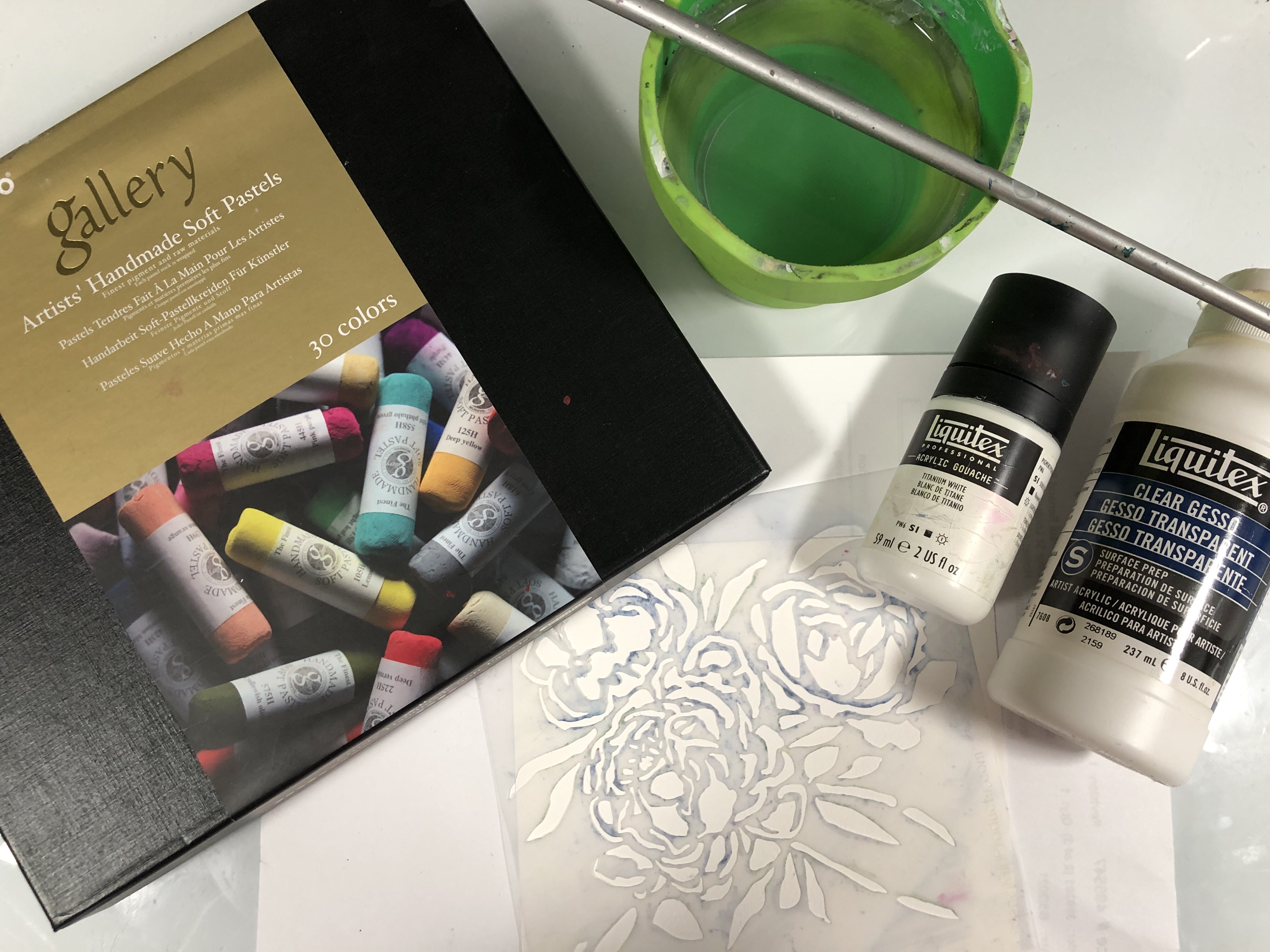
Pictured above are most of the materials I used in the video. I hadn't planned to splatter so the white and black acrylic are not in the picture. Soft pastels are readily available. I purchased these from Amazon during the pandemic. The watercolor paper was a brand called Fluid that comes in a block and the Liquitex products are also readily available online or in big box or art stores.
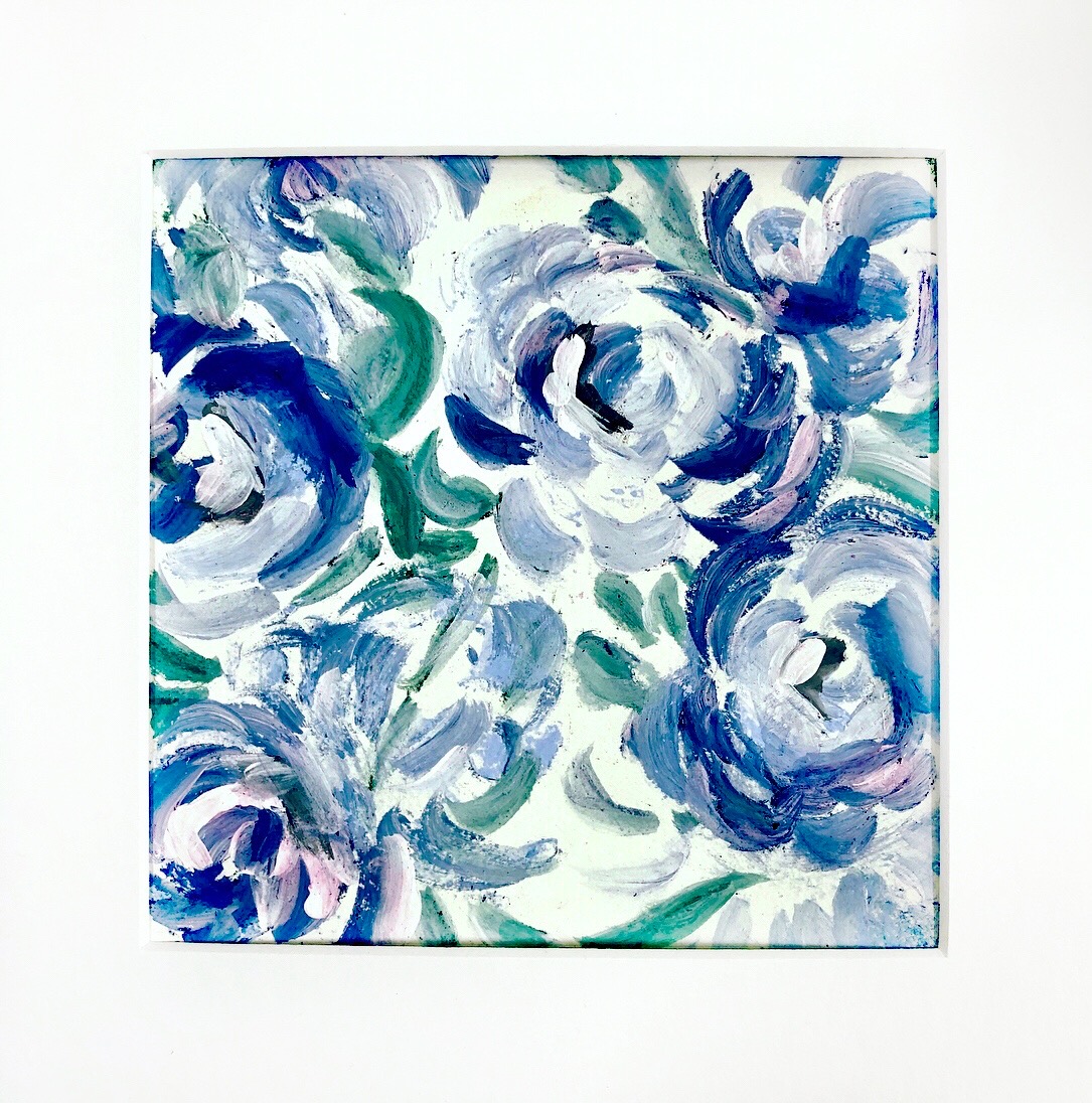
As mentioned above, I added some spontaneity to the showcase video with the splatter and the thicker application of paint. Below you will see the end result from that video. The one below was done before filming with the same colors but heavier use of the clear gesso in the petals so the colors are deeper and more vibrant. Both were made with Peony Blooms by Wendy Brightbill. As you can see, your options produce varying results.
From the video: splatter & layered paint
Earlier piece with more clear gesso and green variations.
I played around with some different stencils while I was familiarizing myself with this technique. Two of my floral favorites are below. Jessica Sporn created the "Feeling Groovy" set for StencilClub members and the stencil I used was the 9" x 12" pictured here. This piece was almost exclusively done with clear gesso. Club members can back order club stencils. These are definitely keepers. They worked well for this technique, but I also love them with alcohol inks.
I also enjoyed playing with Wendy Brightbill's Bouquet Greenery. There's a lot of negative space to work with so it made the process a little slower filling in the background, but I loved the vast pinkness of it.
This has definitely been an interesting technique with varying results. I can't wait to play more and see what else will play nicely with the soft pastels. I sealed all of them with Krylon UV Archival satin (personal choice) and am pleased with the final results. Thanks for following along with me. I love to take you all on adventures. As always, I am happy to be here and certainly hope you'll continue to journey with me here and on my social media. This page has links to it all. I'll see you all soon!!!!
I adore the magic of the holiday season, even the wrapping, but most of all, I enjoy putting my own diy stamp on our home decor that blends well with my favorite motifs that are part of my life story. I've been making alcohol ink ornaments for a few years now and really enjoy the happenstance of them all. I hadn't planned to do an ornament project until I walked into my studio and saw some ornaments at the ready. That's when the idea of melding my process with stencil design was hatched. In the tutorial video above, I talk through the process, but there are a few specifics I'll add here.
I chose to use 3" white glass orbs but you could use clear and drop some diluted white in the middle to create the contrast layer or use metallic colored glass balls. I love the look of alcohol ink on the metallics. What I won't recommend are the powder coated ornaments. The alcohol ink eats right through the powder coat and you are usually left with a silver undercoat. It makes for a choppy application. There is no prep that needs to happen with these ornaments. I love that convenience. You can find them at Michael's or Hobby Lobby early in the season.
The rest of the products I used are in the flat lay photo below that includes a view of the finished orbs. I used Ranger and Jacquard on this project. Nothing tops Jacquard's Real Gold for me. Any alcohol ink could be substituted except for Ranger's Alcohol Pearls. The Pearls would not move as well over the surface in this process. The bottle of 91% is rubbing alcohol. As for the acrylic, I would use the most pigmented, smooth black you have so that it stands out well against the prior layer. Cosmetic sponges are great to use because you can cut them to fit smaller stencils. Last but not least, I chose a few abstract stencils: The smaller scale stencils were from ( L792) Rae Missigman's ATC Mixup#1Art Marks, the mainly organic circles were a StencilClub 1/2019 by Mary Beth Shaw and Seth Apter, Cecilia Swatton's Ornamental Curls (S462) challenged me to use narrow lines, and Daniella Woolf's Fez Medina Wall (S749) gave me the chunky coverage I was looking for. What I would say about stencil choice is that abstract is the easiest to use because if you miss a little coverage pouncing on the orb, no one will know. Staying in the abstract genre also follows the random, abstract application of the bottom layer.
Once the orbs are dry, it's your choice to add a spray sealant layer. They really don't need it but if you do, you will need an isolation layer or two of Kamar Varnish and then your choice of a final coat, matte, satin or gloss spray. Always give the layers time to dry before adding another spray. All choices give a different look.
As always, it is my pleasure and privilege to be on this blog. I'll back in February with something new. Follow me on FBK and Nancy Curry Art and IG at Nancy Curry Art or browse my galleries on my site. I'll have a sale coming up shortly so sign up here if you want notice (very low volume).