Showing posts with label gouache. Show all posts

Wednesday, November 12, 2025

Using Stencils to Highlight Your Lettering Style & SALE!

Hello Beautiful!

Trena Brannon here, and I'm so happy to spend a little time with you today, sharing a fun and simple project to create a greeting card that will make someone smile.


This technique puts your hand lettering in the spotlight, with the stencils playing a supporting role. We'll also explore how to use different elements to connect the layers of your artwork, making the whole piece feel cohesive and engaging. 

STEPS:

  • Building the base. I started by selecting a stencil (Curve Ball Tile S989) that was airy and open, allowing most of the white card base to show through. This creates a clean, minimal background that provides a nice contrast for the detailed design to come. I gently dabbed on some gouache paint with a sponge, keeping it slightly dry to get those nice, crisp lines.
  

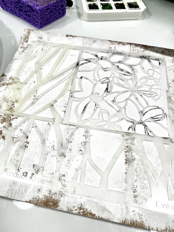
  • TIP: Use a baby wipe to clean your stencil and transfer the paint onto a journal or scrap paper. It's a great way to start your next creative project! I learned this from my stencil sister, Carolyn Dube!
    • Connecting the layers. I used the same stencil on a piece of colored cardstock, using a similar color of paint to create a subtle tone-on-tone effect. This immediately begins to connect your different layers.


    To see it better, here's a shot of the piece of cardstock on a black background:

    • Adding a second connection. Next, I used a different stencil (Diamonds and Kisses Tile) and applied the color I used on my white card base. Repeating a color throughout the piece is another great way to create a feeling of connection.


    • Making the details sing. Now for a bit of contrast! I used a tiny detailed stencil (Couture ATC Patterns) to add little pops of white. Using the same color as the white card base helps tie everything together and adds some interest through a contrast in scale.  For more flexibility in using the ATC sections, I cut them out of the larger stencils.


    • Lettering with joy. Now for the most stylized part that personalizes the card —your lettering! I did a few quick very rough sketches on scrap paper to find the style I wanted. Then, I used a black brush pen to draw the letters on my orange cardstock, leaving enough space inside each letter to see a piece of the design. It's so important to have fun with this part! As you can see, my letters aren’t perfect—and that's okay! They are drawings of letters - that's what makes them unique. Initially, I forgot my "y." 😁


    • Bringing it all together. Once my letters were cut out, I played with their arrangement until I found a placement I loved. Before I glued them down, I added a few small black dots to the base layer—a final chance to connect color in the letters to the base card. I chose a bouncy, playful look that conveyed a sense of joy.


    • TIPS: 

    After cutting your letters out, use a black marker to darken the edges. This gives them a nice, finished look and tidies up any stray cuts. I do this from the back side of the cardstock to avoid accidentally drawing onto the design side. 

    Take a photo of your final layout before you glue anything down. It's the perfect guide to keep you on track.


    • One more detail: To make the card even more special, I added a design element to the envelope to give the receiver a hint of what's inside. 


    Here are the Supplies I used: 

    Stencils: 

    • substrate/surface: white and color cardstock
    • stencils: Curve Ball Tile S989, Diamonds and Kisses Tile, Couture ATC Patterns, 
    • color: gouache paint dried in a palette, reactivated with distilled water - the white paint was freshly squeezed
    • tools: sponges, black marker pen, color pencil, scissors, craft knife, cutting mat
    • adhesives: low tack tape, permanent tape runner

    All my stencils are on sale for the next two weeks! Use code: TB20.

    When you create a card or another type of art piece with this technique, I would love to see it! Feel free to tag me on Instagram @trenabrannon and/or Facebook at TrenaBrannon Art & Design.

    Take care and stay positive! 

    Trena

    =========================

    Tuesday, January 24, 2023

    Sponged


    S        P        O        N        G        E        D

    It's Nancy Curry back on the blog with my first projects for 2023.  Even when I've worked with a medium for a long time, I love to find new (to me) ways to apply that lend themselves to different outcomes.  This week's exploration was applying watercolor with a household sponge.  Using a sponge through a stencil helps to control the amount of water leading to less seepage and adds an interesting texture as well.  The three pieces in the top photo were all done with the same palette of colors.  All are done on craft paper that had an application of gesso, but you can also do this with watercolor paper or even a good mixed media paper. 

    M A T E R I A L S     L I S T:

    • artist grade watercolors 
    • gesso
    • household sponges cut into parts 
    • plate 
    • watercolor paper or paper treated with gesso 
    • black gouache, acrylic paint or permanent black ink
    • scissors and glue stick
    • cardstock or other substrate
    S T E N C I L     L I S T:
    I like to use a large stoneware plate that I found at Wal-Mart for my palette.  It is non staining and the flat surface is good for a number of different applications.  I bought a few and let the watercolor dry on them so I have palettes ready.  I transfer the watercolor with an old brush a few minutes before I am starting to paint.  Its surface area can hold a nice array for colors.  You'll see me use it often in my Instagram videos.  I also prepped some craft paper with gesso. I generally apply it in a thick and thin manner and leave some areas bare for a distressed look.  Complete coverage is also fine.


    I spritzed the dry watercolors with a light fine mist of water and pressed my sponge into it.  I then used a light-medium pressure to pounce through the Paperwhites stencil.  If there are areas that you want to use different palette colors, place a piece of printer paper in those areas.  In this case, I did the leaf areas first and later returned to do the flowers in purple.  I decided the flowers needed centers and added them with a brush. 


    To finish, I mounted it on dimensionally striped cardstock.

    I had paint left over so I continued playing.  For the second piece, I chose a rectangular format and parts of Capture the Journey. I began by using washi tape to mark off a place for a word and then sponged on the background florals and leaves.  Originally,  I was going to add a word in the masked area directly onto the background, but changed course and did it on a separate piece of paper.  I finished it off by sponging black gouache with Emotions & Feelings #3 and attached to the background with a glue stick.  


     I mounted the background on coordinating green cardstock
    My final piece was a stencil I'd been dying to use, Twisted Forest.  I cut paper into a 3.75" square and sponged into the stencil.  Once finished, I attached it to tumbled stone coaster, cut out letters from a National Geographic, and used a glue stick to affix.  


    I had a great time playing with kitchen sponges.  They clean up well, are reusable and easy to find. Be sure to use highly pigmented watercolors for the best color.  Acrylic ink will also do well if you're looking for something else to try.  Just don't leave it on your sponge overnight!  As always, it's a pleasure to share my projects with you. For more of my work, head here, or my main website where my store is.  

    I wish you a happy, healthy and creative 2023.
     
    xoxo,
     
    Nancy


    Tuesday, April 19, 2022

    Pastel Painterly Pizzazz

    Hi!  It's Nancy Curry back on the blog.  Last time I was here it was snowy and I was obsessed with b/w hearts, but now I've moved on to channeling the spring that is trying desperately to come.  I do a lot of floral paintings in several mediums and have taught floral painting a few times.  I get a lot of nervousness from people due to the wonky nature of flowers.  They get caught up in trajectory, perspective, shadows, etc.  I've been trying to come up with something that would ease them into creating so they could enjoy it. That's where the seed of this process came from. 

    While I totally enjoy the crispness and beautiful imagery that stencil use allows, I sometimes like to push the envelope to enjoy a more painterly outcome.  Sure, you can use paint through the stencil for a perfect effect, but I really enjoy having an under layer of media that is just a guide that I can use or veer off on my own to create a painting.  Using soft pastel as the media base allows me to lose that crispness you would have with a painted underlayer, while mapping a guide for painterly strokes, mark-making, and even some spontaneity.  Along the way, I discovered the mixture of the softer, paint strokes with the harsher pastel strokes really gives me definition.  I'm sure I'll discover more as I journey.  For now, enjoy my recent meanderings.  


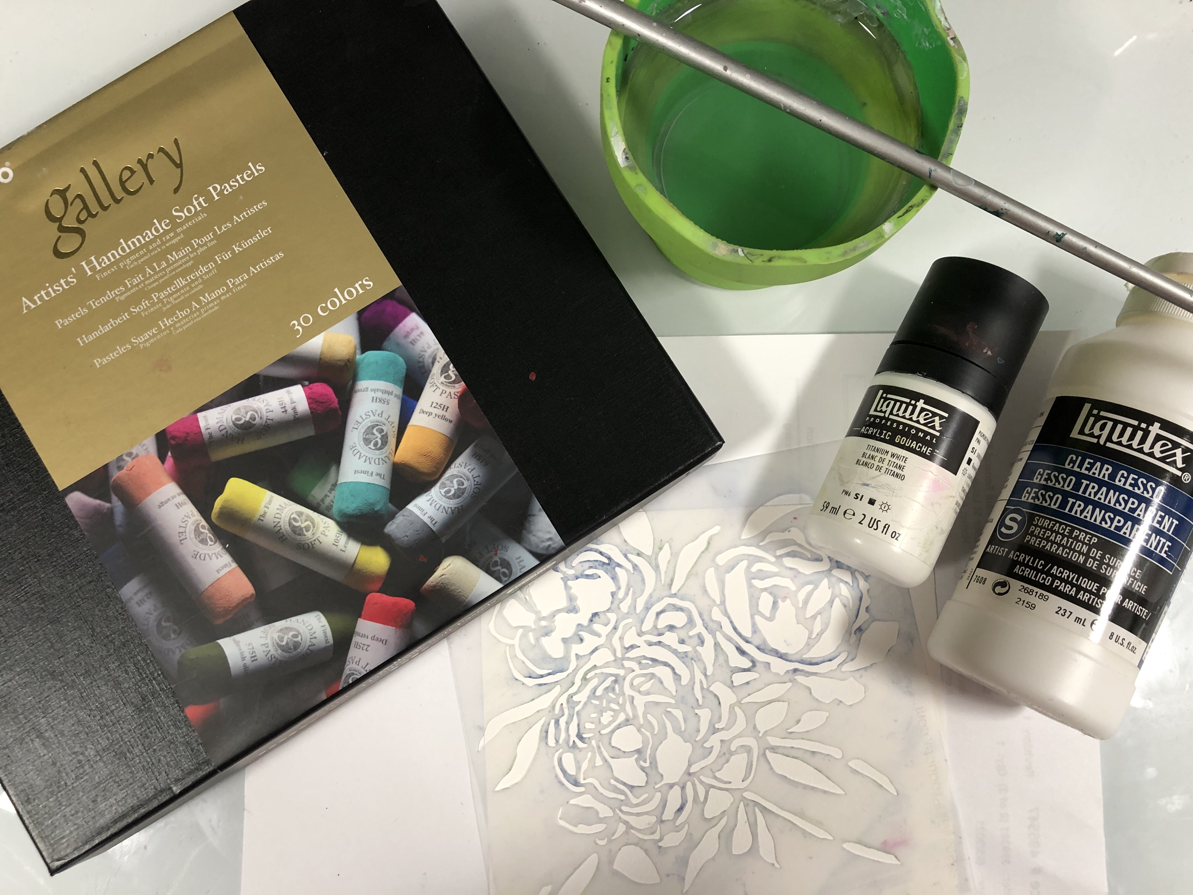
    Pictured above are most of the materials I used in the video.  I hadn't planned to splatter so the white and black acrylic are not in the picture.  Soft pastels are readily available.  I purchased these from Amazon during the pandemic.  The watercolor paper was a brand called Fluid that comes in a block and the Liquitex products are also readily available online or in big box or art stores.  

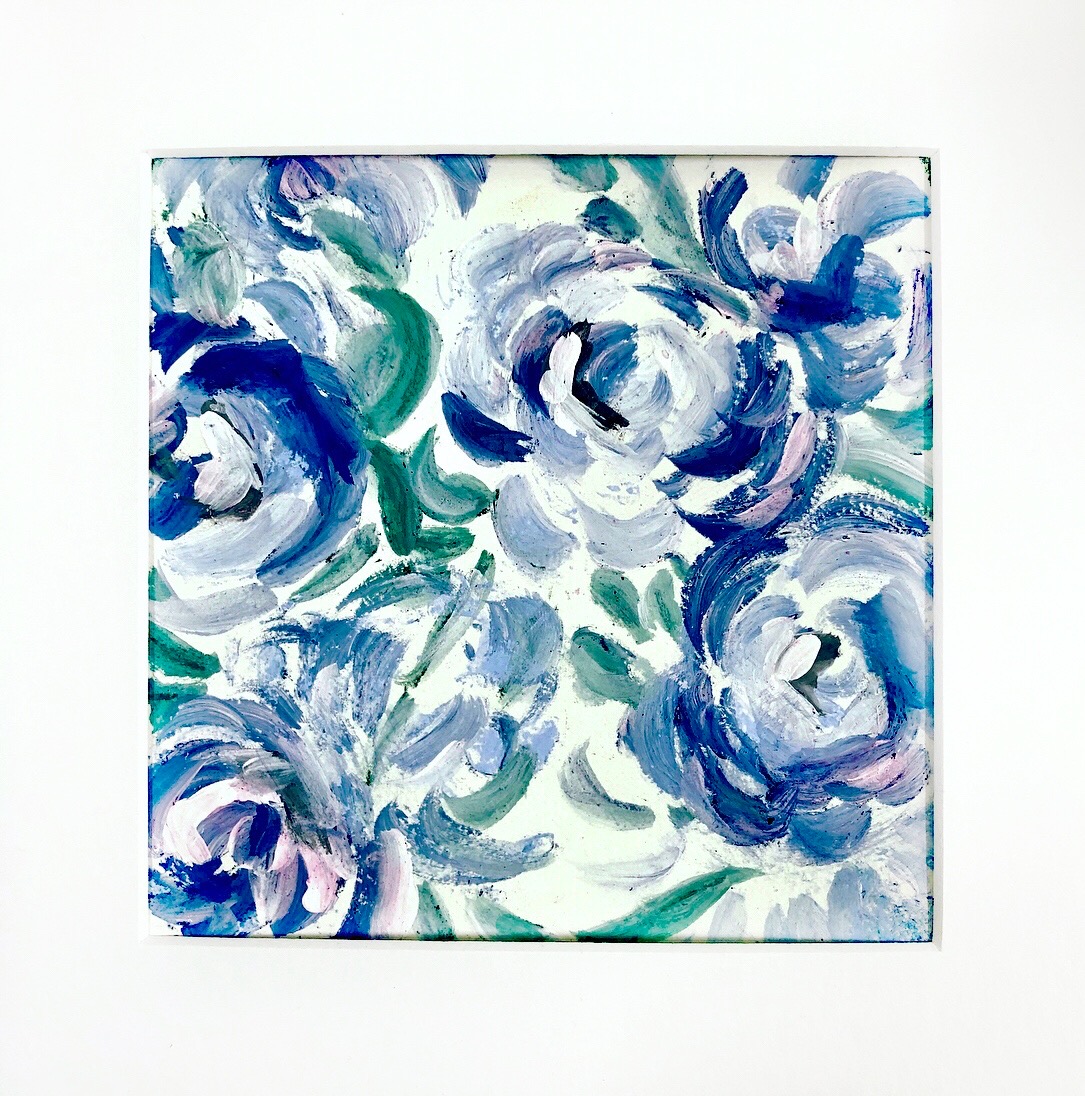
    As mentioned above, I added some spontaneity to the showcase video with the splatter and the thicker application of paint.  Below you will see the end result from that video. The one below was done before filming with the same colors but heavier use of the clear gesso in the petals so the colors are deeper and more vibrant. Both were made with Peony Blooms by Wendy Brightbill.  As you can see, your options produce varying results. 


    From the video: splatter & layered paint


    Earlier piece with more clear gesso and green variations.

    I played around with some different stencils while I was familiarizing myself with this technique.  Two of my floral favorites are below. Jessica Sporn created the "Feeling Groovy" set for StencilClub members and the stencil I used was the 9" x 12" pictured here. This piece was almost exclusively done with clear gesso.  Club members can back order club stencils.  These are definitely keepers.  They worked well for this technique, but I also love them with alcohol inks.  


    I also enjoyed playing with Wendy Brightbill's Bouquet Greenery.  There's a lot of negative space to work with so it made the process a little slower filling in the background, but I loved the vast pinkness of it.  

    This has definitely been an interesting technique with varying results.  I can't wait to play more and see what else will play nicely with the soft pastels. I sealed all of them with Krylon UV Archival satin (personal choice) and am pleased with the final results.  Thanks for following along with me.  I love to take you all on adventures.  As always, I am happy to be here and certainly hope you'll continue to journey with me here and on my social media.  This page has links to it all.  I'll see you all soon!!!! 

    xoxo

    Nancy


    Thursday, May 20, 2021

    Watercolor, Gouache, and Acrylics with StencilGirl® Products

    Hi Everyone, I'm Brenda Townsend of Brilliant Spectrum Art, and I'm so delighted to be with you as the StencilGirl® Products Guest Blogger today! Honestly, I'm primarily a painter who works in watercolor, gouache, and acrylics. I had used three beautiful stencils created by my awesome teacher, Helen Shafer Garcia (Echevarias, Echevaria Ballet, Filigree Sprigs) to create my series, "Critters Who Will Eat Your Succulents."

    In the two paintings pictured above, I used gesso with the stencils, but needed something to create more contrast between my gouache and the stenciling.  I love to play and experiment, and for some reason, leaf rubbings came to mind.  I scanned my workspace for a suitable material that I could use to rub across the raised surface.  I ended up trying a Conte crayon on its side and was quite pleased with the results!  I began to consider what other materials might also serve the same purpose, and that is the idea behind my blog post today: Experimenting to see which other art supplies could be used to get similar results with stencils and gesso.


    If you choose to use this simple technique, here are a few tips for best results:

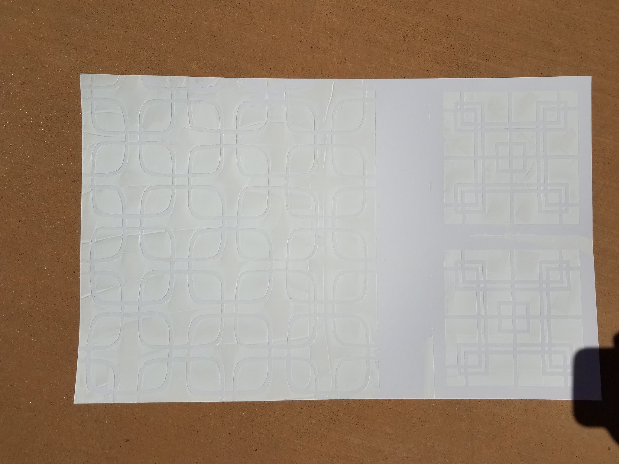
    • Don't be shy with the amount of gesso you use... The more you use, the higher the gesso will be raised, and easier to capture with the medium dragged on its side.
    • Use a credit card to scrape the gesso through the stencil.  I tried sponging the gesso, and it didn't allow the gesso to create a raised relief effect.  Ideally, you want to be able to feel it underneath your fingertips when dry.
    • I used Golden Gesso bright white acrylic primer. It's a bit more expensive, but it allows you to achieve the best results possible.

    Overall, I experimented on cold press watercolor paper, linen-finish watercolor paper, and Bristol Board using acrylic ink, goauche, regular watercolor, and concentrated watercolor for the stenciled backgrounds.  To create contrast, I used Conte crayon, square pastels, soft pastels, oil pastels, and Marabu Art Crayons which are a type of watercolor crayon.


    As a fan of all things Mid-Century Modern, I used Square Clover Leaf 6, Lattice Full, and Centered Circle which remind me of the "breezeblock" walls, so prevalent in Mid Mod architecture. 


    First, I used a credit card and gesso to stencil the various designs onto the paper.

    Next, I layered a variety of mediums and on the backgrounds to see what kinds of effects could be achieved.


    Each combination ended up with quite a different feel, depending upon materials used, so the outcomes are nearly endless!  I hope this post inspires you to experiment with this simple technique and discover which styles you like best, to enhance the great work you’re already doing.  It’s an effective technique to pull out when you just want to add some quick contrast to your 3-D piece.


    Ideas for further exploration:

    ·         Colored pencil 

    ·         Prismacolor Nupastels

    ·         Crayola crayon


    Happy Creating!

    Love, Brenda @BrilliantSpectrumArt


    I am Brenda Townsend of Brilliant Spectrum Art. I'm a California-Credentialed Arts Educator, working in watercolor, acrylic, colored pencil, pastels and more on paper, murals, and theatre sets. Some of my favorite subjects include lights, tikis, mermaids, birds, flowers, and/or shells in a fantasy setting, with an exotica/retro vibe. Major artistic influences include Disney artist, Mary Blair, The Artist SHAG, Oceanic Art and the Natural World. I work in multi-media, and my process often involves using hand- made stamps and stencils and using found objects to print. I paint my current thoughts and discoveries on top of these backgrounds, in a semi-realistic style, using exciting and surprising color palettes.

    I feel passionate about creating uplifting, fun, and beautiful works with broad appeal to provide viewers an emotional respite from everyday life. My work is escapist, joyous, and unapologetic, exuding positive energy which allows viewers to recharge and be transported while experiencing an enhanced reality.

    Wednesday, March 18, 2020

    Art Workshop with StencilGirl® Products

    Hi, everyone! Jennifer Evans here!
    Recently I taught an art workshop at Periwinkle Art Studio using my 9" x 12" Butterflies Play in the Garden stencil and Playful Butterflies stencil, and I couldn't wait to share photos!

    We used cold pressed Watercolor paper (9" x 12") and the stencils to position the butterflies (and any flowers, if desired). The watercolor tends to seep a bit under the stencils, so it's beneficial to use a medium brush with not a whole lot of liquid loaded in it. This is just meant to get the shape of the butterflies on paper -- you can fill in and correct any blips once you carefully remove the stencil.
    Class participants used either watercolor or gouache -- it's really just preference.
    If you like watercolor, use watercolor. If you want something more vibrant and opaque, use gouache.
    Once the composition is decided and the butterfly images are outlined,
    begin the process of filling in the wings.
    Add a background.
    This is mostly water and just a little pigment, so as not to distract from the central image.
    When everything is dry, use markers and pens to add outlines and doodle patterns into the wings.
    If you have a word or phrase for 2020, this is a great time to feature it! (see my finished example).
    Here is one more project, using Butterfly Wings of Whimsy stencil: a greeting card I made with that stencil!

    Using the Strathmore Watercolor Greeting Card stock, create a light colored background with watercolors of your choice.
    On a scrap of mixed media or Bristol paper, stencil some wings.
    I used blue and magenta acrylic paint to do this.
    Cut out the wings and arrange on the greeting card, once the background is dry.
    Secure with matte medium or Mod Podge.
    For the butterfly body, I used bits of twine, also secured with decoupage medium. 
    Embellish the wings with acrylic paint.
    Allow to dry, then outline with thin brush or black marking pen.

    Happy Spring!
    Jennifer