Happy hubby thought he wanted a plain blue curtain.
Ever stenciled a big canvas? A wall? A curtain?
Peer into this post and you’ll find me, Carol Baxter,
peering out at you from the front window of my RV. We can see each other
because the Baxter home-away-from-home needs a curtain!
Acrylics in hand, this RV Curtain is my first attempt at painting anything larger than 18” x 24” that was not
one color of paint on a wall. I am using regular acrylics instead of fabric
paint as I am not anticipating a need to wash this curtain much.
I began at my kitchen counter (protected – eek! I nearly
forgot this step - with a piece of board to protect it) and a 2 yards long
piece of navy cotton duck, conveniently, at 70” x 43” just about the size I
needed after sealing the edges with hem tape. I taped down the fabric after
noting the vertical center.
Once hung between the cab of our Jamboree and the
dining/cooking/sleeping area, much of the bottom right and some of the bottom
left won’t be visible so I planned my painting to fade out. My counter space is
smaller than my fabric so I’ll be moving and re-taping or rolling the fabric for
Layers 2-5. Note that because this fabric was not stretched on a frame it did
move and stretch a little.
Next: Gather stencils and lay them out. This was fun, I
grabbed more stencils than I thought and ended up with ones (koi) I would not
have thought about using had I not sorted through my folders.
Onto painting the sky! I thought the roller would be great,
it was not. The squeegee worked okay. I cleaned up a few linear edges with
paint on a sponge.
Area 1: I initially chose navy fabric because I
figured the sky would be at least a third of my piece. I painted black and blue
then white, blue, and pthalo blue to gradually take my sky from dark to light.
I used white to create my mountain using the rock portions of the small stencil
from the Caves and Ladders StencilClub set. I also used white to the color in
the area where I will eventually park my Vintage Camper Trailer and I needed a
couple of trees to hang my flags.
Area 2: I hand-painted in the trunk and arms of the trees
that frame my trailer because I had the mask and not the stencil of the small WindsweptTree. Added another couple of layers to my mountain.
I used Quinacridone Nickel Azo Gold (QNAG) to stencil in the
trailer outlines. I filled the trailer in, then once it dried, went back in
with black to outline the doors and windows so they have polka dot curtains. At
this point, I am not sure what colors I am going to paint the flags and I have
another couple of elements I want to add so I am holding off.
I am no gardener, but like art journaling, I keep trying. I yellow,
pink, and orange to paint flowers using the small stencil from the Floral Fascinations
StencilClub set around my abode and then sponged in a little green around the
edges and used the small stencil from the Modern Botanicals StencilClub set to
add some bushes.
Area 3: I completed this layer in two sessions and got
excited for the second time when I started layering up the cenote.
First, I painted earthy greens and browns with a river
running through it with the large stencil from the Early Art 2 StencilClub Set.
I was originally going to go for a beach scene, but the
hubby and I are headed to Bottomless Lakes (cenotes, not really bottomless) in
New Mexico for our first RV vacay in a couple of summers and lo and behold,
Carol Wiebe designed a cenote for StencilClub back in September 2018 (okay, it
might be a well, but I am using it as a cenote) and a cave in the mountainside
was part of that set. Meant to be. I mixed a light blue for the water.
Stenciled in the bricks/rocks around it then went over them with
a lighter paint.
Two Chinese Garden Koi swam into the picture. I
used yellow to stencil one fish and then added details with black. I detailed
the other fish in orange and black. I added the line details back in with QNAG.
If the fish are that big in Lake Lea, I will truly have a
tale to tell when I get home!
I touched up the bricks/rocks and drew in the reeds around
the water by dragging a toothpick through green paint. There were little marks
around the cenote, so I stenciled in a bunch of flowers and then made some dot flowers
with the end of my paintbrush.
The first time I ever swam in a cenote was near the Mayan Chichen
Itzu Ruins. There were a couple hundred steps to get down to it and there were
flowering vines hanging down, some to the waterline. The water was clear yet
dark and soft. It was gorgeous and an amazing experience. The Cenotes in New
Mexico are closer to level with the surface of the land. Cenotes are fed by
underground rivers and rivers lead to the sea; facts lead me to the base of my RV curtain.
Rumor has it a Mermaid may be swimming in from the Coast.
Area 4: Although the curtain will only be up at
night, I couldn’t decide between night or day, so I decided to go for both.
Time for scattered starlight.
This section was pure fun!
I had previously swiped some back paint where I thought it
would look cool as a darker sky. Not so much. The large stencil from Second Star to the Right... StencilClub set to the rescue! I hummed
David Bowie tunes and stenciled in a bunch of black stars.
I used gold, silver, rose, and purple paint Soho paints and randomly
stenciled in stars with
We always have music around the fire at night so my moon
glows as a Musical Roundabout in silver.
Area 5:Rose Window is a gorgeous stencil. I
stenciled it in yellow and then went back and filled it in with
yellow/white/orange. After it dried, I put the stencil back down as close as I
could and stenciled it in gold. Subtle but fabulous.
I extended the cloudy sky.
There is a Japanese fairy tale about a rabbit who lives on
the moon. I’m sending a Bunny in Motion to the moon via a Hot Air Balloon.
You can see the sun and the bunny in the quick video below.
Hang it: Sticky back Velcro strips (5lb strength). With the a/c on when we are plugged into electric the curtain makes a nice barrier to keep the cool air on us :)
Beats the heck out of the pinned-up sheet it has replaced.
With the addition of grommets, I’ve hung my personalized RV curtain. Ray and I will
now sleep sound knowing that nobody can see inside.
Touch-ups for later: Front curtain on trailer the trailer and I will probably paint the opposite side of the mountain black.
Although this was an all-day-and-into-the-next-several art project, I might just be hooked on large formats. If you have not tried
stenciling something big, I encourage you to try.
For me, totally worth it.
p.s. Have you seen all of the perks of StencilClub? Current members
my order past club sets!
For about 30 years, I made my living as a children's book author. I wrote quite a lot of books for children and teens, and many of the books I wrote were illustrated, although not be me. In addition, all my books had covers (obviously) designed by either the in-house art director or a free-lance illustrator and/or designer. As an author, I was never consulted on matters of book design and interior art. I did, however, learn a great deal over the course of my children's book career about illustration and cover design, and about some of the key concepts related to narrative art. Because many of us in the mixed media community are working in art journals where we have some narrative component, I thought it might be helpful to share one of these concepts as it relates to faces and figures: direction.
At its most basic, direction in illustration or narrative art is determined by the direction of text. In other words, if you read from left to right, anything moving to the right, facing right, pointing to the right, can be interpreted as heading forward. This is the direction we go when we read - we go to the right. Typically, people who read from left to right also "read" artwork from left to right, read a crowd of people from left to right, inspect a room from left to right, and so on. The left side is presumed to be the beginning, and the right side is presumed to be the end of a sequence, or a pause in the sequence. (Incidentally, in cultures where text is read from right to left, the opposite is true; for example, the cover illustration of one of my books was reversed when published in Japanese.)
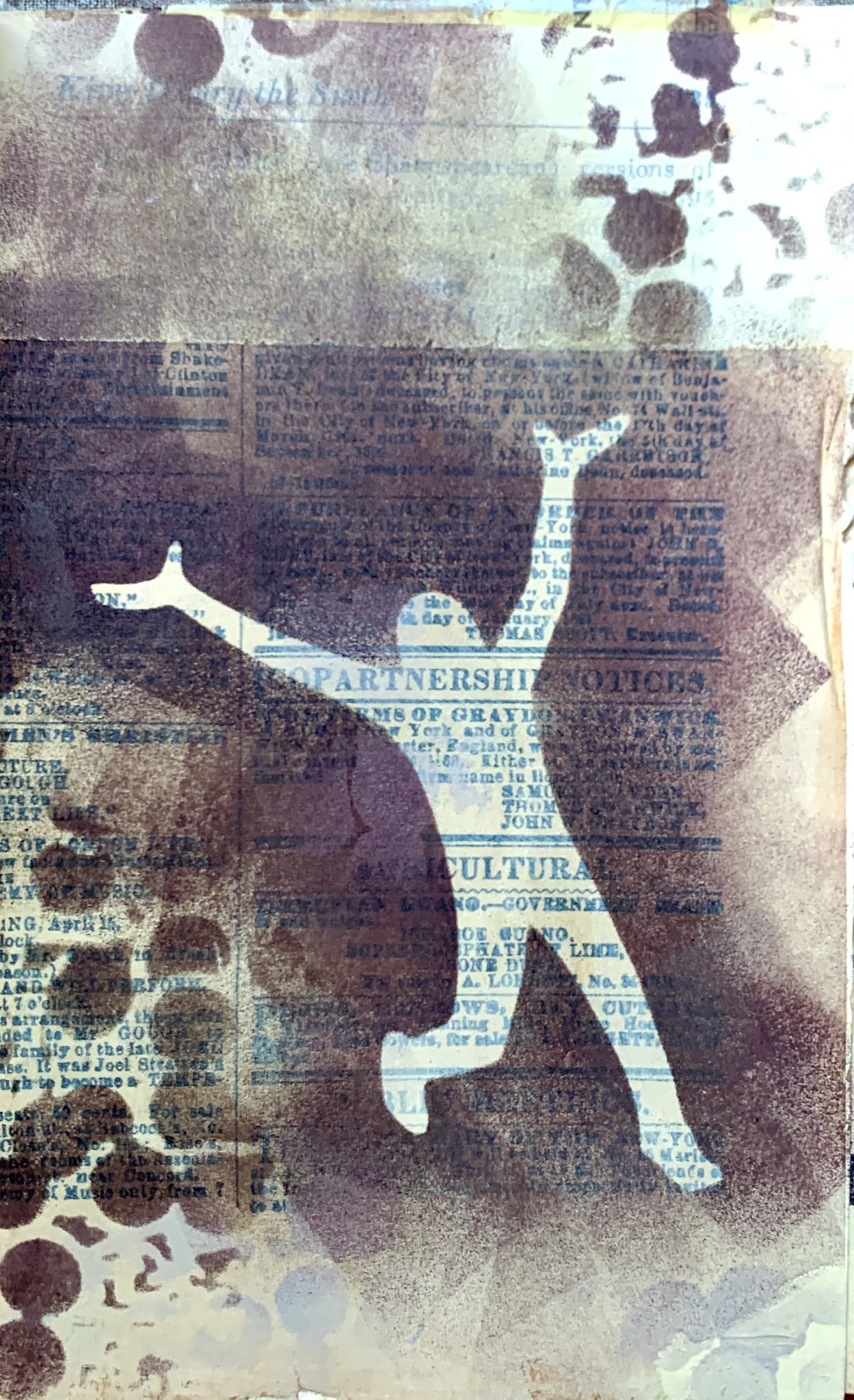
In the art journal spread below, featuring the Angel Circle Stencil by Kate Thompson and the Near Miss figure by Wendy Aikin, the figure is at the right side of the spread, facing right and leaning right. With printed text above to reinforce the direction, and crows also facing right rather than retreating in alarm, this figure can easily be presumed to be focused intently on something interesting up ahead, rather than something behind.
Taking the idea of forward, ahead, and right a little further, we can manipulate this design choice to imply an emotional content for faces or figures pointing or facing right. Figures in this orientation can indicate optimism, progress, hopefulness, success. Conversely, faces and figures moving toward the left can imply return, regression, regret, the past, and so on. Take for example, the two figures below, using the same mask from Figures Praising by Valerie Sjodin. In both cases the background and colors are the same, but depending on other choices (color, line work, contrast, composition, massing, etc.) you could make the first figure seem to be bounding joyfully into the future, and the second figure running away from danger to safety.
Now, I do not mean to imply that every face or figure in your artwork is doomed to carry this kind of subconscious baggage depending on what direction it's going. However, sometimes when narrative art featuring a face or a figure doesn't feel right, it's due to this - the brain is getting mixed signals. Our brains are hard-wired to read images this way (for left-to-right language readers); we have this 'right is right' unconscious bias whether we like it or not. As a test, try holding your work up to the mirror and see if it strikes you as emotionally or psychologically different. A great advantage to using stencils is that they can be flipped in either direction. So a composition that doesn't quite seem to hit the right note can be given another go by changing direction of the stencil.
Of course, when there are two figures or faces in a composition, they might be facing each other, in which case no particular psychological reading is especially pertinent - they are interacting. The interaction may be negative, neutral, or positive, but the orientation is probably not going to factor into that reading. However, if the faces or figures are not interacting, but oriented away from each other, there is a lot of room for inference. With Jeanne Oliver's Thougtful Face, we also have the advantage of playing with scale, because this stencil comes in two sizes. Now, with the smaller face on the left, facing left, and the larger face on the right, facing right, it is not hard to read this as the past and the present (or future) in an autobiographical composition.
It would be an interesting exercise to use these two stencils in all possible configurations simply to see how different the compositions feel. Obviously, many additional factors go into the emotional or psychological content of a piece of art - but going in the appropriate direction is one you don't want to miss if that's the one that can get you where you want to go.
Hi all stencil lovers! Patricia Lintner here! I have an exciting project to share with you that I loved using my StencilGirl® stencils on!
A good majority of my work involves animals. Dogs,
birds, wildlife and recently chickens. Why animals? They are pure
creatures that speak to me and all of us in some way or another. They can
bring many emotions in us such as, comfort, inspiration, love,
curiosity, nurture, beauty and so much more!
With that said, I started doing a spirit animal
series a while back, and wanted to do something “different” with them.
After some time, stencils seemed to interest me, yet I was not sure
how I was going to use them with my animals. So, I just jumped in and
started playing!
For today’s project I decided on doing a spirit
animal Cougar for its confidence, strength, and wisdom.
I started with a 9" x 12" cradled wood
panel that I exclusively use in most of my art. I sealed the panel both front and
back as well as sides with Golden Gac 100, then gessoed the front
and sides to prep the panel.
I used oil paint sticks, using a combination of R
& F Pigment Sticks and Richeson Shiva Artists' Oil Paintstiks, to
start adding a base color. What I love about oil paint sticks is that
they don't take as long to dry as oil paint out of the tubes. At this
point I let it “set” overnight.
Next I used a piece of deli paper, also known as
dry waxed paper, to sketch my subject with a charcoal pencil in black.
You can use reference photos and trace, or just go for it
yourself! I actually like my work not so perfect so that works for me.
Then I turn over the paper and trace the front to the back. I use the
deli paper to draw on first so that if I need to correct something, I
don’t have to worry about making “corrections” on the project itself.
Turning the paper back over again, I find where I
want to place my subject, (another reason why I like to use the
deli paper first), then take the tip of a smaller paint brush handle to
burnish the image onto the painting.
Feeling the desire to add a second animal, I was
drawn to an owl for its ability to guide intuition (which is the
cornerstone of most of my work), transitions in life, and the gift of
observation. I used the same method as I did with the cougar and the deli
paper.
Next I start adding color with the oil paint
sticks and Caran D'arche Neopastels.
At this time I start looking at what stencils will
work. Note that I do not start with a stencil in mind, but rather
what speaks to me.
I chose several mandala styles because of how the
cougar and owl are placed, and how the circular composition bring
these two subject together. I finally settled on Rose Window and
Border Stencil by Lizzie Mayne. I love this design because not only
of the circular composition, but also of the "architectural" feel that I am so drawn to.
Momentarily setting the stencil aside, I draw more
defined lines and now more color. I also at this stage start to
scrape the paint to add more texture and visual interest. I still need
more base color so that when I add the stencil design, I will have that
layer underneath. Again I let the paint set overnight.
Now is the time to bring that beautiful stencil
in! The oil sticks are heavy bodied which is what I love about them
because I love texture. I add my chosen colors and making sure not to move
the stencil I start applying the oil sticks. I also somewhat remove
the exposed areas with a paper towel and even baby wipes (my number one
supply I use with all my work), as a tool. Notice how the thickness of
the paint stick and removing some between the layers creates even more
texture! I also decided at this point to not use the whole
stencil, but rather just on the subjects. Cleaning the stencil with baby oil
works beautifully!
I felt I needed something in the negative space in
the lower left hand corner. So going through my StencilGirl® stencils
I quickly found the 4" x 4" Feathered Tribe exclusive club
stencil by Gwen Lafleur was perfect! I used the same method as I did with the
previous stencil except I did not take any away, to leave a
"raised" effect.
Adding finishing touches with mark making using my
Neopastels, charcoal, scratching with a razor blade and
skewer. Here I am paying attention to color, shape, detail, contrast and
again composition.
I seal the painting with Gamblin Cold Wax all over
sides and front.
And the finished piece!
Thank you everyone for coming along on my journey
of my Spirit Cougar and Owl "One by One"!
I am so excited to be here on the StencilGirl® blog again today
as a guest designer. My
name is Niamh Baly and I am a Primary (elementary) school teacher from
Tasmania, Australia, a content creator and mum to two gorgeous girls. I am also
stencil addict! Stencils are such an amazing tool to help produce fabulous
artwork and are so simple to use. They are one of the most important tools that
I use in my art journal pages, and nearly every page I create has a stenciled
image or texture on it. In this project we will be using stencils to create a
quirky abstract journal page using lots of mark making. I find pages like this
very relaxing to make, and great pieces for days when you want to paint – but
aren’t sure what to make. Below you will find a full process video as well if
you want to see this page from start to finish.
To begin, paint a number of different colours in your
background. I tend to use analogous colours (colours that sit together on the
colour wheel) as they blend nicely together – in this case I used warm colours.
I tend to apply the colour in threes on my page to create visual triangles.
Once dry I then create drama by applying black gesso through the monoprint
stencil by Rae Missigman. This allows any marks applied over the top to really
sing against the stark black.
Adding marks to a page can be daunting but take a leap
and have fun. I use different paint brushes in a variety of shapes and sizes to
create my marks, and often the cheaper the brush the better – as you don’t mind
squishing it into your page. I tend to repeat colours from the background again
to create repetition or chose a contrasting colour (opposite on the colour
wheel from the background colours) to create a focus. You can also use paint
pens and stamps to add extra marks and interest to your background.
Finally, I wanted to add a focal image to my page. I
chose to stencil the bold flower stencils in a number of different sizes to
create movement. I used the lapis blue to stencil to give a huge pop of
contrasting colour, but also as the blue is semi-transparent, so you can still
see the marks and colours from the background peeping through. I then lettered
on the words – just breathe, as I found while I was creating this page I felt
relaxed, at peace and able to just breathe after a crazy week at work.
Here is a video of the full process creating this
page:
Build your own arched city or Leaning Tower of Pisa with Carolyn Dube's new Arches and Towers of Arches. You can even create artworks where the arches become abstract!
Art journal? Check.
Gel print? Check
Fun? Check. Check.
These stencil/masks are a playful take on the arches in classical Greek and Roman architecture. Stack them, combine them with Arches, or use parts of them.
Towers of Arches. Simply snip out the masks and you are good to go.
One of the perks of getting the masks with the stencil is it can make deciding where to place an arch before you make the commitment of paint! Not only can this stencil make arches it can make organic oval shapes that look NOTHING like an arch.
Stretch now. Arch your back. Feel your creative flow. Get ready to play:
Need a little more art inspiration with these arches? Check.


