Showing posts with label printmaking. Show all posts

Monday, January 2, 2023

Hiroshige Study


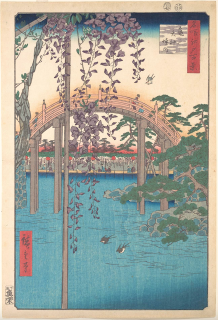
    Hello, Jennifer Armstrong here, back with another master study.  This time I am turning my attention to the great Japanese printmaker, Utagawa Hiroshige, 1797-1858.  I have a framed poster of one of his prints in my dining room where I can see it every day.  I love it.  It's this one, called In the Kameido Tenjin Shrine, dated 1856.


There are many things I love about this image, and I will begin to break it down analytically in a moment, but first, I want to talk about this artist's influence on Western art. 

Hiroshige's prints (and those of other Japanese masters) were shown in Paris beginning with the Exposition Universelle (World's Fair) of 1855, after Japan reluctantly opened its doors to trade with the West.   To say that the impact on European artists was electrifying is an understatement.  Along with Hokusai, Hiroshige influenced every major artist of the day and the following decades - Van Gogh, Manet, Monet, Gaugin, Cassat, and so on.  Copies of the prints were widely and cheaply available, and Van Gogh, for one, amassed a huge collection.  These artists were already restless and dissatisfied with academic classicism, and were ready for a new way of seeing. Arguably, the Impressionist Movement would have taken a very different form without the new visual vocabulary that these woodblock prints offered.  Go here for a good introduction to Japonisme and its influence on European artists - the treatment of the surface, the use of color, and so on.  There haven't been many thunderbolts that had such an profound impact.   Look at European paintings before 1855 and then after - it's all wildly new.

Hiroshige produced two major series of woodblock prints, one largely in landscape format, and the other in a vertical format.  I want to show a few more examples of vertical Hiroshige prints and begin to highlight certain characteristics that I will then attempt to emulate.  From the left: Jumantsubo Plain at Fukagawa Susaki of 1856, Suido Bridge and the Surugadai Quarter, 1857, and Kinryusan Temple at Asakusa 1856.  These three, along with the one above, share some similar elements.

The first is the color.  Aizuri-e literally means "blue printed picture."  Hiroshige's work is very predominantly blue, and specifically, Prussian blue.  These images all have extensive fields of flat blue color, which - among other things - creates a harmoniousness from one print to another through the series. There is also high chromatic contrast, especially between the blue and a dark brick red that appears in the rectangular text blocks, as well as other spots.  Another characteristic of these images is the extreme contrast of scale.  In each one, a relatively small object - flower, bird, kite, lantern - is shown in extreme closeup, while the remaining elements - landscape, architecture, human figures - are shown at an extreme distance.  The flip-flopping of scale is fascinating.  It brings the viewer into close interaction with the picture, creating the impression that the viewer is standing and taking in the view through a window or doorway.  The features of each image that are ostensibly the main focus, based on title, are very far away and thus very small; the titles tell us that it is not not the large, in-your-face object dominating the composition that we are supposed to pay attention to. One of the other elements that captivated the Impressionists was the two-dimensionality of these pictures.  Whereas Western artists had for generations been perfecting the illusion of three-dimensionality in painting, the Japanese prints are deliberately flat, emphasizing surface pattern and line. Objects have outlines.  There is no attempt at creating a naturalistic representation of nature and objects.  European art underwent a revolution after viewing these works.

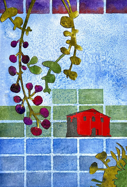
My own attempt at integrating these concepts is a lot less groundbreaking (to say the least!), but it was an interesting exercise. 


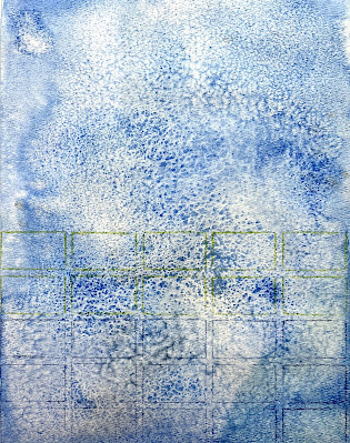
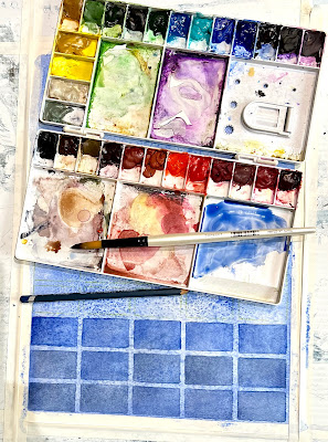
I began with a blue field.  I used ultramarine and Payne's gray watercolor to approximate Prussian blue, and used salt to give the surface a grainy texture.  Then, to emulate the surface pattern and two-dimensionality of the inspiration prints, I used L826 Swatch Grid Stencil by Rae Missgman and watercolor pencils to begin a grid of color blocks.  This, I propose, creates an abstract landscape.  Knowing I would have to have a strong red component, as well as a relatively large object to push into the distance, I stenciled the house from Club Set November 2018 by Pam Carriker onto a piece of magazine paper that had some interesting features. To get a good strong contrast I used micaceous iron oxide. I tried it a couple of ways to see which one would turn out the best. 

For the "small object in extreme close-up" element, I toyed with a number of botanical stencils until landing on L911, Rae Missgman's Imaginary Botanical Mask and Stencil set.  I used acrylic paint on a separate sheet of watercolor paper and cut out the images so I could test them out on the composition.  I also chose to outline each of the elements in black, to emulate the outlines on the woodblock prints, giving them all a crisp definition. There isn't a lot of tonal contrast, but the chromatic contrast is pretty vivid. 

My takeaway from this experiment is that the compositional technique I'm most likely to use in future work is the play of scale.  I find the "big thing in the far distance, small thing brushing my forehead" trick very appealing.   I also love the colors, which is why I have one of these prints in my home to begin with.   I urge you all to take a Google tour of Hiroshige's work and notice the features that so profoundly moved artists like Van Gogh and Monet.  It's a wonderful way to see with new eyes.

Stencils used:

L826 Swatch Grid by Rae Missigman


Sunday, July 18, 2021

Printmaking with Stencils


Hello all! It's Gwen back again with another project tutorial focusing on paint and texture. This month I wanted to share a quick and easy way to create a layered mixed media piece by doing some printmaking with several of my stencil designs and a gelatin plate.

Printmaking with Stencils - Mixed Media Project - Gwen Lafleur

To start, I took a piece of 9" x 9" watercolor paper (140lb / 300 gsm) and covered the background with two colors of PaperArtsy Fresco Acrylic Paint (Twilight and Azure,) let it dry, and then stenciled layered patterns from three of my stencils using ink and a blender brush. 

I started with my Collage Textures & Patterns - Medieval Cyrillic stencil (with Cobalt Archival Ink,) then added sections of one of the designs from my Art Deco Borders stencil (Sepia Archival Ink,) and in the top layer I repeated my Suzani Circle Flowers stencil (Jet Black Archival Ink.) 

I was just looking for layers of pattern to create a sense of texture since this was just going to be the background and a lot would get covered up. 

Printmaking with Stencils - Tutorial Step 1 - Gwen Lafleur

Now for the printmaking part... you can do this with a stencil, but for the effect I wanted on this piece I chose to use a mask (you paint or ink around the design rather than through it.) 

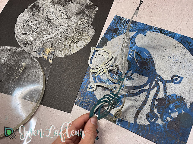
I pulled out my Ornamental Peacock mask and positioned it where I wanted the shape to show up on my piece and then used my brayer to coat an 8" round gelatin plate with paint (I used PaperArtsy Fresco Acrylic Paint in Truffle.) I left one of the acetate sheets on the plate to use as kind of a stamp mount for printing.

Printmaking with Stencils - Tutorial Step 2 - Gwen Lafleur

With the paint still wet I quickly but carefully flipped the gelatin plate upside down (holding the acetate as much as possible to keep my fingers out of the paint,) and laid it down over my mask centered on the page. I rubbed firmly all over to make sure the plate completely printed before carefully peeling it back off.

Printmaking with Stencils - Tutorial Step 3 - Gwen Lafleur

I stamped the gelatin plate again on a piece of black cardstock (why waste the paint?) and got a bit of a peacock design that I can use later in another piece and then lifted my peacock mask off of the background. (If you do that quickly enough and the paint is still wet, you can print that too.)

If you have any details that didn't completely print (like the wing on my peacock,) you can always replace the mask and go back over the details with more paint and a stencil brush or sponge.

Printmaking with Stencils - Tutorial Step 3A - Gwen Lafleur

When my print was dry, I pulled out my Chinese Garden Buddha stencil, my Palmistry Hand stencil, and the 4" x 4" from my February 2021 StencilClub Feathered Tribe set and added some marks onto the printed circle.

Printmaking with Stencils - Tutorial Step 4 - Gwen Lafleur

For the final details I took one of the designs from my EGL-10 stamp set from PaperArtsy (I call this my Japanese Patterns set,) and stamped a bit of a cruciform pattern to fill in and anchor the design and then used a pen and colored pencil to outline and add a few more details. 

Last but not least, I edged the borders with brown and black ink to frame and finish the piece. 

Printmaking with Stencils - Tutorial Step 5 - Gwen Lafleur

I really love the deceptive simplicity of this project - it's quick and easy, but the layers and details made with a few basic tools and supplies make it look a lot more complicated than it actually is... one of my favorite types of projects!

Printmaking with Stencils - Mixed Media Project Closeup - Gwen Lafleur

Here's another peek at the finished project... you could follow the same process on a canvas or panel, in an art journal, or even on a handmade card or tag just using different sizes of gelatin plates and masks. 

Printmaking with Stencils - Mixed Media Project - Gwen Lafleur

Hopefully you enjoyed today's project and tutorial as much as I did! And if you try this yourself, make sure to link me up so I can see how it turns out.

Until next time, happy stenciling!
Photo of Gwen Lafleur


Monday, November 11, 2019

Grid It + Gift It: Wooden Box Gel Printed with StencilGirl® Stencils

Hi there! It’s Marsha Valk, and I’m here today to share a new column with you!

As a printmaker, I have tools that not only look dangerous, but that can actually cause harm if not handled carefully.
One of the first things my teacher told me was to put corks on my scrapers and cutters.

Not to protect the tools, but to prevent them from poking me while carrying them in my bag to and from class.

The teacher illustrated it with a horror story about a former student just to make sure I got the importance of the matter.

Last term, I kept the tools safe in a pencil case, but intaglio inks and cute canvas cases don’t really go together, so for this term, I decided to gift myself an upcycled wooden box.


The box needs to be practical, so I didn’t mind that it was a little beat up, to begin with. This one used to contain building blocks and I found it some time ago in a thrift store.

I started the renovations by cleaning it up a bit and sanding it with sandpaper.

After repairing one corner with wood filler and giving it a final sanding, it was time for the fun part: decorating!


I decided to turn the box into an alternative souvenir to commemorate a recent teaching trip to Barcelona.

Deciding on which stencils I wanted to use to decorate the box with, I was thinking about three things that have stuck in my mind:


The wrought iron gate work you see on balconies and entryways all over the city.


The beautiful old Spanish tiled floors I saw in a shop in GrƔcia and at the Laie Librerƭa CafƩ.


And, the mind-blowing work of Joan Miró.

Watch the video and see if you can spot how I used these points of inspiration to decorate the box:


See you next time!

Marsha Valk

Stencils used:
Trapezoid Squared Stencil by Mary Beth Shaw
Oval Grate Stencil by Mary Beth Shaw
Iron Flowers by Mary Beth Shaw
Exploded Fan Stencil by Mary Beth Shaw
Brilliant Star Stencil by Mary Beth Shaw


Monday, August 12, 2019

Making Negative Marks with StencilGirl® Stencils


Hi there! It’s Marsha Valk, and I’m here today to share a new column with you!

This month’s StencilGirl® Creative Team Inspiration theme is Make Marks On It.


Marks are ‘the fingerprints of your art’ as the queen of mark-making, Rae Missigman, puts it in her beautiful book ‘Paint Play Explore’.

Marks are all the ways you try to put your own stamp on art. Over time the marks you make can develop into something personal and recognisable.


According to Rae, the key components for achieving this are your own carefully (or accidentally) curated collection of tools and mediums in addition to lots of experimenting and practice.

StencilGirl® stencils are excellent mark-making tools, and they are an essential element in my printmaking arsenal.

However, they are designed by the fab StencilGirl® designers and, they're available for all of us. So they're not unique to me. That’s why I always try to combine the use of stencils with something utterly ‘me’.

Mark making is an essential part of printmaking, and I have a particular fondness for subtractive methods.


You can add media with marks, but you can also mask, wipe, fade, bleach, cut, erase, carve or scratch it away.

Watch the video and see me experiment with negative mark-making using some of the tools and mediums in my toolbox!


Until next time!

Marsha Valk

Stencils used:
Mid-Century Modern Banners by Valerie Sjodin
Rounded Tiles by Andrew Borloz 
Exchange Place by Nathalie Kalbach
Manhattan by Nathalie Kalbach
Fragmented Line Columns by Cynthia Silveri
Stone Tilings by Valerie Sjodin
Mid Century Modern Vibe 2 by Jennifer Evans
Screw Heads Small by Andrew Borloz

Wednesday, July 24, 2019

An ocean of art is possible with this Navigation Chart Stencil & Mask Series!

Mary C. Nasser’s Navigation Chart series was inspired by navigation charts that ancient mariners memorized before their voyages over huge expanses of ocean. The maps were created by tying small sticks together in straight or curved lines, representing the waves of the ocean. The abstract designs of these stencils make them great for adding shapes, patterns, and harmony to your art journal pages, mixed media projects, printmaking and more. 


The Navigation Chart stencil/mask series includes: Navigation Chart (mini M271, small S720, large L738), Ancient Mariner's Map (small S718, mini M269), Sea Map (small S719, mini M270), Ocean Map (small S721, mini M272), and Voyage (small S722, mini M273).


Discover this Navigation Chart Series and all of Mary C. Nasser's stencils right here


Thursday, May 2, 2019

Upcycled “Story Quilt Collage” with Cathy Nichols

Hello StencilGirl® friends! I love sharing my process for creating artwork from my StencilGirl® collection. Today I’m excited to show you how to create unique hand-made paper out of left-over scraps from other projects. I use paper like this in many of my art pieces as well as in the oracle cards I design as part of my Create Your Own Oracle Deck e-course. It is so much fun and a great way to upcycle while getting into your creative flow!

1)      Begin with a pile of scrapbook paper, old book pages or any other pieces of colored paper you have on hand.

2)      Gather about 3 different color families of paint as well as neutrals for your palette. I used a favorite bracelet for color inspiration. For this project, I used acrylics, a make-up sponge and my monoprinting set up (gel plate & brayer), but you can use any stenciling media that makes you happy.

3)      If you’re using a gel plate, apply 1-3 colors of acrylic paint to your gel plate.  
Roll it out with your brayer to mix until you get a pleasing color combination.

4)      Then position a stencil on top of the gel plate color. I used my Kilim Stencil. Next, place a sheet of paper over the stencil face down. Rub on the back of the paper with your brayer.
When you lift the paper off the gel plate, you will have transferred the stencil design to your scrap paper.

5)      You can also apply the paint using a make-up sponge. I used bright pink with my Kilim Stencil.

6)      I love creating stories in my artwork, so I added indigo paint with a make-up sponge to the little houses and trees from my City Stories Stencil.
 I cut these out leaving some of the paper as a background for collaging later.

7)      I also created this sweet little couple from my Love Story Stencil by stenciling on top of a sheet of poetry using magenta and light purple. Elements like this help me to come up with stories for my larger collage.

8)      Repeat this process using a variety of stencils and papers. Then cut up your work into smaller pieces so that you have a bunch of ‘patches’ that can be make into a collage quilt. If you cut out your smaller design elements, this gives you a lot of room to explore design within your quilt. You can put the little houses on top of the landscape or within it!

9)      Finish your composition with hand-drawn elements using markers or your favorite paints!

10)   Enjoy this little video & time-lapse snippet of my composition process: